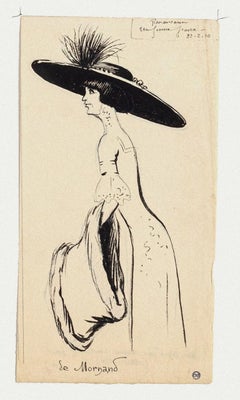
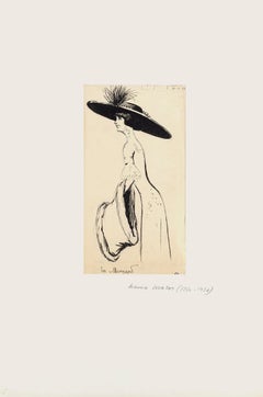
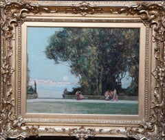
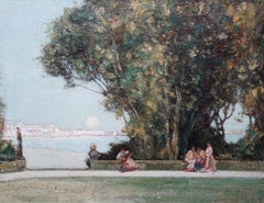
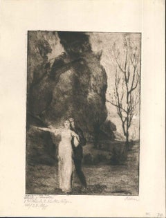
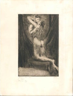
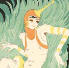
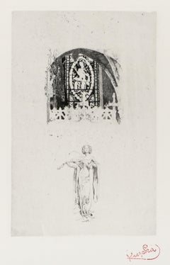
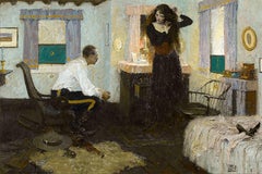
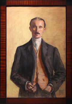
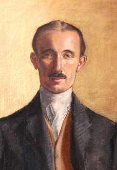
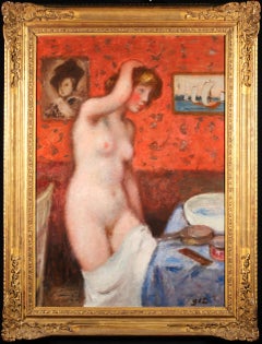
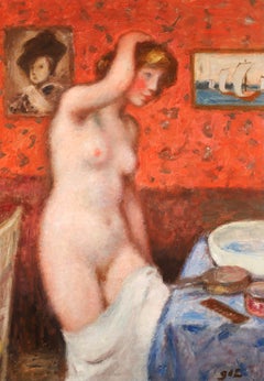
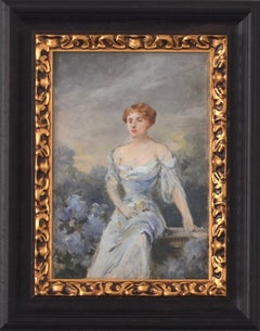
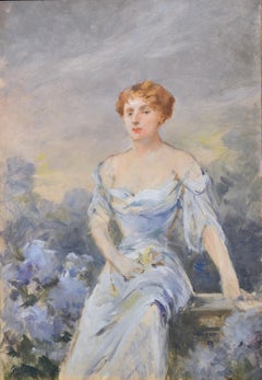
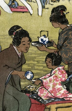
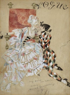
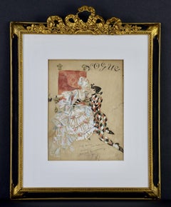
By Georges d'Espagnat
Located in Marlow, Buckinghamshire
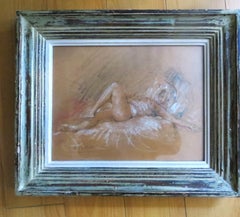
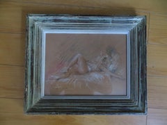
Signed oil on original canvas nude circa 1914 by French post impressionist painter Georges D'espagnat. The work depict a nude woman standing beside a wash basin in a boudoir.
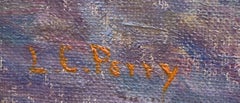
Signature:
Signed lower right
Dimensions:
Framed: 45"x34"
Unframed: 37"x26"
Provenance:
Private collection - Netherlands
From the beginning of his career, it was a constant concern of Georges d'Espagnet to assert his originality. His studies at the École des Arts Décoratifs, Paris, did not last very long, for he wanted immediate independence and decided to follow courses in the private academies of Montparnasse. In about 1900, he became acquainted with Maurice Denis, Bonnard and Vuillard, and his collaboration with Denis led to a renewal of religious art in France.
In 1903, d'Espagnet was one of the founders of the Salon d'Automne, and was appointed professor in charge of studios at the École des Beaux-Arts, Paris, in 1934. He illustrated a number of books: Rémy de Gourmont's Evil Prayers ( Oraisons mauvaises) (1896), The Saints of Paradise ( Les Saintes du paradis) (1898), Simone (1907), Sistine ( Sixtine) (1922); Alphonse Daudet's The Immortal ( L'Immortel) (1930); André Gide's The Pastoral Symphony ( La Symphonie pastorale); Francis Jammes' Clearings in the Sky ( Chairières dans le ciel) (1948).
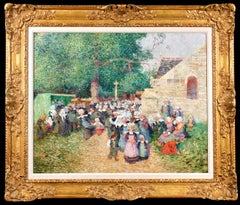
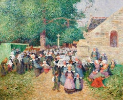
D'Espagnet belongs to the group of artists who made the Courrier Français so successful. The drawings of his which are published in it are strongly expressive and some bear comparison with the designs of the great Renaissance masters. He also contributed to L'Image. He often placed cheerful nudes in a landscape, reminding us that, though he moved away from the Fauves, he retained their freedom of colour and arabesque. He painted many portraits, including those of Albert André, André Barbier, Victor Boucher, Déodat de Séverac, Albert Marque, André Marty and Albert Roussel. He also painted mural decorations, including a wall for the Palais de la Découverte (1937), the ceiling of the Victor Hugo Room in the Palais du Luxembourg (1939), a decorative panel for the Palais de Justice, Toulouse (1941) and interior decorations for private houses. His landscapes are Impressionist in inspiration, and work for a certain sobriety, an intimacy, both in their composition - one, two or three sketched figures and large open spaces - and in the choice of colours and treatment with the special hazy brushstroke that marks his style.
D'Espagnet took part in a number of annual Parisian exhibitions, including the Salon des Indépendants, the Salon de la Société Nationale des Beaux-Arts, the Salon d'Automne (from 1903 to 1949, except in special circumstances), the Salon de la Libre Ésthétique, Brussels (1899, 1901), the Berlin Secessionists (1940). He also exhibited at the first Salon de la Société de la Gravure sur Bois. Among other exhibitions were 1912, A Century of French Art ( Centenaire de l'art français), St Petersburg; 1916, Kunstverein, Winterthur; 1918, 1926, Galerie M. Bertheim, Paris; 1930, Contemporary French Art...
Category
Post-Impressionist 1910s Art