2018 marks the centenary anniversary of Ferdinand Hodler’s death. In that 100 years time, the art world’s esteem of this important artist has proved fickle. It has shifted from extolling his artistic merits during his lifetime to showing something of a feigned disdain- more reflective of the world political order than a true change of heart for Hodler’s work. After years of Hodler being all but a footnote in the annals of art history and generally ignored, finally, the pendulum has righted itself once again. Recent retrospective exhibitions in Europe and the United States have indicated not only a joyful rediscovery of Hodler’s art but a firm conviction that his work and world view hold particular relevance today. DAS WERK FERDINAND HODLERS is not only a collection of printed work reflecting the best of all of his painted work created up to 1914 just before the outbreak of World War I, the portfolio itself is an encapsulation of Hodler’s ethos, Parallelisme.
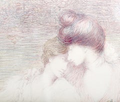
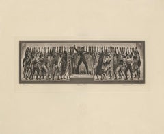
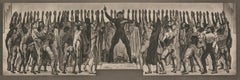
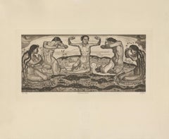
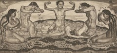
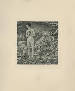
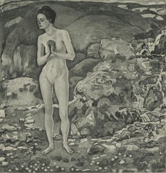
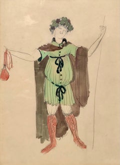
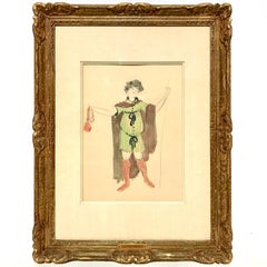
Hodler developed his philosophy of Parallelisme as a unifying approach to art which strips away detail in search of harmony. By means of abstraction, symmetry and repetition, Hodler sought ways to depict Nature’s essence and her fundamental, universal order. He believed these universal laws governing the natural, observable world extend to the spiritual realm. Symbolist in nature with Romantic undertones, his works are equally portraits of these universal concepts and feelings governing all life as they are a visual portrait in the formal sense. Whether his subject is a solitary tree, a moment in battle, mortal fear, despair, the awe inspired by a vast mountain range, a tender moment or even the collective conviction in a belief, Hodler unveils this guiding principle of Parallelisme.
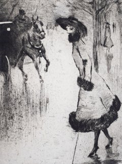
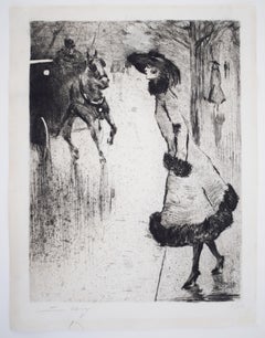
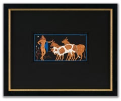
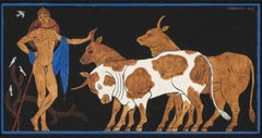
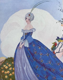
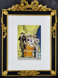
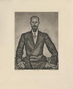
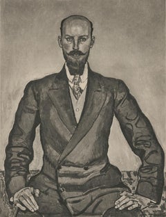
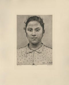
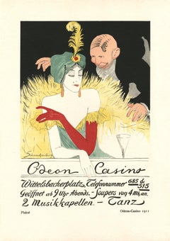
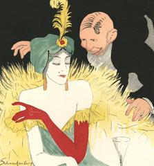
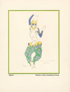
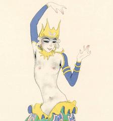
Several aspects of Hodler’s portfolio reinforce his tenets of Parallelisme. The Table of Contents clearly preferences a harmonious design over detail. The two columns, consisting of twenty lines each, list the images by order of appearance using their German titles. The abbreviated titles are somewhat cryptic in that they obscure the identities of the sitters. Like the image Hodler presents, they are distillations of the sitter without any extraneous details. This shortening was also done in an effort to maintain a harmonious symmetry of the Table of Contents, themselves, and keep titles to a one-line limit. The twenty-fourth title: “Bildnis des Schweizerischen Gesandten C.” was so long, even with abbreviation, that it required two lines; so, for the sake of maintaining symmetry, the fortieth title: “Bauernmadchen” was omitted from the list. This explains why the images are not numbered. Hodler’s reasoning is not purely esoteric. Symmetry and pattern reach beyond mere formal design principles. Finding sameness and imposing it over disorder goes to the root of Hodler’s identity and his art. A Swiss native, Hodler was bi-lingual and spoke German and French. Each printed image, even number forty, have titles in both of Hodler’s languages. Certainly, there was a market for Hodler’s work among francophones and this inclusion may have been a polite gesture to that end; however, this is the only place in the portfolio which includes French. With German titles at the lower left of each image, Hodler’s name at bottom center and corresponding French titles at the lower right of each image, there is a harmony and symmetry woven into all aspects of the portfolio. This holds true for the page design, as it applies to each printed image and as it describes the Swiss artist himself. Seen in this light, Hodler’s portfolio of printed work is the epitome of Hodler’s Parallelisme. DAS WERK FERDINAND HODLERS is also one of the most significant documents to best tell the story of how Hodler, from Switzerland, became caught between political cross-hairs and how the changing tides of nations directly impacted the artist during his lifetime as well as the accessibility of his art for generations to come.
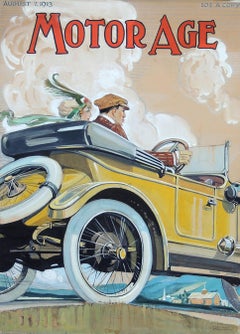
The Munich-based publisher of the portfolio, R. Piper & Co., Verlag, plays a crucial role in this story. Publishing on a wide range of subjects from philosophy and world religion to music, literature and the visual arts; the publisher’s breadth of inquiry within any one genre was equal in scope. Their marketing strategy to publish multiple works on Hodler offers great insight as to what a hot commodity Hodler was at that time. R.Piper & Co.’s Almanach, which they published in 1914 in commemoration of their first ten years in business, clearly illustrates the rapid succession- strategically calculated for achieving the deepest and broadest impact - in which they released three works on Hodler to hit the market by the close of 1914. DAS WERK FERDINAND HODLERS was their premier publication. It preceded C.A. Loosli’s Die Zeichnungen Ferdinand Hodlers, a print portfolio after 50 drawings by Hodler which was released in Autumn of 1914 at the mid-level price-point of 75-150 Marks; and a third less expensive collection of prints after original works by Hodler, which had not been included in either of the first two portfolios, was released at the end of that year entitled Ferdinand Hodler by Dr. Ewald Bender.
The title and timing of DAS WERK FERDINAND HODLERS' debut leaves little doubt as to the connection it has with another avant-garde portfolio of art prints, Das Werk Gustav Klimts, released in 5 installments from 1908 -1914 by Galerie Miethke in Vienna. Hodler, himself, was involved in Klimt’s ground-breaking project. As the owner of Klimt’s 1901 painting, “Judith with the Head of Holifernes” which appears as the ninth collotype print in the second installment of Das Werk Gustav Klimts, Hodler was obliged to grant access of the painting to the art printers in Vienna for them to create the collotype sometime before 1908. Hodler had been previously invited in 1904 to take part in what would be the last exhibition of the Vienna Secession before Klimt and others associated with Galerie Miethke broke away. In an interview that same year, Hodler indicated that he respected and was impressed by Klimt. Hodler’s esteem for Klimt went beyond the art itself; he emulated Klimt’s method aimed at increasing his market reach and appeal to a wider audience by creating a print portfolio of his painted work. By 1914, Hodler and his publisher had the benefit of hindsight to learn from Klimt’s Das Werk publication.
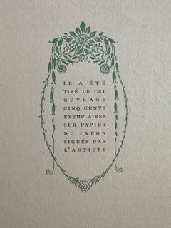
Responding to the sluggish sales of Klimt’s expensive endeavor, Hodler’s publisher devised the same diversified 1-2-3 strategy for selling Hodler’s Das Werk portfolio as they did with regards to all three works on Hodler they published that year. For their premium tier of DAS WERKS FERDINAND HODLERS, R. Piper & Co. issued an exclusive Museum quality edition of 15 examples on which Hodler signed each page. At a cost of 600 Marks, this was generally on par with Klimt’s asking price of 600 Kronen for his Das Werk portfolio. A middle-tiered Preferred edition of 30, costing somewhat less and with Hodler’s signature only on the Title Page, was also available. The General edition, targeting the largest audience with its much more affordable price of 150 Marks, is distinguishable by its smaller size.
Rather than use the subscription format Miethke had chosen for Klimt’s portfolios which proved to have had its challenges, R. Piper & Co. employed a different strategy. In addition to instantly gratifying the buyer with all 40 of the prints comprising DAS WERK FERDINAND HODLERS and the choice among three price points, they advertised in German journals a fourth possibility of ordering single prints from them directly. These printed images are easily discernible from the three complete folio editions. The paper size of the single purchased images is of the larger format like the Museum and Preferred editions, measuring 65 h x 50 w cm; however, the paper itself is the same copper print paper used in the General edition and then mounted on poster board. The publishing house positioned itself to be a direct retailer of Hodler’s art. They astutely recognized the potential for profitability and the importance, therefore, of having proprietary control over his graphic works.
R. Piper & Co. owned the exclusive printing rights to Hodler’s best work found in their three publications dating from 1914. That same year, a competing publication out of Weimar entitled Ferdinand Hodler: Ein Deutungsversuch von Hans Muhlestein appeared. Its author, a young scholar, expressed his frustration with the limited availability of printable work by Hodler. In his Author’s Note on page 19, dated Easter, 1914, Muhlestein confirms that the publisher of Hodler’s three works from that same year owned the exclusive reproductive rights to Hodler’s printed original work. He goes further to explain that even after offering to pay to use certain of those images in his book, the publisher refused. Clearly, a lot of jockeying for position in what was perceived as a hot market was occurring in 1914.
Instead, their timing couldn’t have been more ill-fated, and what began with such high hopes suddenly found a much different market amid a hostile climate. The onset of WWI directly impacted sales. Many, including Ferdinand Hodler, publicly protested the September invasion by Germany of France in which the Reims Cathedral, re-built in the 13th century, was shelled, destroying priceless stained glass and statuary and burning off the iron roof and badly damaging its wooden interior. Thomas Gaehtgens, Director of the Getty Research Institute describes how the bombing of Reims Cathedral triggered blindingly powerful and deeply-felt ultra-nationalistic responses: “The event profoundly shocked French intellectuals, who for the most part had an intense admiration for German literature, music and art. By relying on press accounts and abstracting from the visual propagandistic content, they were unable to interpret the siege of Reims without turning away from German culture in disgust. Similarly, the German intelligentsia and bourgeoisie were also shocked to find themselves described as vandals and barbarians. Ninety-three writers, scientists, university professors, and artists signed a protest, directed against the French insults, that defended the actions of the German army.”
In similar fashion, a flurry of open letters published in German newspapers and journals as well as telegrams and postcards sent directly to Hodler following his outcry in support of Reims reflected the collectively critical reaction to Hodler’s position. Loosli documents that among the list of telegrams Hodler received was one from none other than his publisher in Germany, R.Piper & Co. Allegiances were questioned. The market for Hodler in Germany immediately softened. Matters worsened for the publisher beyond the German backlash to Hodler and his loss of appeal in the home market; with the war in full swing until 1918, there was little chance a German publisher would have much interest coming from outside of Germany and Austria. Following the war and Hodler’s death in 1918, the economy in Germany continued to spiral out and just 5 years later, hyper-inflation had rendered its currency worthless vis-a-vis its value in the pre-war years. Like the economy, Hodler’s reputation was slow to find currency in these difficult times. Even many French art fans had turned sour on Hodler as they considered his long-standing relationship in German and Austrian art circles. Thus, the portfolio’s rarity in Hodler’s lifetime and, consequently, the availability of these printed images from DAS WERK FERDINAND HODLERS since his death has been scarce.
In many ways, Hodler and his portfolios were casualties of war. Thwarted from their intended purpose of reaching a wide audience and show-casing Parallelisme, Hodler’s unique approach to art, this important, undated work has been both elusive and shrouded in mystery. Perhaps DAS WERK FERDINAND HODLERS was left undated as a means of affirming the timelessness of Hodler’s art. Digging back into the past, Hodler’s contemporaries, like R. Piper, C.A. Loosli and Hans Muhlestein, indeed provide the keys to unequivocally clarify what has largely been mired in obscurity. Just after Hodler’s death, the May, 1918 issue of the Burlington Review ran a small column which opined hope for better access to R.Piper & Co.’s DAS WERK FERDINAND HODLERS; 100 years later, it is finally possible. Hodler’s voice rings out through these printed works. Once more, his modern approach to depicting portraits, landscapes and grand scale scenes of Swiss history speak to us of what is universal. Engaging with any one of these images is the chance to connect to Hodler’s vision and his world view- weltanschauung in German, vision du monde in French- however one expresses these concepts through language, its message embedded in his work is the same: “We differ from one another, but we are like each other even more. What unifies us is greater and more powerful than what divides us.” Today, Hodler’s art couldn’t be more timely.
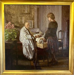
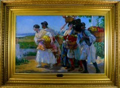
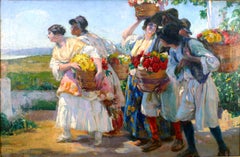
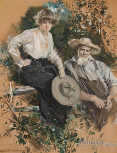
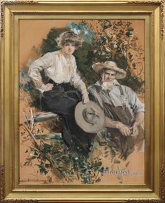
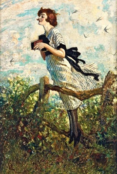
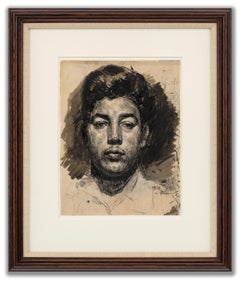
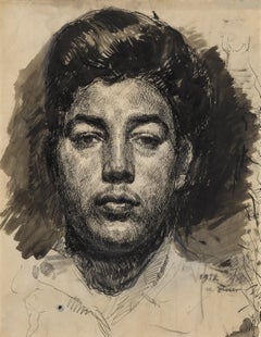
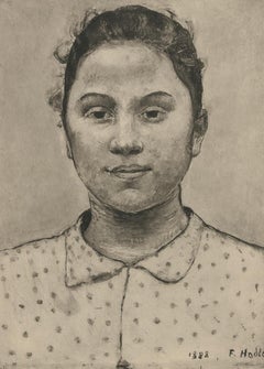
FERDINAND HODLER (SWISS, 1853-1918) explored Parallelisme through figurative poses evocative of music, dance and ritual. His images of sex, night, desertion and death as well as his many landscapes exploring the universal longing for harmony with Nature are unique and important works embodying a Symbolist paradigm. Truly a Modern Master, Hodler’s influence can be felt in the work of Gustav Klimt and Kolomon Moser and subsequent Expressionist artists such as Egon Schiele. He was born into an impoverished family in Bern, Switzerland in 1853. His entire family succumbed to tuberculosis, and he was orphaned by the age of 13, the only surviving child among his 13 siblings. In the absence of family, the influence and guidance which his art instructors provided Hodler was foundational and profound. Hodler began formal studies in 1872 at the Geneva School of Design. Under Barthelemy Menn, Hodler was drawn to the ordered beauty of Euclidian geometry and Durer’s fundamentals of human proportion that proved to be guiding principles informing his art throughout his life.
By the 1880s, Hodler began to enjoy some recognition for his work which put him on a new path towards stability. Remaining in Geneva, he became assistant to the well-known muralist, Edouard Castres. Following his first solo show in 1885, Hodler’s work took on a Symbolist quality. He frequently associated with a group of Swiss Symbolist...
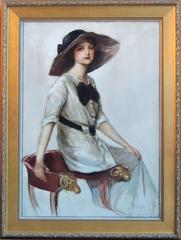
Category
Symbolist 1910s Art