
Louis Schanker Art

American, 1903-1981

"Though much of my work is generally classified as abstract, all of my work develops from natural forms. I have great respect for the forms of nature and an inherent need to express myself in relation to those forms. No matter how far my experimental design may take me … there remains always a core of objective reality which I have no desire to destroy or even to impair but only to investigate, analyze, develop." Louis Schanker was one of many members of the American Abstract Artists who chose to base his art in the objects, patterns, and rhythms of nature. Although never a student of Hans Hofmann, Schanker's ideas about art had many parallels with Hofmann's. Concern for the spatial dynamics of a painting's surface, and an insistence on some aspect of nature as a starting point for art, are two areas that mirror a shared philosophy between the two artists. Although much of Schanker's later work is completely abstract, during the 1930s and 1940s he frequently used direct, identifiable themes—motifs drawn from sports, his early years working for a circus, and even socially conscious subjects not normally employed by abstract artists. During the mid 1930s, Schanker began making prints and subsequently became a graphic arts supervisor for the WPA. He also completed murals for radio station WNYC, the Neponsit Beach Hospital in Long Island, and the Science and Health building at the 1939 New York World's Fair. During World War II, Schanker worked as a shipfitter and began teaching the technique of color woodblock printing at the New School for Social Research. In 1949, he became an assistant professor at Bard College, where he remained until his retirement. Throughout the 1930s and 1940s, Schanker exhibited frequently in group shows both in museums and in commercial galleries. He became especially well known for his innovations as a printmaker. Schanker belonged to The Ten, a group that exhibited together in protest against the hegemony of Americanscene painting in Whitney exhibitions and in support of artistic experimentation and an international (rather than nativist) outlook in art.

to
10
10
10
6
3
1
Louis SCHANKER “Jai Alai”
By Louis Schanker
Located in San Francisco, CA
Louis Schanker : 1903-1981. Well, listed American abstract artist. He was well exhibited and is in the permanent collections of many important museums. This fabulous piece is a color...
Category

1930s Abstract Louis Schanker Art

Materials

Woodcut

CARNIVAL
By Louis Schanker
Located in Portland, ME
Schanker, Louis CARNIVAL. Color woodcut, 1948. Edition of 30. Signed, titled and numbered 24/30 in pencil. 14 1/4 x 21 inches (image), 18 x 24 inches (sheet). Hinging residue, verso,...
Category

1940s Louis Schanker Art

Materials

Woodcut

GIRL WITH LUTE
By Louis Schanker
Located in Portland, ME
Schanker, Louis (American 1903-1981). GIRL WITH LUTE. Johnson 18. Linocut in colors, 1938. Edition of 10. Titled, numbered 6/10 and signed in pencil. 5 1/2 x...
Category

1930s Louis Schanker Art

Materials

Linocut

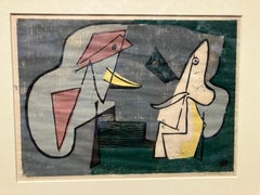
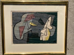
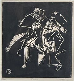
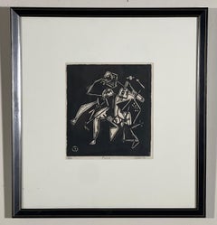
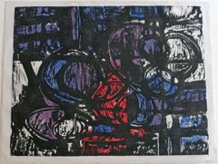
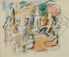
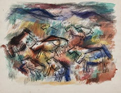
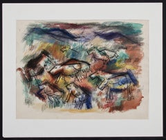
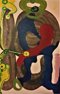
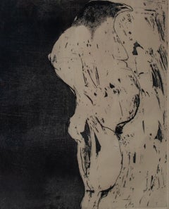
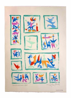
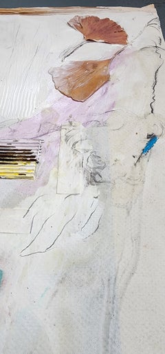
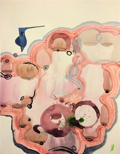
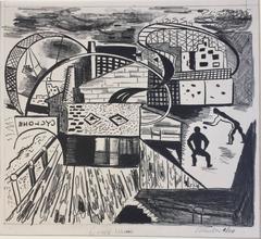
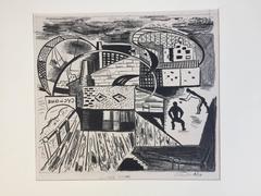
Abstract Composition
By Louis Schanker
Located in Wiscasett, ME
Tempura on heavy paper, signed and dated 1945 lower left. The piece measures 23" x 30" including the frame and presents very well overall. Provenance: Willard Gallery, NYC Brad...
Category

1940s Abstract Louis Schanker Art

Materials

Tempera, Watercolor

POLO
By Louis Schanker
Located in Portland, ME
Schanker, Louis (American, 1903-1981). POLO. Woodcut, 1937. Edition of 30. Signed, titled, and numbered, all in pencil. Printed on Japan paper. 7 7/8 x 7 1/4 inches (image), framed t...
Category

1930s Louis Schanker Art

Materials

Woodcut

Early American modernist abstract sculpture - Totem
By Louis Schanker
Located in Colfax, CA
A rare sculpture by a fascinating American modernists, Louis Schanker. Shanker was born in New York City in 1903. At a young age he quit school, ran away from home and joined the ci...
Category

1930s Abstract Louis Schanker Art

Materials

Wood, Oil

Interior Scene with Figures
By Louis Schanker
Located in Fairlawn, OH
Interior Scene with Figures Ink and watercolor on paper, c. 1930's Signed with the Estate stamp lower center Condition: Loss upper right corner; two small tears lower margin ...
Category

1930s American Modern Louis Schanker Art

Materials

Watercolor

FIGURE NO. 1
By Louis Schanker
Located in Portland, ME
Schanker, Louis (American 1903-1981). FIGURE NO.1. Johnson 99. Wood etching in colors, 1949. Edition of 6. Titled and signed in pencil. 25 1/2 X 13 3/8 inches (image). Framed to 33...
Category

1940s Louis Schanker Art

Materials

Woodcut

Cows in a Field (Recto) Two Figures in an Interior (Verso)
By Louis Schanker
Located in Fairlawn, OH
Cows in a Field (Recto) Two Figures in an Interior (Verso) Watercolor on heavy textured paper, 1938 Signed in ink verso image of Two Figures, unsigned ...
Category

1930s American Modern Louis Schanker Art

Materials

Watercolor

CIRCLE IMAGE NO. 25
By Louis Schanker
Located in Portland, ME
Schanker, Louis. CIRCLE IMAGE NO. 25. Relief Print in color, 1954-1955. Edition of 210 published by IGAS. Signed and numbered 17/200 (the edition included 10 artist's proofs). 14 x 1...
Category

1950s Abstract Louis Schanker Art

Materials

Woodcut

Related Items
Pink Pleasure (Textile Inspired Abstract Wood Wall Sculpture in Pink and Yellow)
By Susan Stover
Located in Hudson, NY
Pink Pleasure (Textile Inspired Abstract Wood Wall Sculpture in Pink and Yellow), made by Susan Stover in 2024 wood, oil paint, varnish, waxed linen thread 54 x 72 inches Lightweight...
Category

2010s Abstract Geometric Louis Schanker Art

Materials

Thread, Wood, Oil, Acrylic, Cardboard

Mnemonic Rhythm (Bright, Multicolored Textile Inspired Abstract Wall Sculpture)
By Susan Stover
Located in Hudson, NY
Mnemonic Rhythm (Bright, Multicolored Textile Inspired Abstract Wall Sculpture), made by Susan Stover in 2025 wood, oil paint, varnish, waxed linen thread 30 x 30 inches Lightweight,...
Category

2010s Abstract Geometric Louis Schanker Art

Materials

Thread, Wood, Oil, Acrylic, Cardboard

Basement Systems
By Kory Twaddle
Located in Kansas City, MO
Artist : Kory Twaddle Title : Basement Systems Materials : Acrylic, tempera, gouache, and glitter glue on cardboard drawing pad back Date : 2019 Dimensions : 18 x 12 x .2 in. Kory ...
Category

2010s Abstract Expressionist Louis Schanker Art

Materials

Paint, Paper, Conté, Charcoal, India Ink, Acrylic, Tempera, Watercolor, ...

Basement Systems
$1,150
H 18 in W 12 in D 0.2 in
Cat - Woodcut by Giselle Halff - Mid 20th Century
By Giselle Halff
Located in Roma, IT
Black Cat is an Original Woodcut Print realized in the Mid-20th Century by Giselle Halff (1899-1971). Good condition, monogrammed on the lower right corner. Giselle Halff (1899-197...
Category

Mid-20th Century Modern Louis Schanker Art

Materials

Woodcut

Refraction (Contemporary Wood Panel Painting)
Located in New Orleans, LA
Artist's Statement: "Around 30 years ago, not long after I had started painting seriously, I was at a one-man exhibition of the great Brice Marden at the Fort Worth Museum of Modern Art when I visited the annex to get a cocktail. There was one other guy at the small bar table in an otherwise empty room, waiting for his coffee to be handed to him. He turned and dumped half of it down my front. I immediately recognized him as none other than Brice Marden. He apologized profusely, but I stopped him and said: 'No problem: how often is it that Brice Marden dumps coffee on your pants? They're worth more now.' We both had a good laugh. At any rate - I was certainly channeling his early work when I began work on this series. They are made with oil and beeswax on wood panels...
Category

2010s Abstract Louis Schanker Art

Materials

Oil, Wood Panel, Acrylic

'Carp and Water Chestnut' — Showa lifetime impression
By Ohara Koson
Located in Myrtle Beach, SC
Ohara Koson (1877-1945), 'Carp and Water Chestnut', color woodblock print, 1926. A fine impression, with fresh colors, on cream Japan paper; the full sheet, in excellent condition. Signed 'Koson' with the artist’s red seal 'Koson'. Published by Watanabe Shozaburo. With the Watanabe 'C' seal in the lower right margin, indicating a lifetime impression printed between 1929-1942. Image size 13 1/2 x 7 1/4 inches (343 x 184 mm); sheet size 14 1/2 x 7 1/2 inches (368 x 191 mm). Archivally sleeved, unmatted. Literature: 'Crows, Cranes, and Camellias: The Natural World of Ohara Koson', Newland, Amy R.: Jan Perree & Robert Schaap, Leiden: Hotei Publishing, 2001. S39.1, pl 169. Collections: National Museum of Asian Art (Smithsonian), Smart Museum of Chicago (University of Chicago). In Japanese art, the carp represents good luck and good fortune. ABOUT THE ARTIST Koson Ohara...
Category

1920s Showa Louis Schanker Art

Materials

Woodcut

Pura Vida, 1985, (A/P)
By Carol Summers
Located in Milwaukee, WI
Woodcut in colors on Japanese paper. Signed and titled by artist. 24.25" x 24.25" art 34.88" x 34.63" frame Carol Summers (1925-2016) has worked as an artist throughout the second ...
Category

1980s Louis Schanker Art

Materials

Woodcut

Untitled by Donald Judd, Woodcut, Abstract, Orange, Cadmium Yellow
By Donald Judd
Located in Köln, DE
Woodcut in cadmium Yellow Deep by Donald Judd. "No Title" from "Set of 6 woodcuts printed in Cadmium Yellow Light, Cadmium Yellow and Cadmium Yellow Deep" Sheet 6 1988-1990 60 x 80...
Category

1980s Minimalist Louis Schanker Art

Materials

Woodcut

"Pura Vida" original color woodcut print signed by Carol Summers
By Carol Summers
Located in Milwaukee, WI
"Pura Vida" is an original color woodcut signed by Carol Summers. A multi-colored piece shows a waterfall with red flames behind it in the middle of the piece. On the left stands a tree with yellow leaves on a hill. To the right is a rainbow. This is an excellent example of Summer's printmaking, not just because of the technique and imagery, but because it numbered 1 of the edition of 125. In addition, it contains a personal inscription to the Milwaukee gallerist David Barnett, who has championed the work of Summers and produced catalogs of his work. Indeed, this print appears as no. 189 in the David Barnett Gallery's 1988 catalogue raisonné of Summer's woodcuts. Feel free to inquire if you would like to purchase a copy of the catalogue raisonné along with your Carol Summers print. Art: 24.25 x 24.75 in Frame: 36 x 35 in signed lower right titled and inscribed to David [Barnett] lower right edition (1/125) lower right Carol Summers (1925-2016) has worked as an artist throughout the second half of the 20th century and into the first years of the next, outliving most of his mid-century modernist peers. Initially trained as a painter, Summers was drawn to color woodcuts around 1950 and it became his specialty thereafter. Over the years he has developed a process and style that is both innovative and readily recognizable. His art is known for it’s large scale, saturated fields of bold color, semi-abstract treatment of landscapes from around the world and a luminescent quality achieved through a printmaking process he invented. In a career that has extended over half a century, Summers has hand-pulled approximately 245 woodcuts in editions that have typically run from 25 to 100 in number. His talent was both inherited and learned. Born in 1925 in Kingston, a small town in upstate New York, Summers was raised in nearby Woodstock with his older sister, Mary. His parents were both artists who had met in art school in St. Louis. During the Great Depression, when Carol was growing up, his father supported the family as a medical illustrator until he could return to painting. His mother was a watercolorist and also quite knowledgeable about the different kinds of papers used for various kinds of painting. Many years later, Summers would paint or print on thinly textured paper originally collected by his mother. From 1948 to 1951, Carol Summers trained in the classical fine and studio arts at Bard College and at the Art Students League of New York. He studied painting with Steven Hirsh and printmaking with Louis Schanker. He admired the shapes and colors favored by early modernists Paul Klee (Sw: 1879-1940) and Matt Phillips (Am: b.1927- ). After graduating, Summers quit working as a part-time carpenter and cabinetmaker (which had supported his schooling and living expenses) to focus fulltime on art. That same year, an early abstract, Bridge No. 1 was selected for a Purchase Prize in a competition sponsored by the Brooklyn Museum. In 1952, his work (Cathedral, Construction and Icarus) was shown the first time at the Museum of Modern Art in New York City in an exhibition of American woodcuts. In 1954, Summers received a grant from the Italian government to study for a year in Italy. Woodcuts completed soon after his arrival there were almost all editions of only 8 to 25 prints, small in size, architectural in content and black and white in color. The most well-known are Siennese Landscape and Little Landscape, which depicted the area near where he resided. Summers extended this trip three more years, a decision which would have significant impact on choices of subject matter and color in the coming decade. After returning from Europe, Summers’ images continued to feature historical landmarks and events from Italy as well as from France, Spain and Greece. However, as evidenced in Aetna’s Dream, Worldwind and Arch of Triumph, a new look prevailed. These woodcuts were larger in size and in color. Some incorporated metal leaf in the creation of a collage and Summers even experimented with silkscreening. Editions were now between 20 and 50 prints in number. Most importantly, Summers employed his rubbing technique for the first time in the creation of Fantastic Garden in late 1957. Dark Vision of Xerxes, a benchmark for Summers, was the first woodcut where Summers experimented using mineral spirits as part of his printmaking process. A Fulbright Grant as well as Fellowships from the Louis Comfort Tiffany Foundation and the Guggenheim Foundation followed soon thereafter, as did faculty positions at colleges and universities primarily in New York and Pennsylvania. During this period he married a dancer named Elaine Smithers with whom he had one son, Kyle. Around this same time, along with fellow artist Leonard Baskin, Summers pioneered what is now referred to as the “monumental” woodcut. This term was coined in the early 1960s to denote woodcuts that were dramatically bigger than those previously created in earlier years, ones that were limited in size mostly by the size of small hand-presses. While Baskin chose figurative subject matter, serious in nature and rendered with thick, striated lines, Summers rendered much less somber images preferring to emphasize shape and color; his subject matter approached abstraction but was always firmly rooted in the landscape. In addition to working in this new, larger scale, Summers simultaneously refined a printmaking process which would eventually be called the “Carol Summers Method” or the “ Carol Summers Technique”. Summers produces his woodcuts by hand, usually from one or more blocks of quarter-inch pine, using oil-based printing inks and porous mulberry papers. His woodcuts reveal a sensitivity to wood especially its absorptive qualities and the subtleties of the grain. In several of his woodcuts throughout his career he has used the undulating, grainy patterns of a large wood plank to portray a flowing river or tumbling waterfall. The best examples of this are Dream, done in 1965 and the later Flash Flood Escalante, in 2003. In the majority of his woodcuts, Summers makes the blocks slightly larger than the paper so the image and color will bleed off the edge. Before printing, he centers a dry sheet of paper over the top of the cut wood block or blocks, securing it with giant clips. Then he rolls the ink directly on the front of the sheet of paper and pressing down onto the dry wood block or reassembled group of blocks. Summers is technically very proficient; the inks are thoroughly saturated onto the surface of the paper but they do not run into each other. The precision of the color inking in Constantine’s Dream in 1969 and Rainbow Glacier in 1970 has been referred to in various studio handbooks. Summers refers to his own printing technique as “rubbing”. In traditional woodcut printing, including the Japanese method, the ink is applied directly onto the block. However, by following his own method, Summers has avoided the mirror-reversed image of a conventional print and it has given him the control over the precise amount of ink that he wants on the paper. After the ink is applied to the front of the paper, Summers sprays it with mineral spirits, which act as a thinning agent. The absorptive fibers of the paper draw the thinned ink away from the surface softening the shapes and diffusing and muting the colors. This produces a unique glow that is a hallmark of the Summers printmaking technique. Unlike the works of other color field artists or modernists of the time, this new technique made Summers’ extreme simplification and flat color areas anything but hard-edged or coldly impersonal. By the 1960s, Summers had developed a personal way of coloring and printing and was not afraid of hard work, doing the cutting, inking and pulling himself. In 1964, at the age of 38, Summers’ work was exhibited for a second time at the Museum of Modern Art. This time his work was featured in a one-man show and then as one of MOMA’s two-year traveling exhibitions which toured throughout the United States. In subsequent years, Summers’ works would be exhibited and acquired for the permanent collections of multiple museums throughout the United States, Europe and Asia. Summers’ familiarity with landscapes throughout the world is firsthand. As a navigator-bombardier in the Marines in World War II, he toured the South Pacific and Asia. Following college, travel in Europe and subsequent teaching positions, in 1972, after 47 years on the East Coast, Carol Summers moved permanently to Bonny Doon in the Santa Cruz Mountains in Northern California. There met his second wife, Joan Ward Toth, a textile artist who died in 1998; and it was here his second son, Ethan was born. During the years that followed this relocation, Summers’ choice of subject matter became more diverse although it retained the positive, mostly life-affirming quality that had existed from the beginning. Images now included moons, comets, both sunny and starry skies, hearts and flowers, all of which, in one way or another, remained tied to the landscape. In the 1980s, from his home and studio in the Santa Cruz mountains, Summers continued to work as an artist supplementing his income by conducting classes and workshops at universities in California and Oregon as well as throughout the Mid and Southwest. He also traveled extensively during this period hiking and camping, often for weeks at a time, throughout the western United States and Canada. Throughout the decade it was not unusual for Summers to backpack alone or with a fellow artist into mountains or back country for six weeks or more at a time. Not surprisingly, the artwork created during this period rarely departed from images of the land, sea and sky. Summers rendered these landscapes in a more representational style than before, however he always kept them somewhat abstract by mixing geometric shapes with organic shapes, irregular in outline. Some of his most critically acknowledged work was created during this period including First Rain, 1985 and The Rolling Sea, 1989. Summers received an honorary doctorate from his alma mater, Bard College in 1979 and was selected by the United States Information Agency to spend a year conducting painting and printmaking workshops at universities throughout India. Since that original sabbatical, he has returned every year, spending four to eight weeks traveling throughout that country. In the 1990s, interspersed with these journeys to India have been additional treks to the back roads and high country areas of Mexico, Central America, Nepal, China and Japan. Travel to these exotic and faraway places had a profound influence on Summers’ art. Subject matter became more worldly and nonwestern as with From Humla to Dolpo, 1991 or A Former Life of Budha, 1996, for example. Architectural images, such as The Pillars of Hercules, 1990 or The Raja’s Aviary, 1992 became more common. Still life images made a reappearance with Jungle Bouquet in 1997. This was also a period when Summers began using odd-sized paper to further the impact of an image. The 1996 Night, a view of the earth and horizon as it might be seen by an astronaut, is over six feet long and only slightly more than a foot-and-a-half high. From 1999, Revuelta A Vida (Spanish for “Return to Life”) is pie-shaped and covers nearly 18 cubic feet. It was also at this juncture that Summers began to experiment with a somewhat different palette although he retained his love of saturated colors. The 2003 Far Side of Time is a superb example of the new direction taken by this colorist. At the turn of the millennium in 1999, “Carol Summers Woodcuts...
Category

1980s Contemporary Louis Schanker Art

Materials

Woodcut

First Floor Biogram
By Kory Twaddle
Located in Kansas City, MO
Title : First Floor Biogram Materials : Acrylic, gouache, oil pastel, marker, charcoal, graphite, and conté crayon on paper Date : 2018 Dimensions : 24 x 18 x .1 in. Description : ...
Category

2010s Abstract Expressionist Louis Schanker Art

Materials

Paint, Paper, Acrylic, Tempera, Watercolor, Graphite, Conté, Oil Pastel,...

First Floor Biogram
$599 Sale Price
51% Off
H 24 in W 18 in D 0.1 in
"Brahma vs. Leghorn, " Farm Scene Wood Engraving by Howard Thomas
By Howard Thomas
Located in Milwaukee, WI
"Brahma vs. Leghorn" is an original wood engraving by Howard Thomas. In front of an understated farm house, Brahma and Leghorn face off, ready to battle. An unidentified plant sits on the center. Unsigned. Image: 6" x 7.44" Framed: 13.75" x 15.18 Thomas Howard (1899-1971) born a Quaker in Ohio, trained in the Midwest at Ohio State University and the Chicago Art Institute. He taught in the Art Department of the Milwaukee State Teachers College (now University of Wisconsin-Milwaukee) where he became good friends with Carl Holty, Edward Boerner, Robert von Neumann...
Category

1930s American Modern Louis Schanker Art

Materials

Woodcut

20th Century British cartoon woodblock print of angry cats by Rod Nelson
Located in Petworth, West Sussex
Rod Nelson (British, 20th Century) Angry cats woodblock print signed and dated ‘Rod Nelson 1992’ (lower left) 7.1/4 x 7.5/8 in. (18.3 x 19.3 cm.)
Category

20th Century Other Art Style Louis Schanker Art

Materials

Woodcut

Previously Available Items
CYCLONE, CONEY ISLAND ca 1933
By Louis Schanker
Located in Santa Monica, CA
LOUIS SCHANKER (1903 – 1981) CYCLONE, CONEY ISLAND ca 1933 Lithograph 10 7/8 x 12 ½” signed, and with no. 1/10. Rare thus! Annotation: Coney Island. ...
Category

1930s American Modern Louis Schanker Art

Materials

Lithograph

Louis Schanker art for sale on 1stDibs.

Find a wide variety of authentic Louis Schanker art available for sale on 1stDibs. You can also browse by medium to find art by Louis Schanker in woodcut print, paint, watercolor and more. Much of the original work by this artist or collective was created during the 20th century and is mostly associated with the modern style. Not every interior allows for large Louis Schanker art, so small editions measuring 12 inches across are available. Customers who are interested in this artist might also find the work of Warrington Colescott, Fred Nagler, and Howard Norton Cook. Louis Schanker art prices can differ depending upon medium, time period and other attributes. On 1stDibs, the price for these items starts at $750 and tops out at $10,500, while the average work can sell for $1,500.

Artists Similar to Louis Schanker