
We didn't find any results for "pope john paul ii commemorative print"

Get notified when items are added to this search

Showing results matching fewer words
268
60
222
110
78
58
44
40
35
34
27
25
21
20
15
13
10
8
8
6
6
5
5
4
4
3
3
3
2
2
2
2
1
1
1
1
1
1
1
1
1
22
22
15
11
9
Pope John Paul II - Vintage Press Print - 1989

Pope John Paul II - Vintage Press Print - 1989

Located in Roma, IT

Pope John Paul II is a is a black and white vintage press print, realized in August 24th, 1989. The photo depicts Pope John Paul II with Soviet envoy, Yuri Karlov, during a private ...

Category

1980s Contemporary Figurative Photography

Materials

Photographic Paper

Pope John Paul II - Photograph - 1970s

Pope John Paul II - Photograph - 1970s

Located in Roma, IT

Pope John Paul II is a vintage black and white photograph realized in the Late 1970s. Good conditions.

Category

1970s Contemporary Landscape Photography

Materials

Photographic Paper

Pope John Paul II and General Wojciech Witold Jaruzelski - 1987

Pope John Paul II and General Wojciech Witold Jaruzelski - 1987

Located in Roma, IT

Pope Giovanni Paolo II and General Wojciech Witold Jaruzelski is a vintage black and white photograph realized in 1987. Good conditions.

Category

1980s Modern Figurative Photography

Materials

Photographic Paper

Antique Print of Pope Adrian VI by Houbraken '1727'

Antique Print of Pope Adrian VI by Houbraken '1727'

Located in Langweer, NL

Antique print titled 'Hadrianus VI Papa Ultrajecti Natus (..)'. Original antique print of Pope Adrian VI, sitting in a chair. Pope Adrian VI (Latin: Hadrianus VI; Dutch: Adrianus/Adriaan VI), born Adriaan Florensz Boeyens (2 March 1459 – 14 September 1523), was head of the Catholic Church and ruler of the Papal States from 9 January 1522 until his death on 14 September 1523. The only Dutchman to become pope, he was the last non-Italian pope until Polish John Paul II 455 years later. Born in the Episcopal principality of Utrecht, Adrian studied at the University of Leuven in the Low Countries, where he rose to the position of professor of theology, also serving as rector (the equivalent of vice-chancellor). In 1507, he became the tutor...

Category

Antique Mid-18th Century Dutch Prints

Materials

Paper

John Northcote Nash, Modern British art, A Window in Bucks

John Northcote Nash, Modern British art, A Window in Bucks

By John Nash

Located in Harkstead, GB

A wonderful image depicting a rural idyll by one of the great cornerstones of Modern British painting. John Northcote Nash (1893-1977) A window in Bucks Signed within print Print in...

Category

20th Century Modern Landscape Prints

Materials

Paper, Color

"Family of Six, " Original Lithograph signed by John Thomas Biggers

"Family of Six, " Original Lithograph signed by John Thomas Biggers

By John Thomas Biggers

Located in Milwaukee, WI

"Family of Six" is an original black and white lithograph by John Biggers. The artist signed and dated the piece in the lower right and titled and editioned it (AP III) in the lower ...

Category

1980s Contemporary Figurative Prints

Materials

Lithograph

Historical  Photo - Pope John Paul II - Vintage Photo - Early 20th Century

Historical Photo - Pope John Paul II - Vintage Photo - Early 20th Century

Located in Roma, IT

Historical  Photo - Pope John Paul II is a black and white vintage photo, realized in the early 20th century.  It belongs to a historical album including historical moments, royal f...

Category

Early 20th Century Modern Figurative Photography

Materials

Photographic Paper

Antique Engraving of King Richard II – Published London, 1785

Antique Engraving of King Richard II – Published London, 1785

Located in Langweer, NL

Antique Engraving of King Richard II – Published London, 1785 This fine copperplate engraving depicts King Richard II of England (1367–1400), who reigned from 1377 until his deposit...

Category

Antique 1780s English Prints

Materials

Paper

John Nash, Window Plants, S.P.4., from School Prints Ltd., 1945 (after)

John Nash, Window Plants, S.P.4., from School Prints Ltd., 1945 (after)

By John Nash

Located in Southampton, NY

This exquisite lithograph after John Nash (1893–1977), titled Window Plants, S.P.4., originates from the School Prints Ltd. series, published by School Prints Ltd., London, under the...

Category

1940s Modern Figurative Prints

Materials

Lithograph

John Nash, Harvesting, S.P.20., from School Prints Ltd., 1946 (after)

John Nash, Harvesting, S.P.20., from School Prints Ltd., 1946 (after)

By John Nash

Located in Southampton, NY

This exquisite lithograph after John Nash (1893–1977), titled Harvesting, S.P.20., originates from the School Prints Ltd. series, published by School Prints Ltd., London, under the d...

Category

1940s Modern Figurative Prints

Materials

Lithograph

John Northcote Nash, Modern British art, Maltings farm, Bures Road

John Northcote Nash, Modern British art, Maltings farm, Bures Road

By John Nash

Located in Harkstead, GB

A beautifully composed image of a rural idyll in high summer rolling away into the distance. John Northcote Nash (1893-1977) Maltings Farm, Bures Road Signed within print Print in c...

Category

20th Century Modern Landscape Prints

Materials

Paper, Color

Original 1946 poster by Paul Colin - “Ils Meurent Pour Vous – Victoire” - WWII

Original 1946 poster by Paul Colin - “Ils Meurent Pour Vous – Victoire” - WWII

By Paul Colin

Located in PARIS, FR

This powerful original 1946 poster by renowned French graphic artist Paul Colin (1892–1985) was created in the aftermath of World War II for the Organisme National d’Aide aux Combattants under the high presidency of General de Gaulle. Titled “Ils Meurent Pour Vous – Victoire” (They Die For You – Victory), the poster is both a commemoration and a call to solidarity. Rendered in Colin’s bold chiaroscuro style, it depicts a kneeling French soldier silhouetted against the dawn sky, his weapon poised towards the horizon. Behind him lie the faint outlines of fallen comrades, underscoring the poster’s solemn message of sacrifice. The simple yet emotionally charged typography conveys urgent patriotism and post-war gratitude. Paul Colin, one of the greatest poster designers of the Art Deco era, was celebrated for his theatre, cabaret, and political works. Here, his graphic precision and emotional clarity serve a national cause, urging public support for veterans who fought and died for liberation. A deeply evocative historical artefact, this poster resonates today as a reminder of France’s liberation struggle and the human cost of victory. It is ideal for collectors of WWII memorabilia...

Category

1940s Prints and Multiples

Materials

Linen, Paper, Lithograph

'Jeune Fille de Polowat', Tokyo, Garbo, Queen Elizabeth II, Kyoto, Woodblock

'Jeune Fille de Polowat', Tokyo, Garbo, Queen Elizabeth II, Kyoto, Woodblock

By Paul Jacoulet

Located in Santa Cruz, CA

Signed lower right in pencil, 'Paul Jacoulet' (French-Japanese, 1902-1960) and stamped with peach seal; titled, lower right margin, 'Jeune Fille de Polowat. Est Carolines' (Young gir...

Category

1940s Post-Impressionist Nude Prints

Materials

Paper, Woodcut

Saint Apollonia FS II.333, Screen Print, Pop Art, Signed AP 21/35, 1986, Framed

Saint Apollonia FS II.333, Screen Print, Pop Art, Signed AP 21/35, 1986, Framed

By Andy Warhol

Located in Aventura, FL

Screen print in colors on Essex Offset Kid Finish paper. Hand signed and numbered by Andy Warhol. Published by Dr. Frank Braun, Düsseldorf. Hand numbered AP 21/35. From the Artist Proof edition (outside the main edition of 250). Frame size approx 31 x 23 inches. The artwork is in excellent condition. Gallery Art issued COA included. All reasonable offers will be considered. Andy Warhol’s Saint Apollonia...

Category

1980s Pop Art Figurative Prints

Materials

Paper, Screen

King Richard II /// Old Masters British Royal Family Portrait Engraving Art

King Richard II /// Old Masters British Royal Family Portrait Engraving Art

By George Vertue

Located in Saint Augustine, FL

Artist: George Vertue (English, 1684-1756) Title: "King Richard II" Portfolio: The Heads of the Kings of England, Proper for Mr. Rapin's History *Issued unsigned, though signed by Ve...

Category

1730s Baroque Portrait Prints

Materials

Laid Paper, Engraving, Intaglio

"Casa Marquez" Original Woodblock Print, Signed and Numbered 93/100

"Casa Marquez" Original Woodblock Print, Signed and Numbered 93/100

By Carol Summers

Located in Soquel, CA

"Casa Marquez" Original Woodblock Print, Signed and Numbered 93/100 Boldly colored woodblock print by Carol Summers (American, 1925-2016). This piece is a closeup on a large stone building, with a landscape reflected in the windows. The building has carved ornamentation in a classical style. There is a bright red sunset in the background behind the building. The title refers to the author Gabriel García Márquez. Signed "Carol Summers" in the lower right corner. Numbered and titled "93/100 Casa Marquez" in the upper right corner. Presented in a silver colored aluminum frame. Frame size: 19.25"H x 23.25"W Paper size: 16"H x 20"W Carol Summers (1925-2016) has worked as an artist throughout the second half of the 20th century and into the first years of the next, outliving most of his mid-century modernist peers. Initially trained as a painter, Summers was drawn to color woodcuts around 1950 and it became his specialty thereafter. Over the years he has developed a process and style that is both innovative and readily recognizable. His art is known for it’s large scale, saturated fields of bold color, semi-abstract treatment of landscapes from around the world and a luminescent quality achieved through a printmaking process he invented. In a career that has extended over half a century, Summers has hand-pulled approximately 245 woodcuts in editions that have typically run from 25 to 100 in number. His talent was both inherited and learned. Born in 1925 in Kingston, a small town in upstate New York, Summers was raised in nearby Woodstock with his older sister, Mary. His parents were both artists who had met in art school in St. Louis. During the Great Depression, when Carol was growing up, his father supported the family as a medical illustrator until he could return to painting. His mother was a watercolorist and also quite knowledgeable about the different kinds of papers used for various kinds of painting. Many years later, Summers would paint or print on thinly textured paper originally collected by his mother. From 1948 to 1951, Carol Summers trained in the classical fine and studio arts at Bard College and at the Art Students League of New York. He studied painting with Steven Hirsh and printmaking with Louis Schanker. He admired the shapes and colors favored by early modernists Paul Klee (Sw: 1879-1940) and Matt Phillips (Am: b.1927- ). After graduating, Summers quit working as a part-time carpenter and cabinetmaker (which had supported his schooling and living expenses) to focus fulltime on art. That same year, an early abstract, Bridge No. 1 was selected for a Purchase Prize in a competition sponsored by the Brooklyn Museum. In 1952, his work (Cathedral, Construction and Icarus) was shown the first time at the Museum of Modern Art in New York City in an exhibition of American woodcuts...

Category

1980s Contemporary Landscape Prints

Materials

Ink, Handmade Paper, Woodcut

Two Fine Prints from the David Suite by Edna Hibel, 1978

Two Fine Prints from the David Suite by Edna Hibel, 1978

By Edna Hibel

Located in New York, NY

Edna Hibel (American, 1917-2015) Two Lithographs from the David Suite, 1978 Hand pulled original lithograph on Japanese rice paper Sheet: 26 x 20 in. Signed lower right: Hibel Number...

Category

1970s Modern Figurative Prints

Materials

Rice Paper, Lithograph

Judaica Jewish Shtetl Etching Hasidic Yeshiva Student Chassidic Print

Judaica Jewish Shtetl Etching Hasidic Yeshiva Student Chassidic Print

By Paul Jeffay

Located in Surfside, FL

"Mendel" Chassidic boy, Yeshiva student with open book. Judaica, Jewish scenes from a ghetto. Saul Yaffie, a.k.a. Paul Jeffay, (1898–1957) was a Scottish Jewish artist. Known for...

Category

20th Century Expressionist Figurative Prints

Materials

Etching

Judaica Jewish Shtetl Etching Hasidic Rabbi "Difficult Problem" Chassidic Print

Judaica Jewish Shtetl Etching Hasidic Rabbi "Difficult Problem" Chassidic Print

By Paul Jeffay

Located in Surfside, FL

"Probleme ardu." Chassidic boy, Yeshiva student with open book. Judaica, Jewish scenes from a ghetto. Saul Yaffie, a.k.a. Paul Jeffay, (1898–1957) was a Scottish Jewish artist. Know...

Category

20th Century Expressionist Figurative Prints

Materials

Etching

Judaica Jewish Etching Hasidic Rabbi, Gaon, Genius, Vintage Chassidic Art Print

Judaica Jewish Etching Hasidic Rabbi, Gaon, Genius, Vintage Chassidic Art Print

By Paul Jeffay

Located in Surfside, FL

"Un savant." Chassidic scholar, Rosh Yeshiva with open book. Judaica, Jewish scenes from a shtetl ghetto. Saul Yaffie, a.k.a. Paul Jeffay, (1898–1957) was a Scottish Jewish artist. Known for his charming French street scenes as well as his judaica work. This is signed in the plate and dated 1931 in the print. This is done in a style similar to the works of the early Bezalel School artists Hermann Struck and Jakob Steinhardt. This lithograph, by artist Paul Jeffay depicts a Judaic Shtetl interior scene with great charm and sensitivity. Saul Yaffie was born in Blythswood, Glasgow on 29 April 1898. His mother was Kate Yaffie (née Karkonoski), and his father, Bernard Yaffie, was a master tailor. Like many Russian Jews...

Category

20th Century Expressionist Portrait Prints

Materials

Etching

Francis Bacon, Three Studies for Portrait of Lucian Freud, 1966 (after)

Francis Bacon, Three Studies for Portrait of Lucian Freud, 1966 (after)

By Francis Bacon

Located in Southampton, NY

This exquisite lithograph after Francis Bacon (1909–1992), titled Three Studies for Portrait of Lucian Freud, originates from the historic 1966 folio Derriere le Miroir, No. 162. Pub...

Category

1960s Modern Abstract Prints

Materials

Lithograph

Judaica Jewish Shtetl Etching Hasidic Youth at Study Vintage Chassidic Art Print

Judaica Jewish Shtetl Etching Hasidic Youth at Study Vintage Chassidic Art Print

By Paul Jeffay

Located in Surfside, FL

"Tristesse." (a state of melancholy sadness. "lamenting a lost love, he leaves us poised at the lip of a chasm of tristesse") Chassidic boy, Yeshiva student with open book. Judaica, Jewish scenes from a ghetto. Saul Yaffie, a.k.a. Paul Jeffay, (1898–1957) was a Scottish Jewish artist. Known for his charming French street scenes as well as his judaica work. This is signed in the plate and dated 1931 in the print. This is done in a style similar to the works of the early Bezalel School artists Hermann Struck and Jakob Steinhardt. This lithograph, by artist Paul Jeffay depicts a Judaic Shtetl interior scene with great charm and sensitivity. Saul Yaffie was born in Blythswood, Glasgow on 29 April 1898. His mother was Kate Yaffie (née Karkonoski), and his father, Bernard Yaffie, was a master tailor. Like many Russian Jews...

Category

1930s Expressionist Figurative Prints

Materials

Etching

"Ravanna's Palace Burning, " Woodcut Landscape signed by Carol Summers

"Ravanna's Palace Burning, " Woodcut Landscape signed by Carol Summers

By Carol Summers

Located in Milwaukee, WI

"Ravanna's Palace Burning" is a woodcut signed by Carol Summers. The image combines landscape and architecture, which is typical of the works Summers produced during the 1980s and '90s. In the image, a dark building stands burning, bright red flames licking from the windows and rooftop. It stands beside an orange field framed in pink, probably representing a plaza. Beyond the plaza are multicolored trees, their branches reaching upward like the flames on the building. The playfulness of the image is enhanced by Summers' signature printmaking technique, which allows the ink from the woodblock to seep through the paper, blurring the edges of each form. Art: 24.5 x 37.25 in Frame: 30 x 42.75 in Numbered 53 of the edition of 125 Carol Summers (1925-2016) has worked as an artist throughout the second half of the 20th century and into the first years of the next, outliving most of his mid-century modernist peers. Initially trained as a painter, Summers was drawn to color woodcuts around 1950 and it became his specialty thereafter. Over the years he has developed a process and style that is both innovative and readily recognizable. His art is known for it’s large scale, saturated fields of bold color, semi-abstract treatment of landscapes from around the world and a luminescent quality achieved through a printmaking process he invented. In a career that has extended over half a century, Summers has hand-pulled approximately 245 woodcuts in editions that have typically run from 25 to 100 in number. His talent was both inherited and learned. Born in 1925 in Kingston, a small town in upstate New York, Summers was raised in nearby Woodstock with his older sister, Mary. His parents were both artists who had met in art school in St. Louis. During the Great Depression, when Carol was growing up, his father supported the family as a medical illustrator until he could return to painting. His mother was a watercolorist and also quite knowledgeable about the different kinds of papers used for various kinds of painting. Many years later, Summers would paint or print on thinly textured paper originally collected by his mother. From 1948 to 1951, Carol Summers trained in the classical fine and studio arts at Bard College and at the Art Students League of New York. He studied painting with Steven Hirsh and printmaking with Louis Schanker. He admired the shapes and colors favored by early modernists Paul Klee (Sw: 1879-1940) and Matt Phillips (Am: b.1927- ). After graduating, Summers quit working as a part-time carpenter and cabinetmaker (which had supported his schooling and living expenses) to focus fulltime on art. That same year, an early abstract, Bridge No. 1 was selected for a Purchase Prize in a competition sponsored by the Brooklyn Museum. In 1952, his work (Cathedral, Construction and Icarus) was shown the first time at the Museum of Modern Art in New York City in an exhibition of American woodcuts. In 1954, Summers received a grant from the Italian government to study for a year in Italy. Woodcuts completed soon after his arrival there were almost all editions of only 8 to 25 prints, small in size, architectural in content and black and white in color. The most well-known are Siennese Landscape and Little Landscape, which depicted the area near where he resided. Summers extended this trip three more years, a decision which would have significant impact on choices of subject matter and color in the coming decade. After returning from Europe, Summers’ images continued to feature historical landmarks and events from Italy as well as from France, Spain and Greece. However, as evidenced in Aetna’s Dream, Worldwind and Arch of Triumph, a new look prevailed. These woodcuts were larger in size and in color. Some incorporated metal leaf in the creation of a collage and Summers even experimented with silkscreening. Editions were now between 20 and 50 prints in number. Most importantly, Summers employed his rubbing technique for the first time in the creation of Fantastic Garden in late 1957. Dark Vision of Xerxes, a benchmark for Summers, was the first woodcut where Summers experimented using mineral spirits as part of his printmaking process. A Fulbright Grant as well as Fellowships from the Louis Comfort Tiffany Foundation and the Guggenheim Foundation followed soon thereafter, as did faculty positions at colleges and universities primarily in New York and Pennsylvania. During this period he married a dancer named Elaine Smithers with whom he had one son, Kyle. Around this same time, along with fellow artist Leonard Baskin, Summers pioneered what is now referred to as the “monumental” woodcut. This term was coined in the early 1960s to denote woodcuts that were dramatically bigger than those previously created in earlier years, ones that were limited in size mostly by the size of small hand-presses. While Baskin chose figurative subject matter, serious in nature and rendered with thick, striated lines, Summers rendered much less somber images preferring to emphasize shape and color; his subject matter approached abstraction but was always firmly rooted in the landscape. In addition to working in this new, larger scale, Summers simultaneously refined a printmaking process which would eventually be called the “Carol Summers Method” or the “ Carol Summers Technique”. Summers produces his woodcuts by hand, usually from one or more blocks of quarter-inch pine, using oil-based printing inks and porous mulberry papers. His woodcuts reveal a sensitivity to wood especially its absorptive qualities and the subtleties of the grain. In several of his woodcuts throughout his career he has used the undulating, grainy patterns of a large wood plank to portray a flowing river or tumbling waterfall. The best examples of this are Dream, done in 1965 and the later Flash Flood Escalante, in 2003. In the majority of his woodcuts, Summers makes the blocks slightly larger than the paper so the image and color will bleed off the edge. Before printing, he centers a dry sheet of paper over the top of the cut wood block or blocks, securing it with giant clips. Then he rolls the ink directly on the front of the sheet of paper and pressing down onto the dry wood block or reassembled group of blocks. Summers is technically very proficient; the inks are thoroughly saturated onto the surface of the paper but they do not run into each other. The precision of the color inking in Constantine’s Dream in 1969 and Rainbow Glacier in 1970 has been referred to in various studio handbooks. Summers refers to his own printing technique as “rubbing”. In traditional woodcut printing, including the Japanese method, the ink is applied directly onto the block. However, by following his own method, Summers has avoided the mirror-reversed image of a conventional print and it has given him the control over the precise amount of ink that he wants on the paper. After the ink is applied to the front of the paper, Summers sprays it with mineral spirits, which act as a thinning agent. The absorptive fibers of the paper draw the thinned ink away from the surface softening the shapes and diffusing and muting the colors. This produces a unique glow that is a hallmark of the Summers printmaking technique. Unlike the works of other color field artists or modernists of the time, this new technique made Summers’ extreme simplification and flat color areas anything but hard-edged or coldly impersonal. By the 1960s, Summers had developed a personal way of coloring and printing and was not afraid of hard work, doing the cutting, inking and pulling himself. In 1964, at the age of 38, Summers’ work was exhibited for a second time at the Museum of Modern Art. This time his work was featured in a one-man show and then as one of MOMA’s two-year traveling exhibitions which toured throughout the United States. In subsequent years, Summers’ works would be exhibited and acquired for the permanent collections of multiple museums throughout the United States, Europe and Asia. Summers’ familiarity with landscapes throughout the world is firsthand. As a navigator-bombardier in the Marines in World War II, he toured the South Pacific and Asia. Following college, travel in Europe and subsequent teaching positions, in 1972, after 47 years on the East Coast, Carol Summers moved permanently to Bonny Doon in the Santa Cruz Mountains in Northern California. There met his second wife, Joan Ward Toth, a textile artist who died in 1998; and it was here his second son, Ethan was born. During the years that followed this relocation, Summers’ choice of subject matter became more diverse although it retained the positive, mostly life-affirming quality that had existed from the beginning. Images now included moons, comets, both sunny and starry skies, hearts and flowers, all of which, in one way or another, remained tied to the landscape. In the 1980s, from his home and studio in the Santa Cruz mountains, Summers continued to work as an artist supplementing his income by conducting classes and workshops at universities in California and Oregon as well as throughout the Mid and Southwest. He also traveled extensively during this period hiking and camping, often for weeks at a time, throughout the western United States and Canada. Throughout the decade it was not unusual for Summers to backpack alone or with a fellow artist into mountains or back country for six weeks or more at a time. Not surprisingly, the artwork created during this period rarely departed from images of the land, sea and sky. Summers rendered these landscapes in a more representational style than before, however he always kept them somewhat abstract by mixing geometric shapes with organic shapes, irregular in outline. Some of his most critically acknowledged work was created during this period including First Rain, 1985 and The Rolling Sea, 1989. Summers received an honorary doctorate from his alma mater, Bard College in 1979 and was selected by the United States Information Agency to spend a year conducting painting and printmaking workshops at universities throughout India. Since that original sabbatical, he has returned every year, spending four to eight weeks traveling throughout that country. In the 1990s, interspersed with these journeys to India have been additional treks to the back roads and high country areas of Mexico, Central America, Nepal, China and Japan. Travel to these exotic and faraway places had a profound influence on Summers’ art. Subject matter became more worldly and nonwestern as with From Humla to Dolpo, 1991 or A Former Life of Budha, 1996, for example. Architectural images, such as The Pillars of Hercules, 1990 or The Raja’s Aviary, 1992 became more common. Still life images made a reappearance with Jungle Bouquet in 1997. This was also a period when Summers began using odd-sized paper to further the impact of an image. The 1996 Night, a view of the earth and horizon as it might be seen by an astronaut, is over six feet long and only slightly more than a foot-and-a-half high. From 1999, Revuelta A Vida (Spanish for “Return to Life”) is pie-shaped and covers nearly 18 cubic feet. It was also at this juncture that Summers began to experiment with a somewhat different palette although he retained his love of saturated colors. The 2003 Far Side of Time is a superb example of the new direction taken by this colorist. At the turn of the millennium in 1999, “Carol Summers Woodcuts...

Category

1980s Contemporary Landscape Prints

Materials

Woodcut

Edward Ardizzone, The Wreck, S.P.32., from School Prints Ltd., 1951 (after)

Edward Ardizzone, The Wreck, S.P.32., from School Prints Ltd., 1951 (after)

By Edward Ardizzone

Located in Southampton, NY

This exquisite lithograph after Edward Ardizzone (1900–1979), titled The Wreck, S.P.32., originates from the School Prints Ltd. series, published by School Prints Ltd., London, under...

Category

1950s Modern Figurative Prints

Materials

Lithograph

The Crucifixion (Christ on the Cross) /// Jesus after Albrecht Dürer Old Masters

The Crucifixion (Christ on the Cross) /// Jesus after Albrecht Dürer Old Masters

Located in Saint Augustine, FL

Artist: Lambrecht Hopfer (German, Active c. 1525-1550) Title: "The Crucifixion (Christ on the Cross)" Portfolio: (after) The Engraved Passion *Issued unsigned, though monogram signed by Hopfer in the plate (printed signature) lower right Circa: 1530, (published c. 1690, second state of three) Medium: Original Etching on laid paper Limited edition: Unknown Printer: The Hopfer family, Augsburg, Germany; (David Funck, Nuremberg, Germany) Publisher: The Hopfer family, Augsburg, Germany; (David Funck, Nuremberg, Germany) Framing: Recently framed, the sheet is floated over, and top-matted with a 100% cotton fabric rag mat from Holland in a wood moulding and Museum glass Framed size: 14.88" x 13.88" Sheet size: 5.5" x 3.63" Reference: Bartsch No. VIII.527.12; Hollstein No. 12.II Condition: Trimmed to platemark. A few tiny professional repairs: at elbow of Jesus's right arm and the inside thigh of Jesus. Some light skinning upper right corner and lower right area. It is otherwise a strong impression in good condition Very rare Notes: Provenance: private collection - Green Bay, WI; acquired from Sotheby's, New York, NY in c. 2015. The artist Lambrecht Hopfer's printed monogram signature "LH" lower right. The printer/publisher David Funck's (plate) number "182" lower right. This etching is after Albrecht Dürer’s 1511 engraving "The Crucifixion (Christ on the Cross)", ("Dürer-Katalog" - Meder No. 13, page 73). Printed in black from an iron plate. The image depicts Christ on the cross at center, the Virgin at left, two Maries behind her, St. John standing at right, a Roman solider behind him. It is after the eleventh plate of Dürer's sixteen plates from his 1507-1513 "The Engraved Passion" series, ("Dürer-Katalog" - Meder No. 3-18, page 70-74). "The print was originally designed without the number engraved in the lower margin (First state: Lambrecht Hopfer, c. 1530). The Hopfers' descendant David Funck (Nuremberg, 1642–1705) acquired over two hundred of their original iron plates, engraved numbers into them, and re-printed them around 1686-1700. The "182" indicates that "The Crucifixion" was the 182nd print in Funck’s series (Second state: David Funck, c. 1686-1700). About a century later, 92 of these plates were acquired by Carl Wilhelm Silberberg in Frankfurt and printed for the third and final time in the book "Opera Hopferiana", of which "The Crucifixion" was the 90th print (Third state: Carl Wilhelm Silberberg for "Opera Hopferiana", 1802)". - Elizabeth Upper, Cambridge University Library, University of Cambridge, Cambridge, UK Biography: Lambrecht (Lambert) Hopfer (Active c. 1525-1550) was a German Old Masters printmaker. He was the brother of Hieronymus Hopfer (Active c. 1520-1530) and son of Daniel Hopfer...

Category

16th Century Old Masters Figurative Prints

Materials

Etching, Laid Paper

USA. Nevada and California."The Misfits", a film by John HUSTON. 1960 II

USA. Nevada and California."The Misfits", a film by John HUSTON. 1960 II

By Eve Arnold

Located in Toronto, ON

Archival Pigment Print on Cotton Rag Paper Including COA Printed by Eve Arnold's own bespoke printer Danny Pope USA. 1960. US actress Marilyn MONROE on the Nevada desert during the ...

Category

21st Century and Contemporary Black and White Photography

Materials

Archival Pigment

Vintage Pop Art 1997 Offset Lithograph Larry Rivers Music Poster Hamptons NY

Vintage Pop Art 1997 Offset Lithograph Larry Rivers Music Poster Hamptons NY

By Larry Rivers

Located in Surfside, FL

Larry Rivers "The Music Festival of the Hamptons / July 18-27 1997" poster, Not hand signed. [Dimensions: 24" H x 18" W] Larry Rivers (born Yitzroch Loiza Grossberg) (1923 – 200...

Category

1990s Pop Art Abstract Prints

Materials

Lithograph, Offset

Large 1960s Abstract Lithograph Field Mouse II Robert Natkin

Large 1960s Abstract Lithograph Field Mouse II Robert Natkin

By Robert Natkin

Located in Surfside, FL

Large "Field Mouse II (1969) Lithograph Robert Natkin (1930-2010) was a New York artist known for his abstract expressionist paintings. Born in 1930 in Chicago, Robert Natkin grew up in an extended Russian-Jewish immigrant family. In 1948 he began studies at the Art School of the Art Institute of Chicago. He was strongly influenced by the Post-Impressionists and Abstract Expressionism, the latter through an article in Life magazine. In 1952 he lived, briefly, in New York where he came under the influence of Willem de Kooning. In 1953, Natkin returned to Chicago and began exhibiting, occasionally, in shows and exhibitions. He became closely associated with other Chicago artists, such as Stanley Sourelis, Ronald Slowinski, Richard Bogart and Judith Dolnick...

Category

1960s Abstract Expressionist Prints and Multiples

Materials

Lithograph

Francis Bacon, Portraits of George Dyer, Derriere le Miroir, 1966 (after)

Francis Bacon, Portraits of George Dyer, Derriere le Miroir, 1966 (after)

By Francis Bacon

Located in Southampton, NY

This exquisite lithograph after Francis Bacon (1909–1992), titled Portraits of George Dyer, originates from the historic 1966 folio Derriere le Miroir, No. 162. Published by Maeght E...

Category

1960s Modern Abstract Prints

Materials

Lithograph

"Grave of Santa Anna's Leg" Original Woodblock Print, Signed Artist's Proof

"Grave of Santa Anna's Leg" Original Woodblock Print, Signed Artist's Proof

By Carol Summers

Located in Soquel, CA

"Grave of Santa Anna's Leg" Original Woodblock Print, Signed Artist's Proof Boldly colored woodblock print by Carol Summers (American, 1925-2016). This piece is a segment of a grave, with a headstone that has a skull and cross. There are two bright green plants flanking the headstone. Below the headstone and plants, there is a large arched blue shape, with a crescent moon and stars. A red leg, bent at the knee, cuts across the blue arch. Signed "Carol Summers" along the right edge of the blue shape. Numbered and titled "A/P Grave of Sant Anna's Leg" along the left edge of the blue shape. Presented in a silver colored aluminum frame. Frame size: 32.245"H x 27.25"W Paper size: 29.75"H x 24.5"W Carol Summers (1925-2016) has worked as an artist throughout the second half of the 20th century and into the first years of the next, outliving most of his mid-century modernist peers. Initially trained as a painter, Summers was drawn to color woodcuts around 1950 and it became his specialty thereafter. Over the years he has developed a process and style that is both innovative and readily recognizable. His art is known for it’s large scale, saturated fields of bold color, semi-abstract treatment of landscapes from around the world and a luminescent quality achieved through a printmaking process he invented. In a career that has extended over half a century, Summers has hand-pulled approximately 245 woodcuts in editions that have typically run from 25 to 100 in number. His talent was both inherited and learned. Born in 1925 in Kingston, a small town in upstate New York, Summers was raised in nearby Woodstock with his older sister, Mary. His parents were both artists who had met in art school in St. Louis. During the Great Depression, when Carol was growing up, his father supported the family as a medical illustrator until he could return to painting. His mother was a watercolorist and also quite knowledgeable about the different kinds of papers used for various kinds of painting. Many years later, Summers would paint or print on thinly textured paper originally collected by his mother. From 1948 to 1951, Carol Summers trained in the classical fine and studio arts at Bard College and at the Art Students League of New York. He studied painting with Steven Hirsh and printmaking with Louis Schanker. He admired the shapes and colors favored by early modernists Paul Klee (Sw: 1879-1940) and Matt Phillips (Am: b.1927- ). After graduating, Summers quit working as a part-time carpenter and cabinetmaker (which had supported his schooling and living expenses) to focus fulltime on art. That same year, an early abstract, Bridge No. 1 was selected for a Purchase Prize in a competition sponsored by the Brooklyn Museum. In 1952, his work (Cathedral, Construction and Icarus) was shown the first time at the Museum of Modern Art in New York City in an exhibition of American woodcuts...

Category

1980s Contemporary Landscape Prints

Materials

Ink, Handmade Paper, Woodcut

Christ and the Little Saint John Playing with the Lamb (2nd State)

Christ and the Little Saint John Playing with the Lamb (2nd State)

By Christoffel Jegher

Located in Chicago, IL

Woodcut after Peter Paul Rubens (Siegen 1577 - 1640 Antwerp) 337 x 451 mm.; 13 1/4 x 17 3/4 inches Provenance: The Metropolitan Museum of Art, New York, Duplicate stamp on verso...

Category

17th Century Baroque Figurative Prints

Materials

Woodcut

Alexander Calder, Card Players II, from Derriere le Miroir, 1975

Alexander Calder, Card Players II, from Derriere le Miroir, 1975

By Alexander Calder

Located in Southampton, NY

This exquisite lithograph by Alexander Calder (1898–1976), titled Joueurs de cartes II (Card Players II), originates from the historic 1975 folio Derriere le Miroir, No. 212. Publish...

Category

1970s Surrealist Figurative Prints

Materials

Lithograph

All This and World War II – Lennon & McCartney Original Film Score Teaser, 1976

All This and World War II – Lennon & McCartney Original Film Score Teaser, 1976

Located in Spokane, WA

This rare original 1976 All This and World War II Lennon McCartney poster represents a historically singular film collaboration—a documentary that commissioned an original musical sc...

Category

1970s American Modern Figurative Prints

Materials

Offset

Creole Dancer
Creole Dancer

Creole Dancer

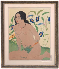
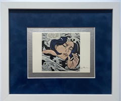
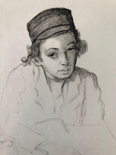
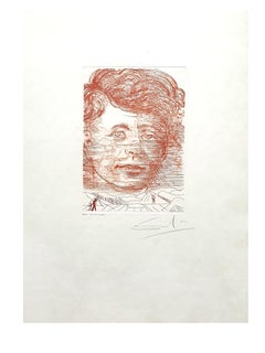
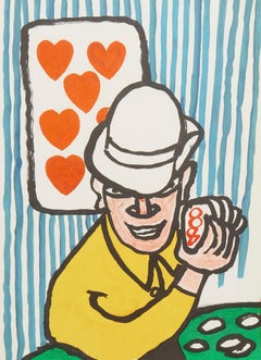
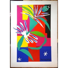
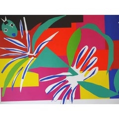
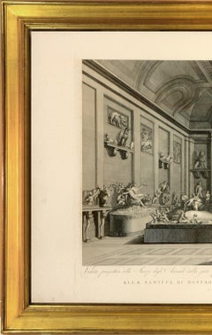
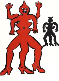
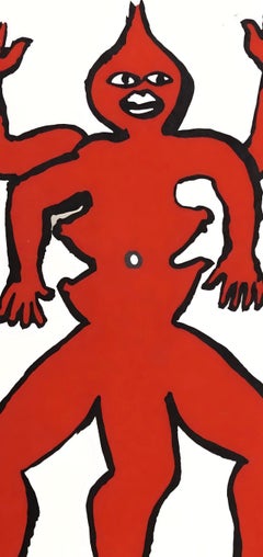
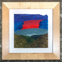
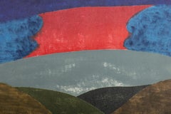
By (after) Henri Matisse

Located in Collonge Bellerive, Geneve, CH

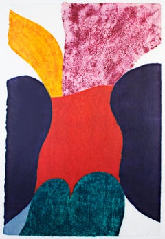
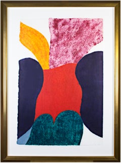
after Henri Matisse - Acrobat Edition of 200 with the printed signature, as issued 80 x 60 cm Posthumous edition after the original paper cut-out with stamp of the Succession Matisse References : Artvalue - Succession Matisse MATISSE'S BIOGRAPHY YOUTH AND EARLY EDUCATION Henri Emile Benoît Matisse was born in a tiny, tumbledown weaver's cottage on the rue du Chêne Arnaud in the textile town of Le Cateau-Cambrésis at eight o'clock in the evening on the last night of the year, 31 December 1869 (Le Cateau-Cambrésis is in the extreme north of France near the Belgian border). The house had two rooms, a beaten earth floor and a leaky roof. Matisse said long afterwards that rain fell through a hole above the bed in which he was born. Matisse’s ancestors had lived in the area for centuries before the convulsive social and industrial upheavals of the nineteenth century. Matisse grew up in a world that was still detaching itself from a way of life in some ways unchanged since Roman times. The coming of the railway had put Bohain on the industrial map, but people still traveled everywhere on foot or horseback. Matisse’s father, Émile Hippolyte Matisse, was a grain merchant whose family were weavers. His mother, Anna Heloise Gerard, was a daughter of a long line of well-to-do tanners. Warmhearted, outgoing, capable and energetic, she was small and sturdily built with the fashionable figure of the period: full breasts and hips, narrow waist, neat ankles and elegant small feet. She had fair skin, broad cheekbones and a wide smile. "My mother had a face with generous features," said her son Henri, who always spoke of her with particular tenderness of the sensitivity. Throughout the forty years of her marriage, she provided unwavering, rocklike support to her husband and her sons. Matisse later said: "My mother loved everything I did." He grew up in nearby Bohain-en-Vermandois, an industrial textile center, until the age of ten, when his father sent him to St. Quentin for lycée. Anna Heloise worked hard. She ran the section of her husband's shop that sold housepaints, making up the customers' orders and advising on color schemes. The colors evidently left a lasting impression on Henri. The artist himself later said he got his color sense from his mother, who was herself an accomplished painter on porcelain, a fashionable art form at the time. Henri was the couple’s first son. The young Matisse was an awkward youth who seemed ill-adapted to the rigors of the North; in particular, he hated the gelid winters. He was a pensive child and by his own account he was a dreamy, frail and not outstandingly bright. In later life he never lost his feeling for his native soil, for seeds and growing things he had encountered in his youth. The fancy pigeons he kept in Nice more than half a century after he left home recalled the weavers' pigeon-lofts tucked away behind even the humblest house in Bohain. Matisse's childhood memories were of a stern upbringing. "Be quick!" "Look out!" "Run along!" "Get cracking!" were the refrains that rang in his ears as a boy. In later years when survival itself depended on habits of thrift and self-denial, the artist prided himself on being a man of the North. When Matisse in turn had children of his own to bring up, he chided himself for any lapse in discipline or open display of tenderness as weakness on his part. In 1887 he went to Paris to study law, working as a court administrator in Le Cateau-Cambrésis after gaining his qualification. Although he considered law as tedious, he nonetheless passed the bar in 1888 with distinction and began his practice begrudgingly. Once Matisse finished school, his father, a much more practical man, arranged for his son to obtain a clerking position at a law office. PAINTING: BEGINNINGS Matisse’s discovery of his true profession came about in an unusual manner. Following an attack of appendicitis, he began to paint in 1889, when his mother had brought him art supplies during the period of convalescence. He said later, “From the moment I held the box of colors in my hands, I knew this was my life. I threw myself into it like a beast that plunges towards the thing it loves.” Matisse’s mother was the first to advise her son not to adhere to the “rules” of art, but rather listen to his own emotions. Matisse was so committed to his art that he later extended a warning to his fiancée, Amélie Parayre, whom he later married: “I love you dearly, mademoiselle; but I shall always love painting more.” Matisse had discovered "a kind of paradise" as he later described it. His drastic change of profession deeply disappointed his father. Two years later in 1891 Matisse returned to Paris to study art at the Académie Julian and became a student of William-Adolphe Bouguereau. After a discouraging year at the Académie Julian, he left in disgust at the overly perfectionist style of teaching there. Afterwards he trained with Gustave Moreau, an artist who nurtured more progressive leanings. In both studios, as was usual, students drew endless figure studies from life. From Bouguereau, he learned the fundamental lessons of classical painting. His one art-schooled technical standby, almost a fetish, was the plumb line. No matter how odd the angles in any Matisse, the verticals are usually dead true. Moreau was a painter who despised the "art du salon", so Matisse was destined, in a certain sense, to remain an "outcast" of the art world. He initially failed his drawing exam for admission to the École des Beaux-Arts, but persisted and was finally accepted. Matisse began painting still-lives and landscapes in the traditional Flemish style, at which he achieved reasonable proficiency. Most of his early works employ a dark palette and tend to be gloomy. Chardin was one of Matisse's most admired painters having made four the French still-life master paintings in the Louvre. Although he executed numerous copies after the old masters he also studied contemporary art. His first experimentations earned him a reputation as the rebellious member of his studio classes. In 1896, Matisse was elected as an associate member of the Société Nationale, which meant that each year he could show paintings at the Salon de la Société without having to submit them for review. In the same year he exhibited 5 paintings in the salon of the Société Nationale des Beaux-Arts, and the state bought two of his paintings. This was the first and almost only recognition he received in his native country during his lifetime. In 1897 and 1898, he visited the painter John Peter Russell on the island Belle Île off the coast of Brittany. Russell introduced him to Impressionism and to the work of Van Gogh who had been a good friend of Russell but was completely unknown at the time. Matisse's style changed completely, and he would later say "Russell was my teacher, and Russell explained color theory to me." Matisse also observed Russell's and other artists' stable marriages. This probably influenced him to find in Amélie Noellie Parayre, his future wife, his anchor. The Dinner Table (1897) was Matisse’s first masterpiece, and he had spent the entire winter working on the oeuvre. Though the Salon displayed the piece, they hung the work in a poor location, disgusted by what they considered its radical, Impressionist aspects. Caroline Joblaud was Matisse's early lover for four years during his initial struggles to affirm his artistic direction and professional career. Caroline (also called Camille) gave Matisse his first daughter Marguerite in 1894, who after Matisse's marriage to Amélie Noellie Parayre was warmly accepted contrary to conventional hostility such arrangements provoked. Caroline posed various times for the artist’s compositions while Marguerite served many times as a model for Matisse throughout his life. MARRIAGE WITH AMÉLIE NOELLIE PARAYRE The Matisses of Bohain and the Parayres of Beauzelle had outwardly nothing in common, and there was no reason why Matisse and Amélie should ever have met. But in October 1897 Matisse went to a wedding in Paris and happened to sit next to her at the uproarious banquet that followed. There had been no banal flirtation between them, even when the wine flowed, each recognized the other as true metal, and when they got up from the table she held out her hand to Henri Matisse in a way that he never forgot. Matisse at that time was not yet the professorial figure of legend. He was known as a prankster, as a ribald and anti-clerical songster, and as someone who had once broken up a café concert performance just for the hell of it. Amélie's relatives operated at that time within a social, intellectual, and political context of which Matisse had had no previous experience. They stood for free thinking, for the separation of church and state, and for the secularization of the French educational system. Her family, better off that that of Matisse, provided the support he needed for the budding artist. When Matisse married Amélie in January 1898, they had been introduced only three months after. Amélie's Aunt Noélie and two of her brothers ran a successful women's shop called the Grande Maison des Modes. Before her marriage, Amélie had shown a gift for designing, making, and modeling hats for a fashionable clientele. In June 1899, she found a partner and opened a shop of her own on the rue de Châteaudun. This allowed Henri and herself to live, with Marguerite, in a tiny two-room apartment on the same street. Madame Matisse, fervently loyal, would play a fundamental role in the life and career of the artist for more than 40 years. Marguerite was to become her father's lifetime mainstay In 1902 disaster struck. Amélie’s parents were disgraced and financially ruined in a spectacular scandal of national scope, as the unsuspecting employees of a woman whose financial empire was based on fraud. Thanks to his early years in a lawyer's office, Matisse was able to busy himself to great effect in the organization of his father-in-law's defense. When all about him lost their heads, burst into tears, and felt more than sorry for themselves, Henri Matisse dealt with their problems one by one. The ordeal had taken its toll, in more than one way. His doctors ordered Matisse to go to Bohain and take two months' complete rest. Amélie had lost both her hat shop and the apartment on the rue de Châteaudun. For the first time, Henri, Amélie and the three children were united in Bohain, having nowhere else to go. Hillary Spurling, one of Matisse’s biographers, asserts that Amélie’s memories of that public disgrace nurtured a “suspicion of the outside world” that would always mark the Matisse family. The Matisse family formed a kind of hermetic unit which revolved around the artist’s work and profession. They fitted their activities according his breaks and work sessions. Silence was essential. Even during the years when Matisse lived mostly alone in Nice, an annual ritual of unpacking, stretching, framing and hanging ended with the whole family settling down to respond to the paintings. The conference might last several days. Then the dealers were admitted. Matisse and his wife had had two sons, Jean (born 1899) and Pierre (born 1900). He was not always in peace with his family. He wrote that their views were not always in accord “which disturbs me considerably in my work, for which I require the most complete calm and from those how surround me, a serenity that I cannot find here. I intend to move to a village a few league away.” Pierre, his brother, Jean, and Marguerite remained close to their father through every vicissitude, and Matisse, in his last invalid years, was devoted to his several grandchildren. In 1899, at a time when his paintings displayed rebellious talent but not much clear direction, Matisse began attending classes in clay modeling and sculpture. Assigned to copy one of the sculptural masterpieces in the Louvre, he selected Jaguar Devouring a Hare a violently precise work by Antoine-Louis Barye. Later, whenever his paintings seemed stuck, he turned to sculpture to organize his thoughts and sensations. Influenced by the works of the post-Impressionists Paul Cézanne, Gauguin, Van Gogh and Paul Signac, and also by Japanese art, Matisse made color a crucial element of his paintings. Matisse said, "In modern art, it is indubitably to Cézanne that I owe the most." By studying Cézanne’s fragmented planes -- which stretched the idea of the still life to a forced contemplation of color surfaces themselves -- Matisse was able to reconstruct his own philosophy of the still life. Many of his paintings from 1899 to 1905 make use of a pointillist technique adopted from Signac. In 1898, he went to London to study the paintings of J. M. W. Turner and then went on a trip to Corsica. After years in poverty, Matisse went through his "dark period" (1902-03), moved briefly to naturalism, went back to a dark palette and told friends in 1903 that he had lost all desire to paint and had almost decided to give up. Fortunately, Matisse was able to earn some money painting a frieze for the World Fair at the Grand Palais in Paris. He also traveled extensively in the early 1900s when tourism was still a new idea. Brought on by railroad, steamships, and other forms of transportation that appeared during the industrial revolution, travel became a popular pursuit. As a cultured tourist, he developed his art with regular doses of travel. FAUVISM Matisse's career can be divided into several periods that changed stylistically, but his underlying aim always remained the same: to discover "the essential character of things" and to produce an art "of balance, purity, and serenity," as he himself put it. The changing studio environments seemed always to have had a significant effect on the style of his work. In these first years of struggle Matisse set his revolutionary artistic agenda. He disregarded perspective, abolished shadows, repudiating the academic distinction between line and color. He was attempting to overturn a way of seeing evolved and accepted by the Western world for centuries by substituting a conscious subjectivity in the place of the traditional illusion of objectivity . Matisse hit his stride in the avant-garde art world in the first years of the new decade. He explored the modern art scene through frequent visits to galleries such as Durand-Ruel and Vollard, where he was exposed to work by Paul Cézanne, Paul Gauguin, and Vincent van Gogh. Matisse’s first solo exhibition took place in 1904, without much success. In 16 May 1905 he arrived in the charming Catalan port of Collioure, in the south of France. He soon invited the painter André Derain (1880-1954), 11 years his junior, to join him. By 1905, Matisse was considered spearhead the Fauve movement in France, characterized by its spontaneity and roughness of execution as well as use of raw color straight from the palette to the canvas. Matisse combined pointillist color and Cézanne’s way of structuring pictorial space stroke by stroke to develop Fauvism - a way less of seeing the world than of feeling it with one’s eyes. When the Fauve summer drew to an end, Derain left Collioure with 30 paintings, 20 drawings and some 50 sketches, never to return, while Matisse departed some days later bringing back to Paris 15 finished paintings, 40 aquarelles, over 100 drawings. He returned Collioure in the summers of 1906, 1907, 1911 and 1914. The lure of the sun would prove always to have powers of restoration to the artist throughout his life particularly after periods of great emotional exertion. When Fauvist works were first exhibited Salon d'Automne in Paris they created a scandal. Eyewitness accounts tell of laughter emanating from room VII where they were displayed. Gertrud Stein, one of Matisse's most important future supporters, reported that people scratched at the canvases in derision. "A pot of paint has been flung in the face of the public" was the reaction by the critic Camille Mauclair. Louis Vauxcelles described the work with the historic phrase "Donatello au milieu des fauves!" (Donatello among the wild beasts), referring to a Renaissance-type sculpture that shared the room with them. His comment was printed on 17 October 1905 in Gil Blas, a daily newspaper, and passed into popular usage. Derain himself later called the Fauves' color "sticks of dynamite." The painting that was singled out for attacks was Matisse's Woman with a Hat, a portrait of Madame Matisse. This picture was bought be was bought by Gertrude and Leo Stein, a fact which had a very positive effect on Matisse who was suffering demoralization from the bad reception of his work. Matisse continued his experiments in Collioure, visible in the painting The Open Window and the View of Collioure , also a characteristic work of Fauvism in its raw color and disregard for details. Both of these works of the landscape in the French Mediterranean present a distinct development towards the spontaneous and uninhibited style. Other than André Derain, Georges Braque, Raoul Dufy and Maurice Vlaminck were also members of the Fauve movement. However, Matisse’s intimate friends among artists were mostly easygoing minor painters, such as Albert Marquet. Matisse’s temperamental aloneness made him prey to vertiginous depressions. He later recalled a breakdown that he underwent in Spain, in 1910: “My bed shook, and from my throat came a little high-pitched cry that I could not stop.” From the onset of is career women were from one of the cardinal motifs of the artist's production. His Joy of Life (1906) draws us into the world of hallucinatory vividness composed of nymphs set in an idyllic open fields dressed in pure color and sensual outline. Two women lounge in the sunlight while two more chat on the edge of the forest. One crouches to pick some flowers while her companion weaves a chain of them into her hair. A couple embraces each other while another group engages in a lively round-dance in the distance. In this way, Joy of Life depicts woodland nymphs engaging in a celebration of their life, their womanhood, and their sexuality. Due to the recurrent incidence of nude women and intensely sensual interpretation many observers have assumed that as a man Matisse must have been a hedonist. On the contrary, historic examination demonstrates that in reality, he was rather a self-abnegating Northerner who lived only to work, and did so in chronic anguish, recurrent panic, and amid periodic breakdowns. While Picasso recompensed himself, as he went along, with gratifications of intellectual and erotic play Matisse did not. In an age of ideologies, Matisse dodged all ideas except perhaps one: that art is life by other means. Matisse’s uninhibited celebration of women is often believed to have initiated from Cézanne’s painting Three Bathers (1882) (which he had acquired for himself along with a Van Gogh and a Gauguin). However, Matisse depicts women as nurturing, welcoming, and unlike the forbidding, massive clay-like presence of those of Paul Cézanne. FAME The decline of the Fauvist movement, after 1906, did nothing to deter the rise of Matisse. From 1906 -1917 he lived in Paris and established his home, studio, and school at Hôtel Biron. Among his neighbors is sculptor Auguste Rodin, writer Jean Cocteau, and dancer Isadora Duncan. Many of his finest works were created in this period, when he was an active part of the great gathering of artistic talent in Montparnasse, even though he did not quite fit in with his conservative appearance and strict bourgeois work habits. In fact, the aim of Matisse’s art was something less than revolutionary. In 1908, in a famous statement drawn from “Notes of a Painter,” Matisse declared as his ideal an art “for every mental worker, for the businessman as well as the man of letters, for example, a soothing, calming influence on the mind, something like a good armchair which provides relaxation from physical fatigue.” Matisse's personal habits were incredibly regular. On a typical day rose early and worked all morning with a second work session after lunch, followed by violin practice, a simple supper (vegetable soup, two hard-boiled eggs, salad and a glass of wine) and an early bedtime. In 1906, he created a series of 12 lithographs, all variations on the theme of a seated nude. He chose to share his graphic work with the public almost immediately. The lithographs were exhibited at the Druet Gallery in Paris the same year that they were produced, and the woodcuts were shown at the Salon des Independants in the spring of 1907. In 1907 Appolinaire, commenting about Matisse in an article published in La Falange, said, "We are not here in the presence of an extravagant or an extremist undertaking: Matisse's art is eminently reasonable." Notwithstanding newly-won fame, Matisse's work continued to encounter vehement criticism and it was difficult for him to provide for his family. His controversial 1907 painting Blue Nude was burned in effigy at the Armory Show in Chicago in 1913. Contrary to the fate of the Impressionists, Matisse and other Fauves were able to exhibit in art galleries. In 1908 Paul Cassirer, the German art dealer and editor who played a significant role in the promotion of the work the French Impressionists and Post-Impressionists, staged an exhibit of Matisse’s works in Berlin. In the same year the American photographer Alfred Stieglitz in New York organized him one-man show in his tiny Manhattan gallery called 291 which effectively introduced Matisse the powerful American art market. In the first decade of his notoriety as the leader of the Fauves, Matisse was more admired by foreigners than by the French. It was, after all, the Russians and the Americans who acquired significant collections of his early work almost as quickly as it was created. The great Matisses we see in the Paris museums today were mostly acquired after the artist's death in lieu of death duties. It took the French a good deal longer to understand Matisse's greatness-longer, certainly, than the international cadre of aspiring talents that flocked to his classes when he was still one of the most controversial figures in the Paris avant-garde. In the summer of 1907, Matisse and his wife went on a long trip to italy "for work and Pleasure," visiting Venice and Padua, where they admired Giotto's frescos. In Florence the were the guests of the Steins in their villa in Fiesole. From this base matisse visited Arezzo, to study Piero della Francesca, and Siena, attracted by the early Sienese painters, especially, Duccio. PICASSO, GERTRUDE STEIN AND THE CONE SISTERS During the first decade of the 20th century Americans in Paris Gertrude Stein, her brothers Leo Stein, Michael Stein and Michael's wife Sarah took keen interest in Matisse's art. In addition, Gertrude Stein's two friends from Baltimore. Clarabel and Etta Cone, became major patrons of Matisse and Picasso, collecting hundreds of their works.The Cone Sisters acquired their first Matisse in 1906 and, during the next four decades, went on to form one of the world's great collections of his art. The Cone Collection not only contains major works from every phase of Matisse's long career but reflects the sisters' special interest in his Nice period, when a new complexity of form and psychology entered the ever intense surface allure of his paintings. In April of 1906 during a gathering at the house of the legendary Gertrude Stein, Matisse was introduced to Pablo Picasso who was 11 years younger. Picasso and Matisse were poles apart aesthetically and their life styles were no less so. Matisse was markedly taller and more polished than the stocky, cocky Catalan, was then ruler of the turbulent Paris avant-garde art scene. The two were said to have always been looking over their shoulders at each other. It is well-known that after their rivalry grew, sides were taken. Picasso later said: "No one has ever looked at Matisse's paintings more carefully than I; and no one has looked at mine more carefully than he." One key difference between their pictorial concepts was that Matisse drew and painted from nature, while Picasso was much more inclined to work from imagination. The subjects painted most frequently by both artists were women and still lives, with Matisse more likely to place his figures in fully realized interiors. Gertrude Stein, who loved stirring things up, wrote, "the feeling between the Picassoites and the Matisse-ites became bitter." Although Matisse dryly noted that "our disputes were always friendly," it should be pointed out that Picasso and his friends threw suction-cupped darts at Matisse's 1906 Portrait of Marguerite (which Picasso had obtained in a trade for his own Pitcher, Bowl and Lemon, from 1907). While the rift between the two artists eventually healed, the one between their supporters remained. ACADEMIE MATISSE IN PARIS & SERGEI SHCHUKIN In 1909, with the Matisse family lived in a former convent on the Boulevard des Invalides, in Paris, where the artist conducted a painting school. His immense notoriety, which had been confirmed in 1905-06 by Joy of Life, a work which seemed to trash every possible norm of pictorial order and painterly finesse.His friends organized and financed the Académie Matisse in Paris, a private and non-commercial school in which Matisse instructed young artists. It operated from 1911 until 1917. Hans Purrmann and Sarah Stein were several of his most loyal students. Although it lasted for only three years (1908-11), and yet, during its brief existence the Académie Matisse became one of the principal crossroads of modern painting for a number of gifted European and American artists. Given the reputation Matisse had acquired as the"wild man" of modernist color, it must have come as a shock to some of his early students that the program of instruction he offered was remarkably conservative. As Jean Heiberg, the first Norwegian to enroll in the Académie, later wrote in a memoir: "The school had, at Matisse's suggestion, acquired a copy of two antique sculptures from the Louvre, Mars and an archaic sculpture, which he often used to demonstrate. Every now and then he got completely rid of the life model and we only drew from the plaster casts, and his critiques then were no less profitable." Among Matisse’s students was Olga Meerson, a Russian Jew who had studied with Wassily Kandinsky in Munich and, already possessed of an elegant style, sought to remake herself under Matisse’s tutelage. Amélie suspected the worst. Perhaps a combination of Amélie’s jealousy and Meerson’s neediness caused a Matisse to end the connection, with bad feeling all around. Meerson moved to Munich, where she married the musician Heinz Pringsheim, a brother-in-law of Thomas Mann. Never having fulfilled her promise as a painter, she committed suicide in Berlin, in 1929. One of Matisse's biographers, with access to much of the artist's correspondence, contends that the artist, after his marriage, rarely, if ever, had sex with models, despite his apparent feelings for many. Two Russian art collectors stood out at the beginning of the 20th century: the cloth merchant Sergei Shchukin (1854–1936) and the textile manufacturer Ivan Morozov (1871–1921). Both acquired modern French art, developed a sensibility for spotting new trends, and publicized them in Russia. In this period, Matisse had initiated his fecund association with the Russian textile magnate and visionary collector, Sergei Shchukin. The artist created one of his major works La Danse specially for Shchukin as part of a two painting commission. Inspired by a circular dance-- perhaps a sardana - performed by fishermen at Collioure, this painting embodies the clash between the sacred and reality. Human hands link together, but they form a divine spirit. Moreover, Matisse all but abandoned perspective The work ’s flatness emphasizes the idea, colors, and material, a notion that made Matisse a model for Modernists. The other painting commissioned was Music, 1909. Shchukin was considered by some almost as a co-producer of some of the artist’s greatest works and was strongly commuted to the French painter’s work. Concerning the violent attacks on his friend, the Russian wrote to the artist: “The public is against you, but the future is yours.” By 1914 Shchukin’s house in Moscow contained thirty-seven Matisses. “He always picked the best,” the artist said. During the political revolution Lenin expropriated Shchukin collection in person but allowed Shchukin to remain, in servants’ quarters, as caretaker and guide. He died in Paris, in 1936. The collection is now in the Hermitage and Pushkin Museums From about 1911 to 1915, Matisse struggled with the ideas of Cubism, an experiment he felt he was "not participating in" because it did not "speak to [his] deeply sensory nature." MOROCCO Like many avant-garde artists in Paris, Matisse was receptive to a broad range of influences. He is one of the first painters to take an interest in various forms of “primitive” art. His art was profoundly influenced by Easter art...

Category

Mid-20th Century Modern Still-life Prints

Materials

Lithograph

FEOLI. Vedute del Museo Pio-Clementino

FEOLI. Vedute del Museo Pio-Clementino

By Vincenzo Feoli

Located in London, London

Magnificent large plate illustrating the Vatican Museum at the end of the eighteenth century by Vincenzo Feoli (1750 - 1831) after Miccinelli and Costa. The Pio-Clementino museum, n...

Category

1790s Naturalistic Interior Prints

Materials

Engraving, Handmade Paper

The Silent Pie

The Silent Pie

By John Sloan

Located in Middletown, NY

Boston: Frederick J. Quinby Company, 1904. Etching on cream wove paper, 5 3/8 x 4 1/4 inches (135 x 107 mm), signed in the plate, lower right. Third state (of 3), from the novel The ...

Category

Early 20th Century American Modern Figurative Prints

Materials

Etching

"Twilight Zinking" Signed Limited Edition Giclee by Mark Kostabi

"Twilight Zinking" Signed Limited Edition Giclee by Mark Kostabi

By Mark Kostabi

Located in San Diego, CA

Signed limited edition giclee on paper entitled "Twilight Zinking" by Mark Kostabi circa 2020. This print is hand-signed /dated in the lower left and numbered (105/180) in the lower ...

Category

21st Century and Contemporary American Prints

Materials

Paper

John W. Mills (1933-2023) Lifesize ‘The Three Kings’ Bronze & Signed Print

John W. Mills (1933-2023) Lifesize ‘The Three Kings’ Bronze & Signed Print

By John Mills

Located in Wormelow, Herefordshire

A lifesize bronze statue titled ‘The Three Kings’ by the acclaimed British sculptor, John W. Mills. This impressive, large scale bronze would make a striking statement piece in any s...

Category

Late 20th Century English Mid-Century Modern Figurative Sculptures

Materials

Metal, Bronze

Alexander Calder, A Family from Over There II, from Derriere le Miroir, 1975

Alexander Calder, A Family from Over There II, from Derriere le Miroir, 1975

By Alexander Calder

Located in Southampton, NY

This exquisite lithograph by Alexander Calder (1898–1976), titled Une famille de là-bas II (A Family from Over There II), originates from the historic 1975 folio Derriere le Miroir, ...

Category

1970s Surrealist Figurative Prints

Materials

Lithograph

"Pura Vida" original color woodcut print signed by Carol Summers

"Pura Vida" original color woodcut print signed by Carol Summers

By Carol Summers

Located in Milwaukee, WI

"Pura Vida" is an original color woodcut signed by Carol Summers. A multi-colored piece shows a waterfall with red flames behind it in the middle of the piece. On the left stands a tree with yellow leaves on a hill. To the right is a rainbow. This is an excellent example of Summer's printmaking, not just because of the technique and imagery, but because it numbered 1 of the edition of 125. In addition, it contains a personal inscription to the Milwaukee gallerist David Barnett, who has championed the work of Summers and produced catalogs of his work. Indeed, this print appears as no. 189 in the David Barnett Gallery's 1988 catalogue raisonné of Summer's woodcuts. Feel free to inquire if you would like to purchase a copy of the catalogue raisonné along with your Carol Summers print. Art: 24.25 x 24.75 in Frame: 36 x 35 in signed lower right titled and inscribed to David [Barnett] lower right edition (1/125) lower right Carol Summers (1925-2016) has worked as an artist throughout the second half of the 20th century and into the first years of the next, outliving most of his mid-century modernist peers. Initially trained as a painter, Summers was drawn to color woodcuts around 1950 and it became his specialty thereafter. Over the years he has developed a process and style that is both innovative and readily recognizable. His art is known for it’s large scale, saturated fields of bold color, semi-abstract treatment of landscapes from around the world and a luminescent quality achieved through a printmaking process he invented. In a career that has extended over half a century, Summers has hand-pulled approximately 245 woodcuts in editions that have typically run from 25 to 100 in number. His talent was both inherited and learned. Born in 1925 in Kingston, a small town in upstate New York, Summers was raised in nearby Woodstock with his older sister, Mary. His parents were both artists who had met in art school in St. Louis. During the Great Depression, when Carol was growing up, his father supported the family as a medical illustrator until he could return to painting. His mother was a watercolorist and also quite knowledgeable about the different kinds of papers used for various kinds of painting. Many years later, Summers would paint or print on thinly textured paper originally collected by his mother. From 1948 to 1951, Carol Summers trained in the classical fine and studio arts at Bard College and at the Art Students League of New York. He studied painting with Steven Hirsh and printmaking with Louis Schanker. He admired the shapes and colors favored by early modernists Paul Klee (Sw: 1879-1940) and Matt Phillips (Am: b.1927- ). After graduating, Summers quit working as a part-time carpenter and cabinetmaker (which had supported his schooling and living expenses) to focus fulltime on art. That same year, an early abstract, Bridge No. 1 was selected for a Purchase Prize in a competition sponsored by the Brooklyn Museum. In 1952, his work (Cathedral, Construction and Icarus) was shown the first time at the Museum of Modern Art in New York City in an exhibition of American woodcuts. In 1954, Summers received a grant from the Italian government to study for a year in Italy. Woodcuts completed soon after his arrival there were almost all editions of only 8 to 25 prints, small in size, architectural in content and black and white in color. The most well-known are Siennese Landscape and Little Landscape, which depicted the area near where he resided. Summers extended this trip three more years, a decision which would have significant impact on choices of subject matter and color in the coming decade. After returning from Europe, Summers’ images continued to feature historical landmarks and events from Italy as well as from France, Spain and Greece. However, as evidenced in Aetna’s Dream, Worldwind and Arch of Triumph, a new look prevailed. These woodcuts were larger in size and in color. Some incorporated metal leaf in the creation of a collage and Summers even experimented with silkscreening. Editions were now between 20 and 50 prints in number. Most importantly, Summers employed his rubbing technique for the first time in the creation of Fantastic Garden in late 1957. Dark Vision of Xerxes, a benchmark for Summers, was the first woodcut where Summers experimented using mineral spirits as part of his printmaking process. A Fulbright Grant as well as Fellowships from the Louis Comfort Tiffany Foundation and the Guggenheim Foundation followed soon thereafter, as did faculty positions at colleges and universities primarily in New York and Pennsylvania. During this period he married a dancer named Elaine Smithers with whom he had one son, Kyle. Around this same time, along with fellow artist Leonard Baskin, Summers pioneered what is now referred to as the “monumental” woodcut. This term was coined in the early 1960s to denote woodcuts that were dramatically bigger than those previously created in earlier years, ones that were limited in size mostly by the size of small hand-presses. While Baskin chose figurative subject matter, serious in nature and rendered with thick, striated lines, Summers rendered much less somber images preferring to emphasize shape and color; his subject matter approached abstraction but was always firmly rooted in the landscape. In addition to working in this new, larger scale, Summers simultaneously refined a printmaking process which would eventually be called the “Carol Summers Method” or the “ Carol Summers Technique”. Summers produces his woodcuts by hand, usually from one or more blocks of quarter-inch pine, using oil-based printing inks and porous mulberry papers. His woodcuts reveal a sensitivity to wood especially its absorptive qualities and the subtleties of the grain. In several of his woodcuts throughout his career he has used the undulating, grainy patterns of a large wood plank to portray a flowing river or tumbling waterfall. The best examples of this are Dream, done in 1965 and the later Flash Flood Escalante, in 2003. In the majority of his woodcuts, Summers makes the blocks slightly larger than the paper so the image and color will bleed off the edge. Before printing, he centers a dry sheet of paper over the top of the cut wood block or blocks, securing it with giant clips. Then he rolls the ink directly on the front of the sheet of paper and pressing down onto the dry wood block or reassembled group of blocks. Summers is technically very proficient; the inks are thoroughly saturated onto the surface of the paper but they do not run into each other. The precision of the color inking in Constantine’s Dream in 1969 and Rainbow Glacier in 1970 has been referred to in various studio handbooks. Summers refers to his own printing technique as “rubbing”. In traditional woodcut printing, including the Japanese method, the ink is applied directly onto the block. However, by following his own method, Summers has avoided the mirror-reversed image of a conventional print and it has given him the control over the precise amount of ink that he wants on the paper. After the ink is applied to the front of the paper, Summers sprays it with mineral spirits, which act as a thinning agent. The absorptive fibers of the paper draw the thinned ink away from the surface softening the shapes and diffusing and muting the colors. This produces a unique glow that is a hallmark of the Summers printmaking technique. Unlike the works of other color field artists or modernists of the time, this new technique made Summers’ extreme simplification and flat color areas anything but hard-edged or coldly impersonal. By the 1960s, Summers had developed a personal way of coloring and printing and was not afraid of hard work, doing the cutting, inking and pulling himself. In 1964, at the age of 38, Summers’ work was exhibited for a second time at the Museum of Modern Art. This time his work was featured in a one-man show and then as one of MOMA’s two-year traveling exhibitions which toured throughout the United States. In subsequent years, Summers’ works would be exhibited and acquired for the permanent collections of multiple museums throughout the United States, Europe and Asia. Summers’ familiarity with landscapes throughout the world is firsthand. As a navigator-bombardier in the Marines in World War II, he toured the South Pacific and Asia. Following college, travel in Europe and subsequent teaching positions, in 1972, after 47 years on the East Coast, Carol Summers moved permanently to Bonny Doon in the Santa Cruz Mountains in Northern California. There met his second wife, Joan Ward Toth, a textile artist who died in 1998; and it was here his second son, Ethan was born. During the years that followed this relocation, Summers’ choice of subject matter became more diverse although it retained the positive, mostly life-affirming quality that had existed from the beginning. Images now included moons, comets, both sunny and starry skies, hearts and flowers, all of which, in one way or another, remained tied to the landscape. In the 1980s, from his home and studio in the Santa Cruz mountains, Summers continued to work as an artist supplementing his income by conducting classes and workshops at universities in California and Oregon as well as throughout the Mid and Southwest. He also traveled extensively during this period hiking and camping, often for weeks at a time, throughout the western United States and Canada. Throughout the decade it was not unusual for Summers to backpack alone or with a fellow artist into mountains or back country for six weeks or more at a time. Not surprisingly, the artwork created during this period rarely departed from images of the land, sea and sky. Summers rendered these landscapes in a more representational style than before, however he always kept them somewhat abstract by mixing geometric shapes with organic shapes, irregular in outline. Some of his most critically acknowledged work was created during this period including First Rain, 1985 and The Rolling Sea, 1989. Summers received an honorary doctorate from his alma mater, Bard College in 1979 and was selected by the United States Information Agency to spend a year conducting painting and printmaking workshops at universities throughout India. Since that original sabbatical, he has returned every year, spending four to eight weeks traveling throughout that country. In the 1990s, interspersed with these journeys to India have been additional treks to the back roads and high country areas of Mexico, Central America, Nepal, China and Japan. Travel to these exotic and faraway places had a profound influence on Summers’ art. Subject matter became more worldly and nonwestern as with From Humla to Dolpo, 1991 or A Former Life of Budha, 1996, for example. Architectural images, such as The Pillars of Hercules, 1990 or The Raja’s Aviary, 1992 became more common. Still life images made a reappearance with Jungle Bouquet in 1997. This was also a period when Summers began using odd-sized paper to further the impact of an image. The 1996 Night, a view of the earth and horizon as it might be seen by an astronaut, is over six feet long and only slightly more than a foot-and-a-half high. From 1999, Revuelta A Vida (Spanish for “Return to Life”) is pie-shaped and covers nearly 18 cubic feet. It was also at this juncture that Summers began to experiment with a somewhat different palette although he retained his love of saturated colors. The 2003 Far Side of Time is a superb example of the new direction taken by this colorist. At the turn of the millennium in 1999, “Carol Summers Woodcuts...

Category

1980s Contemporary Abstract Prints

Materials

Woodcut

Holbein Hand-colored Portrait of Warham, Archbishop of Canterbury for Henry VIII

Holbein Hand-colored Portrait of Warham, Archbishop of Canterbury for Henry VIII

By (After) Hans Holbein The Younger

Located in Alamo, CA

This framed hand colored stipple engraving and etching portrait of William Warham, Archbishop of Canterbury under King Henry VII and his son King Henry VIII was created by Francesco Bartolozzi (1728–1815) after a drawing and a painting by Hans Holbein (1497-1543), who was Henry VIII's court painter. The print was published in London by John Chamberlaine in 1795. The print was created utilizing stipple engraving and etching techniques by the Italian artist Francesco Bartolozzi, who was employed as the royal engraver by King George III of England. The publisher, John Chamberlaine, was Keeper of the King's Drawings and Medals. The inscription beneath the portrait reads" "In His Majesty's Collection", "Engraved by F. Bartolozzi R A Historical Engraver to His Majesty'' in the lower right, and ''From an original drawing by Hans Holbien'' in the lower left. The original painting by Holbein is displayed at Lambeth Castle and the original drawing is in the art collection at Windsor Castle. The engraving is held by many museums, including: The British Museum, The Metropolitan Museum of Art, The National Portrait Gallery, The Chicago Art Institute and The Fine Arts Museums of San Francisco. This portrait depicts Archbishop William Warham facing to his right, wearing a black cap covering his ears and fur trimmed clerical robes. The print is presented in a decorative gold-colored wood frame with a blue-grey fabric mat. The frame measures 26.5" x 20.13" x 1". The print is in excellent condition. William Warham (1450-1532) was the last of the pre-Reformation archbishops of Canterbury, serving under King Henry VII and then under King Henry VIII. He was a quiet, unassuming intellectual whose career ended with a strong and brave stance against the divorce of King Henry VIII and the king's resultant withdrawal of England from the Catholic church and his draconian actions against the clergy. As Lord Chancellor...

Category

Late 18th Century Portrait Prints

Materials

Engraving, Etching

The Silent Pie

The Silent Pie

By John Sloan

Located in Middletown, NY

Etching on cream wove paper, 5 3/8 x 4 1/4 inches (135 x 107 mm), signed in the plate, lower right. Third state (of 3), from the novel The Flower Girl, vol. 2. by Paul de Kock. In go...

Category

Early 20th Century American Modern Figurative Prints

Materials

Handmade Paper, Etching

Sunset After Storm Woodcut Print on Japanese Paper, 1980s, Framed

Sunset After Storm Woodcut Print on Japanese Paper, 1980s, Framed

By Carol Summers

Located in Milwaukee, WI

Original Woodcut in colors on Japanese paper. Carol Summers has worked as an artist throughout the second half of the 20th century and into the first years of the next, outliving m...

Category

1980s Landscape Prints

Materials

Woodcut

"India, " Abstract Woodcut and Monotype signed by Carol Summers

"India, " Abstract Woodcut and Monotype signed by Carol Summers

By Carol Summers

Located in Milwaukee, WI

"India" is a woodcut and monotype signed by Carol Summers. Here, Summer's abstract language for landscape imagery is taken to its most extreme: The image offers a view of a highly stylized waterfall, with red water falling down behind green foliage below. A hint of light blue at the lower left suggests a continuation of the water's flow. Above, purples and yellows mist upward from the power of the water. The playfulness of the image is enhanced by Summers' signature printmaking technique, which allows the ink from the woodblock to seep through the paper, blurring the edges of each form. Summers' signature can be found in pencil at the bottom of the rightmost blue form, with the title and edition at the bottom of the leftmost blue form. A copy of this print can be found in the collection of the Fine Arts Museums of San Francisco. 37.25 x 24.88 inches, artwork 48.5 x 35.5 inches, frame Numbered 44 from the edition of 75 Carol Summers (1925-2016) has worked as an artist throughout the second half of the 20th century and into the first years of the next, outliving most of his mid-century modernist peers. Initially trained as a painter, Summers was drawn to color woodcuts around 1950 and it became his specialty thereafter. Over the years he has developed a process and style that is both innovative and readily recognizable. His art is known for it’s large scale, saturated fields of bold color, semi-abstract treatment of landscapes from around the world and a luminescent quality achieved through a printmaking process he invented. In a career that has extended over half a century, Summers has hand-pulled approximately 245 woodcuts in editions that have typically run from 25 to 100 in number. His talent was both inherited and learned. Born in 1925 in Kingston, a small town in upstate New York, Summers was raised in nearby Woodstock with his older sister, Mary. His parents were both artists who had met in art school in St. Louis. During the Great Depression, when Carol was growing up, his father supported the family as a medical illustrator until he could return to painting. His mother was a watercolorist and also quite knowledgeable about the different kinds of papers used for various kinds of painting. Many years later, Summers would paint or print on thinly textured paper originally collected by his mother. From 1948 to 1951, Carol Summers trained in the classical fine and studio arts at Bard College and at the Art Students League of New York. He studied painting with Steven Hirsh and printmaking with Louis Schanker. He admired the shapes and colors favored by early modernists Paul Klee (Sw: 1879-1940) and Matt Phillips (Am: b.1927- ). After graduating, Summers quit working as a part-time carpenter and cabinetmaker (which had supported his schooling and living expenses) to focus fulltime on art. That same year, an early abstract, Bridge No. 1 was selected for a Purchase Prize in a competition sponsored by the Brooklyn Museum. In 1952, his work (Cathedral, Construction and Icarus) was shown the first time at the Museum of Modern Art in New York City in an exhibition of American woodcuts. In 1954, Summers received a grant from the Italian government to study for a year in Italy. Woodcuts completed soon after his arrival there were almost all editions of only 8 to 25 prints, small in size, architectural in content and black and white in color. The most well-known are Siennese Landscape and Little Landscape, which depicted the area near where he resided. Summers extended this trip three more years, a decision which would have significant impact on choices of subject matter and color in the coming decade. After returning from Europe, Summers’ images continued to feature historical landmarks and events from Italy as well as from France, Spain and Greece. However, as evidenced in Aetna’s Dream, Worldwind and Arch of Triumph, a new look prevailed. These woodcuts were larger in size and in color. Some incorporated metal leaf in the creation of a collage and Summers even experimented with silkscreening. Editions were now between 20 and 50 prints in number. Most importantly, Summers employed his rubbing technique for the first time in the creation of Fantastic Garden in late 1957. Dark Vision of Xerxes, a benchmark for Summers, was the first woodcut where Summers experimented using mineral spirits as part of his printmaking process. A Fulbright Grant as well as Fellowships from the Louis Comfort Tiffany Foundation and the Guggenheim Foundation followed soon thereafter, as did faculty positions at colleges and universities primarily in New York and Pennsylvania. During this period he married a dancer named Elaine Smithers with whom he had one son, Kyle. Around this same time, along with fellow artist Leonard Baskin, Summers pioneered what is now referred to as the “monumental” woodcut. This term was coined in the early 1960s to denote woodcuts that were dramatically bigger than those previously created in earlier years, ones that were limited in size mostly by the size of small hand-presses. While Baskin chose figurative subject matter, serious in nature and rendered with thick, striated lines, Summers rendered much less somber images preferring to emphasize shape and color; his subject matter approached abstraction but was always firmly rooted in the landscape. In addition to working in this new, larger scale, Summers simultaneously refined a printmaking process which would eventually be called the “Carol Summers Method” or the “ Carol Summers Technique”. Summers produces his woodcuts by hand, usually from one or more blocks of quarter-inch pine, using oil-based printing inks and porous mulberry papers. His woodcuts reveal a sensitivity to wood especially its absorptive qualities and the subtleties of the grain. In several of his woodcuts throughout his career he has used the undulating, grainy patterns of a large wood plank to portray a flowing river or tumbling waterfall. The best examples of this are Dream, done in 1965 and the later Flash Flood Escalante, in 2003. In the majority of his woodcuts, Summers makes the blocks slightly larger than the paper so the image and color will bleed off the edge. Before printing, he centers a dry sheet of paper over the top of the cut wood block or blocks, securing it with giant clips. Then he rolls the ink directly on the front of the sheet of paper and pressing down onto the dry wood block or reassembled group of blocks. Summers is technically very proficient; the inks are thoroughly saturated onto the surface of the paper but they do not run into each other. The precision of the color inking in Constantine’s Dream in 1969 and Rainbow Glacier in 1970 has been referred to in various studio handbooks. Summers refers to his own printing technique as “rubbing”. In traditional woodcut printing, including the Japanese method, the ink is applied directly onto the block. However, by following his own method, Summers has avoided the mirror-reversed image of a conventional print and it has given him the control over the precise amount of ink that he wants on the paper. After the ink is applied to the front of the paper, Summers sprays it with mineral spirits, which act as a thinning agent. The absorptive fibers of the paper draw the thinned ink away from the surface softening the shapes and diffusing and muting the colors. This produces a unique glow that is a hallmark of the Summers printmaking technique. Unlike the works of other color field artists or modernists of the time, this new technique made Summers’ extreme simplification and flat color areas anything but hard-edged or coldly impersonal. By the 1960s, Summers had developed a personal way of coloring and printing and was not afraid of hard work, doing the cutting, inking and pulling himself. In 1964, at the age of 38, Summers’ work was exhibited for a second time at the Museum of Modern Art. This time his work was featured in a one-man show and then as one of MoMA’s two-year traveling exhibitions which toured throughout the United States. In subsequent years, Summers’ works would be exhibited and acquired for the permanent collections of multiple museums throughout the United States, Europe and Asia. Summers’ familiarity with landscapes throughout the world is firsthand. As a navigator-bombardier in the Marines in World War II, he toured the South Pacific and Asia. Following college, travel in Europe and subsequent teaching positions, in 1972, after 47 years on the East Coast, Carol Summers moved permanently to Bonny Doon in the Santa Cruz Mountains in Northern California. There met his second wife, Joan Ward Toth, a textile artist who died in 1998; and it was here his second son, Ethan was born. During the years that followed this relocation, Summers’ choice of subject matter became more diverse although it retained the positive, mostly life-affirming quality that had existed from the beginning. Images now included moons, comets, both sunny and starry skies, hearts and flowers, all of which, in one way or another, remained tied to the landscape. In the 1980s, from his home and studio in the Santa Cruz mountains, Summers continued to work as an artist supplementing his income by conducting classes and workshops at universities in California and Oregon as well as throughout the Mid and Southwest. He also traveled extensively during this period hiking and camping, often for weeks at a time, throughout the western United States and Canada. Throughout the decade it was not unusual for Summers to backpack alone or with a fellow artist into mountains or back country for six weeks or more at a time. Not surprisingly, the artwork created during this period rarely departed from images of the land, sea and sky. Summers rendered these landscapes in a more representational style than before, however he always kept them somewhat abstract by mixing geometric shapes with organic shapes, irregular in outline. Some of his most critically acknowledged work was created during this period including First Rain, 1985 and The Rolling Sea, 1989. Summers received an honorary doctorate from his alma mater, Bard College in 1979 and was selected by the United States Information Agency to spend a year conducting painting and printmaking workshops at universities throughout India. Since that original sabbatical, he has returned every year, spending four to eight weeks traveling throughout that country. In the 1990s, interspersed with these journeys to India have been additional treks to the back roads and high country areas of Mexico, Central America, Nepal, China and Japan. Travel to these exotic and faraway places had a profound influence on Summers’ art. Subject matter became more worldly and nonwestern as with From Humla to Dolpo, 1991 or A Former Life of Budha, 1996, for example. Architectural images, such as The Pillars of Hercules, 1990 or The Raja’s Aviary, 1992 became more common. Still life images made a reappearance with Jungle Bouquet in 1997. This was also a period when Summers began using odd-sized paper to further the impact of an image. The 1996 Night, a view of the earth and horizon as it might be seen by an astronaut, is over six feet long and only slightly more than a foot-and-a-half high. From 1999, Revuelta A Vida (Spanish for “Return to Life”) is pie-shaped and covers nearly 18 cubic feet. It was also at this juncture that Summers began to experiment with a somewhat different palette although he retained his love of saturated colors. The 2003 Far Side of Time is a superb example of the new direction taken by this colorist. At the turn of the millennium in 1999, “Carol Summers Woodcuts...

Category

1990s Contemporary Abstract Prints

Materials

Monotype, Woodcut