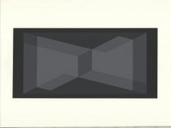
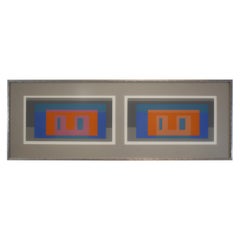
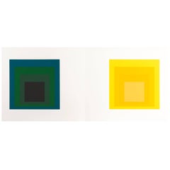
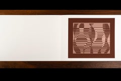
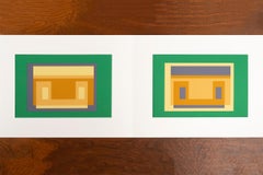
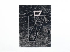
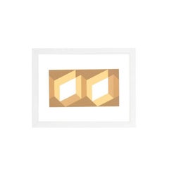
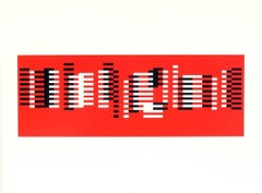
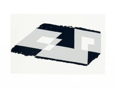
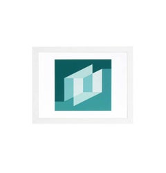
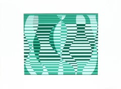
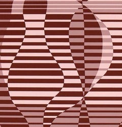
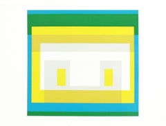
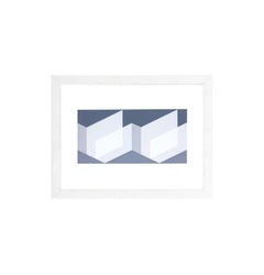
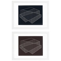
Josef Albers -- Formulation Articulation #C
By Josef Albers
Located in BRUCE, ACT
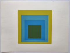
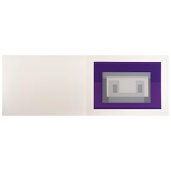
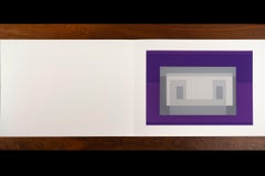
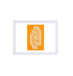
Josef Albers Formulation Articulation #C, 1972 Silkscreen on wove paper First edition. Image size
Category
1970s Prints and Multiples
Materials
Screen
Josef Albers -- Formulation Articulation #C
By Josef Albers
Located in BRUCE, ACT
Josef Albers Formulation Articulation #C, 1972 Silkscreen on wove paper First edition. Image size
Screen

$1,200Sale Price|20% Off
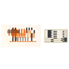
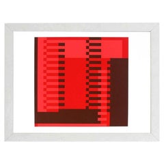
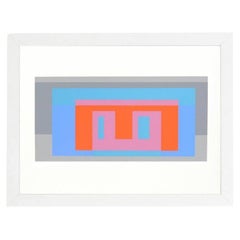
Josef Albers Formulation: Articulation III Screen Print, 1972
By Josef Albers
Located in Brooklyn, NY
silkscreen print page from a portfolio book containing 127 silkscreens of Josef Albers most iconic works
Screen

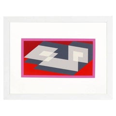
Josef Albers from Formulation, Articulation
By Josef Albers
Located in Stamford, CT
Josef Albers from formulation: Articulation, 1972. Silkscreen prints, folio II/ folder 10. Floated
Paper

$1,200Sale Price|20% Off
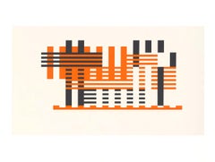
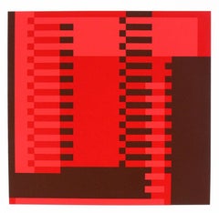
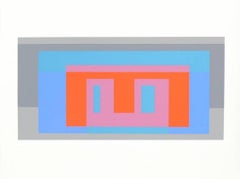
Josef Albers Formulation: Articulation IX Screen Print, 1972, Unframed
By Josef Albers
Located in Brooklyn, NY
silkscreen print page from a portfolio book containing 127 silkscreens of Josef Albers most iconic works
Screen
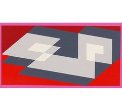
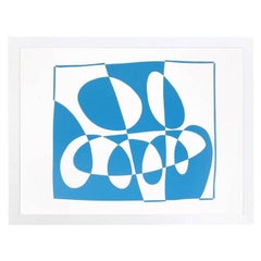
Josef Albers from Formulation: Articulation Portfolio
By Josef Albers
Located in Stamford, CT
Josef Albers from Formulation: Articulation, 1972. Silkscreen prints, folio 1/ folder 1. Floated in
Paper

$568Sale Price|62% Off
Josef Albers 'Formulation: Articulation Portfolio 1, Folder 29' 1972- Serigraph
By Josef Albers
Located in Brooklyn, NY
silkscreen print page from a portfolio book containing 127 silkscreens of Josef Albers most iconic works
Screen
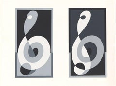
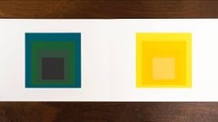
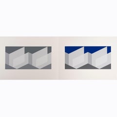
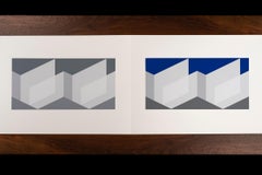
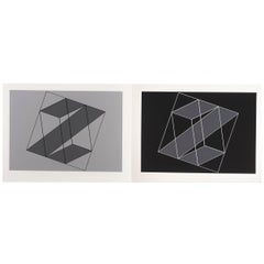
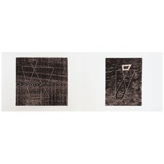
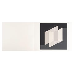
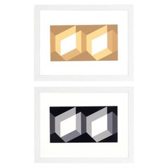
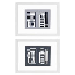
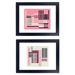
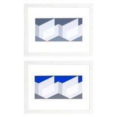
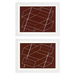
Josef Albers Formulation Articulation Diptych Folio I Folder 17 Circa 1972
By Josef Albers
Located in Toledo, OH
From the Formulation: Articulation collection by Josef Albers, Folio I Folder 17, circa 1972
Paper

$3,040Sale Price|20% Off
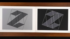
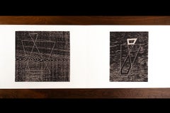
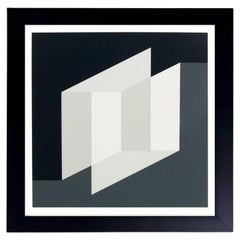
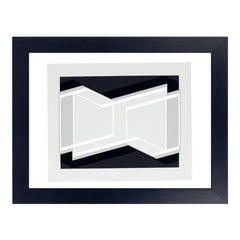
Josef Albers Screen Print Diptych from Formulation, Articulation
By Josef Albers
Located in Toronto, Ontario
A terrific example of a two-paged screen print from Josef Alber's Formulation: Articulation, 1972
Paper
$3,040Sale Price|20% Off
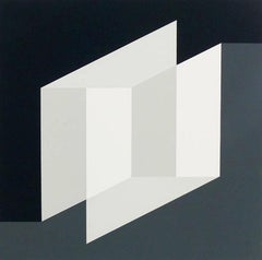
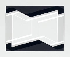
Josef Albers Screen Print Diptych from Formulation Articulation
By Josef Albers
Located in Toronto, Ontario
A terrific example of a two-paged screen print from Josef Alber's Formulation : Articulation, 1972
Paper

$3,040Sale Price|20% Off
Josef Albers Screen Print Diptych from Formulation Articulation
By Josef Albers
Located in Toronto, Ontario
A terrific example of a two-paged screen print from Josef Alber's Formulation: Articulation, 1972
Paper
$3,360Sale Price|20% Off
Josef Albers Screen Print Diptych from Formulation Articulation
By Josef Albers
Located in Toronto, Ontario
A terrific example of a two-paged screen print from Josef Alber's Formulation : Articulation, 1972
Paper
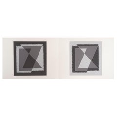
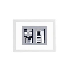
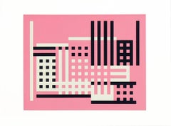
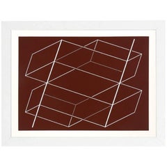
Josef Albers "Formulation : Articulation" Portfolio II, Folder 14
By Josef Albers
Located in Chicago, IL
JOSEF ALBERS (1888 – 1976) "Formulation : Articulation" Portfolio II, Folder 14 Screen-printed
Paper
Josef Albers "Formulation : Articulation" Portfolio II, Folder 25
By Josef Albers
Located in Chicago, IL
JOSEF ALBERS (1888 – 1976) "Formulation : Articulation" Portfolio II, Folder 25 Screen-printed
Paper
Josef Albers "Formulation : Articulation" Portfolio II, Folder 23
By Josef Albers
Located in Chicago, IL
JOSEF ALBERS (1888 – 1976) "Formulation : Articulation" Portfolio II, Folder 23 Screen-printed
Paper
Josef Albers "Formulation : Articulation" Portfolio II, Folder 15
By Josef Albers
Located in Chicago, IL
JOSEF ALBERS (1888 – 1976) "Formulation : Articulation" Portfolio II, Folder 15 Screen-printed
Paper
Josef Albers "Formulation : Articulation" Portfolio II, Folder 18
By Josef Albers
Located in Chicago, IL
JOSEF ALBERS (1888 – 1976) "Formulation : Articulation" Portfolio II, Folder 18 Screen-printed
Paper
$3,200Sale Price|20% Off
Josef Albers "Formulation : Articulation" Portfolio II, Folder 16
By Josef Albers
Located in Chicago, IL
JOSEF ALBERS (1888 – 1976) "Formulation : Articulation" Portfolio II, Folder 16 Screen-printed
Paper
Josef Albers "Formulation : Articulation" Portfolio II, Folder 20
By Josef Albers
Located in Chicago, IL
JOSEF ALBERS (1888 – 1976) "Formulation : Articulation" Portfolio II, Folder 20 Screen-printed
Paper

Josef Albers "Formulation : Articulation" Portfolio II, Folder 19
By Josef Albers
Located in Chicago, IL
JOSEF ALBERS (1888 – 1976) "Formulation : Articulation" Portfolio II, Folder 19 Screen-printed
Paper
$2,800Sale Price|20% Off
Josef Albers "Formulation : Articulation" Portfolio II, Folder 22
By Josef Albers
Located in Chicago, IL
JOSEF ALBERS (1888 – 1976) "Formulation : Articulation" Portfolio II, Folder 22 Screen-printed
Paper

$2,880Sale Price|20% Off
Josef Albers "Formulation : Articulation" Portfolio II, Folder 26
By Josef Albers
Located in Chicago, IL
JOSEF ALBERS (1888 – 1976) "Formulation : Articulation" Portfolio II, Folder 26 Screen-printed
Paper

$2,880Sale Price|28% Off
Josef Albers "Formulation : Articulation" Portfolio II, Folder 30
By Josef Albers
Located in Chicago, IL
JOSEF ALBERS (1888 – 1976) "Formulation : Articulation" Portfolio II, Folder 30 Screen-printed
Paper
$3,200Sale Price|20% Off
Josef Albers "Formulation : Articulation" Portfolio II, Folder 29
By Josef Albers
Located in Chicago, IL
JOSEF ALBERS (1888 – 1976) "Formulation : Articulation" Portfolio II, Folder 29 Screen-printed
Paper

Josef Albers "Formulation : Articulation" Portfolio II, Folder 31
By Josef Albers
Located in Chicago, IL
JOSEF ALBERS (1888 – 1976) "Formulation : Articulation" Portfolio II, Folder 31 Screen-printed
Paper

Josef Albers "Formulation : Articulation" Portfolio II, Folder 12
By Josef Albers
Located in Chicago, IL
JOSEF ALBERS (1888 – 1976) "Formulation : Articulation" Portfolio II, Folder 12 Screen-printed
Paper
$3,024Sale Price|24% Off
Josef Albers "Formulation : Articulation" Portfolio II, Folder 17
By Josef Albers
Located in Chicago, IL
JOSEF ALBERS (1888 – 1976) "Formulation : Articulation" Portfolio II, Folder 17 Screen-printed
Paper
Josef Albers, from the Formulation Articulation Portfolio Priced Individually
By Josef Albers
Located in Stamford, CT
Josef Albers from Formulation: Articulation, 1972. Silkscreen prints, folio 1/folder 6. Floated in
Paper
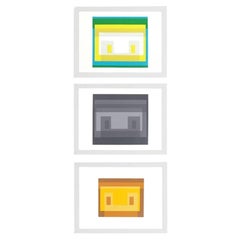
Abstract Lithographs by Josef Albers from Formulation and Articulation
By Josef Albers
Located in Atlanta, GA
Josef Albers abstract lithographs from Formulation and Articulation, published by Harry N. Abrams
Glass, Wood, Paper
Lithograph by Josef Albers from Formulation and Articulation
By Josef Albers
Located in Atlanta, GA
Josef Albers abstract lithograph from Formulation and Articulation, published by Harry N. Abrams
Glass, Wood, Paper
Lithographs by Josef Albers from Formulation and Articulation
By Josef Albers
Located in Atlanta, GA
Josef Albers abstract lithographs from Formulation and Articulation, published by Harry N. Abrams
Glass, Wood, Paper
Josef Albers Abstract Lithograph from Formulation and Articulation
By Josef Albers
Located in Atlanta, GA
Josef Albers abstract lithograph from formulation and articulation, published by Harry N. Abrams
Glass, Wood, Paper
Lithograph by Josef Albers from Formulation and Articulation
By Josef Albers
Located in Atlanta, GA
Josef Albers abstract lithograph from formulation and articulation, published by Harry N. Abrams
Glass, Wood, Paper
Lithographs by Josef Albers from Formulation and Articulation
By Josef Albers
Located in Atlanta, GA
Josef Albers abstract lithographs from Formulation and Articulation, published by Harry N. Abrams
Glass, Wood, Paper
Lithographs by Josef Albers from Formulation and Articulation
By Josef Albers
Located in Atlanta, GA
Josef Albers abstract lithographs from formulation and articulation, published by Harry N. Abrams
Glass, Wood, Paper
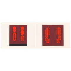
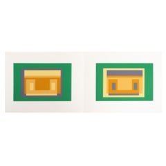
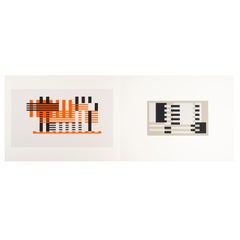
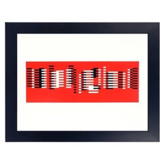
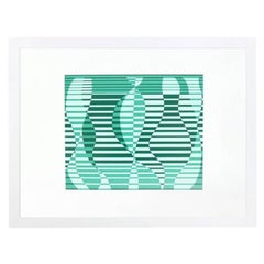
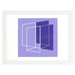
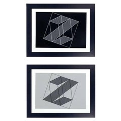
"Variant IV" from the Formulation: Articulation Portfolio by Josef Albers
By Josef Albers
Located in Los Angeles, CA
Josef Albers’s “Formulation: Articulation” portfolio contains 127 silkscreens of his most iconic
Glass, Wood, Paper
Abstract Lithographs by Josef Albers from Formulation and Articulation
By Josef Albers
Located in Atlanta, GA
Josef Albers abstract lithographs from Formulation and Articulation, published by Harry N. Abrams
Glass, Wood, Paper
Abstract Lithographs by Josef Albers from Formulation and Articulation
By Josef Albers
Located in Atlanta, GA
Josef Albers abstract lithographs from formulation and articulation, published by Harry N. Abrams
Glass, Wood, Paper
Abstract Lithograph by Josef Albers from Formulation and Articulation
By Josef Albers
Located in Atlanta, GA
Josef Albers abstract lithograph from Formulation and Articulation, published by Harry N. Abrams
Glass, Wood, Paper
Abstract Lithograph by Josef Albers from Formulation and Articulation
By Josef Albers
Located in Atlanta, GA
Josef Albers abstract lithograph from Formulation and Articulation, published by Harry N. Abrams
Glass, Wood, Paper
Abstract Lithograph by Josef Albers from Formulation and Articulation
By Josef Albers
Located in Atlanta, GA
Josef Albers abstract lithograph from Formulation and Articulation, published by Harry N. Abrams
Glass, Wood, Paper
Pair of Josef Albers Lithographs from Formulation and Articulation
By Josef Albers
Located in Atlanta, GA
Pair of Josef Albers lithographs from formulation and articulation, published by Harry N. Abrams
Glass, Wood, Paper
Josef Albers Abstract Screen-Print from Formulation and Articulation
By Josef Albers
Located in Atlanta, GA
Abstract screen-print, by Josef Albers, from Formulation and Articulation, published by Harry N
Glass, Wood, Paper
Pair of Josef Albers Lithographs from Formulation and Articulation
By Josef Albers
Located in Atlanta, GA
Pair of Josef Albers lithographs from formulation and articulation, published by Harry N. Abrams
Glass, Wood, Paper
Abstract Lithograph by Josef Albers from Formulation and Articulation
By Josef Albers
Located in Atlanta, GA
Josef Albers abstract lithograph from Formulation and Articulation, published by Harry N. Abrams
Glass, Wood, Paper
Abstract Lithograph by Josef Albers from Formulation and Articulation
By Josef Albers
Located in Atlanta, GA
Josef Albers abstract lithograph from Formulation and Articulation, published by Harry N. Abrams
Glass, Wood, Paper
Abstract Lithographs by Josef Albers from Formulation and Articulation
By Josef Albers
Located in Atlanta, GA
Josef Albers abstract lithographs from Formulation and Articulation, published by Harry N. Abrams
Glass, Wood, Paper
Abstract Lithographs by Josef Albers from Formulation and Articulation
By Josef Albers
Located in Atlanta, GA
Josef Albers abstract lithographs from Formulation and Articulation, published by Harry N. Abrams
Glass, Wood, Paper

Abstract Lithographs by Josef Albers from Formulation and Articulation
By Josef Albers
Located in Atlanta, GA
Josef Albers abstract lithographs from Formulation and Articulation, published by Harry N. Abrams
Glass, Wood, Paper

Abstract Lithographs by Josef Albers from Formulation and Articulation
By Josef Albers
Located in Atlanta, GA
Abstract Lithographs by Josef Albers, from Formulation and Articulation, published by Harry N
Glass, Wood, Paper

Abstract Lithographs by Josef Albers from Formulation and Articulation
By Josef Albers
Located in Atlanta, GA
Josef Albers abstract lithographs from Formulation and Articulation, published by Harry N. Abrams
Glass, Wood, Paper

Abstract Lithograph by Josef Albers from Formulation and Articulation
By Josef Albers
Located in Atlanta, GA
Josef Albers abstract lithograph from Formulation and Articulation, published by Harry N. Abrams
Glass, Wood, Paper

Abstract Lithographs by Josef Albers from Formulation and Articulation
By Josef Albers
Located in Atlanta, GA
Josef Albers abstract lithographs from formulation and articulation, published by Harry N. Abrams
Glass, Wood, Paper

Abstract Lithographs by Josef Albers from Formulation and Articulation
By Josef Albers
Located in Atlanta, GA
Josef Albers abstract lithographs from Formulation and Articulation, published by Harry N. Abrams
Glass, Wood, Paper
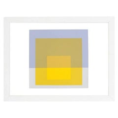
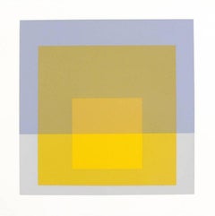
The German-born American painter, writer, and educator Josef Albers was a pioneer of 20th century modernism, and an innovative practitioner of color theory. With his wife, the textile artist and printmaker Anni Albers (1899–1994), he shaped the development of a generation of American artists and designers through his teaching at the experimental Black Mountain College in North Carolina, and later at Yale University School of Art, where he was the chairman of the department of design from 1950–1958. Albers is widely known for his series of prints and paintings "Homages to the Square," which he created between 1950 and 1975. His influential volume on color theory The Interaction of Color was published in 1963.
Albers was born in Bottrop, Germany, and as a young man he studied art education, earning certification from the Königliche Kunstschule in Berlin in 1915. He entered the legendary Bauhaus school in Weimar in 1920. The Bauhaus had been established by Walter Gropius in 1919, in the immediate aftermath of World War I, with the hope that its innovative curriculum would foster connections between architecture, art, and traditional crafts. In 1923 Albers began teaching the Vorkurs, the introductory class in which new students learned to work with each of the key artists’ materials, along with color theory, composition, construction and design.
Albers was a polymath, and the multidisciplinary environment of the Bauhaus was fertile ground for his artistic ambitions. When the school moved from Weimar to Dessau in 1925, he became a full professor, and in addition to glass and metal, he designed typefaces and furniture. While at the Bauhaus, Albers drew inspiration from the work of his colleagues, the color theorist Johannes Itten, and the painter, photographer, and designer László Moholy-Nagy, with whom he co-taught the Vorkurs.
In 1933, the Bauhaus was shut down due to pressure from the Nazi Party, which perceived the school as being sympathetic to communist intellectuals. As Albers’ wife Anni was Jewish, the couple resolved to leave Germany, and settled in rural North Carolina. The architect Philip Johnson helped make arrangements for Albers to join the faculty of Black Mountain College as the head of the painting program, where he remained until 1949. While at Black Mountain, both Josef and Anni Albers became influential mentors to American artists including Ruth Asawa, Cy Twombly, and Robert Rauschenberg, while working alongside fellow professors Buckminster Fuller, John Cage, Merce Cunningham and William de Kooning.
In 1950, Albers joined the faculty of the Yale University School of Art where he would head the newly established Department of Design until his retirement in 1958. In the 1950s, the Alberses began taking trips to Mexico, where the colors and forms of the local art and architecture inspired both artists.
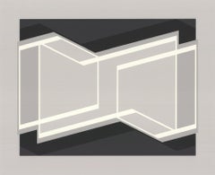
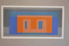
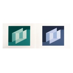
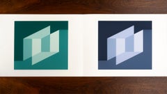
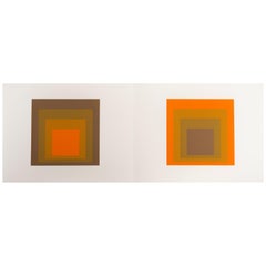
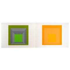
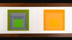
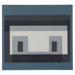
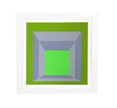
In 1971, Albers became the first living artist whose work was the subject of a solo retrospective at the Metropolitan Museum of Art. Though they worked in different mediums, Josef and Anni Albers’ work shares a fascination with color and geometry. Josef Albers’ compositions from the "Homages to the Square" series, such as Formulation: Articulation Portfolio II Folder 28 (B), from 1972, give deceptively simple shapes a novel vibrance as colors play off of one another. The hues in Articulation Portfolio II Folder 28 (B) work in concert to give the flat surface the distinct appearance of a tunnel or other three-dimensional space; while the form on the left appears to move towards the viewer, the form on the right seems to lead directly into the canvas. Similarly, Anni Albers’ designs for textiles use graphic design to lend a sense of dynamism to flat works. Her Study for Unexecuted Wall Hanging (Bauhaus), from 1984 is a Mondrian-like pattern for a weaving in which different colors alternately recede and advance into the foreground, giving the image a sense of complexity and uncanny depth.
Josef Albers also created works of public art, including a delicate, geometric gold leaf mural called Two Structural Constellations for the lobby of the Corning Glass building in New York City in 1959. He designed a work called Two Portals for the lobby of the Time & Life Building in 1961, in which which and brown bands move towards two square panels made of bronze. Walter Gropius invited Albers to create a piece for the Pan Am Building, which he was designing with the architectural firm of Emery Roth & Sons. Albers reworked an existing glass piece from his Bauhaus days called City, and, fittingly, renamed it Manhattan.
Find a collection of authentic Josef Albers art on 1stDibs.