In a prewar building designed by architect Benjamin Marshall on Chicago’s Gold Coast, a floor-through apartment had sat untouched since the 1960s. The floor plan wasn’t right for a 21st-century family, particularly the location of the small, dark kitchen near the center of the home.
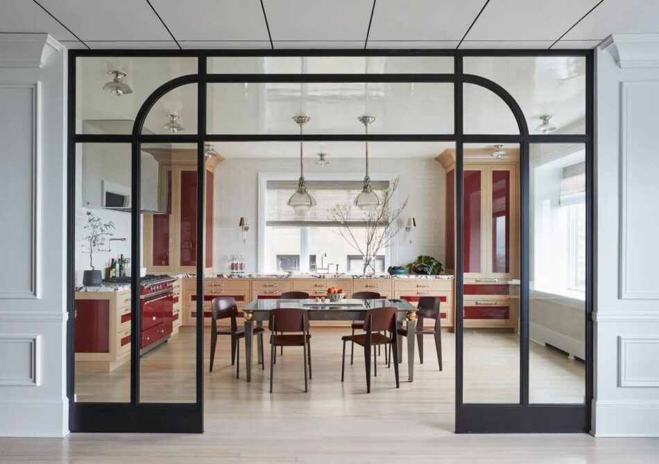
Interior designer Summer Thornton met with the flat’s soon-to-be owner before the closing. “During our walk-through, I said, ‘Wouldn’t it be great if we could move the kitchen to the front of the apartment?’ ” she recalls. “This new location would have lake views and a better connection with the living spaces, not to mention great light. It was an architectural feat, but we pulled it off, and it completely changed the way the apartment lived.”
To visually link the new cooking area with the rest of the home, she sourced a vintage dining table from 1stDibs, rather than install the expected kitchen island. A steel-and-glass divider offers some separation while still letting light flow between rooms.
“The true star of this room, though, is the thoughtful use of this bold oxblood red,” Thornton says, “which is taken from the Lacanche range and pulled onto the millwork for a powerful punch!”
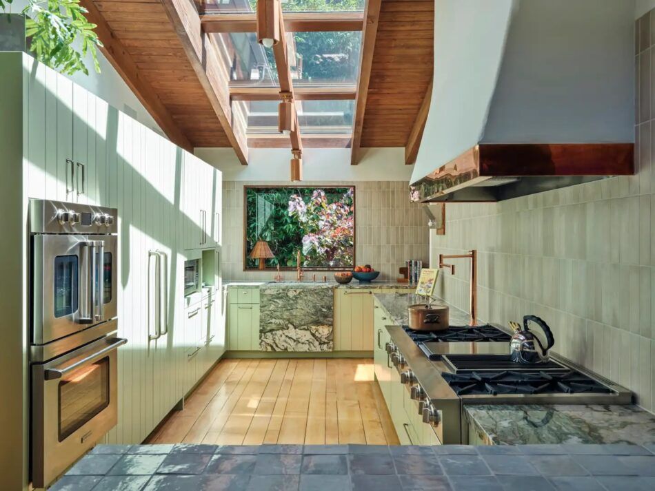
When renovating a 1955 house in Beverly Hills, Ashley Drost and Marie Trohman, the founders of Proem Studio, stripped the kitchen down to the studs.
“The previous kitchen did not offer a very good workflow, and it felt pretty heavy,” says Drost. “We removed all the upper cabinets around the range hood, relocated the other appliances to one wall and moved the sink in front of the window to take advantage of the garden view.”
The homeowner has an affection for bold decor, so the designers felt comfortable going all-in with mint green in the tiles, cabinets and marble surfaces, reflecting the lush garden outside. The color is both contrasted and complemented by the copper tone of the Waterstone faucets, range-hood trim and light fixtures, including an Elliott Barnes sconce.
If the room conjures visions of a mid-century cabin in Northern California, that’s kind of the point. “The architecture of the house has a bit of a summer camp vibe,” Drost says. “And we really leaned into that for the design direction.”
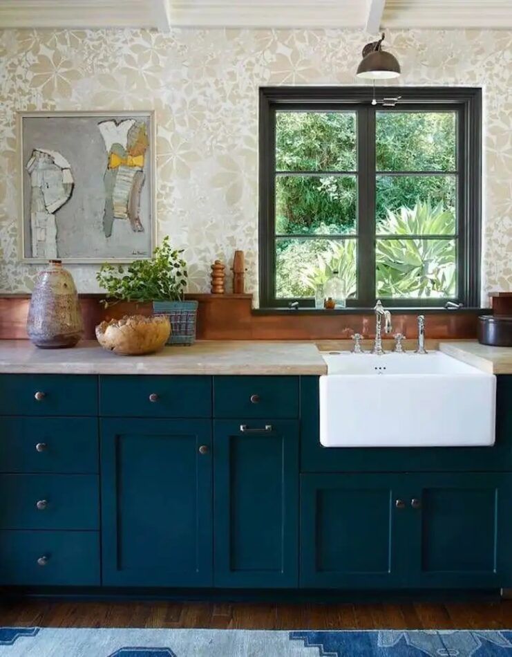
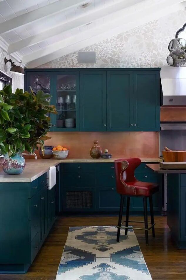
Commune Design was brought in to update a Spanish-Moorish Revival house in Los Angeles built in 1922 by Stiles O. Clements, designer of the city’s iconic El Capitan and Wiltern theaters.
“For us, it was important to be respectful of the history and original details of the house but without being too literal or stuffy with the decor,” says Steven Johanknecht, the firm’s coprincipal. “There is a mix of periods and styles of furnishings in every room.”
The kitchen had been enlarged by a previous owner, he explains, “so our moves were mostly decorative in nature.” The team painted all the cabinets and added a copper backsplash and Van Cronenburg hardware.
On the wall is a hand-printed paper by Marthe Armitage. The chandelier is Lindsay Adelman, the abstract canvas is by Stephen Greene, the barstools are from Soane, the vintage sconces came from Obsolete, and the vintage runner is from Amadi Carpets.
“Function is absolutely the most important aspect of designing a kitchen. However, it’s also important to try to create a space where it’s nice to hang out,” Johanknecht notes. “After all, it’s been said, ‘The party is always in the kitchen.’ ”
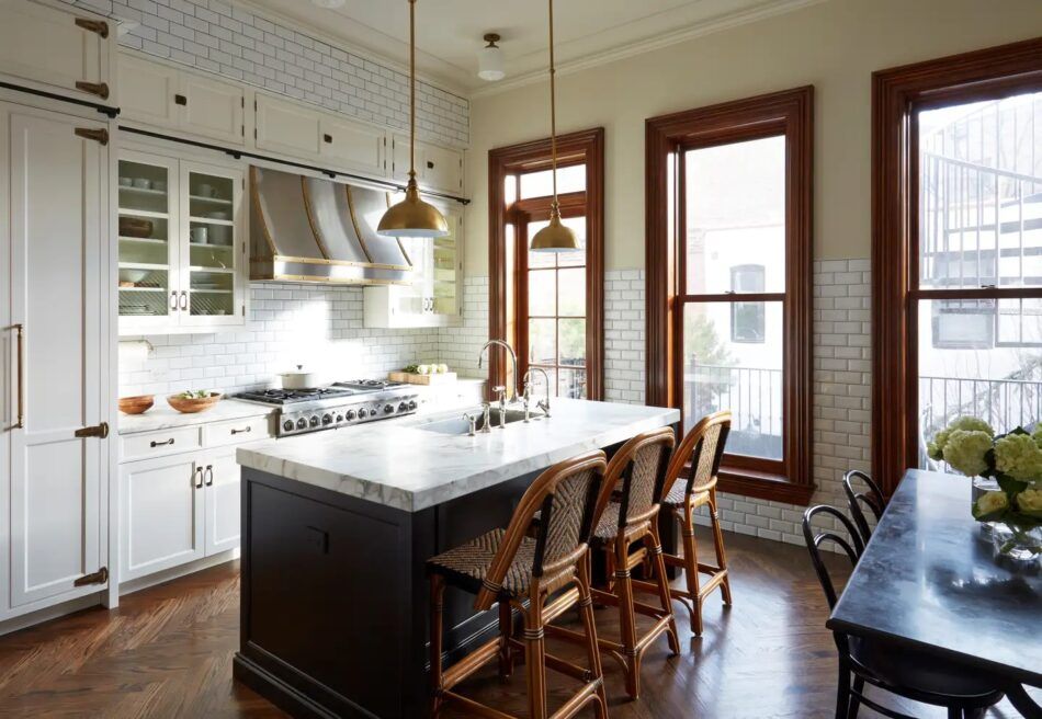
This classic eat-in kitchen is part of a three-story addition to a historic brownstone in Chicago’s Lincoln Park neighborhood. “Our main goal was to have the kitchen look like it had always been there,” says Rebekah Zaveloff, cofounder and design principal of Imparfait Design Studio and KitchenLab.
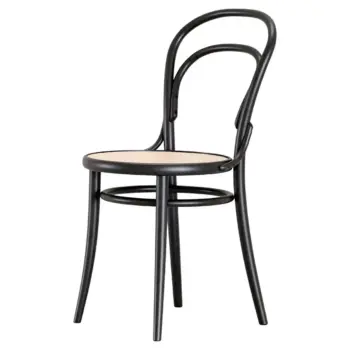
Zaveloff asked artisans to craft moldings that matched the originals found elsewhere in the house. Adding to the space’s trad charm are rattan Ballard Designs counter stools, TON bistro chairs and a Williams Sonoma table.
“I love bringing in vintage elements in furniture and lighting and mixing metals so that a kitchen feels assembled over time,” the designer says. “Most people spend most of their time in the kitchen, so it should be comfortable and welcoming, not make you feel like you could perform surgery on the island.”
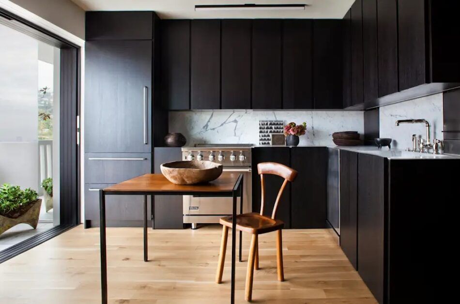
In West Hollywood, a pied-à-terre condominium in a mid-century high-rise got a total renovation by Clements Design, led by the mother-and-son team of Kathleen and Tommy Clements.
“The client wanted to completely modernize the kitchen and was committed to taking a minimalist approach,”says Kathleen. They installed all-new flooring, cabinetry and appliances “with the client’s aesthetic in mind, but also her desire for a true functioning kitchen.”
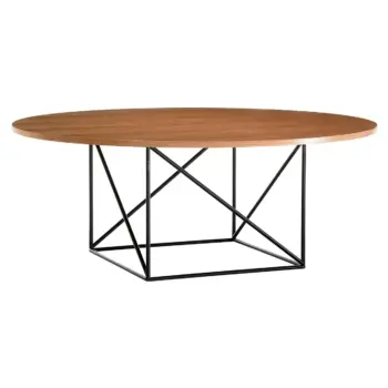
Touches of vintage French character come in the form of a circa 1929 Le Corbusier table and the circa 1945 Alexandre Noll mahogany side chair pulled up to it. Oh là là!
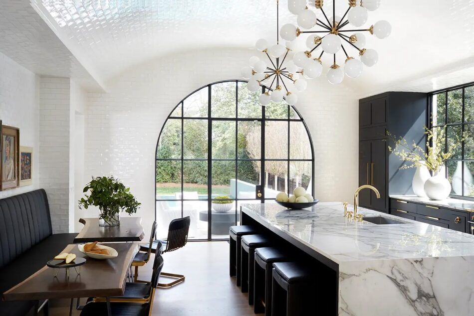
“For the kitchen, every surface is swathed in just one of three materials — subway tile, marble or hardwood — for maximum impact,” Melanie Turner says of this sunny, California-inspired interior that she designed in Atlanta.
Sputnik-style pendants by Visual Comfort lend a 1960s Space Age vibe to the brand-new room, while the wood-framed oil paintings and pair of custom walnut live-edge tables at the 12-foot banquette have a more natural feel.
Radiating even more light around the kitchen, the glossy subway tiles, Turner says, “add a luminous quality to the stunning barrel-vaulted ceiling.”
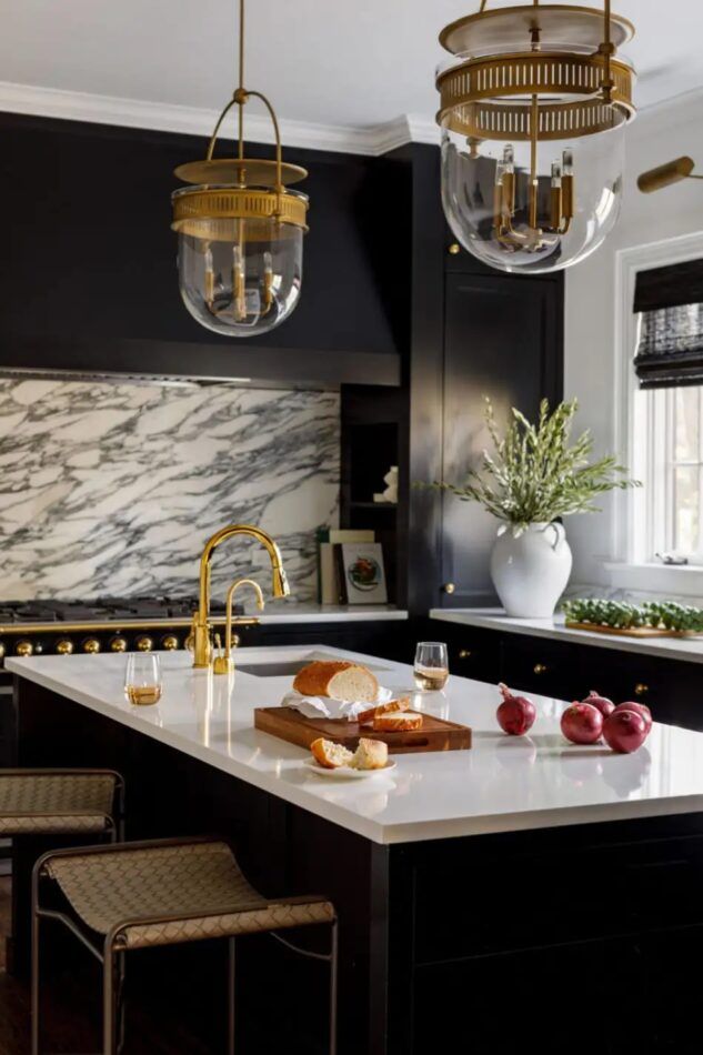
In overhauling the kitchen of a century-old house in Winnetka, Illinois, Alexandra Kaehler says, “we not only needed to renovate for a new design, but we also needed to move around appliances and maximize storage and prep space.”
She brought in the deeply veined marble backsplash “for a wow” and went with a durable quartz for the countertops. Pulled up to the island are woven-leather-and-steel counter stools, with brass-and-glass Urban Electric pendants hanging above. The matte-black storage and finishes are the work of Scott Lyon & Company.
“So often, kitchens are overlooked as an opportunity for an aesthetic statement,” Kaehler says. “Our goal was to make the space chic and special but still super-functional for a family that loves to cook.”
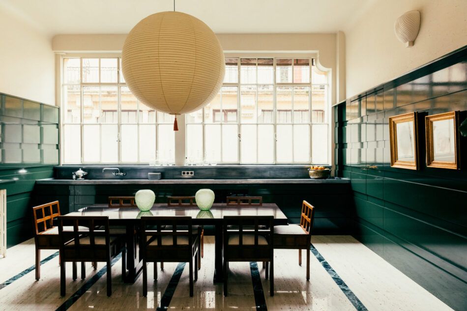
When it came time to redo his own apartment in Paris, Fabrizio Casiraghi chose a deep emerald green as the main color for the kitchen.
The jewel tone appears not only in the lacquer that covers all the cabinetry and paneling but also on the floor, in the narrow strips of green marble between the wide slabs of travertine. (That last material was the color source for the cream-colored surfaces and lighting in the upper half of the room.)
Counters topped with zinc, which patinates naturally over time, offer a flat-metallic contrast to the gleaming lacquer.
And the furnishings? As Casiraghi notes in the 1stDibs 50 spotlight of the space, “When you mix Art Deco chairs with a wooden table with Japanese Noguchi lamps, it could seem risky. But at the end, it is totally harmonious.”
