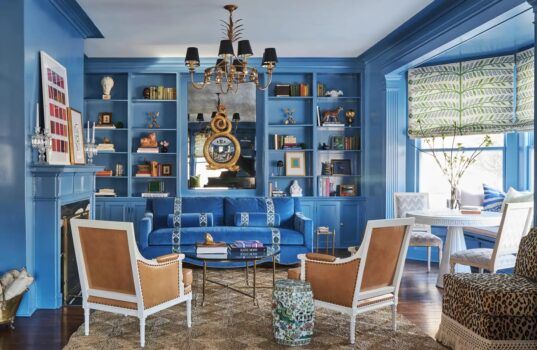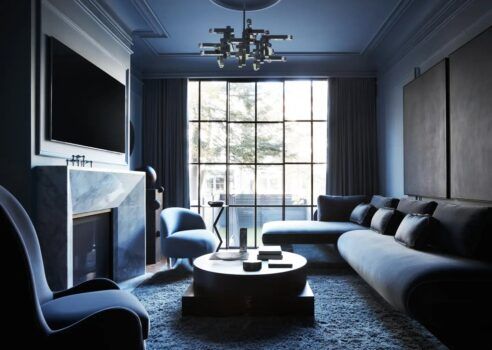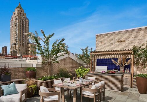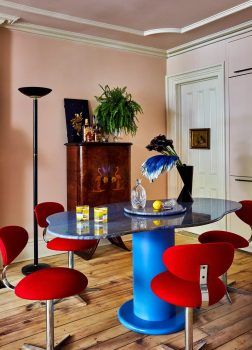
Generally speaking, pattern mixing is not for the faint of heart. If you’re the monochromatic-and-serene type, it’s probably not for you. But even flamboyant practitioners of the art might catch their breath in maximalist rooms by the San Francisco designer Noz Nozawa, whose fearlessness with pattern and color would make Liberace blush.
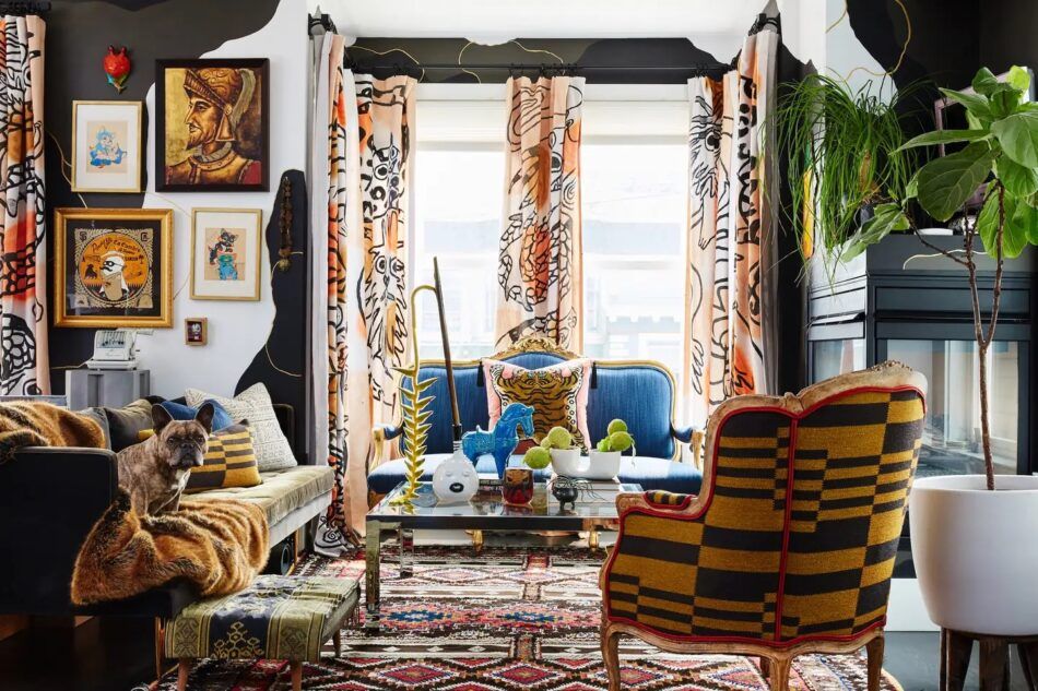
For the living room of her own home — a modern two-bedroom addition to a Victorian-era apartment house in the city’s Hayes Valley neighborhood — she thought big. She began with black walls. But after living with them for some time, she collaborated with a friend, decorative artist Caroline Lizarraga, to conjure an abstract effect she calls glamoflage. “It’s as if a giant came into the house and started tearing sheets of paint off the wall to reveal the white,” Nozawa explains. Fundamentally neutral, it nevertheless creates a large-scale graphic statement that she describes as lying somewhere between “the scale of a traditional wallpaper repeat and a mural.”
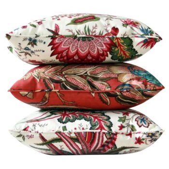
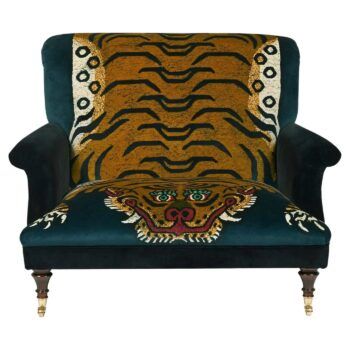
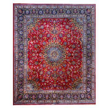
With another artist, Isa Beniston, she channeled the bestiaries depicted in 16th- and 17th-century tapestries to create hand-painted curtains of “lions and tigers and dragons — oh my!” A tiger pillow from House of Hackney invites the wildlife farther into the room, while Pierre Frey’s blocky Country pattern, gracing a Louis XVI–style bergère, skews more geometric. There’s also a Balinese fabric on a mid-century ottoman and a pillow made of African mud cloth. On the floor is the source for the room’s color scheme: an intricately patterned 1930s Afghan tribal rug.
How do you make it all gel? “You need a place for the eye to rest,” says Nozawa, who provided two — the blue strié-effect weave on the circa 1870 Louis XIV–style settee from Antique Revival, as well as the green velvet sofa. But there also need to be commonalities. “I consider the black in the Pierre Frey pattern a neutral, so it’s really basically yellow,” she explains. “And the curtains are mostly brown and a peach color. So, they’re all in the same color family.” Another common thread? The bold black lines seen on the curtains, the settee pillow, the mud cloth and even the art.
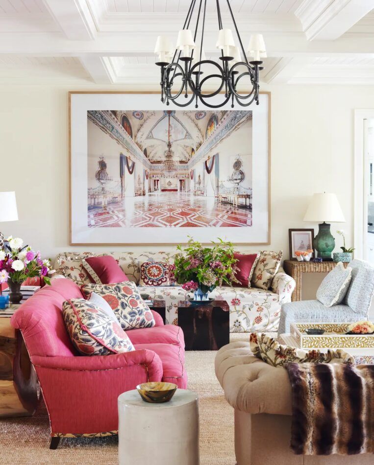
“Any room benefits from a mixture of different scales in the fabric patterns,” says Markham Roberts, “especially a room this large with multiple groups of seating.” That would be the enormous living room of a holiday home in Sagaponack, New York, with three conversation groupings. Colors and patterns vary throughout, but the starting point, says Roberts, was the floral sofa fabric.
“The client and I chose the larger, loosely scaled and softly colored Indian floral for the sofa slipcover and the curtains, then built the rest of the room around it, pulling the different prints, textures and geometric wovens together and balancing them throughout the room.” He alternated colors from one grouping to another. Picking “colors of both vibrant and more subdued saturation, which do not match exactly but rather simply relate to one another,” he explains, “prevents it from looking like the Garanimals department.”
In front of the sofa, the wood-and-resin cube tables from Andrianna Shamaris refract and reflect some of the raspberry hue of the nearby loveseat. This gets its pattern kick from a bolder, tighter floral on the pillows, which sports grays, blues and pinks that don’t quite match the palette of the sofa or the minutely scaled geometric pattern of the slipper chair. Even the Chinese patinated-bronze vase turned lamp on the wicker Parsons table (from James Sansum Fine & Decorative Art) subtly, but not completely synchronously, converses with the room’s blues.
The Candida Höfer photograph on the wall behind the sofa seems to inform the entire scene. The opposite, however, is true. “No, we did not dye the suzani fabric on the center pillow the exact colors of the lavish Capodimonte ballroom room hanging above it,” Roberts quips. “In fact, the photo was the very last thing found and added to the mix.” Crowning it all is a Paul Ferrante chandelier.
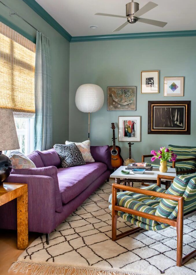
Looking at this 1950s house on Sullivan’s Island — which sits along South Carolina’s Intracoastal Waterway — you’d never dream it was once “very bland and very beige,” according to Angie Hranowsky, who undertook its redesign. The den, which features an Isamu Noguchi Akari floor lamp and colors that evoke a more adventurous strain of mid-century modernism, hints at the home’s vintage. Yet the space bears no resemblance to its former self. Originally a secondary bedroom suite, it was repurposed as a casual hangout for the client’s family.
The color palette — expressed in a purple sofa, sage walls, teal moldings and a pair of Milo Baughman chairs dressed in a green-and-blue stripe — may seem unusual at first glance. But Hranowsky doesn’t find it all that unconventional. “Purple is like a neutral to me at this point,” she says. “It doesn’t faze me anymore.” The chairs’ stripes most obviously relate to the wall color and the subtly striped Raoul fabric used for the curtains. But if you look closely, you’ll notice “a darker, almost mahogany brown” line in the upholstery that ties in to the sofa’s rich purple. “You’re not matching exactly, but you’re staying in the same color family,” Hranowsky explains.
Diamond patterns of different scales unify the room as well, showing up in the Moroccan rug, the sofa pillows and one of the artworks on the wall.
“You want it to look like it sort of came together gradually,” says Hranowsky, “not like you pulled it together all at once.” The McGuire burlwood Parsons table, for instance, might have appeared in the space around the 1970s and the Ralph Lauren lamp atop it in the 1990s. That said, inspired design often results from healthy doses of instinct, experimentation and chance. “I don’t remember what exactly was intentional and what was not,” she admits.
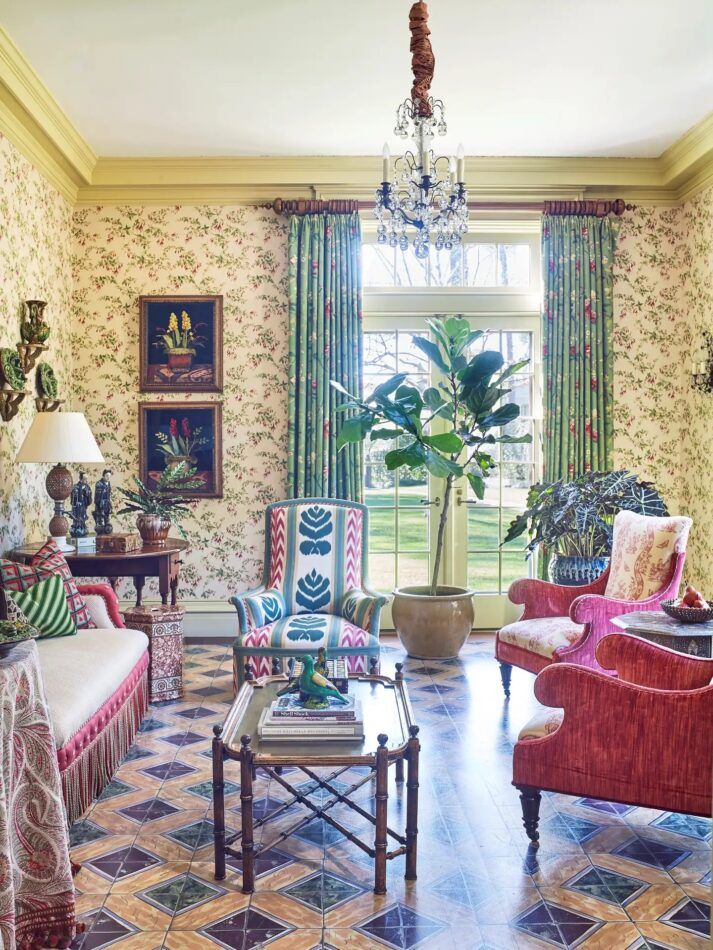
Ann Wolf’s scheme for the sunroom of her Houston-area home began with an Italian tile she found at an antique-tile dealer. When the dealer discovered that the design was no longer made, “we were left with this one little tile,” Wolf says, “so I decided to paint the pattern on the floor.”
The anchor for the room was a French Napoleon III settee (purchased through 1stDibs), which she upholstered in a solid neutral but trimmed with a discreetly embroidered floral on a raspberry ground. Chairs with a similar form got a more graphic ikat, which picked up the trim’s pink and added teal blue. Newer chairs have the pink wrapped around their curvaceous frames but feature toile de Jouy cushions. “You can always mix an ikat with florals and geometrics,” Wolf says. “And toile is easy, because it’s just two colors. As long as one of those colors relates to the other colors in the room, it works.”
All these pinks represent a spectrum of tones, not a monolithic hue. “Try not to obsess too much about matching,” Wolf advises. “You want something that surprises you. In bohemian rooms, there’s always something a little off.” One aspect, however, did require some rethinking. Wolf had initially painted the walls a solid color, which she came to feel wasn’t quite right. “I found the wallpaper last,” she recalls. “That’s when the room finally started working.” The paper’s wispy, lacy florals created a unifying backdrop for the pattern mix, which also included a medium-scale floral on the curtains and a paisley print on a skirted table. “The needlepoint pillows were a happy accident,” adds Wolf.
The patterns throw into higher relief fine pieces like the 18th-century American gateleg side table and the faux-bamboo coffee table, both from 1stDibs, as well as a collection of 19th-century Portuguese majolica, some by José Alves Cunha, an avid follower of the Renaissance tradition established by French master Bernard Palissy.
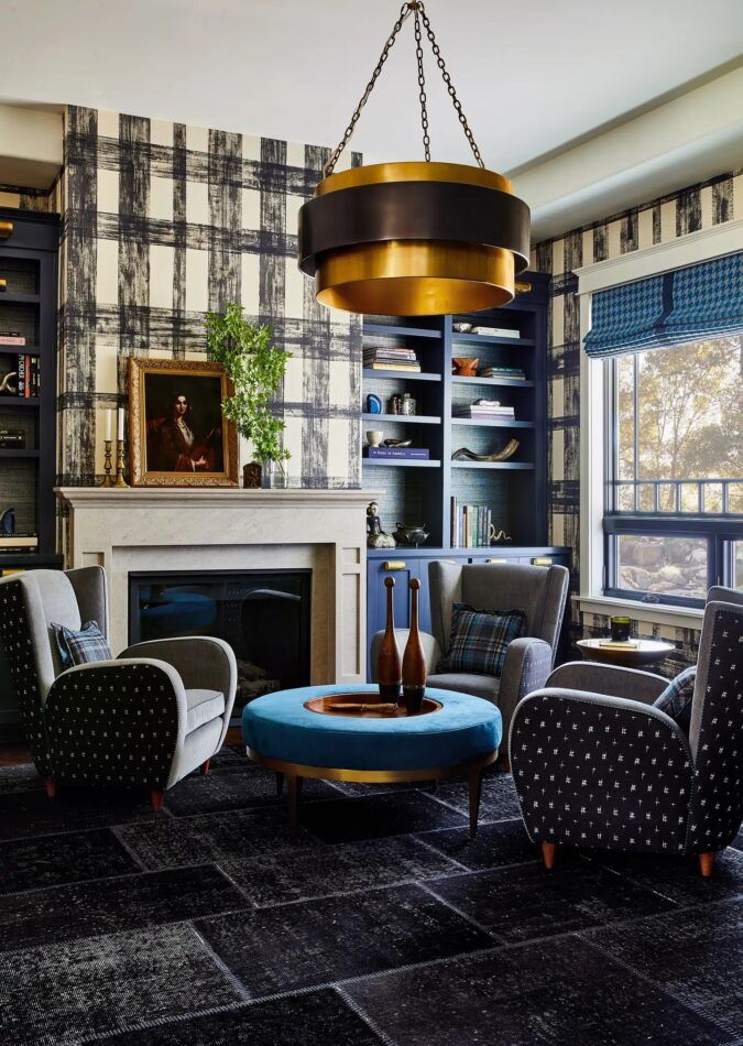
Jeff Schlarb’s light renovation of a 1990s home in Healdsburg, California, includes a library with several variations on the theme of grids. If you count the grass cloth backing the shelves and the Lauren Hwang upholstery on the 1940s-inspired Coup D’Etat armchairs, you arrive at six permutations in total.
According to Schlarb, there are a couple of secrets to making that many hashtag-like patterns work. First, they have to complement each other in terms of scale. “The wallcovering, for example, is like a basketball scale, while the houndstooth is the size of a lemon,” he notes.
Equally important is the balance he strikes between looser and more formal patterns: “Every organic pattern nestles up to something more classic.” The hand-painted Porter Teleo wallpaper reads as open and casual, which, Schlarb says, “makes the room look more relaxing.” The paper plays off the window shades’ houndstooth print — a nod to classic menswear, as are the plaid pillows and the armchairs’ gray wool. The Stark rug, an overdyed patchwork, and the Lauren Hwang ikat feel organic in contrast to the traditional plaid of the pillows. “It’s a constant push and pull,” Schlarb explains.
He softened the orderly grids with the curves of the Visual Comfort chandelier and Cliff Young table. The custom mantel is made of Indiana limestone, an homage to the owner, who hails from the Hoosier State. Since this is his room, “we elected not to do light, ethereal patterns or florals,” Schlarb says. “The grids feel more masculine.”
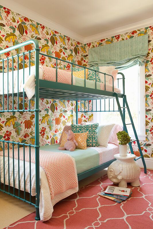
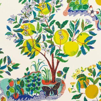
Clients are sometimes more willing to be daring with color and pattern in their vacation homes than in their permanent residences. This was the case for a recently renovated circa 1896 house in Coronado, California, designed by Taylor Borsari. Her clients loved the bright RM COCO fabric inspired by Josef Frank that Borsari selected for their daughter’s bedroom. “We worked the rest of the room from there,” the designer says. “I opted to pull out the turquoise in the fabric as a grounding element for the beds to help settle some of the color on the walls.” The Art Deco–style metal frames also had a streamlined silhouette that complemented, rather than rivaled, the bold floral.
Extrapolating a palette from the most graphic element in a room is a common practice when mixing and matching. But how many colors? “It’s different with each room,” says Borsari, “more of an organic feel thing for me rather than a hard formula.” The main objective, she says, is achieving “the right balance for things to feel connected without being overly hectic and too carnival-like.”
Ditto for patterns. Most of the ones she chose were small (as on the blankets, linens and yellow-and-red pillows) or textural (as on the window shade). But “the walls are extremely bold, so they needed something to compete with them,” says Borsari. “Those suzani-like pillows were the perfect players.” One could say the same for the salmon-pink rug, with its large-scale pattern reminiscent of French and Spanish wrought-iron work.
The final note of whimsy is an elephant-shaped blanc de chine garden stool, which echoes the bulbous shapes of the wallpaper’s green pods.
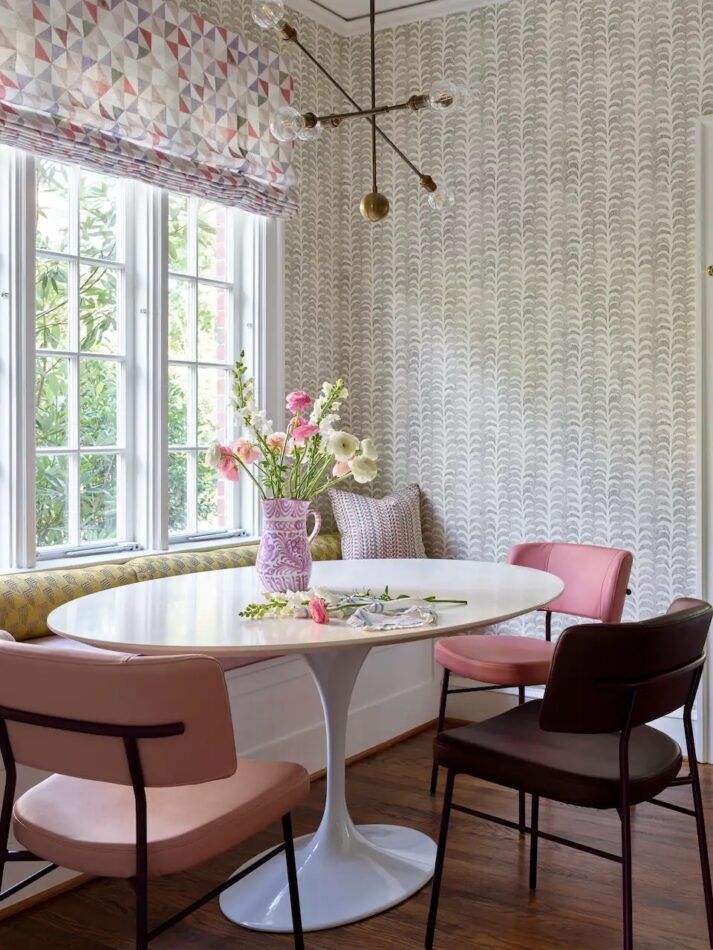
“This client’s house is bursting with color and pattern,” says Charlotte Lucas, referring to a family home she designed in Charlotte, North Carolina, “and the breakfast nook is no exception.” Throughout the project, Lucas relied on a tried-and-true trick to make each room simultaneously lively and restful. “We used a pattern-pairing recipe that has long served us well,” she says, “mixing a number of small-to-medium-scale patterns within the same general color scheme.”
The aforementioned breakfast nook is predominantly pink and gray, but Lucas is fond of throwing in an element of surprise. In this case, it is the yellow-green back cushions of the banquette, whose medium-scale pattern is vaguely Secession in style. Essentially geometric, it conveys the same sense of order as the triangles on the window shade but introduces a fresh, spring-like chartreuse.
Both patterns are inherently modern and clean-lined. In this, they contrast with the wallpaper, a gray foliate design on white ground that functions, Lucas says, as “a bit of stripe in this space, leaving room for us to incorporate additional florals and geometrics. Since it is a neutral colorway, it also allowed for this mix of pattern and color without being overpowering or distracting.”
She surrounded the clients’ own oval Eero Saarinen table with chairs from Traba, found on 1stDibs, and then threw in another surprise. Instead of choosing all pink chairs, she included one in a deep eggplant that, like the chartreuse, subverts expectations. The Apparatus light fixture adds another geometric touch.
