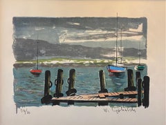
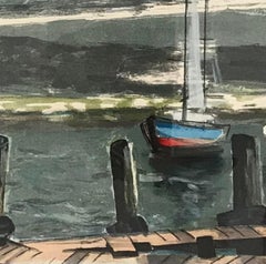
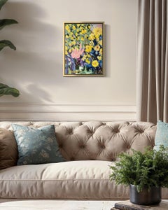
By Michael Mazur
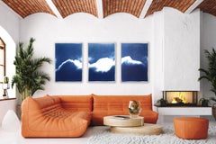
Located in Surfside, FL
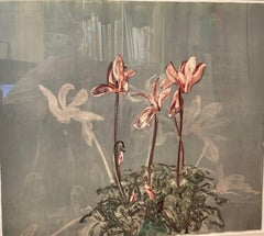
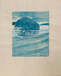
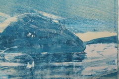
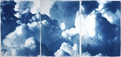
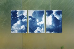
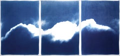
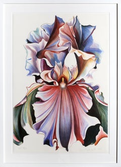
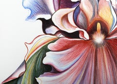
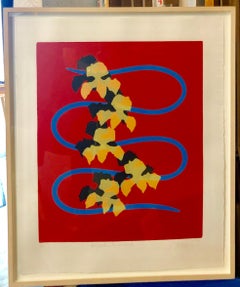
Serpentine with Orchids, 2005
Four-color screenprint on Rives BFK. Edition: 50 + 7 artist’s proofs
28 x 22 (paper size)
framed by Bark Frameworks.
Michael Burton Mazur (1935-August 18, 2009) was an American artist who was described by William Grimes of The New York Times as "a restlessly inventive printmaker, painter, and sculptor."
Born and raised in New York City, Mazur attended the Horace Mann School. He received a bachelor's degree from Amherst College in 1958, then studied art at Yale.
Mazur first gained notice for his series of lithographs and etchings of inmates in a mental asylum, which resulted in two publications, "Closed Ward" and "Locked Ward." Over the years, he worked in printmaking and painting. His series of large-scale prints for Dante's Inferno won critical acclaim, and were the subject of a traveling exhibition organized by the University of Iowa in 1994. Later he concentrated on creating large, lyrical paintings which make use of his free, gestural brushwork and a varied palette. Some of these paintings were seen in an exhibition of 2002 at Boston University, "Looking East: Brice Marden, Michael Mazur, and Pat Steir." (See also Susan Danly, "Branching: The Art of Michael Mazur," 1997).
The Museum of Fine Arts, Boston, has acquired a definMichael Mazur received a B.A. from Amherst College in 1957, studying in his senior year at the Accademia di Belle Arti in Florence, Italy. He went on to earn both a B.F.A. and an M.F.A. from the Yale School of Art and Architecture in 1961. Mazur's first teaching job was at the Rhode Island School of Design from 1961 to 1964. He was awarded a Guggenheim Foundation fellowship for 1964–65. From 1965 to 1976, he taught at Brandeis University, and from 1976 to 1978 at Harvard University. As an artist, teacher, and writer, Mazur has been active in reviving the monotype process. He contributed an essay to the pioneering exhibition catalogue The Painterly Print, published by the Metropolitan Museum of Art in 1980. Mazur recently chaired the New Provincetown...
Category
Early 2000s American Modern Michael Mazur Art
MaterialsLithograph, Screen