1990s Art

to
1,985
4,338
3,038
2,843
1,822
2,004
Overall Width
to
Overall Height
to
7,583
21,300
165,047
237,015
2,096
2,323
4,983
6,474
5,870
15,346
21,066
26,301
19,038
14,135
5,370
4,979
1,808
1,790
1,072
492
295
197
148
87
72
66
20
19
4
7,260
5,193
990
5,195
2,685
1,810
1,682
1,305
1,244
955
886
734
722
718
641
604
575
391
346
316
310
302
299
4,448
3,628
1,991
1,649
1,530
497
206
176
111
101
2,570
3,915
9,400
4,432
Period: 1990s
Return of Time #5
Return of Time #5

Return of Time #5

By John Hardy (Artist)

Located in Long Island City, NY

Return of Time #5 John Hardy, American (1923–2014) Date: 1990 Oil on Canvas, signed lower right Size: 35 x 105 in. (88.9 x 266.7 cm)

Category

Contemporary 1990s Art

Materials

Oil

Living Room Interior, Folk Art Acrylic Painting by Ernani Silva

Living Room Interior, Folk Art Acrylic Painting by Ernani Silva

Located in Long Island City, NY

Ernani Silva, Brazilian - Living Room Interior, Medium: Acrylic, Collage and Enamel on board, signed and titled in marker lower right, Size: 21.5 x 21 in. (54.61 x 53.34 cm)

Category

Folk Art 1990s Art

Materials

Enamel

Encuentro, Monasteries on the slopes of Popocatépetl, Mexico, Oil on canvas,

Encuentro, Monasteries on the slopes of Popocatépetl, Mexico, Oil on canvas,

Located in Houston, TX

Encuentro by Mercedes Ayala is an oil painting most like painted at the Monasteries on the slopes of Popocatépetl. The Monasteries consists of fourteen monasteries built on or near the Popocatépetl volcano in central Mexico in the sixteenth century by members of the Franciscan, Dominican and Augustinian orders. They were a major factor in the Christianization of a large population over a vast territory and in a short period of time. These 14 monasteries cover over 150 miles (242 kilometers) of land southeast of Mexico City; 11 in the state of Morelos and three in Puebla state. It was impossible to photograph but behind the second monk is a third monk and you can barely see the candle. This is an oil on canvas and painted in her studio in Mexico D.F. Excellent Condition Commentary of her work: Desiderio Hernández Xochitiotzin "Emphasizing the light; the inner light of the being where fragile and subtle figures of angelic appearance inhabit magical beings guardians of good, monks or sages, reminiscences that refuse to disappear. Figures that contrast faintly on a background, almost always dominated by suggestive colors of the night space or of the first morning flashes. Mercedes Ayala Gress, Artist of a high sensitivity as befits her to a great family of Artists… Meche as we fraternally call her, is an artist of a magnificent plastic domain and her work has recreated the greatness of our national landscapes and with great affection that of our Tlaxcalteca land, recreating with emotion in those novo Hispanic...

Category

1990s Art

Materials

Oil

Fantasy, Japanese, limited edition lithograph, black, white, red, signed, titled

Fantasy, Japanese, limited edition lithograph, black, white, red, signed, titled

By Toko Shinoda

Located in Santa Fe, NM

Fantasy, Japanese, limited edition lithograph, black, white, red, signed, titled Shinoda's works have been collected by public galleries and museums, including the Museum of Modern Art, Solomon R. Guggenheim Museum, Brooklyn Museum and Metropolitan Museum (all in New York City), the National Museum of Modern Art in Tokyo, the British Museum in London, the Art Institute of Chicago, Arthur M. Sackler Gallery of the Smithsonian in Washington, D.C., the Singapore Art Museum, the National Museum of Singapore, the Kröller-Müller Museum in Otterlo, Netherlands, the Albright–Knox Art Gallery in Buffalo, New York, the Cincinnati Art Museum, and the Yale University Art Gallery in New Haven, Connecticut. New York Times Obituary, March 3, 2021 by Margalit Fox, Alex Traub contributed reporting. Toko Shinoda, one of the foremost Japanese artists of the 20th century, whose work married the ancient serenity of calligraphy with the modernist urgency of Abstract Expressionism, died on Monday at a hospital in Tokyo. She was 107. Her death was announced by her gallerist in the United States. A painter and printmaker, Ms. Shinoda attained international renown at midcentury and remained sought after by major museums and galleries worldwide for more than five decades. Her work has been exhibited at, among other places, the Metropolitan Museum of Art and the Museum of Modern Art in New York; the Art Institute of Chicago; the British Museum; and the National Museum of Modern Art in Tokyo. Private collectors include the Japanese imperial family. Writing about a 1998 exhibition of Ms. Shinoda’s work at a London gallery, the British newspaper The Independent called it “elegant, minimal and very, very composed,” adding, “Her roots as a calligrapher are clear, as are her connections with American art of the 1950s, but she is quite obviously a major artist in her own right.” As a painter, Ms. Shinoda worked primarily in sumi ink, a solid form of ink, made from soot pressed into sticks, that has been used in Asia for centuries. Rubbed on a wet stone to release their pigment, the sticks yield a subtle ink that, because it is quickly imbibed by paper, is strikingly ephemeral. The sumi artist must make each brush stroke with all due deliberation, as the nature of the medium precludes the possibility of reworking even a single line. “The color of the ink which is produced by this method is a very delicate one,” Ms. Shinoda told The Business Times of Singapore in 2014. “It is thus necessary to finish one’s work very quickly. So the composition must be determined in my mind before I pick up the brush. Then, as they say, the painting just falls off the brush.” Ms. Shinoda painted almost entirely in gradations of black, with occasional sepias and filmy blues. The ink sticks she used had been made for the great sumi artists of the past, some as long as 500 years ago. Her line — fluid, elegant, impeccably placed — owed much to calligraphy. She had been rigorously trained in that discipline from the time she was a child, but she had begun to push against its confines when she was still very young. Deeply influenced by American Abstract Expressionists like Jackson Pollock, Mark Rothko and Robert Motherwell, whose work she encountered when she lived in New York in the late 1950s, Ms. Shinoda shunned representation. “If I have a definite idea, why paint it?,” she asked in an interview with United Press International in 1980. “It’s already understood and accepted. A stand of bamboo is more beautiful than a painting could be. Mount Fuji is more striking than any possible imitation.” Spare and quietly powerful, making abundant use of white space, Ms. Shinoda’s paintings are done on traditional Chinese and Japanese papers, or on backgrounds of gold, silver or platinum leaf. Often asymmetrical, they can overlay a stark geometric shape with the barest calligraphic strokes. The combined effect appears to catch and hold something evanescent — “as elusive as the memory of a pleasant scent or the movement of wind,” as she said in a 1996 interview. Ms. Shinoda’s work also included lithographs; three-dimensional pieces of wood and other materials; and murals in public spaces, including a series made for the Zojoji Temple in Tokyo. The fifth of seven children of a prosperous family, Ms. Shinoda was born on March 28, 1913, in Dalian, in Manchuria, where her father, Raijiro, managed a tobacco plant. Her mother, Joko, was a homemaker. The family returned to Japan when she was a baby, settling in Gifu, midway between Kyoto and Tokyo. One of her father’s uncles, a sculptor and calligrapher, had been an official seal carver to the Meiji emperor. He conveyed his love of art and poetry to Toko’s father, who in turn passed it to Toko. “My upbringing was a very traditional one, with relatives living with my parents,” she said in the U.P.I. interview. “In a scholarly atmosphere, I grew up knowing I wanted to make these things, to be an artist.” She began studying calligraphy at 6, learning, hour by hour, impeccable mastery over line. But by the time she was a teenager, she had begun to seek an artistic outlet that she felt calligraphy, with its centuries-old conventions, could not afford. “I got tired of it and decided to try my own style,” Ms. Shinoda told Time magazine in 1983. “My father always scolded me for being naughty and departing from the traditional way, but I had to do it.” Moving to Tokyo as a young adult, Ms. Shinoda became celebrated throughout Japan as one of the country’s finest living calligraphers, at the time a signal honor for a woman. She had her first solo show in 1940, at a Tokyo gallery. During World War II, when she forsook the city for the countryside near Mount Fuji, she earned her living as a calligrapher, but by the mid-1940s she had started experimenting with abstraction. In 1954 she began to achieve renown outside Japan with her inclusion in an exhibition of Japanese calligraphy at MoMA. In 1956, she traveled to New York. At the time, unmarried Japanese women could obtain only three-month visas for travel abroad, but through zealous renewals, Ms. Shinoda managed to remain for two years. She met many of the titans of Abstract Expressionism there, and she became captivated by their work. “When I was in New York in the ’50s, I was often included in activities with those artists, people like Mark Rothko, Jackson Pollock, Motherwell and so forth,” she said in a 1998 interview with The Business Times. “They were very generous people, and I was often invited to visit their studios, where we would share ideas and opinions on our work. It was a great experience being together with people who shared common feelings.” During this period, Ms. Shinoda’s work was sold in the United States by Betty Parsons, the New York dealer who represented Pollock, Rothko and many of their contemporaries. Returning to Japan, Ms. Shinoda began to fuse calligraphy and the Expressionist aesthetic in earnest. The result was, in the words of The Plain Dealer of Cleveland in 1997, “an art of elegant simplicity and high drama.” Among Ms. Shinoda’s many honors, she was depicted, in 2016, on a Japanese postage stamp. She is the only Japanese artist to be so honored during her lifetime. No immediate family members survive. When she was quite young and determined to pursue a life making art, Ms. Shinoda made the decision to forgo the path that seemed foreordained for women of her generation. “I never married and have no children,” she told The Japan Times in 2017. “And I suppose that it sounds strange to think that my paintings are in place of them — of course they are not the same thing at all. But I do say, when paintings that I have made years ago are brought back into my consciousness, it seems like an old friend, or even a part of me, has come back to see me.” Works of a Woman's Hand Toko Shinoda bases new abstractions on ancient calligraphy Down a winding side street in the Aoyama district, western Tokyo. into a chunky white apartment building, then up in an elevator small enough to make a handful of Western passengers friends or enemies for life. At the end of a hall on the fourth floor, to the right, stands a plain brown door. To be admitted is to go through the looking glass. Sayonara today. Hello (Konichiwa) yesterday and tomorrow. Toko Shinoda, 70, lives and works here. She can be, when she chooses, on e of Japans foremost calligraphers, master of an intricate manner of writing that traces its lines back some 3,000 years to ancient China. She is also an avant-garde artist of international renown, whose abstract paintings and lithographs rest in museums around the world. These diverse talents do not seem to belong in the same epoch. Yet they have somehow converged in this diminutive woman who appears in her tiny foyer, offering slippers and ritual bows of greeting. She looks like someone too proper to chip a teacup, never mind revolutionize an old and hallowed art form She wears a blue and white kimono of her own design. Its patterns, she explains, are from Edo, meaning the period of the Tokugawa shoguns, before her city was renamed Tokyo in 1868. Her black hair is pulled back from her face, which is virtually free of lines and wrinkles. except for the gold-rimmed spectacles perched low on her nose (this visionary is apparently nearsighted). Shinoda could have stepped directly from a 19th century Meji print. Her surroundings convey a similar sense of old aesthetics, a retreat in the midst of a modern, frenetic city. The noise of the heavy traffic on a nearby elevated highway sounds at this height like distant surf. delicate bamboo shades filter the daylight. The color arrangement is restful: low ceilings of exposed wood, off-white walls, pastel rugs of blue, green and gray. It all feels so quintessentially Japanese that Shinoda’s opening remarks come as a surprise. She points out (through a translator) that she was not born in Japan at all but in Darien, Manchuria. Her father had been posted there to manage a tobacco company under the aegis of the occupying Japanese forces, which seized the region from Russia in 1905. She says,”People born in foreign places are very free in their thinking, not restricted” But since her family went back to Japan in 1915, when she was two, she could hardly remember much about a liberated childhood? She answers,”I think that if my mother had remained in Japan, she would have been an ordinary Japanese housewife. Going to Manchuria, she was able to assert her own personality, and that left its mark on me.” Evidently so. She wears her obi low on the hips, masculine style. The Porcelain aloofness she displays in photographs shatters in person. Her speech is forceful, her expression animated and her laugh both throaty and infectious. The hand she brings to her mouth to cover her amusement (a traditional female gesture of modesty) does not stand a chance. Her father also made a strong impression on the fifth of his seven children:”He came from a very old family, and he was quite strict in some ways and quite liberal in others.” He owned one of the first three bicycles ever imported to Japan and tinkered with it constantly He also decided that his little daughter would undergo rigorous training in a procrustean antiquity. “I was forced to study from age six on to learn calligraphy,” Shinoda says, The young girl dutifully memorized and copied the accepted models. In one sense, her father had pushed her in a promising direction, one of the few professional fields in Japan open to females. Included among the ancient terms that had evolved around calligraphy was onnade, or woman's writing. Heresy lay ahead. By the time she was 15, she had already been through nine years of intensive discipline, “I got tired of it and decided to try my own style. My father always scolded me for being naughty and departing from the traditional way, but I had to do it.” She produces a brush and a piece of paper to demonstrate the nature of her rebellion. “This is kawa, the accepted calligraphic character for river,” she says, deftly sketching three short vertical strokes. “But I wanted to use more than three lines to show the force of the river.” Her brush flows across the white page, leaving a recognizable river behind, also flowing.” The simple kawa in the traditional language was not enough for me. I wanted to find a new symbol to express the word river.” Her conviction grew that ink could convey the ineffable, the feeling, "as she says, of wind blowing softly.” Another demonstration. She goes to the sliding wooden door of an anteroom and disappears in back of it; the only trace of her is a triangular swatch of the right sleeve of her kimono, which she has arranged for that purpose. A realization dawns. The task of this artist is to paint that three sided pattern so that the invisible woman attached to it will be manifest to all viewers. Gen, painted especially for TIME, shows Shinoda’s theory in practice. She calls the work “my conception of Japan in visual terms.” A dark swath at the left, punctuated by red, stands for history. In the center sits a Chinese character gen, which means in the present or actuality. A blank pattern at the right suggests an unknown future. Once out of school, Shinoda struck off on a path significantly at odds with her culture. She recognized marriage for what it could mean to her career (“a restriction”) and decided against it. There was a living to be earned by doing traditional calligraphy:she used her free time to paint her variations. In 1940 a Tokyo gallery exhibited her work. (Fourteen years would pass before she got a second show.)War came, and bad times for nearly everyone, including the aspiring artist , who retreated to a rural area near Mount Fuji and traded her kimonos for eggs. In 1954 Shinoda’s work was included in a group exhibit at New York City’s Museum of Modern Art. Two years later, she overcame bureaucratic obstacles to visit the U.S.. Unmarried Japanese women are allowed visas for only three months, patiently applying for two-month extensions, one at a time, Shinoda managed to travel the country for two years. She pulls out a scrapbook from this period. Leafing through it, she suddenly raises a hand and touches her cheek:”How young I looked!” An inspection is called for. The woman in the grainy, yellowing newspaper photograph could easily be the on e sitting in this room. Told this, she nods and smiles. No translation necessary. Her sojourn in the U.S. proved to be crucial in the recognition and development of Shinoda’s art. Celebrities such as actor Charles Laughton and John Lewis of the Modern Jazz Quartet bought her paintings and spread the good word. She also saw the works of the abstract expressionists, then the rage of the New York City art world, and realized that these Western artists, coming out of an utterly different tradition, were struggling toward the same goal that had obsessed her. Once she was back home, her work slowly made her famous. Although Shinoda has used many materials (fabric, stainless steel, ceramics, cement), brush and ink remain her principal means of expression. She had said, “As long as I am devoted to the creation of new forms, I can draw even with muddy water.” Fortunately, she does not have to. She points with evident pride to her ink stone, a velvety black slab of rock, with an indented basin, that is roughly a foot across and two feet long. It is more than 300 years old. Every working morning, Shinoda pours about a third of a pint of water into it, then selects an ink stick from her extensive collection, some dating back to China’s Ming dynasty. Pressing stick against stone, she begins rubbing. Slowly, the dried ink dissolves in the water and becomes ready for the brush. So two batches of sumi (India ink) are exactly alike; something old, something new. She uses color sparingly. Her clear preference is black and all its gradations. “In some paintings, sumi expresses blue better than blue.” It is time to go downstairs to the living quarters. A niece, divorced and her daughter,10,stay here with Shinoda; the artist who felt forced to renounce family and domesticity at the outset of her career seems welcome to it now. Sake is offered, poured into small cedar boxes and happily accepted. Hold carefully. Drink from a corner. Ambrosial. And just right for the surroundings and the hostess. A conservative renegade; a liberal traditionalist; a woman steeped in the male-dominated conventions that she consistently opposed. Her trail blazing accomplishments are analogous to Picasso’s. When she says goodbye, she bows. --by Paul Gray...

Category

Contemporary 1990s Art

Materials

Lithograph

Untitled
Untitled

Untitled

By Kiki Smith

Located in New York, NY

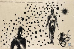
Kiki Smith 'Untitled,' 1995 Woodcut with color additions by hand 31 x 21 inches Edition 43 of 47 Signed In 1995 five well-known American artists - Donald Baechler, Julian Lethbridge...

Category

1990s Art

Materials

Woodcut

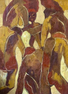
Black is Beautiful: Abstract Expressionist Oil Painting from the 1990s

Black is Beautiful: Abstract Expressionist Oil Painting from the 1990s

By Abiodun Nafiu Azeez

Located in Ibadan, Oyo

Shipping Procedure Ships in a well-protected tube from Nigeria This work is unique, not a print or other type of copy. Accompanied by a Certificate of Authenticity (Issued by the Gallery) About Artist Abiodun Nafiu Azeez is an accomplished artist with a diverse background in contemporary painting, particularly Osogbo art. However, his true passion lies in abstract expression, where he seeks to promote African art, culture, and nature. Influenced by his artist father, he paints to preserve memories and connect with broader societal concerns. Abiodun's artistic style is characterized by the abstraction and simplification of human compositions. He employs vibrant oil colors, often focusing on primary colors that transition into secondary and tertiary hues. His subjects stand out against neutral backgrounds, creating a harmonious balance in his paintings. A prominent feature in his works is the use of red, blue, and yellow tones, subtly blended to emphasize form and shape. His artistic journey includes training under renowned bead painting contemporary artist Jimoh Buraimoh...

Category

Abstract Expressionist 1990s Art

Materials

Canvas, Oil, Acrylic

Katie at Natural History Museum

Katie at Natural History Museum

By Blake Fitch

Located in New York, NY

Archival pigment print Signed, titled, dated, and numbered, verso 30 x 40 inches, sheet (Edition of 5) 16 x 20 inches, sheet (Edition of 10) This photograph is offered by ClampArt...

Category

Contemporary 1990s Art

Materials

Archival Pigment

Gordon and Duke

Gordon and Duke

By Theodore Waddell

Located in Bozeman, MT

Waddell's paintings are a combination of rough marks, thick paint, transparent elegant strokes, and, on a few occasions a slow, hard line scratched into the canvas. You can feel the ...

Category

Contemporary 1990s Art

Materials

Canvas, Encaustic, Oil

Portrait of Dr. Burger, the Diet Doctor, v. 2, by Peter Max

Portrait of Dr. Burger, the Diet Doctor, v. 2, by Peter Max

By Peter Max

Located in Long Island City, NY

Artist: Peter Max, German/American (1937 - ) Title: Portrait of Dr. Burger, the Diet Doctor, v. 2 Year: 1991 Medium: Acrylic on Canvas, signed upper right and signed, dated, and numb...

Category

Pop Art 1990s Art

Materials

Acrylic

"India, " Abstract Woodcut and Monotype signed by Carol Summers

"India, " Abstract Woodcut and Monotype signed by Carol Summers

By Carol Summers

Located in Milwaukee, WI

"India" is a woodcut and monotype signed by Carol Summers. Here, Summer's abstract language for landscape imagery is taken to its most extreme: The image offers a view of a highly stylized waterfall, with red water falling down behind green foliage below. A hint of light blue at the lower left suggests a continuation of the water's flow. Above, purples and yellows mist upward from the power of the water. The playfulness of the image is enhanced by Summers' signature printmaking technique, which allows the ink from the woodblock to seep through the paper, blurring the edges of each form. Summers' signature can be found in pencil at the bottom of the rightmost blue form, with the title and edition at the bottom of the leftmost blue form. A copy of this print can be found in the collection of the Fine Arts Museums of San Francisco. 37.25 x 24.88 inches, artwork 48.5 x 35.5 inches, frame Numbered 44 from the edition of 75 Carol Summers (1925-2016) has worked as an artist throughout the second half of the 20th century and into the first years of the next, outliving most of his mid-century modernist peers. Initially trained as a painter, Summers was drawn to color woodcuts around 1950 and it became his specialty thereafter. Over the years he has developed a process and style that is both innovative and readily recognizable. His art is known for it’s large scale, saturated fields of bold color, semi-abstract treatment of landscapes from around the world and a luminescent quality achieved through a printmaking process he invented. In a career that has extended over half a century, Summers has hand-pulled approximately 245 woodcuts in editions that have typically run from 25 to 100 in number. His talent was both inherited and learned. Born in 1925 in Kingston, a small town in upstate New York, Summers was raised in nearby Woodstock with his older sister, Mary. His parents were both artists who had met in art school in St. Louis. During the Great Depression, when Carol was growing up, his father supported the family as a medical illustrator until he could return to painting. His mother was a watercolorist and also quite knowledgeable about the different kinds of papers used for various kinds of painting. Many years later, Summers would paint or print on thinly textured paper originally collected by his mother. From 1948 to 1951, Carol Summers trained in the classical fine and studio arts at Bard College and at the Art Students League of New York. He studied painting with Steven Hirsh and printmaking with Louis Schanker. He admired the shapes and colors favored by early modernists Paul Klee (Sw: 1879-1940) and Matt Phillips (Am: b.1927- ). After graduating, Summers quit working as a part-time carpenter and cabinetmaker (which had supported his schooling and living expenses) to focus fulltime on art. That same year, an early abstract, Bridge No. 1 was selected for a Purchase Prize in a competition sponsored by the Brooklyn Museum. In 1952, his work (Cathedral, Construction and Icarus) was shown the first time at the Museum of Modern Art in New York City in an exhibition of American woodcuts. In 1954, Summers received a grant from the Italian government to study for a year in Italy. Woodcuts completed soon after his arrival there were almost all editions of only 8 to 25 prints, small in size, architectural in content and black and white in color. The most well-known are Siennese Landscape and Little Landscape, which depicted the area near where he resided. Summers extended this trip three more years, a decision which would have significant impact on choices of subject matter and color in the coming decade. After returning from Europe, Summers’ images continued to feature historical landmarks and events from Italy as well as from France, Spain and Greece. However, as evidenced in Aetna’s Dream, Worldwind and Arch of Triumph, a new look prevailed. These woodcuts were larger in size and in color. Some incorporated metal leaf in the creation of a collage and Summers even experimented with silkscreening. Editions were now between 20 and 50 prints in number. Most importantly, Summers employed his rubbing technique for the first time in the creation of Fantastic Garden in late 1957. Dark Vision of Xerxes, a benchmark for Summers, was the first woodcut where Summers experimented using mineral spirits as part of his printmaking process. A Fulbright Grant as well as Fellowships from the Louis Comfort Tiffany Foundation and the Guggenheim Foundation followed soon thereafter, as did faculty positions at colleges and universities primarily in New York and Pennsylvania. During this period he married a dancer named Elaine Smithers with whom he had one son, Kyle. Around this same time, along with fellow artist Leonard Baskin, Summers pioneered what is now referred to as the “monumental” woodcut. This term was coined in the early 1960s to denote woodcuts that were dramatically bigger than those previously created in earlier years, ones that were limited in size mostly by the size of small hand-presses. While Baskin chose figurative subject matter, serious in nature and rendered with thick, striated lines, Summers rendered much less somber images preferring to emphasize shape and color; his subject matter approached abstraction but was always firmly rooted in the landscape. In addition to working in this new, larger scale, Summers simultaneously refined a printmaking process which would eventually be called the “Carol Summers Method” or the “ Carol Summers Technique”. Summers produces his woodcuts by hand, usually from one or more blocks of quarter-inch pine, using oil-based printing inks and porous mulberry papers. His woodcuts reveal a sensitivity to wood especially its absorptive qualities and the subtleties of the grain. In several of his woodcuts throughout his career he has used the undulating, grainy patterns of a large wood plank to portray a flowing river or tumbling waterfall. The best examples of this are Dream, done in 1965 and the later Flash Flood Escalante, in 2003. In the majority of his woodcuts, Summers makes the blocks slightly larger than the paper so the image and color will bleed off the edge. Before printing, he centers a dry sheet of paper over the top of the cut wood block or blocks, securing it with giant clips. Then he rolls the ink directly on the front of the sheet of paper and pressing down onto the dry wood block or reassembled group of blocks. Summers is technically very proficient; the inks are thoroughly saturated onto the surface of the paper but they do not run into each other. The precision of the color inking in Constantine’s Dream in 1969 and Rainbow Glacier in 1970 has been referred to in various studio handbooks. Summers refers to his own printing technique as “rubbing”. In traditional woodcut printing, including the Japanese method, the ink is applied directly onto the block. However, by following his own method, Summers has avoided the mirror-reversed image of a conventional print and it has given him the control over the precise amount of ink that he wants on the paper. After the ink is applied to the front of the paper, Summers sprays it with mineral spirits, which act as a thinning agent. The absorptive fibers of the paper draw the thinned ink away from the surface softening the shapes and diffusing and muting the colors. This produces a unique glow that is a hallmark of the Summers printmaking technique. Unlike the works of other color field artists or modernists of the time, this new technique made Summers’ extreme simplification and flat color areas anything but hard-edged or coldly impersonal. By the 1960s, Summers had developed a personal way of coloring and printing and was not afraid of hard work, doing the cutting, inking and pulling himself. In 1964, at the age of 38, Summers’ work was exhibited for a second time at the Museum of Modern Art. This time his work was featured in a one-man show and then as one of MoMA’s two-year traveling exhibitions which toured throughout the United States. In subsequent years, Summers’ works would be exhibited and acquired for the permanent collections of multiple museums throughout the United States, Europe and Asia. Summers’ familiarity with landscapes throughout the world is firsthand. As a navigator-bombardier in the Marines in World War II, he toured the South Pacific and Asia. Following college, travel in Europe and subsequent teaching positions, in 1972, after 47 years on the East Coast, Carol Summers moved permanently to Bonny Doon in the Santa Cruz Mountains in Northern California. There met his second wife, Joan Ward Toth, a textile artist who died in 1998; and it was here his second son, Ethan was born. During the years that followed this relocation, Summers’ choice of subject matter became more diverse although it retained the positive, mostly life-affirming quality that had existed from the beginning. Images now included moons, comets, both sunny and starry skies, hearts and flowers, all of which, in one way or another, remained tied to the landscape. In the 1980s, from his home and studio in the Santa Cruz mountains, Summers continued to work as an artist supplementing his income by conducting classes and workshops at universities in California and Oregon as well as throughout the Mid and Southwest. He also traveled extensively during this period hiking and camping, often for weeks at a time, throughout the western United States and Canada. Throughout the decade it was not unusual for Summers to backpack alone or with a fellow artist into mountains or back country for six weeks or more at a time. Not surprisingly, the artwork created during this period rarely departed from images of the land, sea and sky. Summers rendered these landscapes in a more representational style than before, however he always kept them somewhat abstract by mixing geometric shapes with organic shapes, irregular in outline. Some of his most critically acknowledged work was created during this period including First Rain, 1985 and The Rolling Sea, 1989. Summers received an honorary doctorate from his alma mater, Bard College in 1979 and was selected by the United States Information Agency to spend a year conducting painting and printmaking workshops at universities throughout India. Since that original sabbatical, he has returned every year, spending four to eight weeks traveling throughout that country. In the 1990s, interspersed with these journeys to India have been additional treks to the back roads and high country areas of Mexico, Central America, Nepal, China and Japan. Travel to these exotic and faraway places had a profound influence on Summers’ art. Subject matter became more worldly and nonwestern as with From Humla to Dolpo, 1991 or A Former Life of Budha, 1996, for example. Architectural images, such as The Pillars of Hercules, 1990 or The Raja’s Aviary, 1992 became more common. Still life images made a reappearance with Jungle Bouquet in 1997. This was also a period when Summers began using odd-sized paper to further the impact of an image. The 1996 Night, a view of the earth and horizon as it might be seen by an astronaut, is over six feet long and only slightly more than a foot-and-a-half high. From 1999, Revuelta A Vida (Spanish for “Return to Life”) is pie-shaped and covers nearly 18 cubic feet. It was also at this juncture that Summers began to experiment with a somewhat different palette although he retained his love of saturated colors. The 2003 Far Side of Time is a superb example of the new direction taken by this colorist. At the turn of the millennium in 1999, “Carol Summers Woodcuts...

Category

Contemporary 1990s Art

Materials

Monotype, Woodcut

African American Large Vintage Color Photograph Dandy C Print Photo Ike Ude

African American Large Vintage Color Photograph Dandy C Print Photo Ike Ude

By Iké Udé

Located in Surfside, FL

BEYOND DECORUM, CLOSED AND OPEN Series, I am selling each individually. they are pairs of open and closed jackets. I will include the second photo for reference. This listing is just for the closed jacket photograph. Vintage C-print on Fuji crystal archive paper. Image size is 40 x 30", sheet measures 50 X 32 Provenance: printed by Muse X, Los Angeles. I believe these were test, proof prints. They are not signed or editioned The work of Nigerian-born Iké Udé explores a world of dualities: photographer/performance artist, artist/spectator, African/post-nationalist, mainstream/marginal, individual/everyman and fashion/art. Iké Udé (born 1964) is a Nigerian-American photographer, performance artist, Ike Ude was born in 1964 in Lagos, Nigeria where he was raised. The eldest son of a wealthy family, he was exposed to photography and portraiture at an early age by dressing up for biweekly family portraits. Udé knew he was an artist by the age of six, when he developed a habit of firing a catapult at passers-by when he disapproved of their walk or the way they were dressed. As an adolescent, Udé attended the Government Secondary School, a British boarding school in Afikpo Nigeria. He was a habitué of London before he moved to New York in 1981 to study Media Communications at Hunter College, CUNY. He began his art career in the late 1980s with abstract painting and drawing. Since the 1990s, photography has been his primary medium. Udé is a dual citizen of the United States and Nigeria. Udé's paintings and drawings are less well known than his photography, though critics and art historians have recognized his early work. The late Henry Geldzahler, said of Udé's paintings and works on paper: "I am touched and amazed at the ways in which he manages to blend invisibly the modernist tradition with his own Nigerian roots. There is never anything forced in the conjunction; air and light seem to be his media." Udé began his Cover Girls series in 1994. Each photograph imitates the cover of a popular fashion or lifestyle magazines, in which the artist himself is featured as the model. (ala the work of Cindy Sherman) The photographs were consciously stylized, posed, photographed and then paired with type matching that of the respected magazine. At first glance, each photograph appears to be an authentic magazine cover. Udé used the magazine cover as a stage to critique the fetishism of the upper class white model and the effects of popular culture on today's consumerist society. The series was exhibited in 1994 in the New York City gallery Exit Art. Udé's black and white series of photographs, Uli, references both high fashion and Uli body art, wall motifs from Udé's Igbo heritage. The photographs explore the anonymity of the inscribed and disembodied self. Udé's dynamic use of light, namely the chiaroscuro effect, serves as a critical compositional element in the series. Udé's Beyond Decorum series, begun in 1999, juxtaposes photographs of men's shirts and women's pumps with suggestive personal advertisements in place of the clothing tags. With its accompanying book, Beyond Decorum: Photographs by Iké Udé, the series traveled across the United States and Canada. The exhibition was shown at the Institute of Contemporary Art in Portland, Maine; OBORO in Montreal, Canada; Sert Gallery; Carpenter Center at the Harvard University Art Museum; and MAK Museum in Vienna, Austria before traveling for two more years internationally. Udé's Paris Hilton: Fantasy and Simulacrum is a conversation between his alter ego, Visconti, and the celebrity Paris...

Category

Conceptual 1990s Art

Materials

Photographic Paper, C Print, Color

Gold Panthers Brass Sculptures Neo Art Deco Style

Gold Panthers Brass Sculptures Neo Art Deco Style

Located in Rome, IT

Elegant pair of gold Panthers Brass Sculptures Neo Art Deco Style The item will be well-suited to either an indoor or outdoor setting. Excellent condition.

Category

Contemporary 1990s Art

Materials

Bronze

Edges 9
Edges 9

Edges 9

By Alex Katz

Located in Toronto, Ontario

Adored by collectors and art lovers around the globe, Alex Katz (b. 1927) is renowned for his elegant and distinctive version of figuration. Katz has been dedicated to art-making si...

Category

Minimalist 1990s Art

Materials

Etching

k.d. lang and Cindy Crawford, Los Angeles

k.d. lang and Cindy Crawford, Los Angeles

By Herb Ritts

Located in Toronto, Ontario

Herb Ritts (1952-2002) was a Los Angeles-born photographer acclaimed for his celebrity portraits, nudes, and fashion photography from the 1970s onward. His dynamic career defied boun...

Category

Contemporary 1990s Art

Materials

Silver Gelatin

Galerie Lelong, by Antoni Tapies, 1990

Galerie Lelong, by Antoni Tapies, 1990

By Antoni Tàpies

Located in New York, NY

Artist: Antoni Tàpies Medium: Original Lithographic Poster, 1990 Dimensions: 30.3 x 24.4 in, 77 × 62 cm Classic Poster Paper - Perfect Condition A+ This vintage exhibition poster...

Category

1990s Art

Materials

Lithograph

Untitled (Still Life with Boxing Gloves)

Untitled (Still Life with Boxing Gloves)

By Paul Meleschnig

Located in New York, NY

Gelatin silver print (Edition of 6) Signed, dated, and numbered, verso 15 x 15 inches, image This photograph is offered by ClampArt, located in New York City. Price includes framing.

Category

Other Art Style 1990s Art
Materials

Silver Gelatin

Untitled
Untitled

Untitled

By Wolff Buchholz

Located in Kansas City, MO

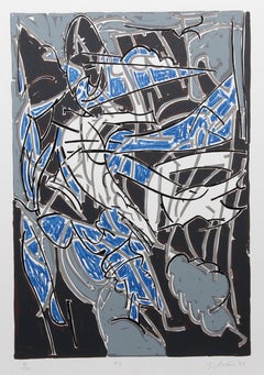
Wolff Buchholz Title: Untitled Medium: Lithograph Year: 1993 Signed and dated by hand Size: 25.2 × 17.9 on 23.0 × 15.4 inches Wolff Buchholz was born in 1935 in Hamburg, Germany. Fr...

Category

Modern 1990s Art
Materials

Lithograph

"Neiman Marcus, Derek #4", New York, NY, 1995

"Neiman Marcus, Derek #4", New York, NY, 1995

By Jose Picayo

Located in Hudson, NY

This photograph is printed on Japanese Paper. The price is for an unframed photograph. 11" X 14" Edition of 25. The Robin Rice Gallery is pleased to announce, 25 Years of Polaroi...

Category

Contemporary 1990s Art
Materials

Photographic Paper

Francesco Clemente, Geography West

Francesco Clemente, Geography West

By Francesco Clemente

Located in New York, NY

GEOGRAPHY, WEST Year: 1992 Medium: 2-color, soft ground etching Paper Size: 28 x 25 inches (71 x 64 cm) Plate Size: 19 x 18 inches (48 x 46 cm) Edition: 60 Price: $6,000 Suite of f...

Category

Contemporary 1990s Art
Materials

Etching

Telescoping #2 (Large Photorealist Oil Painting of a Red & White Crane on Blue)

Telescoping #2 (Large Photorealist Oil Painting of a Red & White Crane on Blue)

Located in Hudson, NY

Large, photo-realist painting on canvas featuring a fire engine red and white industrial crane against a bright sky blue background 69 x 48 x 2 inches oil on canvas, thin wood stripping signed verso, "Joseph E. Richards" Hangs with wire installed on the back Excellent condition, ready to hang as is This precisely detailed photo-realist painting was made by Joseph E. Richards in 1992. The artist painted this piece when he was 71 years old during a long career of painting trains, cargo ships, and industrial machinery. Richards served in the US Navy during WWII and went on to study at the American Academy of Art in Chicago and the Pennsylvania Academy of Fine Arts in Philadelphia before showing with Ivan Karp of O.K. Harris Gallery in NYC. The artist moved upstate to Hillsdale, NY for the later years of his life. This painting captures one of Richards' most beloved subjects, industrial cranes. With a photo-realist approach to the subject, Richards was able to capture detailed changes in light and shadow, shape and form. The red and white crane, painted with extreme detail and focus, vividly contrasts against a bright blue sky. Areas of brown rust, attesting to the machine's power and longevity, are captured with immaculate precision. Since the painting has a very smooth surface, one could easily confuse this painting with a photograph. It is not until you examine the painting up close, do you realize the artist's calculated brushwork. The painting is framed with natural wood stripping. The work is lightweight and easy to hang with pre-installed wire. The artist's signature is located on the back of the canvas. About the artist: Joseph Richards...

Category

Photorealist 1990s Art
Materials

Canvas, Oil

Old couple-Signed limited edition fine art print, Romantic, Contemporary

Old couple-Signed limited edition fine art print, Romantic, Contemporary

By Ian Sanderson

Located in Sant Cugat del Vallès, Barcelona

Old couple , Paris - Signed limited edition archival pigment print Edition of 5 This image was captured on film in 1994. The negative was scanned c...

Category

Contemporary 1990s Art
Materials

Photographic Film, Archival Paper, Black and White, Giclée, Pigment, Arc...

Modernist Detroit Table Sculpture Wood Collage Box Assemblage Americordo Copper

Modernist Detroit Table Sculpture Wood Collage Box Assemblage Americordo Copper

Located in Surfside, FL

Copper and wood box. "Americordo #7" is composed of copper tiles inlaid to the bottom half of the box and on the top rests a patinated etched copper or bronze circle. The box when closed measures to be 17" Sq. x 3.5" H. David Barr (1939-2015) is an American sculptor and painter from Detroit, MI. Known for constructivist sculpture, architecture and surrealist, assemblage box sculpture collage works. Born in 1939, Barr is an internationally known artists and has created many installations in natural settings. Vault took over a year to complete. His sculptures represent mathematics, geography and structurist nature, and otherwise known as "geo-structures." This one is kinetic and can be moved around. Barr is a graduate of Wayne State University and recipient of the WSU Distinguished Alumni Award. Influenced by sculptor Charles Biederman. In 1995 he founded the Michigan Legacy Art Park, and has pieces at the Chrysler World Headquarters, Flint's Bishop Airport, the Detroit Zoo, the State of Michigan Historical Museum and the Meadowbrook Festival Grounds Barr earned a master’s of fine arts degree from Wayne State University and was an associate professor of sculpture at Macomb Community College in Warren for 37 years. He worked on perhaps the largest sculpture in the world, the Four Corners Project, with installations at Greenland, Africa, Irian Jaya (New Guinea) and Easter Island. His sculptures are located all over the state of Michigan, but perhaps his most recognizable is Transcending, a blend of bronze, steel and granite that acknowledges the contributions of Detroit’s laborers and skilled tradespeople. David Barr is the founder of Michigan Legacy Art Park. David’s career as an artist, instructor, author and global thinker has crossed borders around the world, bringing people and ideas together. Over fifty years as a sculptor, David created a body of work that includes hundreds of wall-hanging structurist reliefs, sculptures for public spaces (such as Transcending in Hart Plaza, Detroit done with Sergio De Giusti), works for private collections, massive global projects (such as The Four Corners Project) and Michigan Legacy Art Park. David’s studio was in Detroit for fifteen years until he realized he needed nature as a source of inspiration. In 1977 he bought 4 acres of land in rural Oakland County (now Novi) and in 1979 built his home, a contemporary structure that has become the centerpiece of his own art park. His work is included in the collection of outdoor sculptures at The Dennos Museum Center along with Clement Meadmore, Hanna Stiebel...

Category

Cubist 1990s Art
Materials

Metal, Copper

Haven

Haven

By Mark Lavatelli

Located in Buffalo, NY

An original oil on canvas diptych by American contemporary artist Mark Lavatelli created in 1996. 72" X 122"

Category

Expressionist 1990s Art
Materials

Canvas, Oil

No title

No title

By Pierre Marie Brisson

Located in Paris, FR

Lithograph Handsigned by the artist in pencil and annoted EA VII/XV 65.00 cm. x 48.00 cm. 25.59 in. x 18.9 in. (paper) 39.00 cm. x 39.00 cm. 15.35 in. x 15.35 in. (image) Annoted "...

Category

Abstract 1990s Art
Materials

Lithograph