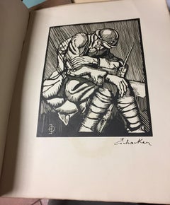
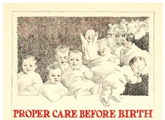
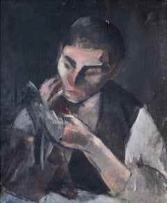
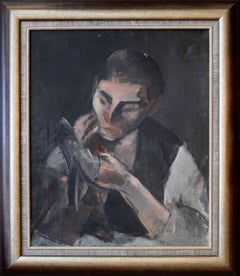
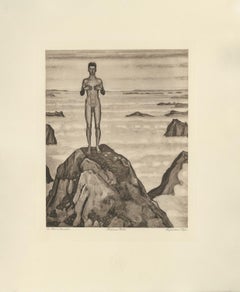
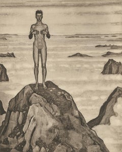
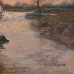
2018 marks the centenary anniversary of Ferdinand Hodler’s death. In that 100 years time, the art world’s esteem of this important artist has proved fickle. It has shifted from extolling his artistic merits during his lifetime to showing something of a feigned disdain- more reflective of the world political order than a true change of heart for Hodler’s work. After years of Hodler being all but a footnote in the annals of art history and generally ignored, finally, the pendulum has righted itself once again. Recent retrospective exhibitions in Europe and the United States have indicated not only a joyful rediscovery of Hodler’s art but a firm conviction that his work and world view hold particular relevance today. DAS WERK FERDINAND HODLERS is not only a collection of printed work reflecting the best of all of his painted work created up to 1914 just before the outbreak of World War I, the portfolio itself is an encapsulation of Hodler’s ethos, Parallelisme.
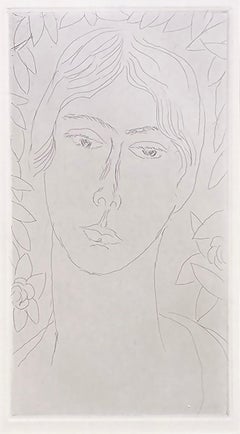
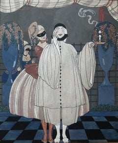
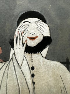
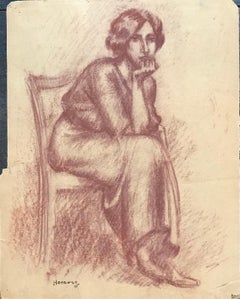
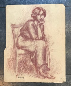
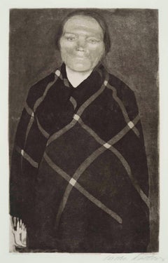
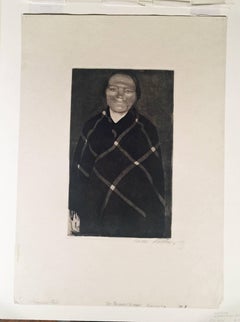
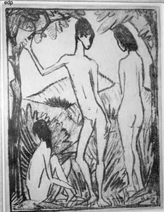
Hodler developed his philosophy of Parallelisme as a unifying approach to art which strips away detail in search of harmony. By means of abstraction, symmetry and repetition, Hodler sought ways to depict Nature’s essence and her fundamental, universal order. He believed these universal laws governing the natural, observable world extend to the spiritual realm. Symbolist in nature with Romantic undertones, his works are equally portraits of these universal concepts and feelings governing all life as they are a visual portrait in the formal sense. Whether his subject is a solitary tree, a moment in battle, mortal fear, despair, the awe inspired by a vast mountain range, a tender moment or even the collective conviction in a belief, Hodler unveils this guiding principle of Parallelisme.
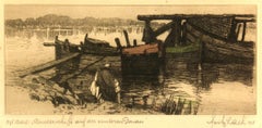
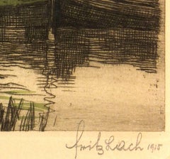
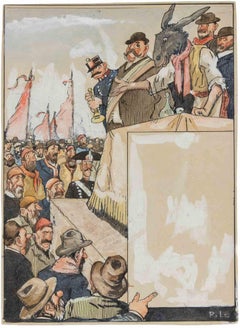
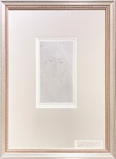
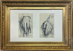
Several aspects of Hodler’s portfolio reinforce his tenets of Parallelisme. The Table of Contents clearly preferences a harmonious design over detail. The two columns, consisting of twenty lines each, list the images by order of appearance using their German titles. The abbreviated titles are somewhat cryptic in that they obscure the identities of the sitters. Like the image Hodler presents, they are distillations of the sitter without any extraneous details. This shortening was also done in an effort to maintain a harmonious symmetry of the Table of Contents, themselves, and keep titles to a one-line limit. The twenty-fourth title: “Bildnis des Schweizerischen Gesandten C.” was so long, even with abbreviation, that it required two lines; so, for the sake of maintaining symmetry, the fortieth title: “Bauernmadchen” was omitted from the list. This explains why the images are not numbered. Hodler’s reasoning is not purely esoteric. Symmetry and pattern reach beyond mere formal design principles. Finding sameness and imposing it over disorder goes to the root of Hodler’s identity and his art. A Swiss native, Hodler was bi-lingual and spoke German and French. Each printed image, even number forty, have titles in both of Hodler’s languages. Certainly, there was a market for Hodler’s work among francophones and this inclusion may have been a polite gesture to that end; however, this is the only place in the portfolio which includes French. With German titles at the lower left of each image, Hodler’s name at bottom center and corresponding French titles at the lower right of each image, there is a harmony and symmetry woven into all aspects of the portfolio. This holds true for the page design, as it applies to each printed image and as it describes the Swiss artist himself. Seen in this light, Hodler’s portfolio of printed work is the epitome of Hodler’s Parallelisme. DAS WERK FERDINAND HODLERS is also one of the most significant documents to best tell the story of how Hodler, from Switzerland, became caught between political cross-hairs and how the changing tides of nations directly impacted the artist during his lifetime as well as the accessibility of his art for generations to come.
The Munich-based publisher of the portfolio, R. Piper & Co., Verlag, plays a crucial role in this story. Publishing on a wide range of subjects from philosophy and world religion to music, literature and the visual arts; the publisher’s breadth of inquiry within any one genre was equal in scope. Their marketing strategy to publish multiple works on Hodler offers great insight as to what a hot commodity Hodler was at that time. R.Piper & Co.’s Almanach, which they published in 1914 in commemoration of their first ten years in business, clearly illustrates the rapid succession- strategically calculated for achieving the deepest and broadest impact - in which they released three works on Hodler to hit the market by the close of 1914. DAS WERK FERDINAND HODLERS was their premier publication. It preceded C.A. Loosli’s Die Zeichnungen Ferdinand Hodlers, a print portfolio after 50 drawings by Hodler which was released in Autumn of 1914 at the mid-level price-point of 75-150 Marks; and a third less expensive collection of prints after original works by Hodler, which had not been included in either of the first two portfolios, was released at the end of that year entitled Ferdinand Hodler by Dr. Ewald Bender.
The title and timing of DAS WERK FERDINAND HODLERS' debut leaves little doubt as to the connection it has with another avant-garde portfolio of art prints, Das Werk Gustav Klimts, released in 5 installments from 1908 -1914 by Galerie Miethke in Vienna. Hodler, himself, was involved in Klimt’s ground-breaking project. As the owner of Klimt’s 1901 painting, “Judith with the Head of Holifernes” which appears as the ninth collotype print in the second installment of Das Werk Gustav Klimts, Hodler was obliged to grant access of the painting to the art printers in Vienna for them to create the collotype sometime before 1908. Hodler had been previously invited in 1904 to take part in what would be the last exhibition of the Vienna Secession before Klimt and others associated with Galerie Miethke broke away. In an interview that same year, Hodler indicated that he respected and was impressed by Klimt. Hodler’s esteem for Klimt went beyond the art itself; he emulated Klimt’s method aimed at increasing his market reach and appeal to a wider audience by creating a print portfolio of his painted work. By 1914, Hodler and his publisher had the benefit of hindsight to learn from Klimt’s Das Werk publication.
Responding to the sluggish sales of Klimt’s expensive endeavor, Hodler’s publisher devised the same diversified 1-2-3 strategy for selling Hodler’s Das Werk portfolio as they did with regards to all three works on Hodler they published that year. For their premium tier of DAS WERKS FERDINAND HODLERS, R. Piper & Co. issued an exclusive Museum quality edition of 15 examples on which Hodler signed each page. At a cost of 600 Marks, this was generally on par with Klimt’s asking price of 600 Kronen for his Das Werk portfolio. A middle-tiered Preferred edition of 30, costing somewhat less and with Hodler’s signature only on the Title Page, was also available. The General edition, targeting the largest audience with its much more affordable price of 150 Marks, is distinguishable by its smaller size.
Rather than use the subscription format Miethke had chosen for Klimt’s portfolios which proved to have had its challenges, R. Piper & Co. employed a different strategy. In addition to instantly gratifying the buyer with all 40 of the prints comprising DAS WERK FERDINAND HODLERS and the choice among three price points, they advertised in German journals a fourth possibility of ordering single prints from them directly. These printed images are easily discernible from the three complete folio editions. The paper size of the single purchased images is of the larger format like the Museum and Preferred editions, measuring 65 h x 50 w cm; however, the paper itself is the same copper print paper used in the General edition and then mounted on poster board. The publishing house positioned itself to be a direct retailer of Hodler’s art. They astutely recognized the potential for profitability and the importance, therefore, of having proprietary control over his graphic works.
R. Piper & Co. owned the exclusive printing rights to Hodler’s best work found in their three publications dating from 1914. That same year, a competing publication out of Weimar entitled Ferdinand Hodler: Ein Deutungsversuch von Hans...
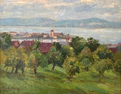
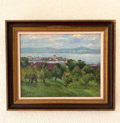
Category
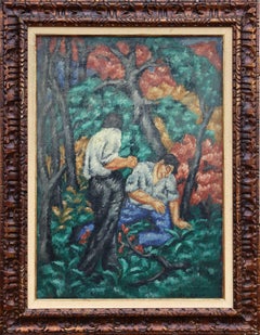
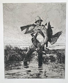
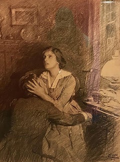
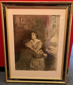
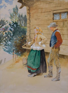
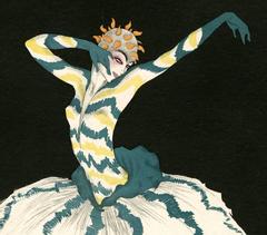
Symbolist 1910s Art