1910s Art

2,179 Results
to
255
1,150
358
401
197
189
Overall Width
to
Overall Height
to
7,669
21,556
166,491
236,895
2,161
2,346
4,732
6,581
6,014
15,887
21,222
26,531
19,338
14,180
5,479
472
291
145
128
54
35
19
12
5
1
1,264
940
38
1,465
718
611
420
390
370
223
145
143
139
134
129
116
107
97
93
81
79
63
61
870
628
519
430
408
136
53
33
24
23
902
442
1,196
1,119
Period: 1910s
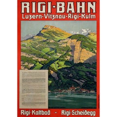
Circa 1910 original travel poster Rigi-Bahn Luzern - Vitznau - Rigi - Kulm

Circa 1910 original travel poster Rigi-Bahn Luzern - Vitznau - Rigi - Kulm

Located in PARIS, FR

This stunning circa 1910 original travel poster promotes the Rigi-Bahn railway route from Luzern through Vitznau to Rigi-Kulm, one of the most picturesque and historic rail journeys ...

Category

1910s Art

Materials

Linen, Paper, Lithograph

Aus Albanien

Aus Albanien

By Ferdinand Andri

Located in Roma, IT

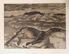
Aus Albanien ("From Albania") is an original artwork realized by Ferdinand Andri in 1916. Lithograph on yellow plate. Printed by k. k. Hof- und Staatsdruckerei Wien / Albert Berger...

Category

Modern 1910s Art

Materials

Lithograph

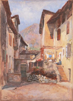
'Alpine Landscape in Piedmont', Munich School Professor

'Alpine Landscape in Piedmont', Munich School Professor

Located in Santa Cruz, CA

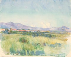
Signed lower left, 'Hans Blum' (German, 1858-1942) and painted circa 1911. Provenance: Exhibited, 'Jubiläums- Ausstellung der Münchener Künstler-Genossenschaft', München 1911 ('Anniv...

Category

Impressionist 1910s Art

Materials

Paper, Watercolor, Gouache, Illustration Board

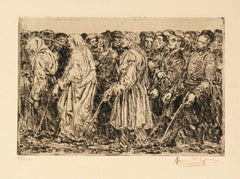
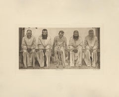
Les Aveugles ( The Blind )

Les Aveugles ( The Blind )

By Henry de Groux

Located in Paonia, CO

Henri DeGroux (1866-1930) was a Belgian Symbolist painter, sculptor and lithographer. He was known for his allegorical, religious and historical subject matter. He became an inspired...

Category

Symbolist 1910s Art

Materials

Lithograph

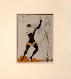
Vaslav Nijinsky as Siegfried in Swan Lake.

Vaslav Nijinsky as Siegfried in Swan Lake.

By George Barbier

Located in London, London

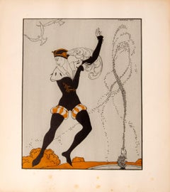
BARBIER, George. Vaslav Nijinsky as Siegfried in Swan Lake. London, C. W. Beaumont, 1913. ‘The designs, although somewhat fantastic in treatment, do convey the impression produced...

Category

Art Nouveau 1910s Art

Materials

Lithograph

"Night Stroll" Amy Londoner, Ashcan School, Figurative Nocturne

"Night Stroll" Amy Londoner, Ashcan School, Figurative Nocturne

By Amy Londoner

Located in New York, NY

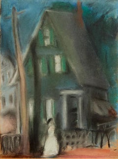
Amy Londoner Beach at Atlantic City, circa 1922 Signed lower right Pastel on paper Sight 23 x 18 inches Amy Londoner (April 12, 1875 – 1951) was an American painter who exhibited at the 1913 Armory Show. One of the first students of the Henri School of Art in 1909. Prior to the Armory Show of 1913, Amy Londoner and her classmates studied with "Ashcan" painter Robert Henri at the Henri School of Art in New York, N.Y. One notable oil painting, 'The Vase', was painted by both Henri and Londoner. Londoner was born in Lexington, Missouri on April 12, 1875. Her parents were Moses and Rebecca Londoner, who moved to Leadville, Colorado, by 1880. In 1899, Amy took responsibility for her father who had come to Los Angeles from Leadville and had mental issues. By 1900, Amy was living with her parents and sister, Blanche, in the vicinity of Leadville, Denver, Colorado. While little was written about her early life, Denver City directories indicated that nineteenth-century members of the family were merchants, with family ties to New York, N.Y. The family had a male servant. Londoner traveled with her mother to England in 1907 then shortly later, both returned to New York in 1909. Londoner was 34 years old at the time, and, according to standards of the day, should have married and raised a family long before. Instead, she enrolled as one of the first students at the Henri School of Art in 1909. At the Henri School, Londoner established friendships with Carl Sprinchorn (1887-1971), a young Swedish immigrant, and Edith Reynolds (1883-1964), daughter of wealthy industrialist family from Wilkes-Barre, PA. Londoner's correspondence, which often included references to Blanche, listed the sisters' primary address as the Hotel Endicott at 81st Street and Columbus Avenue, NYC. Other correspondence also reached Londoner in the city via Mrs. Theodore Bernstein at 252 West 74th Street; 102 West 73rd Street; and the Independent School of Art at 1947 Broadway. In 1911, Londoner vacationed at the Hotel Trexler in Atlantic City, NJ. As indicated by an undated photograph, Londoner also spent time with Edith Reynolds and Robert Henri at 'The Pines', the Reynolds family estate in Bear Creek, PA. Through her connections with the Henri School, Londoner entered progressive social and professional circles. Henri's admonition, phrased in the vocabulary of his historical time period, that one must become a "man" first and an artist second, attracted both male and female students to classes where development of unique personal styles, tailored to convey individual insights and experiences, was prized above the mastery of standardized, technical skill. Far from being dilettantes, women students at the Henri School were daring individuals willing to challenge tradition. As noted by former student Helen Appleton Read, "it was a mark of defiance,to join the radical Henri group." As Henri offered educational alternatives for women artists, he initiated exhibition opportunities for them as well. Troubled by the exclusion of work by younger artists from annual exhibitions at the National Academy of Design, Henri was instrumental in organizing the no-jury, no-prize Exhibition of Independent Artists in 1910. About half of the 103 artists included in the exhibition were or had been Henri students, while twenty of the twenty-six women exhibiting had studied with Henri. Among the exhibition's 631 pieces, nine were by Amy Londoner, including the notorious 'Lady with a Headache'. Similarly, fourteen of Henri's women students exhibited in the groundbreaking Armory Show of 1913, forming about eight percent of the American exhibitors and one-third of American women exhibitors. Of the nine documented works submitted by Londoner, five were rejected, while four pastels of Atlantic City beach scenes, including 'The Beach Umbrellas' now in the Remington Collection, were displayed. Following Henri's example, Londoner served as an art instructor for younger students at the Modern School, whose only requirement was to genuinely draw what they pleased. The work of dancer Isadora Duncan, another artist devoted to the ideals of a liberal education, was also lauded by the Modern School. Henri, who long admired Duncan and invited members of her troupe to model for his classes, wrote an appreciation of her for the Modern School journal in 1915. She was also the subject of Londoner's pastel Isadora Duncan and the Children: Praise Ye the Lord with Dance. In 1914, Londoner traveled to France to spend summer abroad, living at 99 rue Notre Dames des Champs, Paris, France. As the tenets of European modernism spread throughout the United States, Londoner showed regularly at venues which a new generation of artists considered increasingly passe, including the annual Society of Independent Artists' exhibitions between 1918 and 1934, and the Salons of America exhibition in 1922. Londoner also exhibited at the Morton Gallery, Opportunity Gallery, Leonard Clayton Gallery and Brownell-Lambertson Galleries in NYC. Her painting of a 'Blond Girl' was one of two works included in the College Art Associations Traveling Exhibition of 1929, which toured colleges across the country to broad acclaim. Londoner later in life suffered from illnesses then suffered a stroke which resulted in medical bills significantly mounting over the years that her old friends from the Henri School, including Carl Sprinchorn, Florence Dreyfous, Florence Barley, and Josephine Nivison Hopper, scrambled to raise funds and find suitable long-term care facilities for Londoner. Londoner later joined Reynolds in Bear Creek, PA. Always known for her keen wit, Londoner retained her humor and concern for her works even during her illness, noting that "if anything happens to the Endicott, I guess they will just throw them out." Sprinchorn and Reynolds, however, did not allow this to happen. In 1960, Londoner's paintings 'Amsterdam Avenue at 74th Street' and 'The Builders' were loaned by Reynolds to a show commemorating the Fiftieth Anniversary of the Exhibition of Independent Artists in 1910, presented at the Delaware Art Center, Wilmington, DE. In the late 80's, Francis William Remington, 'Bill Remington', of Bear Creek Village PA, along with his neighbor and artist Frances Anstett Brennan, both had profound admiration for Amy Londoner's art work and accomplishments as a woman who played a significant role in the Ashcan movement. Remington acquired a significant number of Londoner's artwork along with Frances Anstett Brenan that later was part of an exhibition of Londoner's artwork in April 15 of 2007, at the Hope Horn...

Category

Ashcan School 1910s Art

Materials

Paper, Pastel

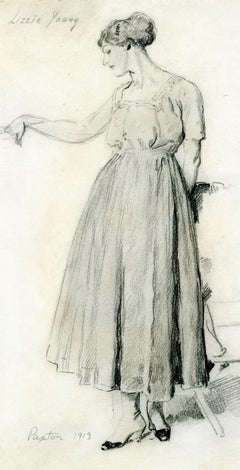
Preliminary Study for the painting Rose and Gold, 1913

Preliminary Study for the painting Rose and Gold, 1913

By William McGregor Paxton

Located in Fairlawn, OH

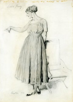
Preliminary Study for the painting Rose and Gold, 1913 Graphite on paper, 1913 Signed in pencil lower left (see photo) Titlted "Lizzy Young" in pencil upper left (see photo) Lizzy was a modle that Paxton depicts numerous times. The painting that this drawing is related to, is illustrated in Lee & Krause, William McGregor Paxton, 1869-1941, Plate 32, text on page 132. The painting was formerly in the collection of Victor Spark and the Honorable Paul Buchanan. It is currently in a Texas Collection. Provenance: Private Collection, Florida William McGregor Paxton (June 22, 1869 – 1941) was an American painter and instructor who embraced the Boston School paradigm and was a co-founder of The Guild of Boston Artists. He taught briefly while a student at Cowles Art School, where he met his wife Elizabeth Okie Paxton, and at the Museum of Fine Arts School in Boston. Paxton is known for his portraits, including those of two presidents—Grover Cleveland and Calvin Coolidge—and interior scenes with women, including his wife. His works are in many museums in the United States. Early life He was born on June 22, 1869, in Baltimore to James and Rose Doherty Paxton. William's father moved the Paxton family and established a catering business in Newton Corner, Massachusetts, in the mid-1870s. Education Paxton attended Cowles Art School on a scholarship he attained at the age of 18. He studied with Dennis Miller Bunker...

Category

American Impressionist 1910s Art

Materials

Graphite

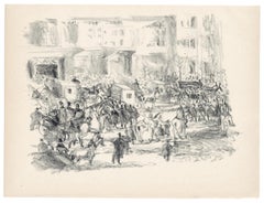
"Begrabnis" original lithograph

"Begrabnis" original lithograph

By Rudolf Grossmann

Located in Henderson, NV

Medium: original lithograph. This is one of the Berlin Scenes executed by Rudolf Grossmann during the years before World War I and published in Germany by Bruno Cassirer from 1911-14...

Category

Expressionist 1910s Art

Materials

Lithograph

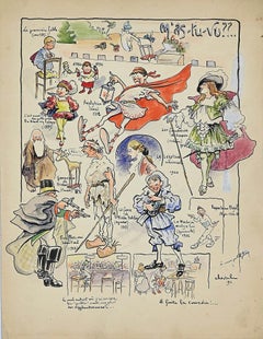
The First Fairy Tale - Original Watercolor and China Ink signed Cheval - 1911

The First Fairy Tale - Original Watercolor and China Ink signed Cheval - 1911

Located in Roma, IT

The first fairy tale is a lovely and colored china ink drawing watercolored signed Cheval and dated 1911. Good conditions, on a brown paper. Hand-signed by the artist on the lower ...

Category

Modern 1910s Art

Materials

Ink, Watercolor

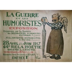
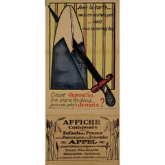
1917 original exhibition poster by M. Leroy La Guerre et les Humoristes

1917 original exhibition poster by M. Leroy La Guerre et les Humoristes

Located in PARIS, FR

The original poster by M. Leroy, titled "La Guerre et les Humoristes," serves as a poignant reflection of the intersection between art and the tumultuous events of World War I. Creat...

Category

1910s Art

Materials

Linen, Paper, Lithograph

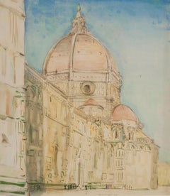
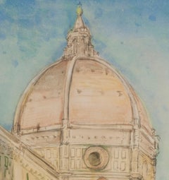
The Duomo, Florence
The Duomo, Florence

The Duomo, Florence

By Donald Shaw MacLaughlan

Located in Fairlawn, OH

The Duomo, Florence Watercolor, 1914 Signed and dated lower center edge (see photo) Florence Cathedral, formally the Cattedrale di Santa Maria del Fiore, is the cathedral of Florence, Italy. It was begun in 1296 in the Gothic style to a design of Arnolfo di Cambio and was structurally completed by 1436, with the dome engineered by Filippo Brunelleschi. Condition: Excellent Image size: 16 3/4 x 14 1/2 inches Frame size: 24 1/4 x 22 inches Donald Shaw MacLaughlan was born in Charlottetown, Prince Edward Island, Canada on November 9, 1876. His family moved to Boston, Massachusetts in 1890 where he began to experiment with different art media; watercolor, oil painting and finally, etching – with a few attempts at lithography. He spent much of his early years at the Boston Public Library studying the work of printmakers, from Durer and Rembrandt to the 18th century English, French and Italian masters. Like many American artists of the time MacLaughlan traveled to Europe to study in Paris, enrolling in the Ecole des Beaux Arts and studied further with Jean Leon Gerome and Jean Paul Laurens. In 1899 he began producing etchings, which became his major interest until his death in 1938. He became acquainted with James NcNeill Whistler (1834-1903) and other artists who created etchings and spent time studying the etchings of Rembrandt van Rijn (1606-1669) and other old masters in the collection of the Bibliothèque Nationale. Both Rembrandt and Whistler would have major influences on his art. In 1900 he created a set of 25 etched views of Paris and in 1901 exhibited two etchings in the Salon de la Société Nationale des Beaux-Arts. He returned to the U.S. in 1903, then went back to Paris the following year. He traveled extensively in Europe, visiting England, Switzerland, Italy and Spain as well as various locales in France. His etched views of Venice were well-known. MacLaughlan exhibited views of Paris, Rouen, Normandy and Italy in 1906 in a solo show at the American Art Association Galleries in Paris. He also displayed his work in the 1906 exhibitions of the Société Nationale des Beaux-Arts and the Société des Peintres-Graveurs Français. MacLaughlan even instructed other expatriate Canadian artists then living in Paris, most notably Clarence...

Category

American Modern 1910s Art

Materials

Watercolor

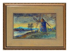
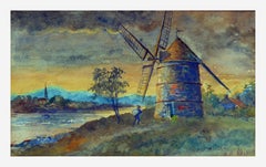
Inlet and Windmill Landscape

Inlet and Windmill Landscape

By William Walker Alexander

Located in Soquel, CA

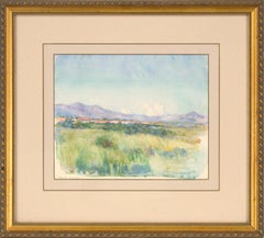
Inlet and windmill, a watercolor painting by William Walker Alexander (Canadian, 1870-1948). Presented a giltwood frame. Signed "W.W Alexander" lower right. Inner mat has minor wear ...

Category

Impressionist 1910s Art

Materials

Paper, Watercolor

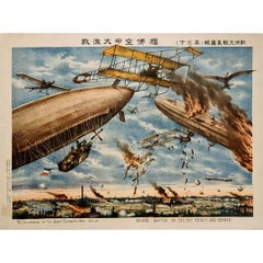
1914 original poster Severe battle in the sky between French and German WWI

1914 original poster Severe battle in the sky between French and German WWI

Located in PARIS, FR

The 1914 original poster depicting the Seuere battle in the sky between French and German forces offers a striking glimpse into the tumultuous era of the Great European War. Produced...

Category

1910s Art

Materials

Linen, Paper, Lithograph

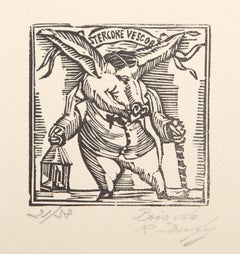
Falourdin, Impressionist Woodcut by Raoul Dufy

Falourdin, Impressionist Woodcut by Raoul Dufy

By Raoul Dufy

Located in Long Island City, NY

Raoul Dufy, French (1877 - 1953) - Falourdin, Year: 1917, Medium: Woodcut, signed and numbered in pencil, Edition: 21/38, Image Size: 2.75 x 2.75 inches, Size: 13 x 9.75 in. (33.02...

Category

Impressionist 1910s Art

Materials

Woodcut

The Old Days - Historical Photo -  The Early 20th century

The Old Days - Historical Photo - The Early 20th century

Located in Roma, IT

The Old Days - Historical Photo is a black and white vintage photo, realized in Early 20th century.  It belongs to historical album including historical moment, royal families, and ...

Category

Modern 1910s Art

Materials

Photographic Paper

La Soirée - Etching and Drypoint  by Anselmo Bucci - 1917

La Soirée - Etching and Drypoint by Anselmo Bucci - 1917

By Anselmo Bucci

Located in Roma, IT

La Soirée - from "Le Croquis du Front Italien" is an Etching and Drypoint realized by the Italian Artist Anselmo Bucci, in 1917 s. Hand signed on the right margin . Edition n. 37/100 specimens on Hollande paper. From the collection: “Croquis du Front Italien” , published in Paris by D'Alignan editions. Good conditions, except for a light yellowing of the paper. Anselmo Bucci (1887-1955) was an Italian painter and printmaker. He took part in the Salon des Indépendants from 1910 on. He enlisted in the Volunteer Cyclist Battalion in 1915 and he became one of the most famous Italian war...

Category

Modern 1910s Art

Materials

Etching

1918 original poster titled Ligue Maritime Française - Les Réalités de la Guerre

1918 original poster titled Ligue Maritime Française - Les Réalités de la Guerre

Located in PARIS, FR

The 1918 original poster titled Ligue Maritime Française - Les Réalités de la Guerre sur Mer was created by Léon Haffner, a renowned French artist and naval illustrator. Known for his depictions of maritime themes, Haffner produced this piece during the final year of World War I, under the commission of the Ligue Maritime Française. This poster was part of a broader campaign by the Ligue Maritime Française to raise awareness of France’s naval challenges and achievements during the war. The focus was on the harsh realities faced by the French Navy as it defended the country’s waters against the threat of German U-boats (submarines). By highlighting the significant victories of the French Navy, particularly the destruction of numerous German submarines, this work was intended to educate the public about the importance of France's maritime defense during the war. The Ligue Maritime Française played a crucial role in promoting maritime interests in France, especially during a time when naval power was critical to national security. Through this poster and similar works, the organization aimed to strengthen public support for the war effort by emphasizing the vital role of the French Navy in protecting the nation. Léon Haffner's involvement in this project underscores his reputation as an artist who could convey the significance of naval warfare through his work. His contributions helped elevate public consciousness regarding the maritime front of World War I, fostering both pride in French naval accomplishments and awareness of the ongoing risks and challenges faced by the nation at sea. The 1918 poster Les Réalités de la Guerre sur Mer is more than just a piece of wartime propaganda; it serves as a historical document, reflecting the broader efforts of France to mobilize public opinion and support for the war. It remains an important artifact from World War I, capturing a critical aspect of the conflict and Léon Haffner's role in illustrating the maritime realities of that time. Original Poster War 14-18 - Navy Maritime map...

Category

1910s Art

Materials

Paper, Lithograph

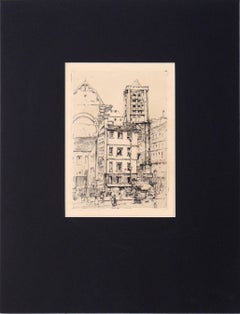
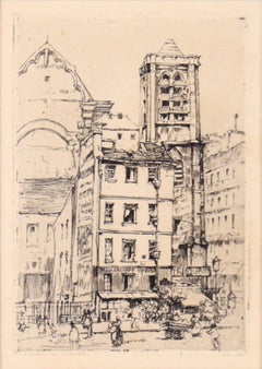
"St. Nicolas du Chardonnet" Etching in Ink on Paper

"St. Nicolas du Chardonnet" Etching in Ink on Paper

Located in Soquel, CA

"St. Nicolas du Chardonnet" Etching in Ink on Paper Delicate and detailed etching by Katherine Kimball (American, 1866-1949). The Catholic church of St. Nicolas du Chardonnet is shown nestled in the streets of Paris. With clever use of line weight and clarity, the building is highlighted and cleanly stands out against the background and surroundings. Stamp with coat of arms on verso. Artist's info written on verso. Presented in a new black mat with foamcore backing. Mat size: 16"H x 12"W Paper size: 10.75"H x 6.75"W Katherine Kimball (American, 1866-1949) was born in Fitzwilliam, New Hampshire. She studied at the National Academy of Design in New York and exhibited in the San Francisco Panama-Pacific Exhibition of 1915. Listed in “Who Was Who in American Art, 1564-1975”; “North American Women Artists...

Category

American Impressionist 1910s Art

Materials

Paper, Ink, Drypoint

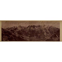
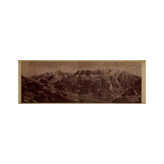
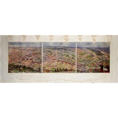
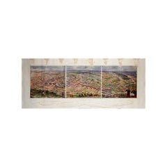
Circa 1910 illustrated document by Paillon - Panoramic view of the Mont Blanc

Circa 1910 illustrated document by Paillon - Panoramic view of the Mont Blanc

Located in PARIS, FR

This rare circa 1910 illustrated document by Maurice Paillon presents a detailed panoramic view of the Mont Blanc Massif, one of the most legendary and awe-inspiring mountain ranges in the world. Capturing the majesty of Western Europe’s highest peak (4,809m) and its surrounding summits, glaciers, and valleys, this historical document serves as both an artistic masterpiece and a valuable mountaineering reference. At the time of its creation, alpinism was flourishing, with climbers from across Europe eager to conquer Mont Blanc and its neighboring peaks. The illustration, likely derived from photographic and topographic studies, offers a remarkably accurate relief representation of the range. Every major peak, ridge, and glacier is meticulously labeled, providing an invaluable geographical guide to the region. The sepia-toned print evokes the early 20th-century aesthetic, blending scientific precision with artistic craftsmanship. The inclusion of key locations such as Chamonix, Aiguille du Midi, Dôme du Goûter, and the Vallée...

Category

1910s Art

Materials

Linen, Paper, Lithograph

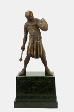
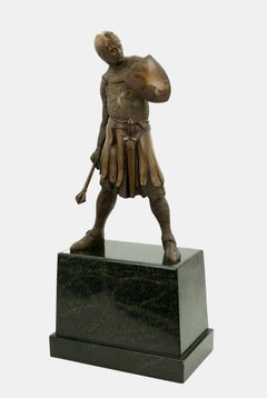
Crusader with shield and mace / - Ready to strike -

Crusader with shield and mace / - Ready to strike -

Located in Berlin, DE

Josef Moest (1873 Cologne - 1914 Rath), Crusader with shield and mace, around 1910. Bronze on a black marble pedestal (19 cm high). 57.5 cm (total height) x 21 cm (width) x 12 cm (de...

Category

Realist 1910s Art

Materials

Bronze

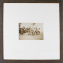
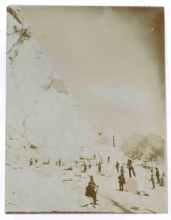
Transportation of Marble Blocks - Vintage Photo - 1910s

Transportation of Marble Blocks - Vintage Photo - 1910s

Located in Roma, IT

Transportation of Marble Blocks is a Silver Salt print realized in the 1910s. From Alinari archive. Good conditions and aged.

Category

Modern 1910s Art

Materials

Photographic Paper

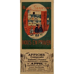
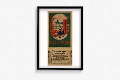
1918 original poster for - "We Will Know How to Do Without"

1918 original poster for - "We Will Know How to Do Without"

Located in PARIS, FR

This 1918 original poster by Camille Boutet, titled "Nous Saurons Nous en Priver" ("We Will Know How to Do Without"), is a striking piece of World War I propaganda, designed to encou...

Category

1910s Art

Materials

Paper, Lithograph

Transportation of Marble Blocks - Vintage Photo - 1910s

Transportation of Marble Blocks - Vintage Photo - 1910s

Located in Roma, IT

Transportation of Marble Blocks is a Silver Salt print realized in the 1910s. From Alinari archive. Good conditions and aged.

Category

Modern 1910s Art

Materials

Photographic Paper

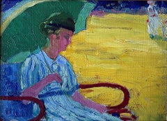
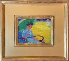
"The Green Parasol, " Henry Hannig, American Impressionist, Woman in Beach Scene

"The Green Parasol, " Henry Hannig, American Impressionist, Woman in Beach Scene

By Henry Hannig

Located in New York, NY

Henry Charles Hannig (1883 - 1948) The Green Parasol Oil on canvas mounted on board 6 x 7 3/4 inches Provenance: R.H. Love Galleries, Chicago, Illinois Private Collection, Lake Orion, Michigan Hannig, born in Hirschberg, Germany on 27 February 1883, came to America with his parents at the age of seven. He attended school in the southwest suburbs before the family settled in Chicago. Young Henry enrolled in the Chicago Academy of Fine Arts where Lawton Parker became his mentor. He made ends meet by working in industrial design and illustration. By 1908 he was a pupil in the School of the Art Institute of Chicago where students followed the traditional European drawing curriculum, beginning with the copying of master engravings and drawing after plaster casts, then concentrating on the nude figure. Students worked toward the goal of winning various academic prizes. One of Hannig's fellow students was Louis Ritman...

Category

American Impressionist 1910s Art

Materials

Canvas, Oil, Board

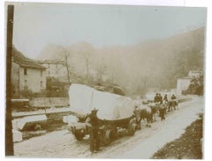
Transportation of Marble Blocks - Vintage Photo - 1910s

Transportation of Marble Blocks - Vintage Photo - 1910s

Located in Roma, IT

Transportation of Marble Blocks is a Silver Salt print realized in the 1910s. From Alinari archive. Good conditions and aged.

Category

Modern 1910s Art

Materials

Photographic Paper

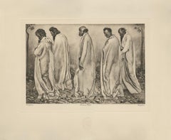
"The World Weary" Copper Plate Heliogravure

"The World Weary" Copper Plate Heliogravure

By Ferdinand Hodler & R. Piper & Co.

Located in Palm Beach, FL

2018 marks the centenary anniversary of Ferdinand Hodler’s death. In that 100 years time, the art world’s esteem of this important artist has proved fickle. It has shifted from extolling his artistic merits during his lifetime to showing something of a feigned disdain- more reflective of the world political order than a true change of heart for Hodler’s work. After years of Hodler being all but a footnote in the annals of art history and generally ignored, finally, the pendulum has righted itself once again. Recent retrospective exhibitions in Europe and the United States have indicated not only a joyful rediscovery of Hodler’s art but a firm conviction that his work and world view hold particular relevance today. DAS WERK FERDINAND HODLERS is not only a collection of printed work reflecting the best of all of his painted work created up to 1914 just before the outbreak of World War I, the portfolio itself is an encapsulation of Hodler’s ethos, Parallelisme. Hodler developed his philosophy of Parallelisme as a unifying approach to art which strips away detail in search of harmony. By means of abstraction, symmetry and repetition, Hodler sought ways to depict Nature’s essence and her fundamental, universal order. He believed these universal laws governing the natural, observable world extend to the spiritual realm. Symbolist in nature with Romantic undertones, his works are equally portraits of these universal concepts and feelings governing all life as they are a visual portrait in the formal sense. Whether his subject is a solitary tree, a moment in battle, mortal fear, despair, the awe inspired by a vast mountain range, a tender moment or even the collective conviction in a belief, Hodler unveils this guiding principle of Parallelisme. Several aspects of Hodler’s portfolio reinforce his tenets of Parallelisme. The Table of Contents clearly preferences a harmonious design over detail. The two columns, consisting of twenty lines each, list the images by order of appearance using their German titles. The abbreviated titles are somewhat cryptic in that they obscure the identities of the sitters. Like the image Hodler presents, they are distillations of the sitter without any extraneous details. This shortening was also done in an effort to maintain a harmonious symmetry of the Table of Contents, themselves, and keep titles to a one-line limit. The twenty-fourth title: “Bildnis des Schweizerischen Gesandten C.” was so long, even with abbreviation, that it required two lines; so, for the sake of maintaining symmetry, the fortieth title: “Bauernmadchen” was omitted from the list. This explains why the images are not numbered. Hodler’s reasoning is not purely esoteric. Symmetry and pattern reach beyond mere formal design principles. Finding sameness and imposing it over disorder goes to the root of Hodler’s identity and his art. A Swiss native, Hodler was bi-lingual and spoke German and French. Each printed image, even number forty, have titles in both of Hodler’s languages. Certainly, there was a market for Hodler’s work among francophones and this inclusion may have been a polite gesture to that end; however, this is the only place in the portfolio which includes French. With German titles at the lower left of each image, Hodler’s name at bottom center and corresponding French titles at the lower right of each image, there is a harmony and symmetry woven into all aspects of the portfolio. This holds true for the page design, as it applies to each printed image and as it describes the Swiss artist himself. Seen in this light, Hodler’s portfolio of printed work is the epitome of Hodler’s Parallelisme. DAS WERK FERDINAND HODLERS is also one of the most significant documents to best tell the story of how Hodler, from Switzerland, became caught between political cross-hairs and how the changing tides of nations directly impacted the artist during his lifetime as well as the accessibility of his art for generations to come. The Munich-based publisher of the portfolio, R. Piper & Co., Verlag, plays a crucial role in this story. Publishing on a wide range of subjects from philosophy and world religion to music, literature and the visual arts; the publisher’s breadth of inquiry within any one genre was equal in scope. Their marketing strategy to publish multiple works on Hodler offers great insight as to what a hot commodity Hodler was at that time. R.Piper & Co.’s Almanach, which they published in 1914 in commemoration of their first ten years in business, clearly illustrates the rapid succession- strategically calculated for achieving the deepest and broadest impact - in which they released three works on Hodler to hit the market by the close of 1914. DAS WERK FERDINAND HODLERS was their premier publication. It preceded C.A. Loosli’s Die Zeichnungen Ferdinand Hodlers, a print portfolio after 50 drawings by Hodler which was released in Autumn of 1914 at the mid-level price-point of 75-150 Marks; and a third less expensive collection of prints after original works by Hodler, which had not been included in either of the first two portfolios, was released at the end of that year entitled Ferdinand Hodler by Dr. Ewald Bender. The title and timing of DAS WERK FERDINAND HODLERS' debut leaves little doubt as to the connection it has with another avant-garde portfolio of art prints, Das Werk Gustav Klimts, released in 5 installments from 1908 -1914 by Galerie Miethke in Vienna. Hodler, himself, was involved in Klimt’s ground-breaking project. As the owner of Klimt’s 1901 painting, “Judith with the Head of Holifernes” which appears as the ninth collotype print in the second installment of Das Werk Gustav Klimts, Hodler was obliged to grant access of the painting to the art printers in Vienna for them to create the collotype sometime before 1908. Hodler had been previously invited in 1904 to take part in what would be the last exhibition of the Vienna Secession before Klimt and others associated with Galerie Miethke broke away. In an interview that same year, Hodler indicated that he respected and was impressed by Klimt. Hodler’s esteem for Klimt went beyond the art itself; he emulated Klimt’s method aimed at increasing his market reach and appeal to a wider audience by creating a print portfolio of his painted work. By 1914, Hodler and his publisher had the benefit of hindsight to learn from Klimt’s Das Werk publication. Responding to the sluggish sales of Klimt’s expensive endeavor, Hodler’s publisher devised the same diversified 1-2-3 strategy for selling Hodler’s Das Werk portfolio as they did with regards to all three works on Hodler they published that year. For their premium tier of DAS WERKS FERDINAND HODLERS, R. Piper & Co. issued an exclusive Museum quality edition of 15 examples on which Hodler signed each page. At a cost of 600 Marks, this was generally on par with Klimt’s asking price of 600 Kronen for his Das Werk portfolio. A middle-tiered Preferred edition of 30, costing somewhat less and with Hodler’s signature only on the Title Page, was also available. The General edition, targeting the largest audience with its much more affordable price of 150 Marks, is distinguishable by its smaller size. Rather than use the subscription format Miethke had chosen for Klimt’s portfolios which proved to have had its challenges, R. Piper & Co. employed a different strategy. In addition to instantly gratifying the buyer with all 40 of the prints comprising DAS WERK FERDINAND HODLERS and the choice among three price points, they advertised in German journals a fourth possibility of ordering single prints from them directly. These printed images are easily discernible from the three complete folio editions. The paper size of the single purchased images is of the larger format like the Museum and Preferred editions, measuring 65 h x 50 w cm; however, the paper itself is the same copper print paper used in the General edition and then mounted on poster board. The publishing house positioned itself to be a direct retailer of Hodler’s art. They astutely recognized the potential for profitability and the importance, therefore, of having proprietary control over his graphic works. R. Piper & Co. owned the exclusive printing rights to Hodler’s best work found in their three publications dating from 1914. That same year, a competing publication out of Weimar entitled Ferdinand Hodler: Ein Deutungsversuch von Hans...

Category

Symbolist 1910s Art

Materials

Paper

Untitled Woodcut
Untitled Woodcut

reni schaschlUntitled Woodcut, 1916

$2,800Sale Price|20% Off

Untitled Woodcut

Located in Wilton, CT

Original hand-colored woodcut from a portfolio of Secessionist fashion illustrations. Signed in the lower right margin by the artist, Reni Schaschl (1895-1979), a talented member of...

Category

Vienna Secession 1910s Art

Materials

Woodcut

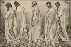
"Eurhythmie" Copper Plate Heliogravure

"Eurhythmie" Copper Plate Heliogravure

By Ferdinand Hodler & R. Piper & Co.

Located in Palm Beach, FL

2018 marks the centenary anniversary of Ferdinand Hodler’s death. In that 100 years time, the art world’s esteem of this important artist has proved fickle. It has shifted from extolling his artistic merits during his lifetime to showing something of a feigned disdain- more reflective of the world political order than a true change of heart for Hodler’s work. After years of Hodler being all but a footnote in the annals of art history and generally ignored, finally, the pendulum has righted itself once again. Recent retrospective exhibitions in Europe and the United States have indicated not only a joyful rediscovery of Hodler’s art but a firm conviction that his work and world view hold particular relevance today. DAS WERK FERDINAND HODLERS is not only a collection of printed work reflecting the best of all of his painted work created up to 1914 just before the outbreak of World War I, the portfolio itself is an encapsulation of Hodler’s ethos, Parallelisme. Hodler developed his philosophy of Parallelisme as a unifying approach to art which strips away detail in search of harmony. By means of abstraction, symmetry and repetition, Hodler sought ways to depict Nature’s essence and her fundamental, universal order. He believed these universal laws governing the natural, observable world extend to the spiritual realm. Symbolist in nature with Romantic undertones, his works are equally portraits of these universal concepts and feelings governing all life as they are a visual portrait in the formal sense. Whether his subject is a solitary tree, a moment in battle, mortal fear, despair, the awe inspired by a vast mountain range, a tender moment or even the collective conviction in a belief, Hodler unveils this guiding principle of Parallelisme. Several aspects of Hodler’s portfolio reinforce his tenets of Parallelisme. The Table of Contents clearly preferences a harmonious design over detail. The two columns, consisting of twenty lines each, list the images by order of appearance using their German titles. The abbreviated titles are somewhat cryptic in that they obscure the identities of the sitters. Like the image Hodler presents, they are distillations of the sitter without any extraneous details. This shortening was also done in an effort to maintain a harmonious symmetry of the Table of Contents, themselves, and keep titles to a one-line limit. The twenty-fourth title: “Bildnis des Schweizerischen Gesandten C.” was so long, even with abbreviation, that it required two lines; so, for the sake of maintaining symmetry, the fortieth title: “Bauernmadchen” was omitted from the list. This explains why the images are not numbered. Hodler’s reasoning is not purely esoteric. Symmetry and pattern reach beyond mere formal design principles. Finding sameness and imposing it over disorder goes to the root of Hodler’s identity and his art. A Swiss native, Hodler was bi-lingual and spoke German and French. Each printed image, even number forty, have titles in both of Hodler’s languages. Certainly, there was a market for Hodler’s work among francophones and this inclusion may have been a polite gesture to that end; however, this is the only place in the portfolio which includes French. With German titles at the lower left of each image, Hodler’s name at bottom center and corresponding French titles at the lower right of each image, there is a harmony and symmetry woven into all aspects of the portfolio. This holds true for the page design, as it applies to each printed image and as it describes the Swiss artist himself. Seen in this light, Hodler’s portfolio of printed work is the epitome of Hodler’s Parallelisme. DAS WERK FERDINAND HODLERS is also one of the most significant documents to best tell the story of how Hodler, from Switzerland, became caught between political cross-hairs and how the changing tides of nations directly impacted the artist during his lifetime as well as the accessibility of his art for generations to come. The Munich-based publisher of the portfolio, R. Piper & Co., Verlag, plays a crucial role in this story. Publishing on a wide range of subjects from philosophy and world religion to music, literature and the visual arts; the publisher’s breadth of inquiry within any one genre was equal in scope. Their marketing strategy to publish multiple works on Hodler offers great insight as to what a hot commodity Hodler was at that time. R.Piper & Co.’s Almanach, which they published in 1914 in commemoration of their first ten years in business, clearly illustrates the rapid succession- strategically calculated for achieving the deepest and broadest impact - in which they released three works on Hodler to hit the market by the close of 1914. DAS WERK FERDINAND HODLERS was their premier publication. It preceded C.A. Loosli’s Die Zeichnungen Ferdinand Hodlers, a print portfolio after 50 drawings by Hodler which was released in Autumn of 1914 at the mid-level price-point of 75-150 Marks; and a third less expensive collection of prints after original works by Hodler, which had not been included in either of the first two portfolios, was released at the end of that year entitled Ferdinand Hodler by Dr. Ewald Bender. The title and timing of DAS WERK FERDINAND HODLERS' debut leaves little doubt as to the connection it has with another avant-garde portfolio of art prints, Das Werk Gustav Klimts, released in 5 installments from 1908 -1914 by Galerie Miethke in Vienna. Hodler, himself, was involved in Klimt’s ground-breaking project. As the owner of Klimt’s 1901 painting, “Judith with the Head of Holifernes” which appears as the ninth collotype print in the second installment of Das Werk Gustav Klimts, Hodler was obliged to grant access of the painting to the art printers in Vienna for them to create the collotype sometime before 1908. Hodler had been previously invited in 1904 to take part in what would be the last exhibition of the Vienna Secession before Klimt and others associated with Galerie Miethke broke away. In an interview that same year, Hodler indicated that he respected and was impressed by Klimt. Hodler’s esteem for Klimt went beyond the art itself; he emulated Klimt’s method aimed at increasing his market reach and appeal to a wider audience by creating a print portfolio of his painted work. By 1914, Hodler and his publisher had the benefit of hindsight to learn from Klimt’s Das Werk publication. Responding to the sluggish sales of Klimt’s expensive endeavor, Hodler’s publisher devised the same diversified 1-2-3 strategy for selling Hodler’s Das Werk portfolio as they did with regards to all three works on Hodler they published that year. For their premium tier of DAS WERKS FERDINAND HODLERS, R. Piper & Co. issued an exclusive Museum quality edition of 15 examples on which Hodler signed each page. At a cost of 600 Marks, this was generally on par with Klimt’s asking price of 600 Kronen for his Das Werk portfolio. A middle-tiered Preferred edition of 30, costing somewhat less and with Hodler’s signature only on the Title Page, was also available. The General edition, targeting the largest audience with its much more affordable price of 150 Marks, is distinguishable by its smaller size. Rather than use the subscription format Miethke had chosen for Klimt’s portfolios which proved to have had its challenges, R. Piper & Co. employed a different strategy. In addition to instantly gratifying the buyer with all 40 of the prints comprising DAS WERK FERDINAND HODLERS and the choice among three price points, they advertised in German journals a fourth possibility of ordering single prints from them directly. These printed images are easily discernible from the three complete folio editions. The paper size of the single purchased images is of the larger format like the Museum and Preferred editions, measuring 65 h x 50 w cm; however, the paper itself is the same copper print paper used in the General edition and then mounted on poster board. The publishing house positioned itself to be a direct retailer of Hodler’s art. They astutely recognized the potential for profitability and the importance, therefore, of having proprietary control over his graphic works. R. Piper & Co. owned the exclusive printing rights to Hodler’s best work found in their three publications dating from 1914. That same year, a competing publication out of Weimar entitled Ferdinand Hodler: Ein Deutungsversuch von Hans Muhlestein appeared. Its author, a young scholar, expressed his frustration with the limited availability of printable work by Hodler. In his Author’s Note on page 19, dated Easter, 1914, Muhlestein confirms that the publisher of Hodler’s three works from that same year owned the exclusive reproductive rights to Hodler’s printed original work. He goes further to explain that even after offering to pay to use certain of those images in his book, the publisher refused. Clearly, a lot of jockeying for position in what was perceived as a hot market was occurring in 1914. Instead, their timing couldn’t have been more ill-fated, and what began with such high hopes suddenly found a much different market amid a hostile climate. The onset of WWI directly impacted sales. Many, including Ferdinand Hodler, publicly protested the September invasion by Germany of France in which the Reims Cathedral, re-built in the 13th century, was shelled, destroying priceless stained glass and statuary and burning off the iron roof and badly damaging its wooden interior. Thomas Gaehtgens, Director of the Getty Research Institute describes how the bombing of Reims Cathedral triggered blindingly powerful and deeply-felt ultra-nationalistic responses: “The event profoundly shocked French intellectuals, who for the most part had an intense admiration for German literature, music and art. By relying on press accounts and abstracting from the visual propagandistic content, they were unable to interpret the siege of Reims without turning away from German culture in disgust. Similarly, the German intelligentsia and bourgeoisie were also shocked to find themselves described as vandals and barbarians. Ninety-three writers, scientists, university professors, and artists signed a protest, directed against the French insults, that defended the actions of the German army.” In similar fashion, a flurry of open letters published in German newspapers and journals as well as telegrams and postcards sent directly to Hodler following his outcry in support of Reims reflected the collectively critical reaction to Hodler’s position. Loosli documents that among the list of telegrams Hodler received was one from none other than his publisher in Germany, R.Piper & Co. Allegiances were questioned. The market for Hodler in Germany immediately softened. Matters worsened for the publisher beyond the German backlash to Hodler and his loss of appeal in the home market; with the war in full swing until 1918, there was little chance a German publisher would have much interest coming from outside of Germany and Austria. Following the war and Hodler’s death in 1918, the economy in Germany continued to spiral out and just 5 years later, hyper-inflation had rendered its currency worthless vis-a-vis its value in the pre-war years. Like the economy, Hodler’s reputation was slow to find currency in these difficult times. Even many French art fans had turned sour on Hodler as they considered his long-standing relationship in German and Austrian art circles. Thus, the portfolio’s rarity in Hodler’s lifetime and, consequently, the availability of these printed images from DAS WERK FERDINAND HODLERS since his death has been scarce. In many ways, Hodler and his portfolios were casualties of war. Thwarted from their intended purpose of reaching a wide audience and show-casing Parallelisme, Hodler’s unique approach to art, this important, undated work has been both elusive and shrouded in mystery. Perhaps DAS WERK FERDINAND HODLERS was left undated as a means of affirming the timelessness of Hodler’s art. Digging back into the past, Hodler’s contemporaries, like R. Piper, C.A. Loosli and Hans Muhlestein, indeed provide the keys to unequivocally clarify what has largely been mired in obscurity. Just after Hodler’s death, the May, 1918 issue of the Burlington Review ran a small column which opined hope for better access to R.Piper & Co.’s DAS WERK FERDINAND HODLERS; 100 years later, it is finally possible. Hodler’s voice rings out through these printed works. Once more, his modern approach to depicting portraits, landscapes and grand scale scenes of Swiss history speak to us of what is universal. Engaging with any one of these images is the chance to connect to Hodler’s vision and his world view- weltanschauung in German, vision du monde in French- however one expresses these concepts through language, its message embedded in his work is the same: “We differ from one another, but we are like each other even more. What unifies us is greater and more powerful than what divides us.” Today, Hodler’s art couldn’t be more timely. FERDINAND HODLER (SWISS, 1853-1918) explored Parallelisme through figurative poses evocative of music, dance and ritual. His images of sex, night, desertion and death as well as his many landscapes exploring the universal longing for harmony with Nature are unique and important works embodying a Symbolist paradigm. Truly a Modern Master, Hodler’s influence can be felt in the work of Gustav Klimt and Kolomon Moser...

Category

Symbolist 1910s Art
Materials

Paper