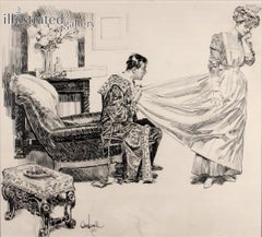
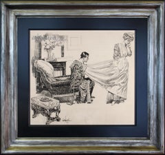
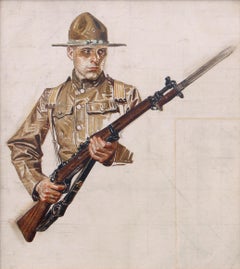
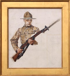
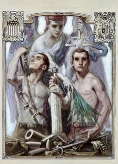
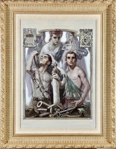
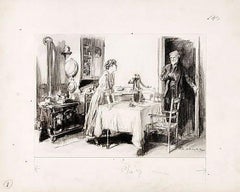
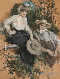
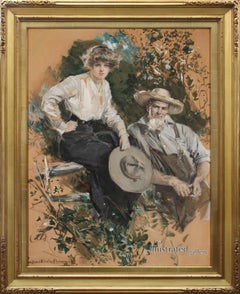
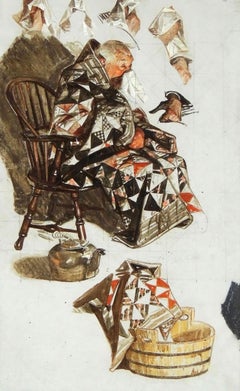
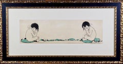
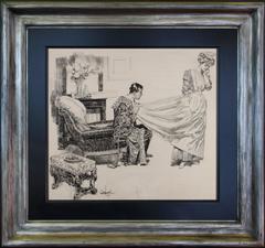
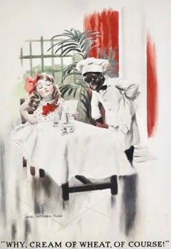
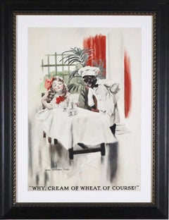
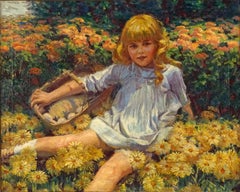
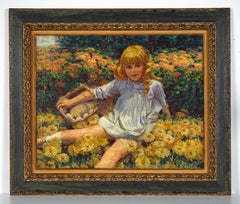
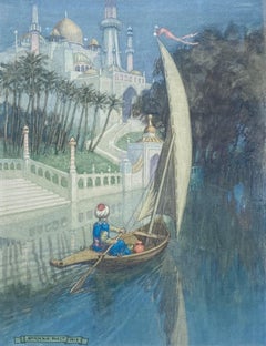
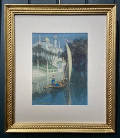
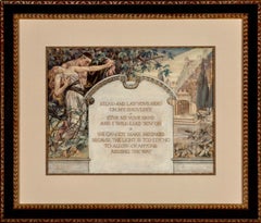
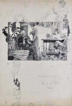
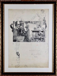
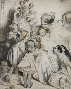
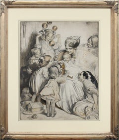
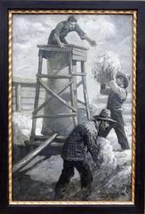
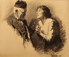
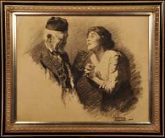
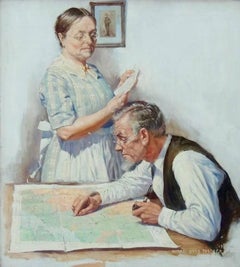
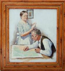
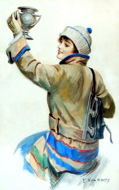
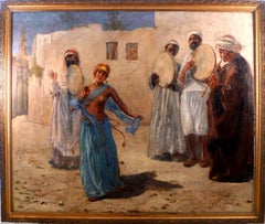
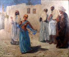
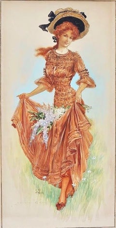
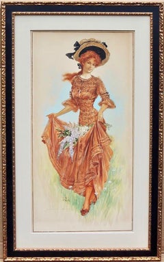
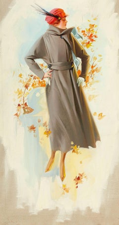
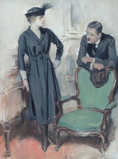
By Jessie Gillespie
Located in Miami, FL
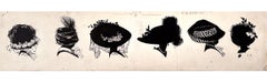
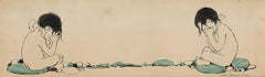
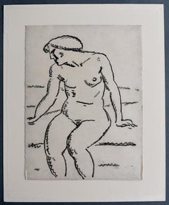
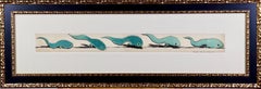
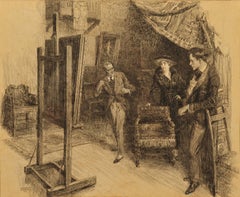
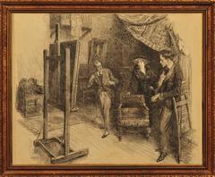
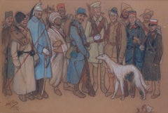
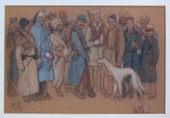
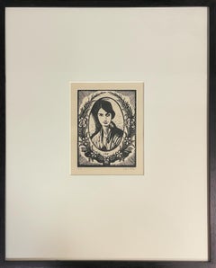
115 years after they were created, one can view these silhouettes differently than the artist’s intent.
After all, the genesis of this work was an editorial illustration for Life Magazine to showcase elaborate women’s hats.
They were done for a commercial assignment with a deadline, and picky editors were overseeing the final work.
Today, they have a dual meaning.
These charming silhouettes are abstractions as much as they are representations.
Moreover, each one is a compact little gem stuffed with observational detail.
Golden Age female illustrator Jesse Gillespie's mastery of technical skill, is apparent in minute details and composition.
Young women, old women, pendants, necklaces, feathers, and laced vails all contribute to the works understated complexity.
The identity of the subjects are revealed by small areas of exposed neck and chin.
As the viewers eyes goes from left to right - all six silhouettes read as fashion hieroglyphs in a sentence with a visual rhythm and cadence. .
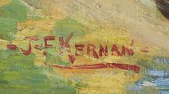
Initialed JG lower right., Matted but not framed.
Published: Life Magazine, March 17th, 1910.
Provenance: Honey and Wax Bookstore
________________________________
From Wikipedia, the free encyclopedia
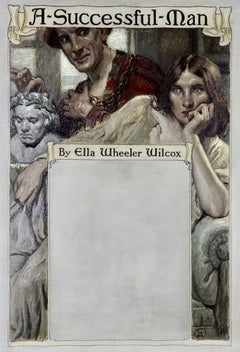
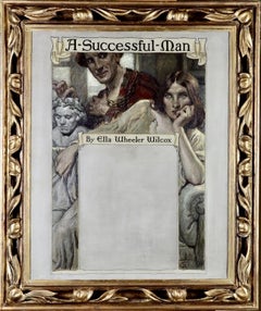
Jessie Gillespie Willing (March 28, 1888 – August 1, 1972) was an American illustrator during the Golden Age of illustration. She was considered the foremost silhouette illustrator of her time, although she did traditional illustration as well. Willing illustrated for books and magazines including Life, The Ladies' Home Journal, Woman's Home Companion, Mother and Child, McClure's Magazine, Childhood Education, the Sunday Magazine, Association Men (the magazine of the YMCA), Farm and Fireside, Every Week, Children: The Magazine for Parents (which became Parents Magazine), and the American Magazine. She is perhaps most well known for her work for the Girl Scouts.
Early life
Willing was born in Brooklyn on March 28, 1888 to John Thomson Willing (August 4, 1860 – July 8, 1947)[1][2] and Charlotte Elizabeth Van Der Veer Willing (December 1, 1859 – March 4, 1930).[3] Thomson Willing was a noted illustrator and art editor. He was also well known for finding new artistic talent. Jessie Willing was the eldest of three children. Her brother Van Der Veer (November 30, 1889 – January 14, 1919), who died of pneumonia at the age of 29, was an advertising agent.[4] Her sister Elizabeth Hunnewell Willing (July 26, 1908 – August 15, 1991) was one of the first women to graduate from the Philadelphia Divinity School.[5][6] Elizabeth married the Rev. Orrin Judd, rector of St. Mary's Episcopal Church, on September 22, 1931, and was active in church work.[citation needed]
The Willing family moved to the Germantown neighborhood of Philadelphia in 1901 or 1902. Jessie Willing attended the Stevens School, from which she graduated in 1905. She then went on to attend the Philadelphia Academy of Fine Arts from 1906 to 1907.[7][8]
Career
Willing used her middle name Gillespie as her professional surname. She also often signed her illustrations J.G.[9] The story goes that the art editor of Life magazine was in Thomson Willing's office when he was the art editor of the Associated Sunday Magazine syndicate. Thomson Willing had some of Jessie's artwork on his desk, which the Life editor saw and admired. He asked for the artist's information so that he could give her freelance work. Thomson Willing did not want to be accused of nepotism so he persuaded Jessie to use Jessie Gillespie as her professional name, which she did.[10][11]
In addition to her extensive illustration work, Willing was also the editor of Heirlooms and Masterpieces from 1922 to 1931 and the art editor of Jewelers' Circular-Keystone from 1933 to 1939.[12] She specialized in jewelry publicity and advertising. In 1966 she won the Gold medal of the Printing Week Graphic Arts Exhibit in Philadelphia for her Christmas catalog for J.E. Caldwell Co., Philadelphia.
Willing was a member of the Plastic Club of Philadelphia,[13] the American Institute of Graphic Arts (AIGA) and the National Arts Club of New York.[14] She was an honorary life member of the National Arts Club[15] and served on its Board of Governors from 1941-1970. In 1963, she received the Gold Medal of the National Arts Club in recognition of 32 years of selfless devotion.[15] Additionally, she was the national director of the American Institute of Graphic Arts (AIGA) from 1943 to 1946.[15] Previous to this she served as the Program Chairman of the AIGA and in that position she put together a travelling exhibit on the "history of narrative art from the first recorded picture story to the comic book of the twentieth century."[16][17]
Illustrations in books
With Tongue and Pen--Frederick Bair, et al. (MacMillan, 1940)
Masoud the Bedouin--Alfred Post Carhart (Missionary Education Movement, 1915)
The Path of the Gopatis--Zilpha Carruthers (National Dairy Council, 1926)
The Schoolmaster and His Son: A Narrative of the Thirty Years War--Karl Heinrich Caspari (Lutheran Publication Society, 1917)
On a Rainy Day--Dorothy Canfield Fisher and Sarah Scott Fisher (A.S. Barnes and Co., 1938)
Book of Games for Home, School and Playground--William B. Forbush and Harry R Allen...
Category
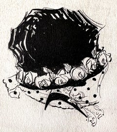
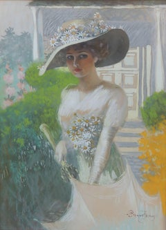
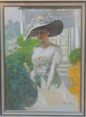
Victorian 1910s Art
MaterialsInk, Illustration Board, Pen