Items Similar to "Acquacaliente, " Colorful Landscape Silkscreen signed by Carol Summers


Want more images or videos?
Request additional images or videos from the seller
1 of 10
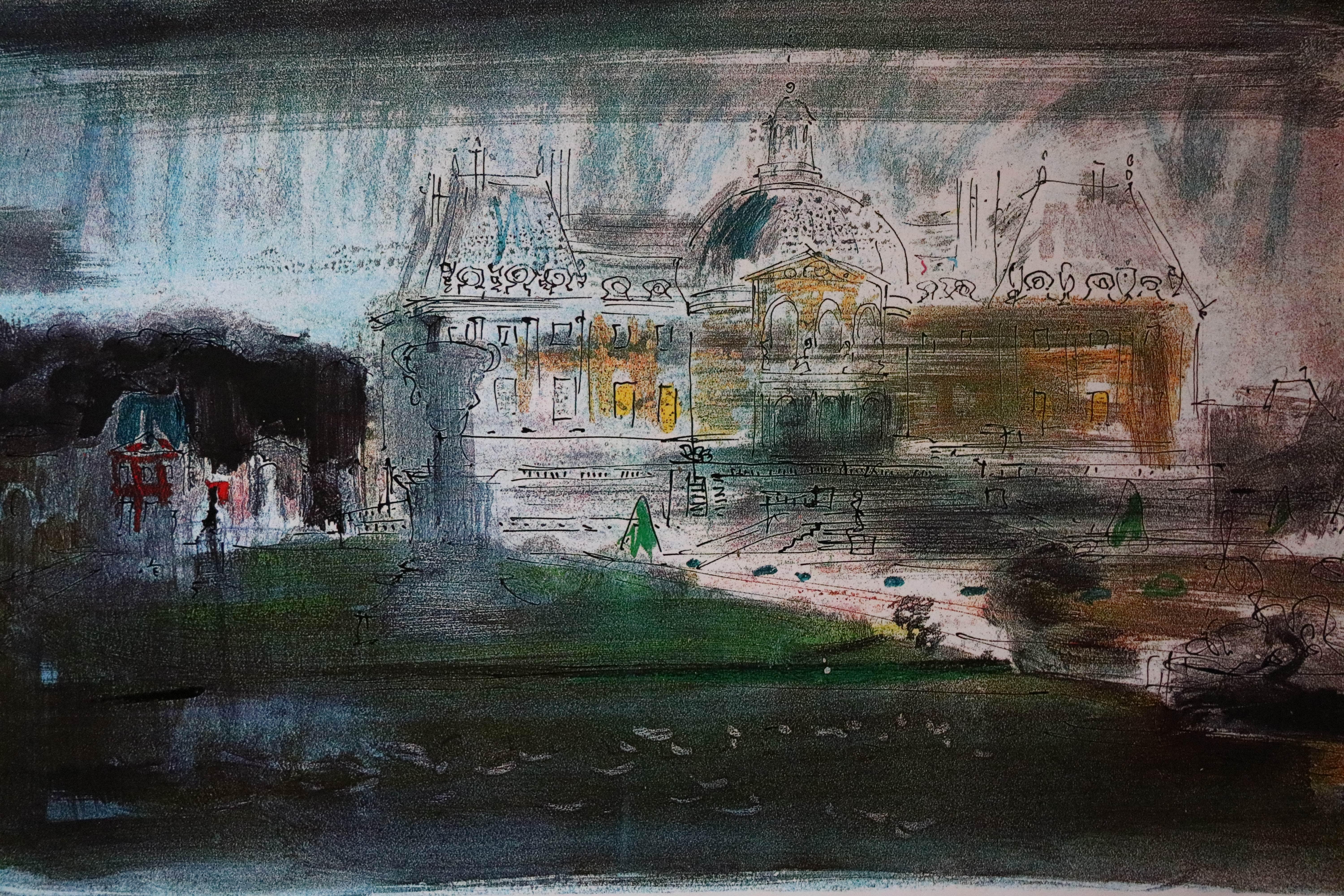
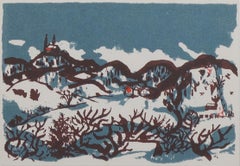
Carol Summers"Acquacaliente, " Colorful Landscape Silkscreen signed by Carol Summers1972
1972
About the Item
"Acquacaliente" is an original color woodcut by Carol Summers. The artist signed the piece in the lower right. This woodcut depicts a fountain spouting rainbows in the background of a colorful landscape. This is an artist's proof for a later signed edition of 75.
20" x 15" art
32 7/8" x 28" frame
Carol Summers has worked as an artist throughout the second half of the 20th century and into the first years of the next, outliving most of his mid-century modernist peers. Initially trained as a painter, Summers was drawn to color woodcuts around 1950 and it became his specialty thereafter.
Over the years he has developed a process and style that is both innovative and readily recognizable. His art is known for it’s large scale, saturated fields of bold color, semi-abstract treatment of landscapes from around the world and a luminescent quality achieved through a printmaking process he invented.
In a career that has extended over half a century, Summers has hand-pulled approximately 245 woodcuts in editions that have typically run from 25 to 100 in number. His talent was both inherited and learned.
Born in 1925 in Kingston, a small town in upstate New York, Summers was raised in nearby Woodstock with his older sister, Mary. His parents were both artists who had met in art school in St. Louis. During the Great Depression, when Carol was growing up, his father supported the family as a medical illustrator until he could return to painting. His mother was a watercolorist and also quite knowledgeable about the different kinds of papers used for various kinds of painting. Many years later, Summers would paint or print on thinly textured paper originally collected by his mother.
From 1948 to 1951, Carol Summers trained in the classical fine and studio arts at Bard College and at the Art Students League of New York. He studied painting with Steven Hirsh and printmaking with Louis Schanker. He admired the shapes and colors favored by early modernists Paul Klee (Sw: 1879-1940) and Matt Phillips (Am: b.1927- ). After graduating, Summers quit working as a part-time carpenter and cabinetmaker (which had supported his schooling and living expenses) to focus fulltime on art. That same year, an early abstract, Bridge No. 1 was selected for a Purchase Prize in a competition sponsored by the Brooklyn Museum. In 1952, his work (Cathedral, Construction and Icarus) was shown the first time at the Museum of Modern Art in New York City in an exhibition of American woodcuts.
In 1954, Summers received a grant from the Italian government to study for a year in Italy. Woodcuts completed soon after his arrival there were almost all editions of only 8 to 25 prints, small in size, architectural in content and black and white in color. The most well-known are Siennese Landscape and Little Landscape, which depicted the area near where he resided. Summers extended this trip three more years, a decision which would have significant impact on choices of subject matter and color in the coming decade. After returning from Europe, Summers’ images continued to feature historical landmarks and events from Italy as well as from France, Spain and Greece. However, as evidenced in Aetna’s Dream, Worldwind and Arch of Triumph, a new look prevailed. These woodcuts were larger in size and in color. Some incorporated metal leaf in the creation of a collage and Summers even experimented with silkscreening. Editions were now between 20 and 50 prints in number. Most importantly, Summers employed his rubbing technique for the first time in the creation of Fantastic Garden in late 1957. Dark Vision of Xerxes, a benchmark for Summers, was the first woodcut where Summers experimented using mineral spirits as part of his printmaking process.
A Fulbright Grant as well as Fellowships from the Louis Comfort Tiffany Foundation and the Guggenheim Foundation followed soon thereafter, as did faculty positions at colleges and universities primarily in New York and Pennsylvania. During this period he married a dancer named Elaine Smithers with whom he had one son, Kyle.
Around this same time, along with fellow artist Leonard Baskin, Summers pioneered what is now referred to as the “monumental” woodcut. This term was coined in the early 1960s to denote woodcuts that were dramatically bigger than those previously created in earlier years, ones that were limited in size mostly by the size of small hand-presses. While Baskin chose figurative subject matter, serious in nature and rendered with thick, striated lines, Summers rendered much less somber images preferring to emphasize shape and color; his subject matter approached abstraction but was always firmly rooted in the landscape. In addition to working in this new, larger scale, Summers simultaneously refined a printmaking process which would eventually be called the “Carol Summers Method” or the “ Carol Summers Technique”.
Summers produces his woodcuts by hand, usually from one or more blocks of quarter-inch pine, using oil-based printing inks and porous mulberry papers. His woodcuts reveal a sensitivity to wood especially its absorptive qualities and the subtleties of the grain. In several of his woodcuts throughout his career he has used the undulating, grainy patterns of a large wood plank to portray a flowing river or tumbling waterfall. The best examples of this are Dream, done in 1965 and the later Flash Flood Escalante, in 2003.
In the majority of his woodcuts, Summers makes the blocks slightly larger than the paper so the image and color will bleed off the edge. Before printing, he centers a dry sheet of paper over the top of the cut wood block or blocks, securing it with giant clips. Then he rolls the ink directly on the front of the sheet of paper and pressing down onto the dry wood block or reassembled group of blocks.
Summers is technically very proficient; the inks are thoroughly saturated onto the surface of the paper but they do not run into each other. The precision of the color inking in Constantine’s Dream in 1969 and Rainbow Glacier in 1970 has been referred to in various studio handbooks. Summers refers to his own printing technique as “rubbing”. In traditional woodcut printing, including the Japanese method, the ink is applied directly onto the block. However, by following his own method, Summers has avoided the mirror-reversed image of a conventional print and it has given him the control over the precise amount of ink that he wants on the paper.
After the ink is applied to the front of the paper, Summers sprays it with mineral spirits, which act as a thinning agent. The absorptive fibers of the paper draw the thinned ink away from the surface softening the shapes and diffusing and muting the colors. This produces a unique glow that is a hallmark of the Summers printmaking technique. Unlike the works of other color field artists or modernists of the time, this new technique made Summers’ extreme simplification and flat color areas anything but hard-edged or coldly impersonal. By the 1960s, Summers had developed a personal way of coloring and printing and was not afraid of hard work, doing the cutting, inking and pulling himself.
In 1964, at the age of 38, Summers’ work was exhibited for a second time at the Museum of Modern Art. This time his work was featured in a one-man show and then as one of MOMA’s two-year traveling exhibitions which toured throughout the United States. In subsequent years, Summers’ works would be exhibited and acquired for the permanent collections of multiple museums throughout the United States, Europe and Asia.
Summers’ familiarity with landscapes throughout the world is firsthand. As a navigator-bombardier in the Marines in World War II, he toured the South Pacific and Asia. Following college, travel in Europe and subsequent teaching positions, in 1972, after 47 years on the East Coast, Carol Summers moved permanently to Bonny Doon in the Santa Cruz Mountains in Northern California. There met his second wife, Joan Ward Toth, a textile artist who died in 1998; and it was here his second son, Ethan was born. During the years that followed this relocation, Summers’ choice of subject matter became more diverse although it retained the positive, mostly life-affirming quality that had existed from the beginning. Images now included moons, comets, both sunny and starry skies, hearts and flowers, all of which, in one way or another, remained tied to the landscape.
In the 1980s, from his home and studio in the Santa Cruz mountains, Summers continued to work as an artist supplementing his income by conducting classes and workshops at universities in California and Oregon as well as throughout the Mid and Southwest. He also traveled extensively during this period hiking and camping, often for weeks at a time, throughout the western United States and Canada. Throughout the decade it was not unusual for Summers to backpack alone or with a fellow artist into mountains or back country for six weeks or more at a time. Not surprisingly, the artwork created during this period rarely departed from images of the land, sea and sky. Summers rendered
these landscapes in a more representational style than before, however he always kept them somewhat abstract by mixing geometric shapes with organic shapes, irregular in outline. Some of his most critically acknowledged work was created during this period including First Rain,1985 and The Rolling Sea, 1989.
Summers received an honorary doctorate from his alma mater, Bard College in 1979 and was selected by the United States Information Agency to spend a year conducting painting and printmaking workshops at universities throughout India. Since that original sabbatical, he has returned every year, spending four to eight weeks traveling throughout that country. In the 1990s, interspersed with these journeys to India have been additional treks to the back roads and high country areas of Mexico, Central America, Nepal, China and Japan.
Travel to these exotic and faraway places had a profound influence on Summers’ art. Subject matter became more worldly and nonwestern as with From Humla to Dolpo, 1991 or A Former Life of Budha, 1996, for example. Architectural images, such as The Pillars of Hercules, 1990 or The Raja’s Aviary , 1992 became more common. Still life images made a reappearance with Jungle Bouquet in 1997.
This was also a period when Summers began using odd-sized paper to further the impact of an image. The 1996 Night, a view of the earth and horizon as it might be seen by an astronaut, is over six feet long and only slightly more than a foot-and-a-half high. From 1999, Revuelta A Vida (Spanish for “Return to Life”) is pie-shaped and covers nearly 18 cubic feet. It was also at this juncture that Summers began to experiment with a somewhat different palette although he retained his love of saturated colors. The 2003 Far Side of Time is a superb example of the new direction taken by this colorist.
At the turn of the millennium in 1999, “Carol Summers Woodcuts, 50 Year Retrospective” exhibitions were held by the Woodstock Artists Association in New York and at the Museum of Art and History in Santa Cruz, California. Summers was chosen Printmaker of the Year in 2004 by the Mid-America Print Council (an outgrowth of the earlier Prairie Printmakers Association) which included a commemorative exhibition of his work at the University of Nebraska Art Center. Since the turn of the century, Summers’ woodcuts have generally been somewhat smaller in scale but more complex and more technically difficult to create. Chamba Bamba created in 2004 and Los Volcanes de Dia Y Noche completed in 2005, are more recent editions by Summers which required multiple blocks, plus more inks and roller work than many of those before.
In 2005, Carol Summers published the first of two catalogs highlighting artifacts from his extensive collection of early 20th century East Indian folk textiles collected over the past 35 years. A Treasury of Indian Folk Textiles will be followed by a second catalog of textiles to be published in 2006. A look through these catalogs shows why Summers is so attracted to the fabrics, shawls, wall-hangings, blankets and articles of clothing from various villages throughout India. He says that he looks upon these objects as works of art that pay homage to the vitality and imagination of their creators. He also acknowledges that in them he sees his own preferences for fields of color, bright and deeply saturated in shapes and forms that tell a story.
- Creator:Carol Summers (1925 - 2016, American)
- Creation Year:1972
- Dimensions:Height: 32.88 in (83.52 cm)Width: 28 in (71.12 cm)
- Medium:
- Movement & Style:
- Period:
- Framing:Frame IncludedFraming Options Available
- Condition:
- Gallery Location:Milwaukee, WI
- Reference Number:
About the Seller
4.9
Platinum Seller
These expertly vetted sellers are 1stDibs' most experienced sellers and are rated highest by our customers.
Established in 1966
1stDibs seller since 2017
390 sales on 1stDibs
Typical response time: 1 hour
- ShippingRetrieving quote...Ships From: Milwaukee, WI
- Return PolicyA return for this item may be initiated within 14 days of delivery.
More From This SellerView All
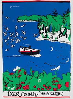
- "Door County, Wisconsin, " Landscape Silkscreen Travel PosterBy Schomer LichtnerLocated in Milwaukee, WI"Door County Wisconsin" is an original silkscreen by Schomer Lichtner. The artist signed the piece lower right in pencil and in the screen. This piece feat...Category
1980s Contemporary Landscape Prints
MaterialsInk, Screen
- "Anticipating Spring" AP Print after Original Watercolor signed by David BarnettBy David BarnettLocated in Milwaukee, WI"Anticipating Spring" is a giclee print on watercolor paper, printed from a scanned original watercolor by David Barnett. It is signed and dated by the artist in the lower right. Thi...Category
Early 2000s Abstract Landscape Prints
MaterialsGiclée
- "Arroyo, " Original Woodcut and Monotype signed by Carol SummersBy Carol SummersLocated in Milwaukee, WI"Arroyo" is an original woodcut and monotype by Carol Summers. The artist signed the piece. It is from an edition of 120 and depicts an abstract landscape in blues and greens. 14 1...Category
1980s Abstract Expressionist Landscape Prints
MaterialsMonotype, Woodcut
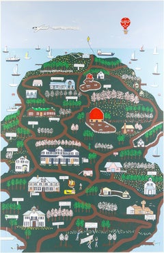
- "Door County, " Original Silkscreen Print by Pamela BachmanBy Pamela BachmanLocated in Milwaukee, WI"Door County" is an original silkscreen by Pamela Bachman. IT depicts an aerial view of different attractions in Door County, Wisconsin. The artist signed ...Category
1980s Landscape Prints
MaterialsScreen
- "Mediterranean, " Original Serigraph Seascape sigmed by Cristina VillamorBy Cristina VillamorLocated in Milwaukee, WI"Mediterranean" is an original color serigraph by Cristina Villamor. The artist signed the piece lower right. This piece is edition 23/350. It depicts a white building overlooking th...Category
1990s Contemporary Landscape Prints
MaterialsScreen
- "Skiing Near Holy Hill, " Original Silkscreen Landscape by Schomer LichtnerBy Schomer LichtnerLocated in Milwaukee, WI"Skiing Near Holy Hill" is an original silkscreen print by Schomer Lichtner. The artist initials are lower right, and the title is along the lower edge. This print depicts people skiing near Holy Hill, Wisconsin. The artist used a muted blue, a deep and dark purple, and accents of red to create this piece. 4 7/8" x 6 7/8" art 11 7/8" x 13 7/8" frame Milwaukee artist, Schomer Lichtner passed away on May 9, 2006 at the age of 101. He continued to amaze and create with his whimsical paintings of ballerinas and cows. He and his late wife Ruth Grotenrath, both well-known Wisconsin artists, began their prolific careers as muralists for WPA projects, primarily post offices. Schomer Lichtner was well known for his whimsical cows and ballerinas, such as his "Ballerina Dancing on Cow" sculpture below. The late James Auer, art critic for the Milwaukee Journal Sentinel referred to Lichtner as the artist laureate of Milwaukee, Wisconsin. He was the official artist of the Milwaukee Ballet. Lichtner also painted murals for industry and private clients. Schomer was a printmaker and produced block prints, lithographs, and serigraph prints. His casein (paint made from dairy products) and acrylic paintings are of the rural Wisconsin landscape and farm animals. He became interested in cows when he and Ruth spent summers near Holy Hill in Washington County. According to David Gordon, director of the Milwaukee Art Museum, Schomer Lichtner had a tremendous joie de vivre, " joy of life," and expressed it in his art. Schomer Lichtner was nationally known for his whimsical paintings and sculptures of black- and white-patterned Holstein cows and elegant ballerina dancers. Lichtner also painted all sorts of combinations of beautiful women, flowers and country landscapes. James Auer, former Milwaukee Journal Sentinel art critic, said that his art eventually "exploded into expressionistic design elements with bold, flat areas of color and high energy that anticipated Pop Art." Auer went on to describe Lichtner’s work as full of "wit, vigor and virtuosity." As early as 1930, Lichtner’s work was shown at the prestigious Carnegie International Exhibition in New York and at museums throughout the Midwest. As a student, he was a protégé of another icon of 20th century American art, Gustave Moeller...Category
1940s American Modern Landscape Prints
MaterialsScreen

You May Also Like
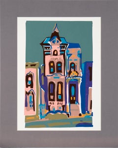
- Victorian House - Multi Layer Fauvist Screenprint on Archival PaperBy Doris WarnerLocated in Soquel, CABold and bright depiction of a Victorian house by Virginia J Hughins (Virginia Brubaker DeWolf) (American, 1923-2004). The scene is composed of chunky,...Category
1980s Abstract Impressionist Landscape Prints
MaterialsPaper, Ink, Screen
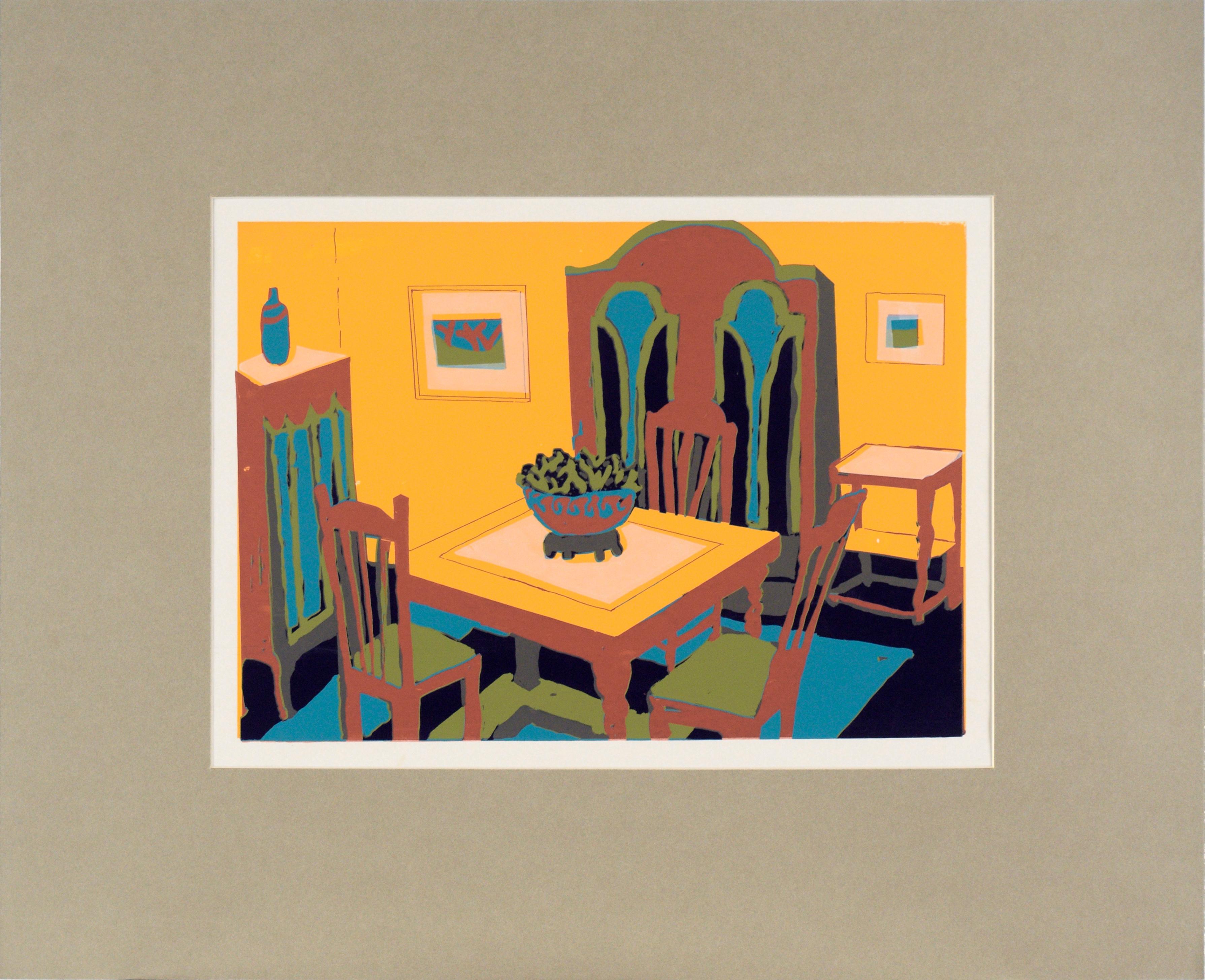
- Yellow Dining Room Interior - Multi Layer Fauvist Screenprint on Archival PaperBy Doris WarnerLocated in Soquel, CABold and bright depiction of a dining room by Virginia J Hughins (Virginia Brubaker DeWolf) (American, 1923-2004). The scene is composed of chunky, rectilinear forms, creating an ani...Category
1980s Abstract Impressionist Landscape Prints
MaterialsPaper, Ink, Screen
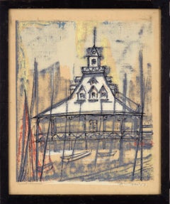
- "Boat House" San Diego- Multi Layer Screen Print in Ink on CardstockLocated in Soquel, CA"Boat House" - Multi Layer Screen Print in Ink on Heavy Cardstock Mid-century modern design of the San Diego Harbor boat house by H. Wilson Smith (Wilson H. Smith)(American, 1901-1981). This scene is created in a characteristic mid-century style, with lots of vertical lines. The outlines have a minimalist feel, but the coloration is partially abstracted, creating a contrast between the two styles. Signed "H W Smith" in the lower right corner. Titled "Boat House" in the lower left corner. Presented in a black wood frame. Frame size: 17"H x 14"W Image size: 15.5"H x 12.5"W H. Wilson Smith (Wilson H. Smith) (American, 1901-1981) was born in Nebraska on May 7, 1901, (Father William H. smith). Smith was a resident of Richmond, CA in 1932 and Los Angeles in 1937-38. Smith moved to San Diego where he operated his own advertising art firm. He was responsible for designs used in the 1965 New York World’s Fair...Category
Mid-20th Century Abstract Impressionist Landscape Prints
MaterialsInk, Screen, Illustration Board
- Mid Century Abstracted Landscape --First FrostBy Kenneth W. AuvilLocated in Soquel, CAWonderful mid-century abstracted landscape serigraph by Kenneth William Auvil (American, b. 1929), 1960. Signed and dated lower right corner. Center edge number "23/27" and titled on...Category
1960s Abstract Landscape Prints
MaterialsInk, Laid Paper, Screen
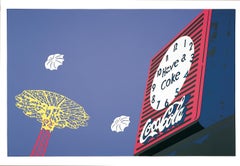
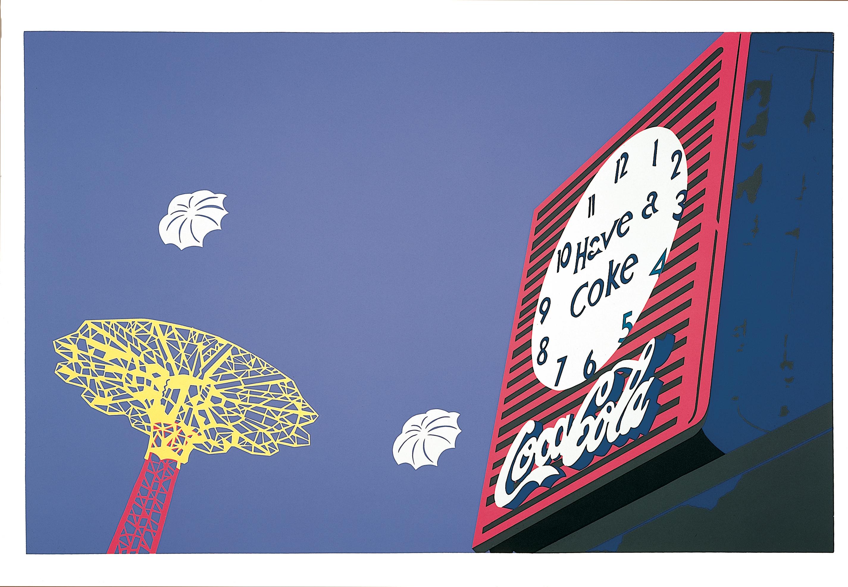
- Clock & Chute, 1981By Philomena MaranoLocated in Brooklyn, NYEdition of 200 Coney Island Philomena Marano is known for her colorful cut paper technique. She worked with Robert Indiana. Ms. Marano's work is in m...Category
1980s Hard-Edge Abstract Prints
MaterialsScreen
- Death in Venice Series - Bridge of Sighs. Black and White Limited edition LithoBy John Piper CHLocated in ludlow, GBIt is called "Death in Venice" a Screenprint by one of Wales's most famous sons - John Piper (1903 - 1992) The Death in Venice Suite was produced in 1973 and consists of 10 Screenpr...Category
Late 20th Century Abstract Impressionist Landscape Prints
MaterialsScreen