Items Similar to UNIQUE one-of-a-kind Signed Drawings on Everything is Shit Except You Love print

Want more images or videos?
Request additional images or videos from the seller
1 of 11
Stephen PowersUNIQUE one-of-a-kind Signed Drawings on Everything is Shit Except You Love print2017
2017
$5,500
£4,239.82
€4,819.10
CA$7,836.69
A$8,525.51
CHF 4,498.78
MX$102,533.98
NOK 56,750.39
SEK 52,815.23
DKK 35,990.78
About the Item
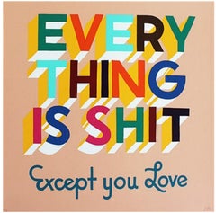
Stephen Powers
Everything is Shit Except You Love (How We Met is Our Story), with unique drawings, 2017
Original graphite drawings on screen print in four colors on 335 gsm Coventry rag paper
Pencil signed, numbered 2/100 and with unique pencil drawings and annotations by the artist
12 x 12 inches
Unframed
Here, the artist has taken one of his most iconic and popular silkscreens "Everything is Shit Except You Love", and added unique, original drawings and text annotations - telling a charming and unique story ideal for any couple's bedroom, living room or dining room. This drawing depicts the image of a pencil, in the midst of writing, with the text "How we met is our story" - and an image of coffee and croissants. There are also stacks of $$ bills, with the commentary "it all evens out", and perhaps most charmingly, the artist has numbered the work 2/50 -- then corrected it to number 2/100, with the annotation "Sorry, wrong number."
So, while the published edition of this work is 2/100, the epiphanies, drawings, and text commentary make it entirely unique - and quite romantic too.
About Stephen Powers
A Fulbright scholar who has been awarded many public commissions and exhibited in major institutions like the Brooklyn Museum.... Born and raised in Philadelphia’s Overbrook neighborhood, Stephen Powers (b. 1968, Philadelphia) moved to New York in 1994, where he gained attention as the publisher of On the Go magazine and the author of the graffiti history The Art of Getting Over. In 1997, Powers undertook an ambitious and far-reaching graffiti campaign of his own, using the official-sounding acronym ESPO (Exterior Surface Painting Outreach) to deflect attention from the illegality of his activities. By 1999, he had covered dozens of storefront grates with giant silver block lettering. Powers gave up street graffiti the following year to concentrate on studio-based projects.
Powers’s work typically fuses word and image in paintings and graphics that evoke the bright look of a handmade bodega and fairground signage while reflecting the artist’s playful sense of humor. In 2005, he curated The Dreamland Artists Club, commissioning more than forty-five artists to repaint signage in Coney Island. As a 2007 Fulbright Scholar, Powers teamed up with local teenagers to create public works in Dublin and Belfast; the latter inspired in part by the city’s tradition of political murals. More recently, he collaborated on A Love Letter for You, in which he and a twenty-artist crew transformed a stretch of West Philadelphia into an open valentine with a series of romantic messages.
"I used to write graffiti, and graffiti is boiling down your whole life into one word, then repeating that word in as many ways as you can, until the word fills years like the days on a calendar. When I stopped writing graffiti and started making art, I went from one word to the rest of them. Words are good but people don’t read anymore — witness the proliferation of emojis as a language. Emojis can only say so much, so I combine word and image to depict the entire world. I make paintings like they were originally made, in a dark cave by a person with limited resources and a need to record what is compelling him to be told. I have more resources and data at my disposal, but it’s still dark, and I’m still compelled to draw the light." - Stephen Powers
- Creator:Stephen Powers
- Creation Year:2017
- Dimensions:Height: 12 in (30.48 cm)Width: 12 in (30.48 cm)
- Medium:
- Movement & Style:
- Period:
- Condition:Unframed.
- Gallery Location:New York, NY
- Reference Number:1stDibs: LU1745216519842
About the Seller
5.0
Gold Seller
Premium sellers maintaining a 4.3+ rating and 24-hour response times
Established in 2007
1stDibs seller since 2022
466 sales on 1stDibs
Typical response time: 2 hours
- ShippingRetrieving quote...Shipping from: New York, NY
- Return Policy
More From This Seller
View AllEverything is Shit Except You Love silkscreen by renowned street artist signed/N
By Steven Powers
Located in New York, NY
Stephen Powers
Everything is Shit Except You Love, ca. 2012
Silkscreen in colors on 254 GSM Coventry Rag Paper
Hand signed and numbered 18/50 by the artist on the lower right front. ...
Category
2010s Street Art Abstract Prints
Materials
Rag Paper, Screen

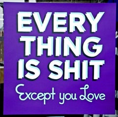
Everything is Shit Except You Love, rare signed Printers Proof, early silkscreen
Located in New York, NY
Stephen Powers
Everything is Shit Except You Love, 2012
17 Color silkscreen on 335 GSM Coventry rag paper
24 × 24 inches
Edition PP 2/4
Hand signed and numbered PP 2/4 in graphite p...
Category
2010s Pop Art Abstract Prints
Materials
Screen
EVERYTHING IS SHIT Except You Love silkscreen, 1 of 3 signed Printer's Proofs
Located in New York, NY
Stephen Powers
EVERYTHING IS SHIT Except You Love, 2014
Screenprint on 335 GSM Coventry Rag paper
24 × 24 inches
Edition PP 3/3
Hand Signed and numbered in the artist's distinctive hand. One of only three rare Printer's Proofs
Rare collectible! One of only three (3) printers proofs!! For offer here is an 11 Color lithograph on 335 GSM Coventry Rag paper featuring the incredibly popular message : "Everything is Shit Except you Love” by artist Stephen Powers, who recently exhibited at the Brooklyn Museum. The simple messaging with bold, playful lettering with purple background has resonated with so many, and the edition sold out almost immediately. This is one of only three rare Printers Proofs, aside from the regular edition, which is also long sold out. In excellent condition; never framed. Makes a terrific gift that says it all. Excellent provenance: Acquired directly from the printer.
About Stephen Powers
A Fulbright scholar who has been awarded many public commissions and exhibited in major institutions like the Brooklyn Museum.... Born and raised in Philadelphia’s Overbrook neighborhood, Stephen Powers (b. 1968, Philadelphia) moved to New York in 1994, where he gained attention as the publisher of On the Go magazine and the author of the graffiti history The Art of Getting Over. In 1997, Powers undertook an ambitious and far-reaching graffiti campaign of his own, using the official-sounding acronym ESPO (Exterior Surface Painting Outreach) to deflect attention from the illegality of his activities. By 1999, he had covered dozens of storefront grates with giant silver block lettering. Powers gave up street graffiti the following year to concentrate on studio-based projects.
Powers’s work typically fuses word and image in paintings and graphics that evoke the bright look of a handmade bodega and fairground...
Category
2010s Street Art Figurative Prints
Materials
Screen, Pencil
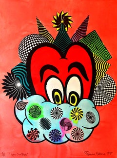
"Your Own Heart" unique signed, colleague of Warhol, Haring, Basquiat & Scharf
By Ronnie Cutrone
Located in New York, NY
Ronnie Cutrone
Your Own Heart, 1987
Watercolor and Silkscreen on Paper
Signed, dated and numbered from the edition of 7, with each work being unique.
40 × 30 inches
Fantastic vintage...
Category
1980s Street Art Abstract Drawings and Watercolors
Materials
Mixed Media, Watercolor, Permanent Marker, Screen
Untitled Signed lithograph on Arches paper by world famous dog artist, unique TP
By Roy De Forest
Located in New York, NY
ROY DE FOREST
Untitled, 1981
Lithograph on Arches paper with four deckled edges.
22 1/2 × 30 inches
Hand signed and annotated Trial Proof, aside from the regular edition of 60
Unfra...
Category
1980s Contemporary Animal Prints
Materials
Archival Paper, Pencil, Graphite, Lithograph

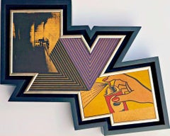
Richard Pettibone The Appropriation Warhol, Stella, Lichtenstein, Unique Signed
By Richard Pettibone
Located in New York, NY
Richard Pettibone
The Appropriation Print Andy Warhol, Frank Stella, Roy Lichtenstein, 1970
Silkscreen in colors on masonite board (unique variant on sculpted board)
Hand-signed by artist, Signed and dated on the front (see close up image)
Bespoke frame Included
This example of Pettibone's iconic Appropriation Print is silkscreened on masonite board rather than paper, giving it a different background hue, and enabling it work to be framed so uniquely.
The Appropriation print is one of the most coveted prints Pettibone ever created ; the regular edition is on a full sheet with white background; the present example was silkscreened on board, allowing it to be framed in 3-D. While we do not know how many examples of this graphic work Pettibone created, so far the present work is the only one example we have ever seen on the public market since 1970. (Other editions of The Appropriation Print have been printed on vellum, wove paper and pink and yellow paper.)
This 1970 homage to Andy Warhol, Frank Stella and Roy Lichtenstein exemplifies the type of artistic appropriation he was engaging in early on during the height of the Pop Art movement - long before more contemporary artists like Deborah Kass, Louise Lawler, etc. followed suit.
This silkscreen was in its original 1970 vintage period frame; a bespoke custom hand cut black wood outer frame was subsequently created especially to house the work, giving it a distinctive sculptural aesthetic.
Measurements:
Framed 14.5 inches vertical by 18 inches horizontal by 2 inches
Work
13 inches vertical by 16.5 inches horizontal
Richard Pettibone biography:
Richard Pettibone (American, b.1938) is one of the pioneering artists to use appropriation techniques. Pettibone was born in Los Angeles, and first worked with shadow boxes and assemblages, illustrating his interest in craft, construction, and working in miniature scales. In 1964, he created the first of his appropriated pieces, two tiny painted “replicas” of the iconic Campbell’s soup cans by Andy Warhol (American, 1928–1987). By 1965, he had created several “replicas” of paintings by American artists, such as Warhol, Roy Lichtenstein (1923–1997), Ed Ruscha (b.1937), and others, among them some of the biggest names in Pop Art. Pettibone chose to recreate the work of leading avant-garde artists whose careers were often centered on themes of replication themselves, further lending irony to his work. Pettibone also created both miniature and life-sized sculptural works, including an exact copy of Bicycle Wheel by Marcel Duchamp (French, 1887–1968), and in the 1980s, an entire series of sculptures of varying sizes replicating the most famous works of Constantin Brancusi (Romanian, 1876–1957). In more recent years, Pettibone has created paintings based on the covers of poetry books by Ezra Pound, as well as sculptures drawn from the grid compositions of Piet Mondrian (Dutch, 1872–1944). Pettibone straddles the lines of appropriation, Pop, and Conceptual Art, and has received critical attention for decades for the important questions his work raises about authorship, craftsmanship, and the original in art. His work has been exhibited at the Institute for Contemporary Art in Philadelphia, the Museum of Modern Art in New York, the Museum of Contemporary Art in Miami, and the Laguna Art Museum in Laguna Beach, CA. Pettibone is currently based in New York.
"I wished I had stuck with the idea of just painting the same
painting like the soup can and never painting another painting.
When someone wanted one, you would just do another one.
Does anybody do that now?"
Andy Warhol, 1981
Since the mid-1960s, Richard Pettibone has been making
hand-painted, small-scale copies of works by other artists — a
practice due to which he is best known as a precursor of appropriation art — and for a decade now, he has been revisiting subjects from across his career. In his latest exhibitions at
Castelli Gallery, Pettibone has been showing more of the “same”
paintings that had already been part of his 2005–6 museum retrospective,1
and also including “new” subject matter drawn from
his usual roster of European modernists and American postwar
artists. Art critic Kim Levin laid out some phases of the intricate spectrum from copies to repetitions in her review of the
Warhol-de Chirico showdown, a joint exhibition at the heyday
of appropriation art in the mid-1980s when Warhol’s appropriations of de Chirico’s work effectively revaluated “the grand
old auto-appropriator”.
Upon having counted well over a dozen
Disquieting Muses by de Chirico, Levin speculated: “Maybe he
kept doing them because no one got the point. Maybe he needed the money. Maybe he meant it when he said his technique
had improved, and traditional skills were what mattered.”
On
the other side, Warhol, in her eyes, was the “latter-day exemplar
of museless creativity”.
To Pettibone, traditional skills certainly
still matter, as he practices his contemporary version of museless creativity. He paints the same painting again and again,
no matter whether anybody shows an interest in it or not. His
work, of course, takes place well outside the historical framework of what Levin aptly referred to as the “modern/postmodern wrestling match”,
but neither was this exactly his match
to begin with.
Pettibone is one of appropriation art’s trailblazers, but his diverse
selection of sources removes from his work the critique of the
modernist myth of originality most commonly associated with
appropriation art in a narrow sense, as we see, for example, in
Sherrie Levine’s practice of re-photographing the work of Walker
Evans and Edward Weston. In particular, during his photorealist
phase of the 1970s, Pettibone’s sources ranged widely across
several art-historical periods. His appropriations of the 1980s
and 1990s spanned from Picasso etchings and Brancusi sculptures to Shaker furniture and even included Ezra Pound’s poetry.
Pettibone has professed outright admiration for his source artists, whose work he shrinks and tweaks to comic effect but, nevertheless, always treats with reverence and care. His response
to these artists is primarily on an aesthetic level, owing much
to the fact that his process relies on photographs. By the same
token, the aesthetic that attracts him is a graphic one that lends
itself to reproduction. Painstakingly copying other artists’ work by hand has been a way of making
it his own, yet each source is acknowledged in
his titles and, occasionally, in captions on white
margins that he leaves around the image as an
indication that the actual source is a photographic image. The enjoyment he receives in copying
is part of the motivation behind doing it, as is
the pleasure he receives from actually being with
the finished painting — a considerable private
dimension of his work. His copies are “handmade
readymades” that he meticulously paints in great quantities in his studio upstate in New York; the commitment
to manual labor and the time spent at material production has
become an increasingly important dimension of his recent work.
Pettibone operates at some remove from the contemporary art
scene, not only by staying put geographically, but also by refusing to recoup the simulated lack of originality through the
creation of a public persona.
In so doing, Pettibone takes a real
risk. He places himself in opposition to conceptualism, and he is
apprehensive of an understanding of art as the mere illustration
of an idea. His reading of Marcel Duchamp’s works as beautiful
is revealing about Pettibone’s priorities in this respect.
When
Pettibone, for aesthetic pleasure, paints Duchamp’s Poster for
the Third French Chess...
Category
1970s Pop Art Abstract Prints
Materials
Masonite, Pencil, Screen
You May Also Like
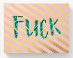
"FUCK" from "Text-I-Monials" by Charles Clary
By Charles Clary
Located in Philadelphia, PA
"FUCK" is an original wall-hanging sculpture by Charles Clary as part of the artist's popular "Text-i-monial" series. To create the artwork, Clary hand cuts a series of individual sh...
Category
21st Century and Contemporary Contemporary Mixed Media
Materials
Paper, Wood Panel
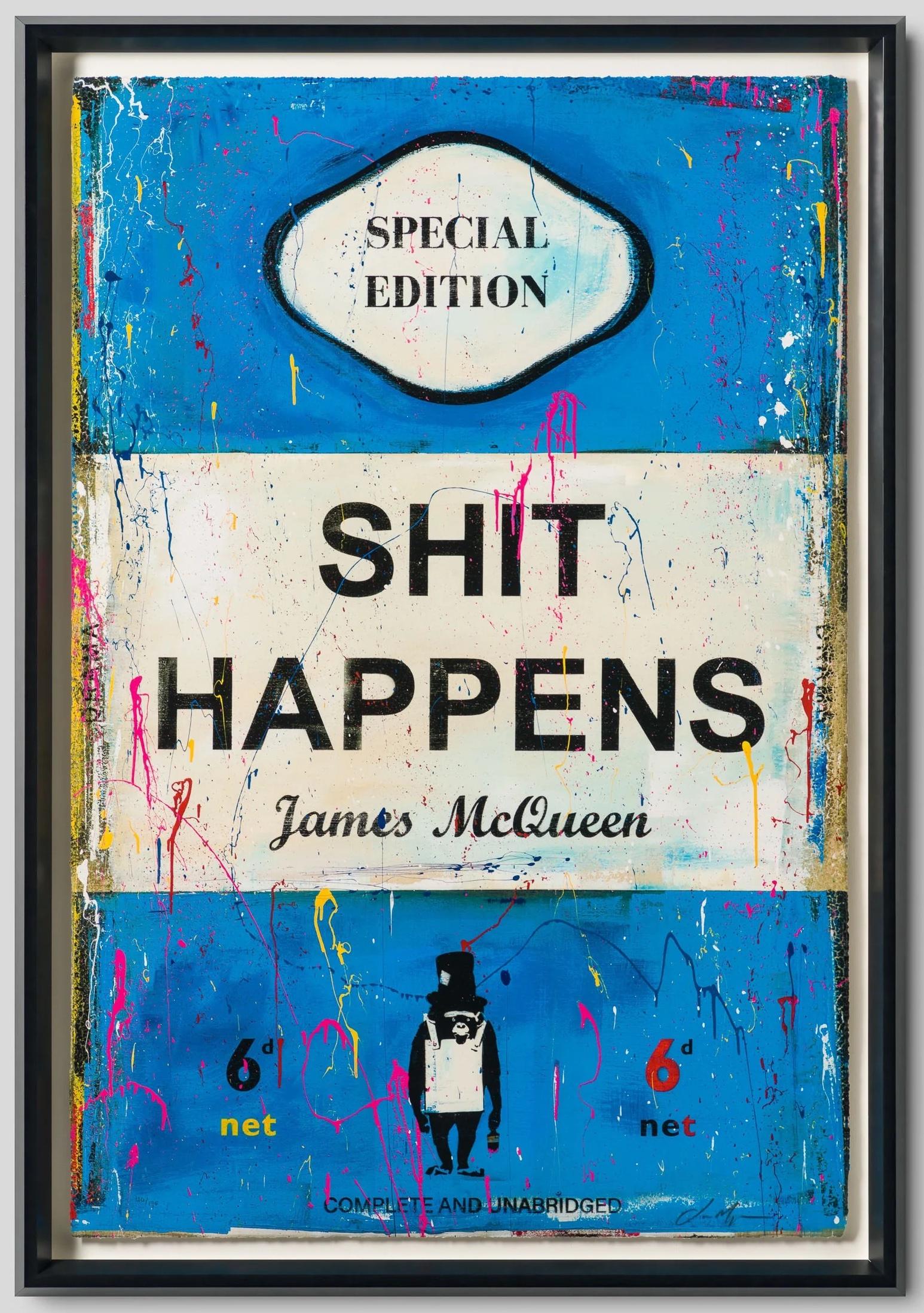
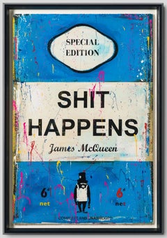
Shit Happens
Located in London, GB
Silkscreen and Archival Pigment in Colour on Deckled Edge Somerset Satin 410gsm Paper floated on a frame with 3mm Float Glass
44 3/10 × 30 7/10 in 112.5 × 78 cm
Edition of 195
hand-...
Category
2010s Contemporary More Prints
Materials
Mixed Media, Archival Pigment, Screen
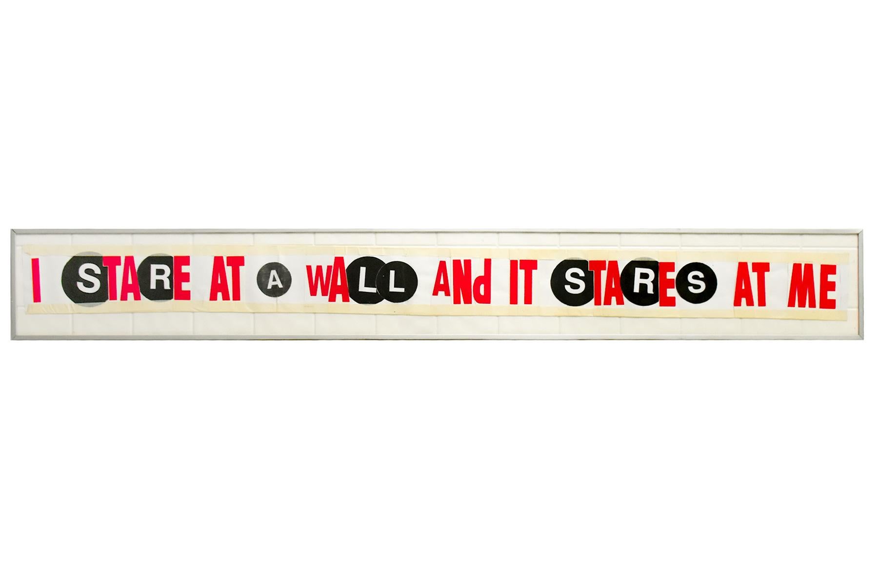
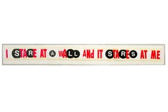
SAMO(c) 4 the Indirectly.../ I Stare at a Wall (Double Sided Original Artwork)
By Al Diaz
Located in Englishtown, NJ
Large double sided Original Artwork by Al Diaz.
Al Diaz is also famous for being the other half of 70’s- 80’s SAMO© duo along with Jean Michel Basquiat.
One side has I Stare At The W...
Category
21st Century and Contemporary Contemporary Mixed Media
Materials
Paper, Board, Permanent Marker
$4,400 Sale Price
20% Off
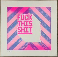
Fuck This shit - Pink
Located in London, GB
Grow Up
Fuck this Shit - Riso Edition, 2020
2 Colour Risograph on Echo Recycled white 200gsm Paper
Signed and numbered by the artist
25.4cm x 25.4cm
Edition of 100
Grow Up is a Brit...
Category
2010s Street Art Abstract Prints
Materials
Digital, Screen
$323 Sale Price
40% Off
Multi-Tags
By Seen
Located in Porto, 13
Seen is widely regarded as one of the most influential and innovative graffiti artists of all time. His unique style, incorporating elements of calligraphy and abstract expressionism...
Category
2010s Street Art Paintings
Materials
Canvas, Spray Paint
$4,155
Whatever 3
By Soren Grau
Located in Los Angeles, CA
With cultural icons and world events acting as inspiration, artist Soren Grau strives to communicate meaning through figures and colors. He paints in a street art-inspired Neo-expres...
Category
21st Century and Contemporary Neo-Expressionist Mixed Media
Materials
Canvas, Mixed Media, Acrylic