Items Similar to "Untitled I" Jane Freilicher, Hamptons Landscape Drawing, Mid-century Abstract
Want more images or videos?
Request additional images or videos from the seller
1 of 8
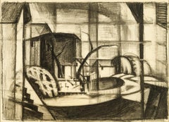
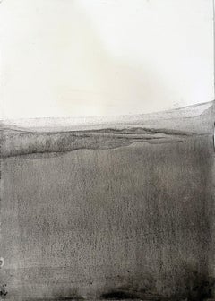
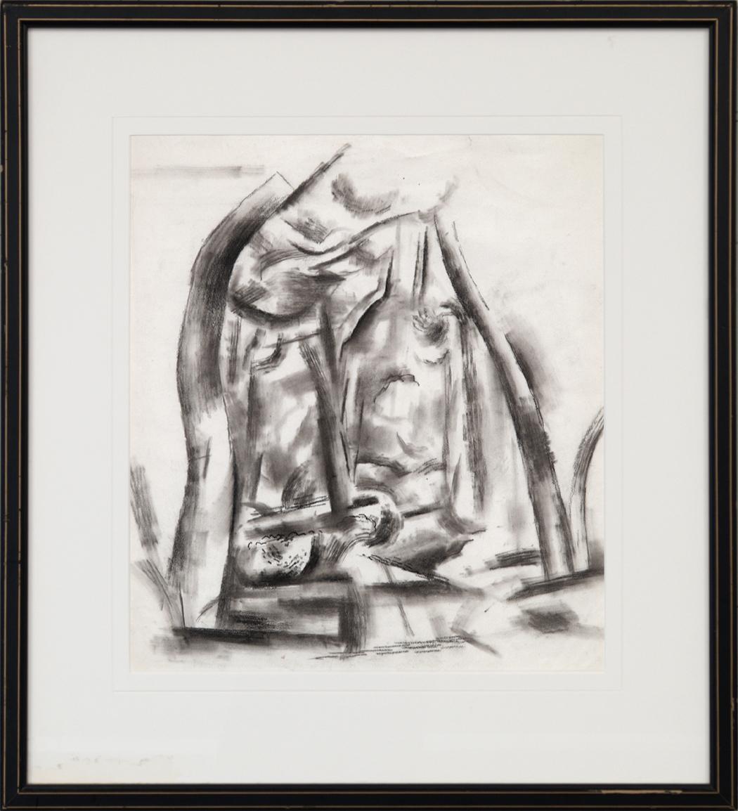
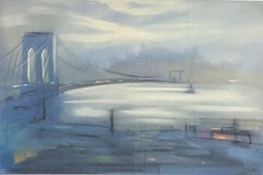
Jane Freilicher"Untitled I" Jane Freilicher, Hamptons Landscape Drawing, Mid-century Abstract 1958-59
1958-59
About the Item
Jane Freilicher
Untitled I, 1958-59
Signed lower right
Charcoal on paper
11 1/2 x 8 3/4 inches
Provenance:
Tibor de Nagy Gallery, New York
Private Collection, New York
Jane Freilicher pursued a distinctive painterly realism for over sixty years. The artist’s work has gained increasing recognition for her unique vision from critics, collectors, and generations of younger painters.
Freilicher is most noted for her sweeping Long Island landscapes seen from her Water Mill studio window, and her dazzling views of downtown Manhattan, often juxtaposed with still life objects in the foreground. Michael Kimmelman of The New York Times has called her work, “the essence of serious painting, deceptively modest, steadfast and fluent.”
Freilicher came of age in the era of Abstract Expressionism at the center of a group of influential artists and poets, including painters Willem de Kooning, Rudy Burckhardt, Joan Mitchell, Larry Rivers, Fairfield Porter, and Alex Katz; and poets John Ashbery, Kenneth Koch, and Frank O’Hara.
A Brooklyn native, Freilicher graduated from Brooklyn College and received an M.A. from Columbia University. She went on to study with the legendary teacher and painter Hans Hofmann, both in New York and Provincetown, Mass. In 1952 she had her first one-person exhibition at the Tibor de Nagy Gallery.
The artist’s work is widely collected and is represented in major museum collections throughout the United States, including the Whitney Museum of American Art, the Metropolitan Museum of Art, and the Museum of Modern Art. Her paintings were selected for inclusion in the 1995 Whitney Biennial.
Freilicher was a longtime member of the American Academy of Arts and Letters and the National Academy of Design. Her many honors included the National Academy of Design Saltus Gold Medal, the Academy of the Arts Lifetime Achievement Award from the Guild Hall Museum, and the Gold Medal in Painting from the Academy of Arts and Letters, its highest honor.
- Creator:Jane Freilicher (1924, American)
- Creation Year:1958-59
- Dimensions:Height: 18.5 in (46.99 cm)Width: 15 in (38.1 cm)
- Medium:
- Movement & Style:
- Period:
- Condition:
- Gallery Location:New York, NY
- Reference Number:1stDibs: LU1841213139812
About the Seller
5.0
Platinum Seller
These expertly vetted sellers are 1stDibs' most experienced sellers and are rated highest by our customers.
Established in 2021
1stDibs seller since 2022
59 sales on 1stDibs
Typical response time: 1 hour
- ShippingRetrieving quote...Ships From: New York, NY
- Return PolicyA return for this item may be initiated within 3 days of delivery.
More From This SellerView All
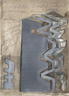
- "Repetition" Chryssa, Greek Female Artist, Abstract, Neon Light Art StudyBy Chryssa Vardea-MavromichaliLocated in New York, NYChryssa Repetition Signed lower right; titled on the reverse Gouache, watercolor, charcoal, and graphite on paper 15 x 11 inches Born and educated in Athens, Greece, Vardea Chryssa, known professionally as Chryssa, became a U.S. citizen and earned a reputation for her sculptured assemblages utilizing light from neon, and plexiglas combined with mixed media pieces. One of her pieces, Untitled Light Sculpture (1980) is 22 feet long and is installed in the atrium of a building at 33 Monroe Street in Chicago. It was programmed electronically to create changing patterns of reflected light through 900 feet of neon tubing. Chryssa's sculptures with precision and definite form were a reaction against the prevalent Abstract Expressionism of the 1950s with its emphasis purely upon the artist's intent. In her work, the focus is on materials and the way they are shaped for specific use by craftsmen. She got her early education in Athens, and first studied to be a social worker. She was then sent by the Greek Ministry of Social Welfare to the Dodecanese Islands and later to the Ionian Sea island of Zante, whose population had suffered great loss from earthquakes. Disillusioned that monies were being provided to restore monasteries but not to help other earthquake victims, Chryssa changed her life's direction to become a painter. In Athens, she studied art with Anghelos Prokopion. Then she went to Paris, France, and studied briefly at the Academie Grande Chaumiere and associated with surrealists Andre Breton, Edgard Varese, and Max Ernst. In 1954, she moved to San Francisco, California for a year of study at the California School of Fine Arts, and there she first saw the work of Jackson Pollock, which had a freeing affect on her and inspired her to experiment with pure form. But later she reacted against action painting with her assemblage sculptures of controlled precision. In 1955, Chryssa settled in New York City, and became the first artist to incorporate neon light tubing and commercial signs into sculpture. It is asserted that her "mature work grew out of the Greek experience, before and after World War II, wedded to the raucous letters, signs, symbols, and lights of Time Square, New York City" (Heller 125). In fact, she was so taken with the lights of Times Square that she unsuccessfully tried to get a job as a sign maker but was prevented by labor union rules. However, one of the members gave her sign-making lessons in his shop. She first made Pop images such as depictions of automobile tires and cigarettes and in sculptures, utilized letters of the alphabet, ideas that predated similar images by Jasper Johns and Andy Warhol. Her first major work of interwoven light and letters was Times Square Sky of 1962, but she was dissatisfied because she thought the piece was too crowded. To create a sense of breathing, she inserted neon light, and for the first time, this material became an art medium. From that time, she was prolific and created many variations based on the letters W and A. For her, a primary motivating factor was remaining cool or mentally collected amidst the onslaught of bombarding information and to process it through her creations in new ways so that nothing was repeated. She set up her own work place...Category
Late 20th Century Abstract Abstract Paintings
MaterialsGouache, Graphite, Paper, Charcoal, Watercolor
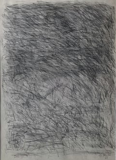
- "Untitled, " Alan Fenton, Abstract ExpressionismLocated in New York, NYAlan Fenton (1927 - 2000) Untitled, 1965 Charcoal and graphite on paper 23 x 17 inches Signed and dated lower right Fenton's quiet and contemplative nonob...Category
1960s Abstract Expressionist Abstract Paintings
MaterialsPaper, Charcoal, Graphite
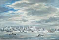
- "New York City Skyline View from the East River, " Lionel Reiss, Jewish ArtistBy Lionel ReissLocated in New York, NYLionel S. Reiss (1894 - 1988) New York City Skyline View from the East River Watercolor on paper 13 x 19 inches Signed lower left In describing his own style, Lionel Reiss wrote, “By nature, inclination, and training, I have long since recognized the fact that...I belong to the category of those who can only gladly affirm the reality of the world I live in.” Reiss’s subject matter was wide-ranging, including gritty New York scenes, landscapes of bucolic Bucks County, Pennsylvania, and seascapes around Gloucester, Massachusetts. However, it was as a painter of Jewish life—both in Israel and in Europe before World War II—that Reiss excelled. I.B. Singer, the Nobel Prize winner for Literature, noted that Reiss was “essentially an artist of the nineteenth century, and because of this he had the power and the courage to tell visually the story of a people.” Although Reiss was born in Jaroslaw, Poland, his family immigrated to the United States in 1898 when he was four years old. Reiss's family settled on New York City’s Lower East Side and he lived in the city for most of his life. Reiss attended the Art Students League and then worked as a commercial artist for newspapers and publishers. As art director for Metro-Goldwyn-Mayer, he supposedly created the studio’s famous lion logo. After World War I, Reiss became fascinated with Jewish life in the ‘Old World.’ In 1921 he left his advertising work and spent the next ten years traveling in Europe, the Middle East, and North Africa. Like noted Jewish photographers Alter Kacyzne and Roman Vishniac, Reiss depicted Jewish life in Poland prior to World War II. He later wrote, “My trip encompassed three main objectives: to make ethnic studies of Jewish types wherever I traveled; to paint and draw Jewish life, as I saw it and felt it, in all aspects; and to round out my work in Israel.” In Europe, Reiss recorded quotidian scenes in a variety of media and different settings such as Paris, Amsterdam, the Venice ghetto, the Jewish cemetery in Prague, and an array of shops, synagogues, streets, and marketplaces in the Jewish quarters of Warsaw, Lodz, Krakow, Lublin, Vilna, Ternopil, and Kovno. He paid great attention to details of dress, hair, and facial features, and his work became noted for its descriptive quality. A selection of Reiss’s portraits appeared in 1938 in his book My Models Were Jews. In this book, published on the eve of the Holocaust, Reiss argued that there was “no such thing as a ‘Jewish race’.” Instead, he claimed that the Jewish people were a cultural group with a great deal of diversity within and between Jewish communities around the world. Franz Boas...Category
1940s American Modern Landscape Drawings and Watercolors
MaterialsPaper, Watercolor
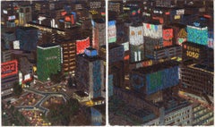
- "Tokyo Diptych, " Yvonne Jacquette, Japanese Urban Cityscape Nocturnal AerialBy Yvonne JacquetteLocated in New York, NYYvonne Jacquette (American, b. 1935) Tokyo Diptych, 1985 Pastel on paper Overall 17 1/4 x 28 1/2 inches Signed lower center Provenance: Carey Ellis Company, Houston, Texas Brooke Alexander, New York Collection of an American Corporation Exhibited: New York, Brooke Alexander, Yvonne Jacquette: Tokyo Nightviews, April 5 - May 3, 1986, n.p., illustrated; this exhibition later traveled to Brunswick, Maine, Bowdoin College Museum of Art, Yvonne Jacquette: Tokyo Nightviews, June 27 - August 24, 1986. Yvonne Jacquette has a preference for high places, a circling plane, a penthouse window, an aerie from which to watch the world. Her work has often depicted the city and man-made landscape from the vantage of angels. It is a privileged perspective, long loved by photographers, who were perhaps the first to recognize the geometric grandeur of the city below. That grandeur structures Jacquette's images but is not its full content. Her work attempts to resolve the visual and emotional pardoxes of the modern metropolis. Only from the tower is there the possibility of order and context. And unlaced beauty. Jacquette first visited Japan in 1982. Nighttime Tokyo, its cars and crowds and canyons of loud Vegas neon, made a vivid and bewildering impression on her. The neon signs, pulsing, scaling the walls of high rises, fascinated the artist, "like Times Square spread over miles." Her fascination was equal parts marvel, confusion, and curiosity—the sparks of art. She returned to Tokyo in May of 1985, choosing hotel rooms with expansive vistas. From these views Jacquette excerpted images for a series of pastel night scenes. The basic forms and colors of each drawing were blocked in during night sessions by the window. She worked in the dark, selecting colors by flashlight. In daylight, she sharpened the geometry and corrected ambiguous passages. She refined the drawings further in the studio until the images read clearly. Photographic correctness was not important. The finished drawings are complete statements, not simply preparatory sketches for paintings. They have the authority of expert witness. In clear, discreet jots of pastel they record the performance of seeing, each touch of color attesting to a moment's close scrutiny. Yvonne Jacquette was born on December 15, 1934 in Pittsburgh, Pennsylvania and grew up in Stamford, Connecticut. She attended the Rhode Island School of Design, Providence from 1952 to 1955, when she moved to New York City. Her late husband was photographer Rudy Burckhardt, and the couple were part of a circle of artist friends that included Fairfield Porter, Alex Katz, Red Grooms, and Mimi Gross. She continues to live and work in New York City, as well as in Searsmont, Maine. A flight to San Diego in 1969 sparked Jacquette’s interest in aerial views, after which she began flying in commercial airliners to study cloud formations and weather patterns. She soon started sketching and painting the landscape as seen from above, beginning a process that has developed into a defining element of her art. Her first nocturnal painting...Category
1980s American Modern Landscape Drawings and Watercolors
MaterialsPaper, Pastel
- "New York City Harbor (Brooklyn Bridge), " Leon Dolice, East River, Mid-CenturyBy Leon DoliceLocated in New York, NYLeon Dolice (1892 - 1960) New York Harbor (Brooklyn Bridge), circa 1930-40 Pastel on paper 12 x 19 inches Signed lower right Provenance: Spanierman Gallery, New York The romantic b...Category
1930s American Modern Landscape Drawings and Watercolors
MaterialsPaper, Pastel
- "New York from the Ferry" John Marin, American Modernism Watercolor, CityscapeBy John MarinLocated in New York, NYJohn Marin New York from the Ferry, 1914 Signed and dated lower right Watercolor and graphite on paper 11 x 12 3/4 inches Provenance: An American Place, New York Kennedy Galleries, Inc., New York Christie's, New York, March 16, 1990, Lot 278 Private Collection (acquired from the above) Sotheby's New York, American Paintings, Drawings, & Sculpture, October 2, 2014, Lot 10 A major figure in early twentieth-century modernism, John Marin captured the colliding energies of the American urban scene and the vibrant contrasts of natural elements in the coastal landscape of Maine and other countryside locales. As one of the premier watercolorists of his era, Marin developed a light, spontaneous style ideally suited to conveying the freshness and flux of city and country experience -- his watercolors are often considered to match in strength those created by Winslow Homer in previous century. At the same time, Marin's sensitivity to mass, form, color, and line and their dynamic interchanges provided a precedent for the Abstract Expressionist movement of the late 1950s. Marin was born in Rutherford, New Jersey, to a family of European descent. After studying mechanical drawing and mathematics for half a year at the Stevens Institute of Technology in New York, Marin worked as a draftsman for several architects. It was not until he was almost thirty years old that he began to study art. He enrolled at the Pennsylvania Academy of the Fine Arts in Philadelphia from 1899 to 1901, and at the Art Students League in New York from 1901 to 1903, where his teachers were William Merritt Chase and Frank Vincent Dumond. While Marin was attending the League, the radical ideas of Arthur Wesley Dow were being disseminated and had an impact on the direction Marin would soon take in his art. Marin left for Europe in 1905. The next five years, which he spent abroad, were of tremendous importance to his career. He became a significant figure in the expatriate community in Paris, frequenting the Dôme, a café that served as a meeting place for artists and writers. While in Europe, Marin visited the Louvre and the Rijksmuseum in Amsterdam and, despite his claims that he had been indifferent to the Paris art world, he undoubtedly became aware of the art of Paul Cézanne and Henri Matisse. The works Marin created in Europe most strongly reflect the influence of James McNeill Whistler, especially the pastels he rendered in Venice. In the summer of 1909, Marin met Alfred Stieglitz in Paris. In February of the next year, Marin's work was shown along with that of Alfred Maurer at Stieglitz's gallery, 291. After returning to America in the following year, Marin became one of the most consistent members of Stieglitz's inner circle, showing at all three of his galleries -- 291, The Intimate Gallery, and An American Place. After 1910, Marin developed the routine that he would follow for the rest of his life, creating paintings, drawings, and prints in New York City and surrounding areas during the winter, and in the summer, traveling to the country, where he focused on the particular characteristics of the regions that he visited. He worked mainly in watercolor until 1928, when he began also to use oil. Marin never became purely abstract. He formulated a unique style melding influences of the art of the French Fauves, Cézanne, Matisse, and the French Cubists with a personal style of luminescent colors, agile brushwork, and a simultaneously delicate and strong handling. In city views, he used broken lines, a light touch, fluid color, and rhythmic compositions to convey what he described as the "great forces at work." He expressed the warring of the great and the small through relationships between masses. As he said, he sought to express the "pull forces" of the modern urban scene. Often portraying the new tall buildings of New York seen...Category
1910s American Modern Landscape Drawings and Watercolors
MaterialsPaper, Watercolor
You May Also Like
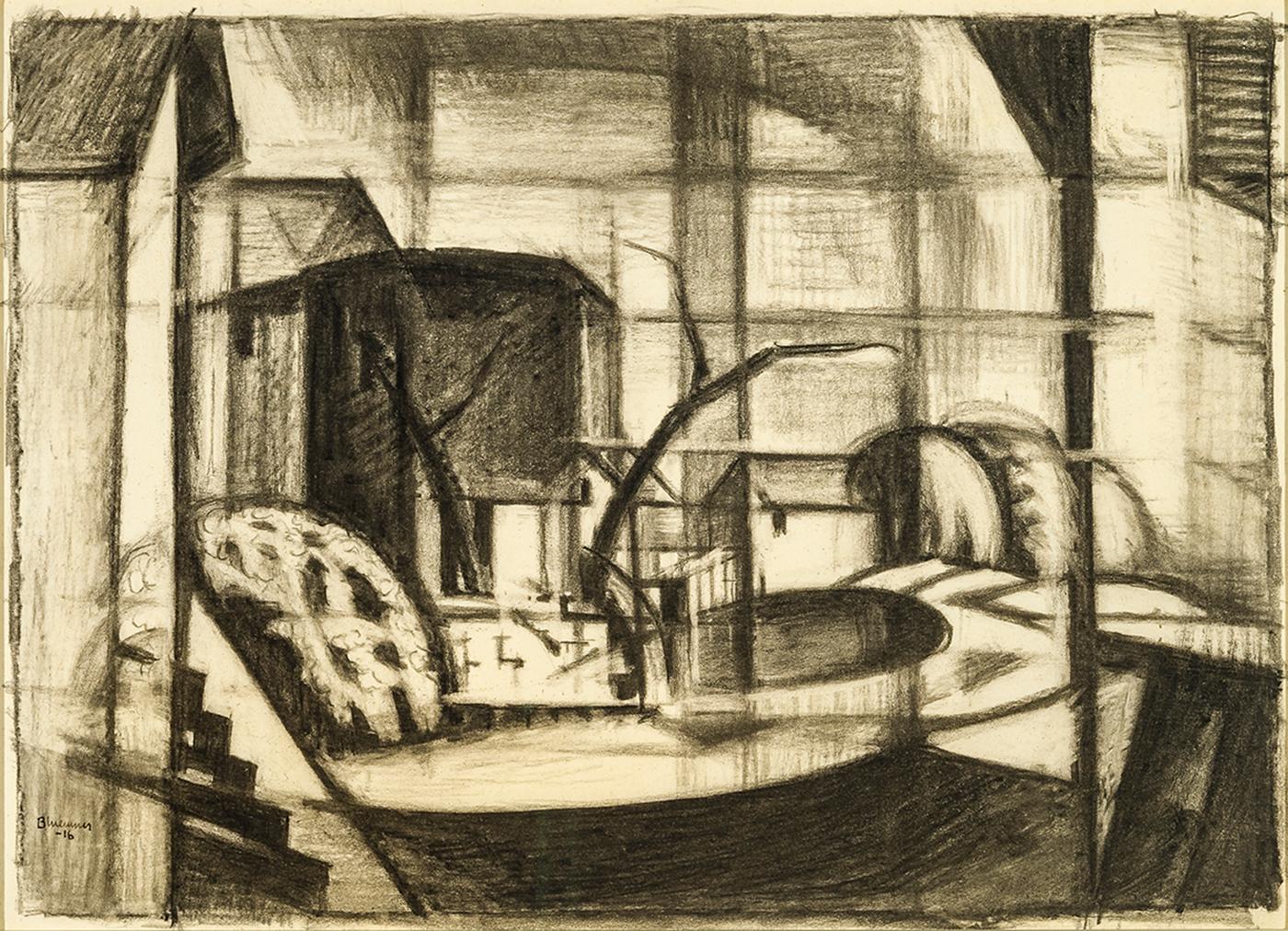
- Study for Old Canal, Red and Blue (Rockaway, Morris Canal)By Oscar Florianus BluemnerLocated in New York, NYOscar Bluemner was a German and an American, a trained architect who read voraciously in art theory, color theory, and philosophy, a writer of art criticism both in German and English, and, above all, a practicing artist. Bluemner was an intense man, who sought to express and share, through drawing and painting, universal emotional experience. Undergirded by theory, Bluemner chose color and line for his vehicles; but color especially became the focus of his passion. He was neither abstract artist nor realist, but employed the “expressional use of real phenomena” to pursue his ends. (Oscar Bluemner, from unpublished typescript on “Modern Art” for Camera Work, in Bluemner papers, Archives of American Art, Smithsonian Institution, as cited and quoted in Jeffrey R. Hayes, Oscar Bluemner [1991], p. 60. The Bluemner papers in the Archives [hereafter abbreviated as AAA] are the primary source for Bluemner scholars. Jeffrey Hayes read them thoroughly and translated key passages for his doctoral dissertation, Oscar Bluemner: Life, Art, and Theory [University of Maryland, 1982; UMI reprint, 1982], which remains the most comprehensive source on Bluemner. In 1991, Hayes published a monographic study of Bluemner digested from his dissertation and, in 2005, contributed a brief essay to the gallery show at Barbara Mathes, op. cit.. The most recent, accessible, and comprehensive view of Bluemner is the richly illustrated, Barbara Haskell, Oscar Bluemner: A Passion for Color, exhib. cat. [New York: Whitney Museum of American Art, 2005.]) Bluemner was born in the industrial city of Prenzlau, Prussia, the son and grandson of builders and artisans. He followed the family predilection and studied architecture, receiving a traditional and thorough German training. He was a prize-winning student and appeared to be on his way to a successful career when he decided, in 1892, to emigrate to America, drawn perhaps by the prospect of immediate architectural opportunities at the Chicago World’s Fair, but, more importantly, seeking a freedom of expression and an expansiveness that he believed he would find in the New World. The course of Bluemner’s American career proved uneven. He did indeed work as an architect in Chicago, but left there distressed at the formulaic quality of what he was paid to do. Plagued by periods of unemployment, he lived variously in Chicago, New York, and Boston. At one especially low point, he pawned his coat and drafting tools and lived in a Bowery flophouse, selling calendars on the streets of New York and begging for stale bread. In Boston, he almost decided to return home to Germany, but was deterred partly because he could not afford the fare for passage. He changed plans and direction again, heading for Chicago, where he married Lina Schumm, a second-generation German-American from Wisconsin. Their first child, Paul Robert, was born in 1897. In 1899, Bluemner became an American citizen. They moved to New York City where, until 1912, Bluemner worked as an architect and draftsman to support his family, which also included a daughter, Ella Vera, born in 1903. All the while, Oscar Bluemner was attracted to the freer possibilities of art. He spent weekends roaming Manhattan’s rural margins, visiting the Bronx, Brooklyn, Queens, and New Jersey, sketching landscapes in hundreds of small conté crayon drawings. Unlike so many city-based artists, Bluemner did not venture out in search of pristine countryside or unspoiled nature. As he wrote in 1932, in an unsuccessful application for a Guggenheim Fellowship, “I prefer the intimate landscape of our common surroundings, where town and country mingle. For we are in the habit to carry into them our feelings of pain and pleasure, our moods” (as quoted by Joyce E. Brodsky in “Oscar Bluemner in Black and White,” p. 4, in Bulletin 1977, I, no. 5, The William Benton Museum of Art, Storrs, Connecticut). By 1911, Bluemner had found a powerful muse in a series of old industrial towns, mostly in New Jersey, strung along the route of the Morris Canal. While he educated himself at museums and art galleries, Bluemner entered numerous architectural competitions. In 1903, in partnership with Michael Garven, he designed a new courthouse for Bronx County. Garven, who had ties to Tammany Hall, attempted to exclude Bluemner from financial or artistic credit, but Bluemner promptly sued, and, finally, in 1911, after numerous appeals, won a $7,000 judgment. Barbara Haskell’s recent catalogue reveals more details of Bluemner’s architectural career than have previously been known. Bluemner the architect was also married with a wife and two children. He took what work he could get and had little pride in what he produced, a galling situation for a passionate idealist, and the undoubted explanation for why he later destroyed the bulk of his records for these years. Beginning in 1907, Bluemner maintained a diary, his “Own Principles of Painting,” where he refined his ideas and incorporated insights from his extensive reading in philosophy and criticism both in English and German to create a theoretical basis for his art. Sometime between 1908 and 1910, Bluemner’s life as an artist was transformed by his encounter with the German-educated Alfred Stieglitz, proprietor of the Little Galleries of the Photo-Secession at 291 Fifth Avenue. The two men were kindred Teutonic souls. Bluemner met Stieglitz at about the time that Stieglitz was shifting his serious attention away from photography and toward contemporary art in a modernist idiom. Stieglitz encouraged and presided over Bluemner’s transition from architect to painter. During the same period elements of Bluemner’s study of art began to coalesce into a personal vision. A Van Gogh show in 1908 convinced Bluemner that color could be liberated from the constraints of naturalism. In 1911, Bluemner visited a Cézanne watercolor show at Stieglitz’s gallery and saw, in Cézanne’s formal experiments, a path for uniting Van Gogh’s expressionist use of color with a reality-based but non-objective language of form. A definitive change of course in Bluemner’s professional life came in 1912. Ironically, it was the proceeds from his successful suit to gain credit for his architectural work that enabled Bluemner to commit to painting as a profession. Dividing the judgment money to provide for the adequate support of his wife and two children, he took what remained and financed a trip to Europe. Bluemner traveled across the Continent and England, seeing as much art as possible along the way, and always working at a feverish pace. He took some of his already-completed work with him on his European trip, and arranged his first-ever solo exhibitions in Berlin, Leipzig, and Elberfeld, Germany. After Bluemner returned from his study trip, he was a painter, and would henceforth return to drafting only as a last-ditch expedient to support his family when his art failed to generate sufficient income. Bluemner became part of the circle of Stieglitz artists at “291,” a group which included Marsden Hartley, John Marin, and Arthur Dove. He returned to New York in time to show five paintings at the 1913 Armory Show and began, as well, to publish critical and theoretical essays in Stieglitz’s journal, Camera Work. In its pages he cogently defended the Armory Show against the onslaught of conservative attacks. In 1915, under Stieglitz’s auspices, Bluemner had his first American one-man show at “291.” Bluemner’s work offers an interesting contrast with that of another Stieglitz architect-turned-artist, John Marin, who also had New Jersey connections. The years after 1914 were increasingly uncomfortable. Bluemner remained, all of his life, proud of his German cultural legacy, contributing regularly to German language journals and newspapers in this country. The anti-German sentiment, indeed mania, before and during World War I, made life difficult for the artist and his family. It is impossible to escape the political agenda in Charles Caffin’s critique of Bluemner’s 1915 show. Caffin found in Bluemner’s precise and earnest explorations of form, “drilled, regimented, coerced . . . formations . . . utterly alien to the American idea of democracy” (New York American, reprinted in Camera Work, no. 48 [Oct. 1916], as quoted in Hayes, 1991, p. 71). In 1916, seeking a change of scene, more freedom to paint, and lower expenses, Bluemner moved his family to New Jersey, familiar terrain from his earlier sketching and painting. During the ten years they lived in New Jersey, the Bluemner family moved around the state, usually, but not always, one step ahead of the rent collector. In 1917, Stieglitz closed “291” and did not reestablish a Manhattan gallery until 1925. In the interim, Bluemner developed relationships with other dealers and with patrons. Throughout his career he drew support and encouragement from art cognoscenti who recognized his talent and the high quality of his work. Unfortunately, that did not pay the bills. Chronic shortfalls were aggravated by Bluemner’s inability to sustain supportive relationships. He was a difficult man, eternally bitter at the gap between the ideal and the real. Hard on himself and hard on those around him, he ultimately always found a reason to bite the hand that fed him. Bluemner never achieved financial stability. He left New Jersey in 1926, after the death of his beloved wife, and settled in South Braintree, Massachusetts, outside of Boston, where he continued to paint until his own death in 1938. As late as 1934 and again in 1936, he worked for New Deal art programs designed to support struggling artists. Bluemner held popular taste and mass culture in contempt, and there was certainly no room in his quasi-religious approach to art for accommodation to any perceived commercial advantage. His German background was also problematic, not only for its political disadvantages, but because, in a world where art is understood in terms of national styles, Bluemner was sui generis, and, to this day, lacks a comfortable context. In 1933, Bluemner adopted Florianus (definitively revising his birth names, Friedrich Julius Oskar) as his middle name and incorporated it into his signature, to present “a Latin version of his own surname that he believed reinforced his career-long effort to translate ordinary perceptions into the more timeless and universal languages of art” (Hayes 1982, p. 189 n. 1). In 1939, critic Paul Rosenfeld, a friend and member of the Stieglitz circle, responding to the difficulty in categorizing Bluemner, perceptively located him among “the ranks of the pre-Nazi German moderns” (Hayes 1991, p. 41). Bluemner was powerfully influenced in his career by the intellectual heritage of two towering figures of nineteenth-century German culture, Johann Wolfgang von Goethe and Georg Wilhelm Friedrich Hegel. A keen student of color theory, Bluemner gave pride of place to the formulations of Goethe, who equated specific colors with emotional properties. In a November 19, 1915, interview in the German-language newspaper, New Yorker Staats-Zeitung (Abendblatt), he stated: I comprehend the visible world . . . abstract the primary-artistic . . . and after these elements of realty are extracted and analyzed, I reconstruct a new free creation that still resembles the original, but also . . . becomes an objectification of the abstract idea of beauty. The first—and most conspicuous mark of this creation is . . . colors which accord with the character of things, the locality . . . [and which] like the colors of Cranach, van der Weyden, or Durer, are of absolute purity, breadth, and luminosity. . . . I proceed from the psychological use of color by the Old Masters . . . [in which] we immediately recognize colors as carriers of “sorrow and joy” in Goethe’s sense, or as signs of human relationship. . . . Upon this color symbolism rests the beauty as well as the expressiveness, of earlier sacred paintings. Above all, I recognize myself as a contributor to the new German theory of light and color, which expands Goethe’s law of color through modern scientific means (as quoted in Hayes 1991, p. 71). Hayes has traced the global extent of Bluemner’s intellectual indebtedness to Hegel (1991, pp. 36–37). More specifically, Bluemner made visual, in his art, the Hegelian world view, in the thesis and antithesis of the straight line and the curve, the red and the green, the vertical and the horizontal, the agitation and the calm. Bluemner respected all of these elements equally, painting and drawing the tension and dynamic of the dialectic and seeking ultimate reconciliation in a final visual synthesis. Bluemner was a keen student of art, past and present, looking, dissecting, and digesting all that he saw. He found precedents for his non-naturalist use of brilliant-hued color not only in the work Van Gogh and Cezanne, but also in Gauguin, the Nabis, and the Symbolists, as well as among his contemporaries, the young Germans of Der Blaue Reiter. Bluemner was accustomed to working to the absolute standard of precision required of the architectural draftsman, who adjusts a design many times until its reality incorporates both practical imperatives and aesthetic intentions. Hayes describes Bluemner’s working method, explaining how the artist produced multiple images playing on the same theme—in sketch form, in charcoal, and in watercolor, leading to the oil works that express the ultimate completion of his process (Hayes, 1982, pp. 156–61, including relevant footnotes). Because of Bluemner’s working method, driven not only by visual considerations but also by theoretical constructs, his watercolor and charcoal studies have a unique integrity. They are not, as is sometimes the case with other artists, rough preparatory sketches. They stand on their own, unfinished only in the sense of not finally achieving Bluemner’s carefully considered purpose. The present charcoal drawing is one of a series of images that take as their starting point the Morris Canal as it passed through Rockaway, New Jersey. The Morris Canal industrial towns that Bluemner chose as the points of departure for his early artistic explorations in oil included Paterson with its silk mills (which recalled the mills in the artist’s childhood home in Elberfeld), the port city of Hoboken, Newark, and, more curiously, a series of iron ore mining and refining towns, in the north central part of the state that pre-dated the Canal, harkening back to the era of the Revolutionary War. The Rockaway theme was among the original group of oil paintings that Bluemner painted in six productive months from July through December 1911 and took with him to Europe in 1912. In his painting journal, Bluemner called this work Morris Canal at Rockaway N.J. (AAA, reel 339, frames 150 and 667, Hayes, 1982, pp. 116–17), and exhibited it at the Galerie Fritz Gurlitt in Berlin in 1912 as Rockaway N. J. Alter Kanal. After his return, Bluemner scraped down and reworked these canvases. The Rockaway picture survives today, revised between 1914 and 1922, as Old Canal, Red and Blue (Rockaway River) in the collection of the Hirshhorn Museum and Sculpture Garden, Smithsonian Institution, Washington D. C. (color illus. in Haskell, fig. 48, p. 65). For Bluemner, the charcoal expression of his artistic vision was a critical step in composition. It represented his own adaptation of Arthur Wesley’s Dow’s (1857–1922) description of a Japanese...Category
20th Century American Modern Abstract Drawings and Watercolors
MaterialsPaper, Charcoal
- "Landscape" Seascape - Large Size -Contemporary Drawing- Made in ItalyBy Marilina MarchicaLocated in Agrigento, AGlandscape mineral oxide on papers ( Canson Paper 300gr) 75 x110 cm framed artwork, white wood frame, 91X122 cm the edge of the frame is 3.5c m Ready to Hang 2022 Artwork published ...Category
2010s Contemporary Landscape Drawings and Watercolors
MaterialsCharcoal, Gouache, Paper
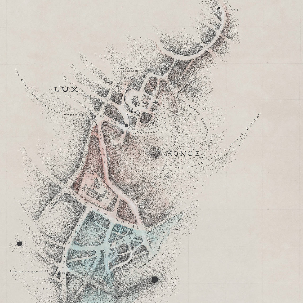
- Compulsion DriftBy Patricia SmithLocated in New York, NYwatercolor, charcoal, graphite, ink on paper 19"x25" available framed Known for her idiosyncratic cartographic explorations of the psyche and mental states, Smith incorporates ou...Category
21st Century and Contemporary Contemporary Landscape Drawings and Waterc...
MaterialsCharcoal, Graphite, Ink, Paper, Watercolor
- Early 20th Century Black White Abstracted Landscape Charcoal DrawingBy Willard Ayer NashLocated in Denver, CO"Abstract" is a charcoal on paper drawing by Willard Ayers Nash (1898-1942) of an abstracted landscape scene. Presented in a custom black frame measuring 22 x 20 x ¾ inches. Image size measures 14 ½ x 12 ¾ inches. Drawing is clean and in very good condition - please contact us for a detailed condition report. Expedited and international shipping is available - please contact us for a quote. About the Artist: Willard Ayer Nash Born Philadelphia, Pennsylvania, 1897 Died Albuquerque, New Mexico, 1942 Biography courtesy of Owings-Dewey Fine Art Willard Nash was frequently referred to as “the American Cézanne”. Like the French Post-Impressionist Cézanne, Nash created form with color and did wonderful work with shadows. Prior to his arrival in New Mexico, Nash painted in a formal, academic style that he learned while studying at the Detroit School of Fine Arts. However, under the tutelage of Andrew Dasburg, a fellow Santa Fe...Category
Early 20th Century Abstract Abstract Drawings and Watercolors
MaterialsPaper, Charcoal
- "Black and White Landscape" Abstract Drawing , Made in ItalyBy Marilina MarchicaLocated in Agrigento, AGLandscape B/W charcoal on paper (300gr) Minimalism- Original art 30x42 cm passepartout- 35x47x05 cm this artwork is part of the solo exhibition "The Fragile Space" panelized on a ...Category
2010s Contemporary Landscape Drawings and Watercolors
MaterialsPaper, Charcoal
- "Landscape BW" Black ad white Abstract Drawing large size by Marilina MarchicaBy Marilina MarchicaLocated in Agrigento, AGLandscape Black ad white abstract drawing mineral oxide on paper ( Canson Montaval Paper 300 gr.) large size 79x105 Frame Size 122 x91 cm by Marilina Marchica signed with certific...Category
2010s Contemporary Abstract Drawings and Watercolors
MaterialsCharcoal, Ink, Archival Paper