Items Similar to Hi, from American Signs Portfolio
Want more images or videos?
Request additional images or videos from the seller
1 of 8
Robert CottinghamHi, from American Signs Portfolio2009
2009
About the Item
ROBERT COTTINGHAM
Hi, from American Signs portfolio, 2009
screenprint in colors, on wove paper, with full margins
40 1/8 x 39 1/8 in (101.9 x 99.4 cm)
signed, dated `2009' and numbered edition of 100 in pencil
Robert Cottingham B. 1935, BROOKLYN, NEW YORK Born in 1935 in Brooklyn, Robert Cottingham is known for his paintings and prints of urban American landscapes, particularly building facades, neon signs, movie marquees, and shop fronts. After serving in the U.S. Army from 1955 through 1958, he earned a BFA at Pratt Institute, Brooklyn, in 1963. Cottingham began his professional artistic career as an art director for the advertising firm Young and Rubicam in the early 1960s. Although he is typically associated with Photorealism, Cottingham never considered himself a Photorealist, but rather a realist painter working in a long tradition of American vernacular scenes. In this respect, his work often draws parallels to a number of American painters such as Stuart Davis, Charles Demuth, Edward Hopper, and Charles Sheeler.
Cottingham’s interest in the intersections of art and commerce derive from his career as an adman and the influence of Pop art. Many of his paintings convey an interest in typography and lettering, as well as an awareness of the psychological impact of certain isolated words and letters. In his facades, techniques from advertising, namely cropping and enlarging, often produce words of enigmatic or comical resonance such as “Art,” “Ha,” or “Oh.” Cottingham’s enlarged sense of scale is reminiscent of James Rosenquist’s work, while his interest in text suggests the influence of Robert Indiana and Jasper Johns. In general, Cottingham viewed his work as continuing the legacy of Pop artists such as Andy Warhol, who also had a background in advertising.
In 1964, Cottingham relocated to Los Angeles for work. There, inspired by the drastically different environment of the West Coast metropolis, he began to commit seriously to painting. Fascinated by Hollywood’s exaggerated glitz and the downtrodden atmosphere of the downtown, Cottingham saw in Los Angeles the relics of a bygone commercial heyday and desired to capture its kitschy and uncanny atmosphere, bathed in the near perpetual sunlight of Southern California.
In 1968, Cottingham ended his advertising career in order to devote all his time to painting. In the late 1960s, he started using photography in his practice, first as an initial reference point for his process. After selecting a photograph, he translates it into black-and-white drawings by projecting the image onto gridded paper, as a means of perfecting the tonal range between light and shadow. He often creates subsequent studies on paper using color. He finalizes the process by projecting either the original slide or any of the drawings onto a canvas and organizing the composition according to a grid. Another reason for Cottingham’s rejection of the Photorealist label is that he does not view his works as mere painterly translations of photographs or reproductions of reality.
He has been known to change the words in his facades to alter the meaning of the subject. His primary interest lies in the subject matter—the urban American vernacular—rather than the deployment of a photo-based technique. After spending a period of time in London from 1972 to 1976, Cottingham found the city’s signs and history too foreign and removed from his own interests, and returned to the United States to settle in rural Connecticut. During the late 1970s and 1980s, his urban cityscapes became more expansive, with more complex and broader views of storefronts, vistas, and entire neighborhoods. In the late 1980s and early 1990s, Cottingham expanded his iconography of American vernacular culture to include trains and railroad imagery. More recently, he has focused on images of vintage typewriters, a subject that first interested him in the late 1990s.
Cottingham taught at the Art Center College of Design, Los Angeles (1969–70), and the National Academy of Design, New York (1991). He was the artist in residence at Wesleyan University, Middletown, Connecticut (1987–92). His work has been included in significant group exhibitions, including Documenta, Kassel, West Germany (1972), and those at the Serpentine Gallery, London (1973); Centre national d’art contemporain, Paris (1974); Whitney Museum of American Art, New York (1978); a traveling exhibition at the National Museum of American Art (now Smithsonian American Art Museum), Washington, D.C. (1986); Samsung Museum of Modern Art, Seoul (2001); and Deutsche Guggenheim, Berlin (2009). Cottingham’s printed oeuvre was celebrated by a solo presentation at National Museum of American Art in 1998–99. The artist lives and works in western Connecticut.
- Creator:Robert Cottingham (1935, American)
- Creation Year:2009
- Dimensions:Height: 40 in (101.6 cm)Width: 39 in (99.06 cm)
- Medium:
- Movement & Style:
- Period:
- Condition:
- Gallery Location:New York, NY
- Reference Number:1stDibs: LU3261217673
About the Seller
5.0
Vetted Seller
These experienced sellers undergo a comprehensive evaluation by our team of in-house experts.
Established in 1996
1stDibs seller since 2013
655 sales on 1stDibs
Typical response time: 4 hours
- ShippingRetrieving quote...Ships From: New York, NY
- Return PolicyA return for this item may be initiated within 3 days of delivery.
More From This SellerView All
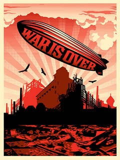
- War is OverBy Shepard FaireyLocated in New York, NYWar is Over Screen Print 18 x 24 inches Edition of 350 Signed and numberedCategory
21st Century and Contemporary Street Art Landscape Prints
MaterialsScreen
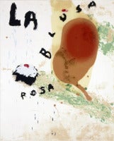
- La Blusa Rosa IIBy Julian SchnabelLocated in New York, NYLa Blusa Rosa II, 1995 "Sexual Spring-like Winter" is a large painterly work, created with layers of pink and resin by the art and film world's favorite enfant terrible, Julian Schn...Category
1990s Neo-Expressionist Abstract Prints
MaterialsScreen
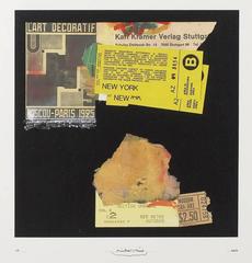
- L'Art DecoratifBy Richard MeierLocated in New York, NYRichard Meier L'Art Decoratif, 2011 Silkscreen Collage (mix media), sheet size: 30" x 30" signed numbered dated in pencil by the artist edition of 50 Richard Meier, (b.1934)...Category
2010s Contemporary Abstract Prints
MaterialsMixed Media, Screen
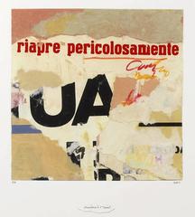
- PericolosamenteBy Richard MeierLocated in New York, NYRichard Meier Pericolosamente, 2011 Silkscreen Collage (mix media), sheet size: 30" x 30" signed numbered dated in pencil by the artist edition of 50 Richard Meier, (b.1934)...Category
2010s Constructivist Abstract Prints
MaterialsMixed Media, Screen
- Art, from American Signs portfolioBy Robert CottinghamLocated in New York, NYROBERT COTTINGHAM Art, from American Signs portfolio, 2009 screenprint in colors, on wove paper, with full margins, 40 1/8 x 39 1/8 in (101.9 x 99.4 cm) signed, dated `2009' and...Category
Early 2000s Photorealist Abstract Prints
MaterialsScreen
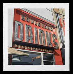
- Drinks, from American Signs portfolioBy Robert CottinghamLocated in New York, NYROBERT COTTINGHAM Drinks, from American Signs portfolio, 2009 screenprint in colors, on wove paper, with full margins 40 1/8 x 39 1/8 in (101.9 x 99.4 cm) signed, dated `2009...Category
Early 2000s Photorealist More Prints
MaterialsScreen

You May Also Like
- "Moi je veux vivre monotone" by Patrick Caulfield, Screenprint, Pop Art, PurpleBy Patrick CaulfieldLocated in Köln, DE"Moi je veux vivre monotone" is from the series "Some poems by Jules Laforgue". Patrick Caulfied was deeply inspired by these poems and found to his very own depiction of these poems...Category
1970s Pop Art Abstract Prints
MaterialsScreen
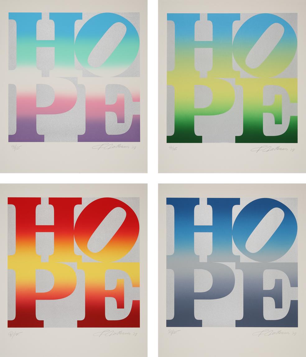
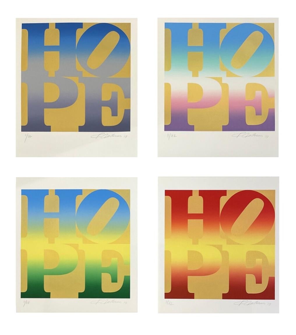
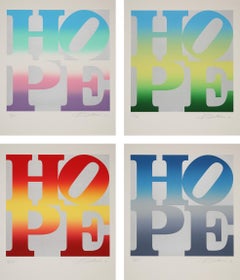
- Four Seasons of Hope (Silver) - HOPE, Four Seasons, vivid colors, silverBy Robert IndianaLocated in Köln, DEThis portfolio by Robert Indiana is a late icon of Pop Art. Since the mid-1960's, he has been working with the word LOVE. Numerous artworks featuring these four letters are well-know...Category
2010s Pop Art More Prints
MaterialsScreen
- "She fled along the avenue" by Patrick Caulfield, 20th Century, Still Life PrintBy Patrick CaulfieldLocated in Köln, DE"She fled along the avenue" is from the series "Some poems by Jules Laforgue". Patrick Caulfied was deeply inspired by these poems and found to his very own depiction of these poems....Category
1970s Pop Art Still-life Prints
MaterialsScreen
- Four Seasons of Hope (Gold) - Indiana, HOPE, Four Seasons, vivid colors, goldBy Robert IndianaLocated in Köln, DEThis portfolio by Robert Indiana is a late icon of Pop Art. Since the mid-1960's, he has been working with the word LOVE. Numerous artworks featuring these four letters are well-know...Category
2010s Pop Art More Prints
MaterialsScreen
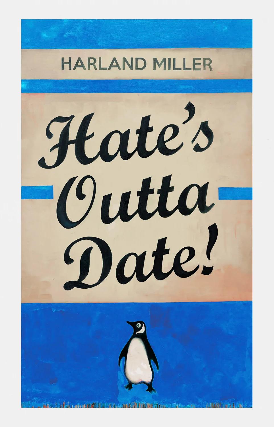
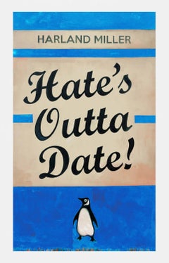
- Hate's Outta Date! (Blue)By Harland MillerLocated in London, GB'I have made two separate versions of this edition – not because it’s worth saying twice – although it is, but more evidently to do with the colours of two paintings I made on the sa...Category
21st Century and Contemporary Pop Art More Prints
MaterialsScreen
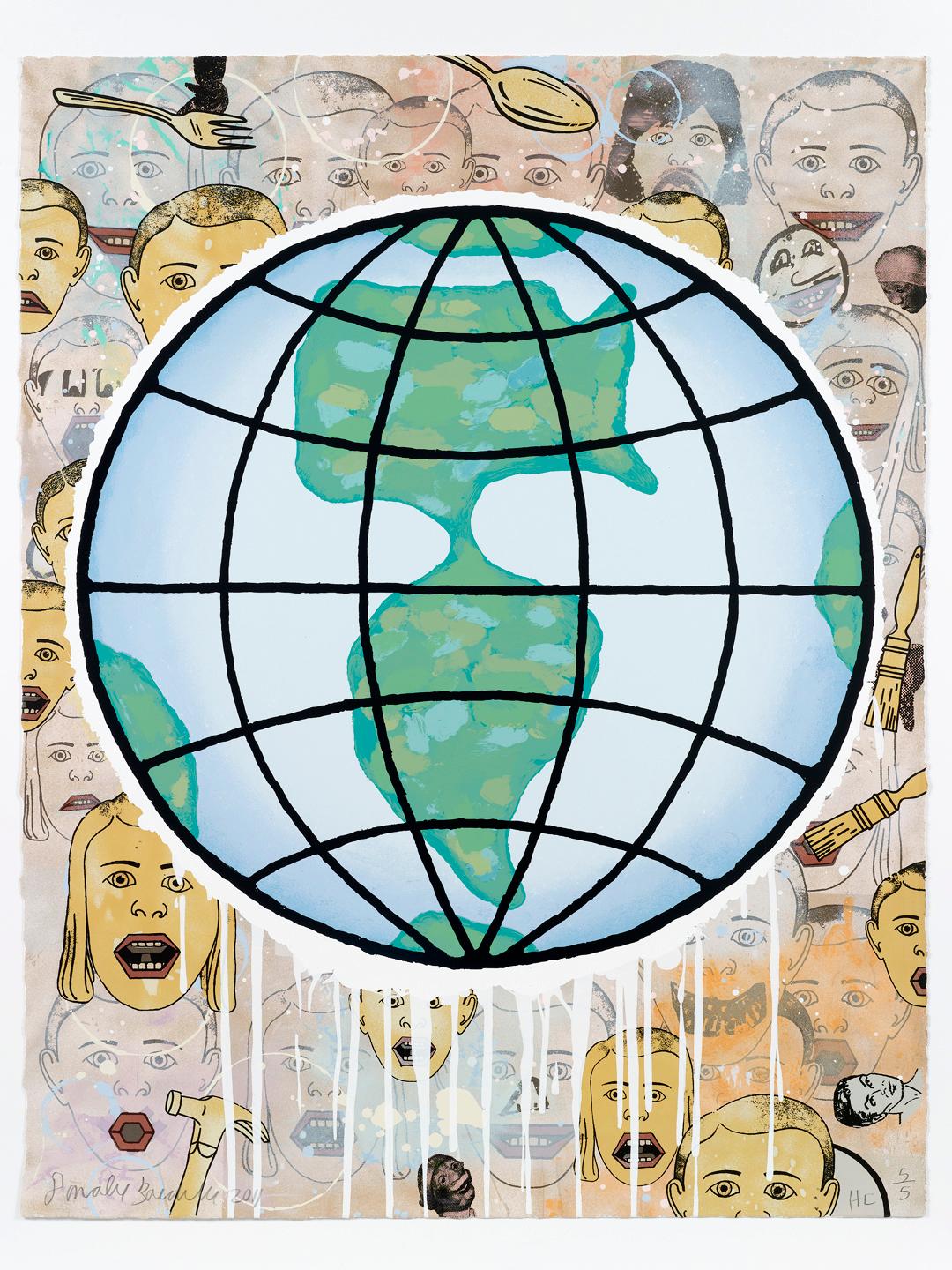
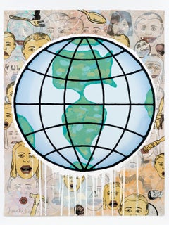
- Lincoln Center Globe by Donald Baechler (image of children around the globe)By Donald BaechlerLocated in New York, NYThis edition was printed in approximately 40 colors on Lanaquarelle paper with a deckled edge. The print is signed, numbered and dated, 2011 by the artist. The print comes directly f...Category
2010s Pop Art More Prints
MaterialsScreen


Recently Viewed
View AllMore Ways To Browse
Vintage Train Signs
Vintage Commercial Signs
Vintage American Advertising
Typography Prints
Railroad Print
Vintage Art Rural
Original Neon Signs
Pop Art Vintage Screen
Vintage Neon Art
Neon Art Vintage
70s Screen
Vintage Neon Sign
Black And White Pencil Drawings Paris
Neon Text Art
Vintage Neon Light
70s Western
Neon 1980s
Vintage California Coast