Items Similar to "Red/Blue/Black Diamond" Silkscreen Print signed by Ilya Bolotowsky


Want more images or videos?
Request additional images or videos from the seller
1 of 9
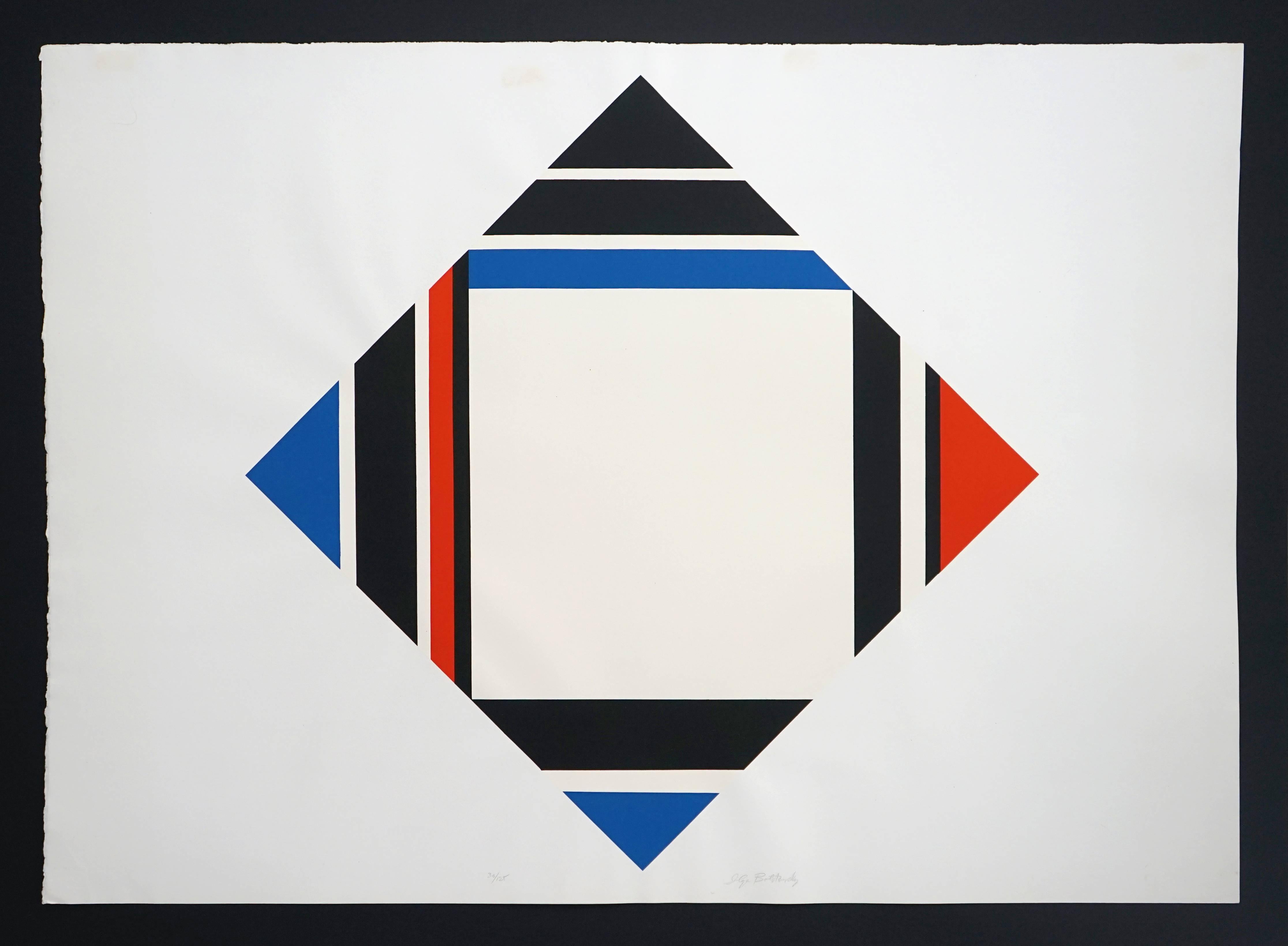
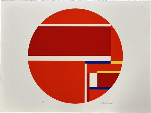
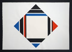
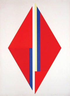
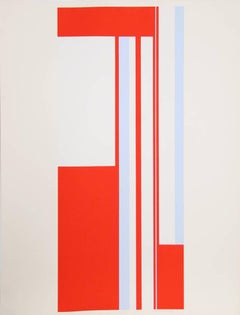
Ilya Bolotowsky"Red/Blue/Black Diamond" Silkscreen Print signed by Ilya Bolotowskyc. 1970
c. 1970
$4,500
£3,406.02
€3,921.98
CA$6,401.72
A$6,934.65
CHF 3,651.37
MX$84,172.27
NOK 45,537.21
SEK 43,054.36
DKK 29,278.69
About the Item
Ilya Bolotowsky's Red/Blue/Black Diamond from around 1970, immediately shows the deep influence of Piet Mondrian's New-Plasticism. Bolotowsky first saw Mondrian's paintings in the 1930s and adopted a Neo-Plastic style in the late 1940s. This diamond-shaped silkcreen recalls the primary colors and the vertical and horizontal patterns of the Dutch painter. Bolotowsky liked the diamond-shaped format. He has said "That the feeling of space is much greater in a diamond-shaped area than in a square of the same lateral measurement because the vertical and horizontal dimensions are larger in relationship to the whole." The artist has a clean, pure, formal approach to painting; he reduces the work to horizontal lines, primary colors and black and white, and a geometric shape. Set against a white rectangle, the work appears to be suspended or floating. The colors form horizontal and vertical lines that create a pulsating pattern that causes the eye to move about the work. This silkscreen recalls Maurice Denis's declaration that painting is a surface covered with colors, which Klein notes was recruited as a foundational expression of the theory of abstract or non-objective painting. According to the critic Donald Kuspit, "[t]his is what the abstract work of art says: It has no identity other than itself and references no reality beyond its own."
Signed to lower margin
Edition 48/125
25 3/4" x 35 7/8" art
26" x 36 1/4" framed
Ilya Bolotowsky was a leading early 20th-century painter in abstract styles in New York City. His work, a search for philosophical order through visual expression, embraced cubism and geometric abstraction and was much influenced by Dutch painter Piet Mondrian.
Born to Jewish parents in St. Petersburg, Russia, Bolotowsky immigrated to America in 1923 to settle in New York City. He attended the National Academy of Design and became associated with a group called "The Ten," artists, including Louis Schanker, Adolph Gottlieb, Mark Rothko and Joseph Solman, who rebelled against the structures of the Academy and held independent exhibitions.
During this period, Bolotowsky came under the influence of the De Stijl painter Piet Mondrian and the tenets of neoplasticism, a movement that advocated the possibility of ideal order in the visual arts. Bolotowsky adopted his mentor's use of horizontal and vertical geometric pattern and a palette restricted to primary colors and neutrals.
In 1936, having turned to geometric abstractions, he was one of the founding members of the American Abstract Artists, a cooperative formed to promote the interests of abstract painters and to increase understanding between themselves and the public. The David Barnett Gallery held a show of Bolotowsky's work just a year before the major Guggenheim retrospective of his work.
- Creator:Ilya Bolotowsky (1907-1981, American, Russian)
- Creation Year:c. 1970
- Dimensions:Height: 26 in (66.04 cm)Width: 36.25 in (92.08 cm)
- Medium:
- Movement & Style:
- Period:
- Framing:Frame IncludedFraming Options Available
- Condition:
- Gallery Location:Milwaukee, WI
- Reference Number:Seller: 6945g1stDibs: LU605312450392
Ilya Bolotowsky
Ilya Bolotowsky grew up in Russia and enjoyed drawing, but his family wanted him to do something “socially useful,” so he planned to be a lawyer. He changed his mind after he moved to New York, however, and enrolled at the National Academy of Design. During the 1930s, the Works Progress Administration hired him as a mural painter, and he was one of the first artists to create completely abstract designs for the project. He composed geometric images from colored rectangles and squares, inspired by his belief in “ideal harmony and order.” From the late 1940s, Bolotowsky used canvases shaped as diamonds, circles, and ovals to show how the edge of the painting could change the visual effect of the lines and angles within. (Bolotowsky, interviewed by Svendsen and Poser, Ilya Bolotowsky, 1974)
About the Seller
4.9
Gold Seller
Premium sellers maintaining a 4.3+ rating and 24-hour response times
Established in 1966
1stDibs seller since 2017
451 sales on 1stDibs
Typical response time: 3 hours
- ShippingRetrieving quote...Shipping from: Milwaukee, WI
- Return Policy
Authenticity Guarantee
In the unlikely event there’s an issue with an item’s authenticity, contact us within 1 year for a full refund. DetailsMoney-Back Guarantee
If your item is not as described, is damaged in transit, or does not arrive, contact us within 7 days for a full refund. Details24-Hour Cancellation
You have a 24-hour grace period in which to reconsider your purchase, with no questions asked.Vetted Professional Sellers
Our world-class sellers must adhere to strict standards for service and quality, maintaining the integrity of our listings.Price-Match Guarantee
If you find that a seller listed the same item for a lower price elsewhere, we’ll match it.Trusted Global Delivery
Our best-in-class carrier network provides specialized shipping options worldwide, including custom delivery.More From This Seller
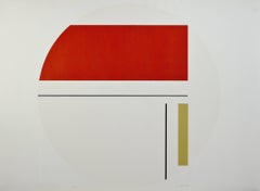
View All"Red & White Tondo, " Silkscreen Geometric Print signed by Ilya Bolotowsky
By Ilya Bolotowsky
Located in Milwaukee, WI
"Red & White Tondo" is a signed silkscreen print by Ilya Bolotowsky. It is a geometric circle with red, yellow, and black lines of differing widths going vertically and horizontally ...
Category
1970s Abstract Geometric Abstract Prints
Materials
Screen
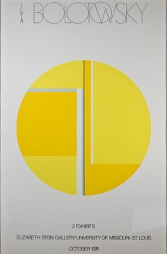
"Elizabeth Stein Gallery" Lithograph Exhibition Poster
By Ilya Bolotowsky
Located in Milwaukee, WI
"Elizabeth Stein Gallery A/P" is a color lithograph poster. This piece features an abstract and geometric design in yellow.
Unsigned.
40" x 26"
Born in Russia in 1907, Ilya Bolotowsky left his native country in his early childhood. The family was forced to emigrate as a result of his parent’s anti-Communist sentiments. They traveled first to Constantinople, then settled in New York City in 1923. Bolotowsky enrolled at the National Academy of Design in 1924. He tried out many styles in this period, ranging from the representational and classical to the abstract and expressionistic. In the early 1930s he became a designer of textiles. In 1932 Bolotowsky spent ten months in Europe. Although he was already familiar with prevailing modernist movements, the opportunity to study a wide range of these works and to meet some of the artists who had made them affected Bolotowsky profoundly. As a result of this trip, Bolotowsky began to synthesize aspects of Cubism with the abstract Surrealism of artists like Miro and Arp. These softer, floating forms gave way to a rectilinear geometry as he became more influenced by the Constructivists and Mondrian. Upon his return to the United States, Bolotowsky married his fellow painter Esphyr Slobodkina...
Category
1970s Abstract Geometric Abstract Prints
Materials
Lithograph
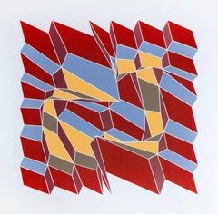
Diamond Variation IV/G
Located in Milwaukee, WI
The work of Ruth Leavitt (1944, Saint Paul, Minnesota) employs computation to manipulate and alter abstract forms by virtually stretching, rotating and deforming them across three ax...
Category
1970s Abstract Geometric Abstract Prints
Materials
Screen
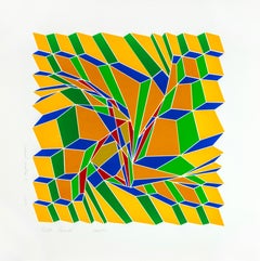
Diamond Variation V
Located in Milwaukee, WI
The work of Ruth Leavitt (1944, Saint Paul, Minnesota) employs computation to manipulate and alter abstract forms by virtually stretching, rotating and deforming them across three ax...
Category
1970s Abstract Geometric Abstract Prints
Materials
Screen
Diamond Variation I
Located in Milwaukee, WI
The work of Ruth Leavitt (1944, Saint Paul, Minnesota) employs computation to manipulate and alter abstract forms by virtually stretching, rotating and deforming them across three ax...
Category
1970s Abstract Geometric Abstract Prints
Materials
Screen
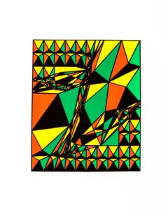
Prismatic Variation II
Located in Milwaukee, WI
The work of Ruth Leavitt (1944, Saint Paul, Minnesota) employs computation to manipulate and alter abstract forms by virtually stretching, rotating and deforming them across three ax...
Category
1970s Abstract Geometric Abstract Prints
Materials
Screen
You May Also Like
Red/Blue/Black Diamond
By Ilya Bolotowsky
Located in Austin, TX
Artist: Ilya Bolotowsky
Title: Red/Blue/Black Diamond
Year: 1970
Dimensions: 25.75 in x 35.875 in
Signed lower right
Edition: 30/125
Gondition: Good. 4 small square spots on top of w...
Category
1970s Abstract Geometric Abstract Prints
Materials
Screen
Blue and Red Rectangles, Geometric Abstract Screenprint by Chris Cristofaro
By Chris Cristofaro
Located in Long Island City, NY
Artist: Cris Cristofaro, American
Title: Untitled - Blue and Red Rectangles
Year: 1978
Medium: Screenprint on Arches Paper, signed and numbered in pencil...
Category
1970s Abstract Geometric Abstract Prints
Materials
Screen
Red, Geometric Abstract Screenprint by Pierre Clerk 1981
Located in Long Island City, NY
Artist: Pierre Clerk, American (1928 - )
Title: Red
Year: 1981
Medium: Silkscreen on BFK Rives, signed and numbered in pencil
Edition: PP 4/4
Image Size: ...
Category
1980s Abstract Geometric Abstract Prints
Materials
Paper, Screen
Geometric Composition with Red Diamond
By Ilya Bolotowsky
Located in Missouri, MO
Signed and Numbered Ed. 125
The following is excerpted from The New York Times, August 6, 2001 by Daniel Watkin:
"Shedding 7 Coats, a Beauty Emerges on a Hospital Wall"
By DANIEL J...
Category
Late 20th Century Abstract Abstract Prints
Materials
Lithograph
Series 6, De Stijl Silkscreen by Bolotowsky
By Ilya Bolotowsky
Located in Long Island City, NY
A silkscreen print by Ilya Bolotowsky circa 1970. A retro modern piece with an abstract geometric design.
Artist: Ilya Bolotowsky, Russian/American (1907 - 1981)
Title: Series 6
Yea...
Category
1970s Abstract Geometric Abstract Prints
Materials
Screen
Series 1, Geometric Abstract Screenprint by Bolotowsky
By Ilya Bolotowsky
Located in Long Island City, NY
A silkscreen print by Ilya Bolotowsky circa 1970. A retro modern piece with an abstract geometric design.
Artist: Ilya Bolotowsky, Russian/American (1907 - 1981)
Title: Series 1
Ye...
Category
1970s Abstract Geometric Abstract Prints
Materials
Screen
More Ways To Browse
Telemaque Herve
Ubu Roi
Andrew Crispo
Antique Prints Scottish Tartan
Blinky Palermo
Calder Sun
Debre Olivier
Deli Sacilotto
Exposition Vallauris
Helen Frankenthaler Signed
Joan Miro Lithograph Signed
Joan Miro Lithograph Volume 1
John Baldessari Signed
John Bolt
Moonlight Lithograph
Nude Descending A Staircase
Pace Gallery Columbus
Red Rider By Marino Marini