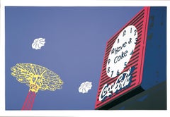
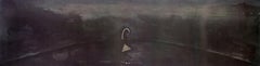
Items Similar to Arles/Miami by Malcolm Morley Miami beach postcard portfolio Van Gogh Arles
Want more images or videos?
Request additional images or videos from the seller
1 of 15
Malcolm MorleyArles/Miami by Malcolm Morley Miami beach postcard portfolio Van Gogh Arles1973
1973
About the Item
These colorful, exuberant and expressionistic works depict a series of hand-drawn Miami beach and tourism postcards in various states of permutation and collapse, at times curling in on themselves and dissolving into glorious, saturated scribbles, the final piece printed with shimmering silver in twenty nine colors. The Arles reference (inspiration for much of Van Gogh's work, and home at various points to Picasso, Gaugin, and Jacques Réattu) reveals Morley's penchant for art history reference in his art.
Malcolm Morley, Arles/Miami, 1973. A portfolio of five lithographs. All stones and plates were drawn by the artist and the editions pulled at the Shorewood Atelier in New York.
Each edition consists of 150 lithographs on Arches paper plus 25 Artist's Proofs on Rives BFK paper. Portfolio 63/150. Shorewood Atelier. Each lithograph is signed and numbered in pencil by the artist.
A copy of this portfolio is in the collection of MoMa, New York, Yale University Art Gallery, Connecticut, Harvard Art Museums, Boston, Minneapolis Institute of Art Collection, Minneapolis, and Brooklyn Museum, Brooklyn.
"MIAMI SILVER" - Twenty-one colors printed from five stones and one plate. 23¼" × 34.
"MIAMI POSTCARD" - Nine colors printed from nine plates. 23" × 33.
"PARROT JUNGLE TWIST" - Six colors printed from six plates. 24" × 34.
"PARROT JUNGLE" - Eleven colors printed from eleven plates. 24" x 34.
"ARLES" - Eight colors printed from eight plates. 24" x 34.
"In each of these lithographs Malcolm Morley takes as his point of departure a mechanical reproduction, as he did in his highly influential paintings of ocean liners and cabins in the mid-60s. The leisure theme recurs in his choice of Miami here ("Magic City; to quote his Miami Postcard), but with enormous technical and emotional differences. In the earlier works a grid was used to coordinate the photographic image with its painted form, but now the grid has been abolished. These lithographs, in fact, represent a climax of Morley's new concern to define form not by the use of a system but by an aggregate of specific observations.
These works are the outcome of a desire to work without the check of an overall system but in terms of a chain of concrete particulars. Thus he is drawing visually-the original postcard of Miami Postcard was drawn in perspective, a fact that is clearly visible- but the parts are not generalised relationally. Thus there is a tension between the legible image of the whole and the succession of detailed points of focus, each one momentary and self-sufficient.
Morley is depicting the world not in terms of an already-known, recognisable order but as a series of discrete sense impressions. His desire to get away from habitual forms of visual order is shown, too, by his choice of beat-up and man-handled objects, often rendered amorphous in close-up.
These lithographs are an essential phase of Morley's work, central to his meditation on artistic process and its possible relations to the world. It should be stressed that they are not derived from existing paintings or sketches. (In fact, Morley made two Miami paintings after the lithographs; in one the color separations of lithography influenced his painting technique and in the other thick paint was embedded with pearls and sequins.
The stretcher bars of both paintings followed the irregular boundaries of the splayed postcard. Morley has described his transfer of images between media as "parley-ing?) The lithographs belong in Morley's development like this. He made a big, two-sided painting New York City Foldout, taken from a concertina postcard which he treated as a free-standing screen. The Miami images pick up this theme of course, but the spatial zig-zag of the original is represented flat on the paper, leading to the remarkable array of complex silhouetted edges in the lithographs.
Morley's first step in making the lithographs was to have printed a black outline drawing, the copies of which gave him the means to "an infinity of choices" of color and treatment, to quote the artist. Miami Silver was made by taking this drawing and printing it in twenty colors using five stones with four colors each. As a result of scrupulous matching the drawing shifts color in narrow ripples from crimson to purple to green to dark blue to peacock blue to yellow, and so on. The linear outline is dissolved by the elusive definition and by the rhythmic repetition of color.
Miami Postcard and Miami Silver convert the successive views of the extended three-dimensional postcard into a flat surface, but there are more complex translations. In Parrot Jungle Twist the ribbon of images has been rotated in space and in Parrot Jungle the postcard has been torn and crumpled (and exposed to rain), so that the crushed panels become a luxurious marsh. An organic dilapidation permeates the images and objects in Arles, also, denying us easily-read cues of identity and scale.
There is no doubt that Morley is thinking of subjects beyond the literal presence of the still life object. A part of this meaning is the sense he gives of a city by using an inventory of its monuments and amenities ("beautiful beaches"), but taking them over on his own terms. For instance, all that remains readable in Parrot Jungle Twist are the words "Race" and "Skaters? Such conjunctions are both common and evocative in our sign-heavy urban culture.
All the views of Miami are shown to us at angles (which contracts the landscape space of the post-card) or incompletely (which fragments the world by overlapping). This is in addition of course to the radical translation of glossy reproductions into Morley's curt, jabbing, and decisive draughtsmanship. He has an urge to be comprehensive: the usefulness of the foldout to Morley is partly that it is two-sided, enabling him to show, when it is pleated or twisted, both front and back. In Arles and Parrot Jungle he dissolves the edges of objects and gives us an amorphous whole suggesting comprehensiveness here by means of an organic continuum. The metropolitan images, then, are neither placid nor devoted quotation, as the title of this portfolio indicates: Arles/Miami.
Arles as a place name is inseparably linked with Van Gogh: it was here that he suffered his first mental disturbance, attacking Gauguin and mutilating his own ear; and it was here that he experienced the pressure of the townspeople to accept full time confinement in hospital. The allusion to Van Gogh's painting The Bridge at Arles is by way of a MiniMasters jigsaw puzzle: several pieces of the unmade-up puzzle are in the lower right and the reproduction of the painting on the lid (an aid to completing the puzzle) is inverted.
What is involved in Morley's procedure of working intensely on one part at a time, with a suspension, as far as possible, of prior judgment, can be seen by reference to the transcription of some words in Miami Postcard. In "Down the stretch-Hiale" there is a contraction of Hialeah and "Busy Down Miami" must have read originally. "Busy Down Town Miami" Just as there is an element of destruction in Morley's use of crumpled objects, just as there is the hint of alienation in the reference to Arles, so these verbal changes imply a breakdown of language. The theme of destruction and loss is first clearly stated in Morley's painting of 1971, Los Angeles Yellow Pages. Here a photograph of the city on the cover of a battered public telephone book is painted in a way that converts wear into cataclysm: the creased and stained paper becomes a metaphor of the San Andreas fault. In Arles/ Miami the imagery of leisure (and even Van Gogh is present as a game) is tangled with an ominous sense of things giving way. The sense of process conveyed by the lithographs is double: there is, on one hand, an imagery of the world changing and, on the other hand, there is a sense of the image being formed, the two levels united in a turbulent flow."
LAWRENCE ALLOWAY
- Creator:Malcolm Morley (1931, British)
- Creation Year:1973
- Dimensions:Height: 34 in (86.36 cm)Width: 23 in (58.42 cm)Depth: 0.25 in (6.35 mm)
- Medium:
- Movement & Style:
- Period:
- Condition:Prints in excellent condition with light aging of paper tone. Original portfolio with light wear.
- Gallery Location:New York, NY
- Reference Number:1stDibs: LU1211214061172
About the Seller
5.0
Gold Seller
These expertly vetted sellers are highly rated and consistently exceed customer expectations.
Established in 1968
1stDibs seller since 2019
293 sales on 1stDibs
Typical response time: <1 hour
- ShippingRetrieving quote...Ships From: New York, NY
- Return PolicyA return for this item may be initiated within 7 days of delivery.
More From This SellerView All
- Sparire I Enzo Cucchi large scale abstract dream scape etching with screeprintBy Enzo CucchiLocated in New York, NYSparire means "to disappear" in Italian. This large-scale, dreamlike print spans almost ten feet. Enzo Cucchi Sparire 1, 1988 Color etching, aquatint and silkscreen 30 1/2 × 118 in ...Category
1980s Surrealist Abstract Prints
MaterialsScreen, Etching, Aquatint
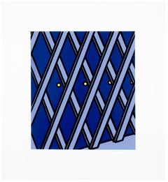
- I'll take my life monotonous from "Some Poems of Jules Laforgue" graphic pop artBy Patrick CaulfieldLocated in New York, NYPrinted in glossy purple, lavender, and bright yellow, I'll take my life monotonous by Patrick Caulfield depicts a lattice outlined in black, with three small dots of yellow. A garden lattice...Category
Late 20th Century Pop Art Landscape Prints
MaterialsScreen
- Sparire 2, Enzo Cucchi dream scape surreal etching, aquatint and silkscreenBy Enzo CucchiLocated in New York, NYSparire means "to disappear" in Italian. This large-scale, dreamlike print spans almost ten feet. Enzo Cucchi Sparire II, 1988 Color etching, aquatint and silkscreen 30 1/2 × 118 in...Category
1980s Abstract Prints
MaterialsEtching, Aquatint, Screen
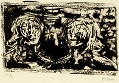
- Two Heads by Henry Moore abstract black and white figure portrait AudenBy Henry MooreLocated in New York, NYOne of a series of 18 lithographs drawn by the artist for the Auden Poems/Moore Lithographs 1974 book and portfolio. This work is from an edition of 25 printed on vellum aside from t...Category
Late 20th Century Realist Abstract Prints
MaterialsLithograph
- Multitude II Henry Moore yorkshire landscape black and white abstract drawingBy Henry MooreLocated in New York, NYOne of a series of 18 lithographs drawn by the artist for the Auden Poems/Moore Lithographs 1974 book and portfolio. This work is from an edition of 25 printed on vellum aside from t...Category
Late 20th Century Abstract Prints
MaterialsLithograph
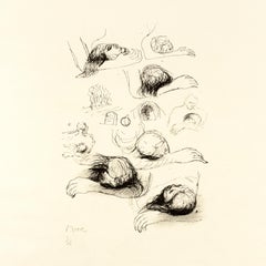
- Lullaby Sketches: black white drawing based on Auden poetry and Yorkshire landsBy Henry MooreLocated in New York, NYOne of a series of 18 lithographs drawn by the artist for the Auden Poems/Moore Lithographs 1974 book and portfolio. This work is from an edition of 25 printed on vellum aside from t...Category
Late 20th Century Modern Abstract Prints
MaterialsLithograph

You May Also Like
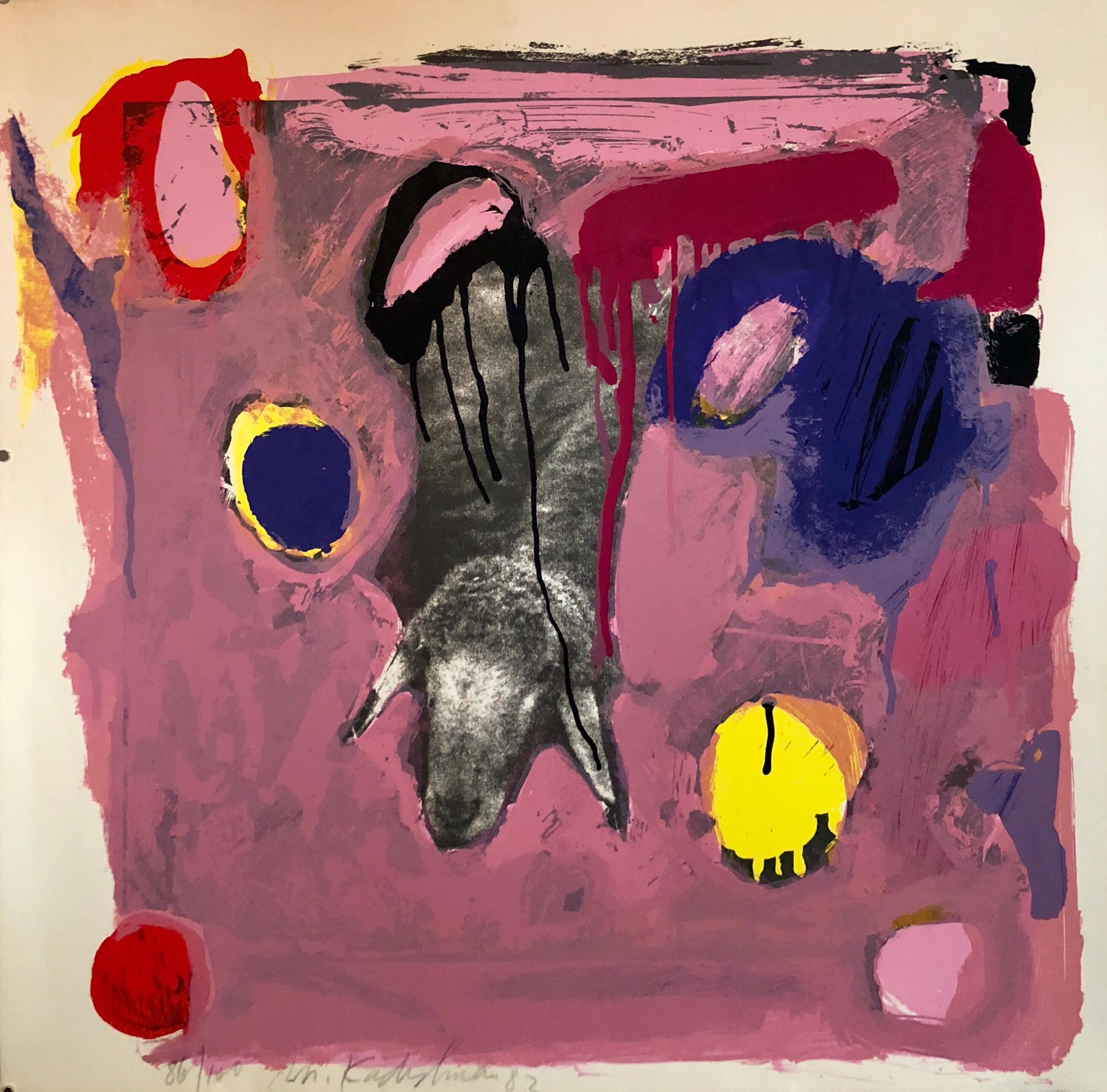
- Israeli Modern Pop Art Photo Silkscreen Serigraph Abstract Paint Sheep KadishmanBy Menashe KadishmanLocated in Surfside, FLMenashe Kadishman was born in Tel-Aviv in 1932. He is a Graduate of St. Martin's School of Art, University of London Studies with Anthony Caro, Reg Butler. From 1947 to 1950, Kadish...Category
1980s Abstract Expressionist Landscape Prints
MaterialsLithograph, Screen
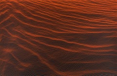
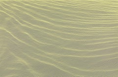
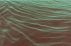
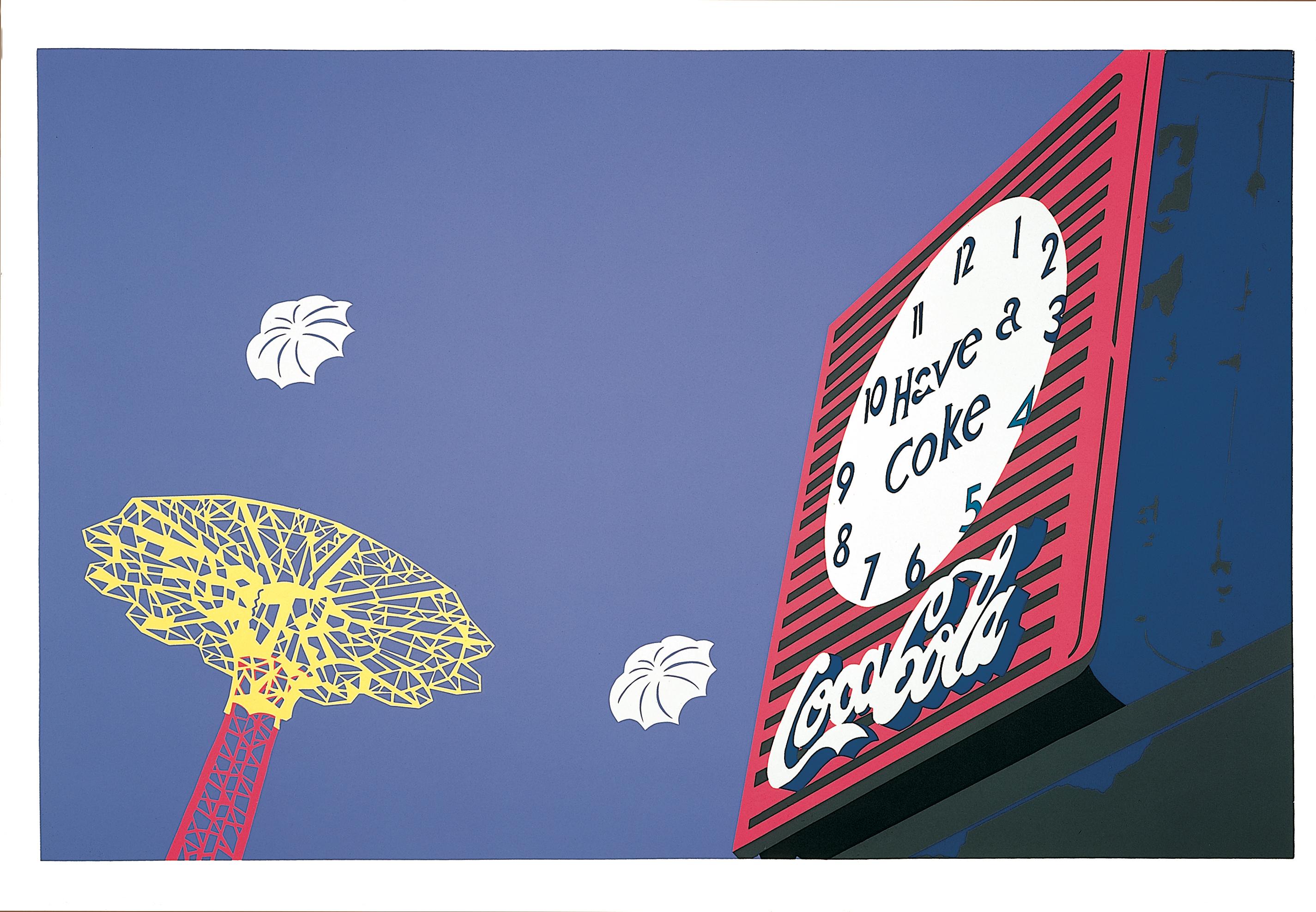
- Clock & Chute, 1981By Philomena MaranoLocated in Brooklyn, NYEdition of 200 Coney Island Philomena Marano is known for her colorful cut paper technique. She worked with Robert Indiana. Ms. Marano's work is in m...Category
1980s Hard-Edge Abstract Prints
MaterialsScreen
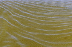
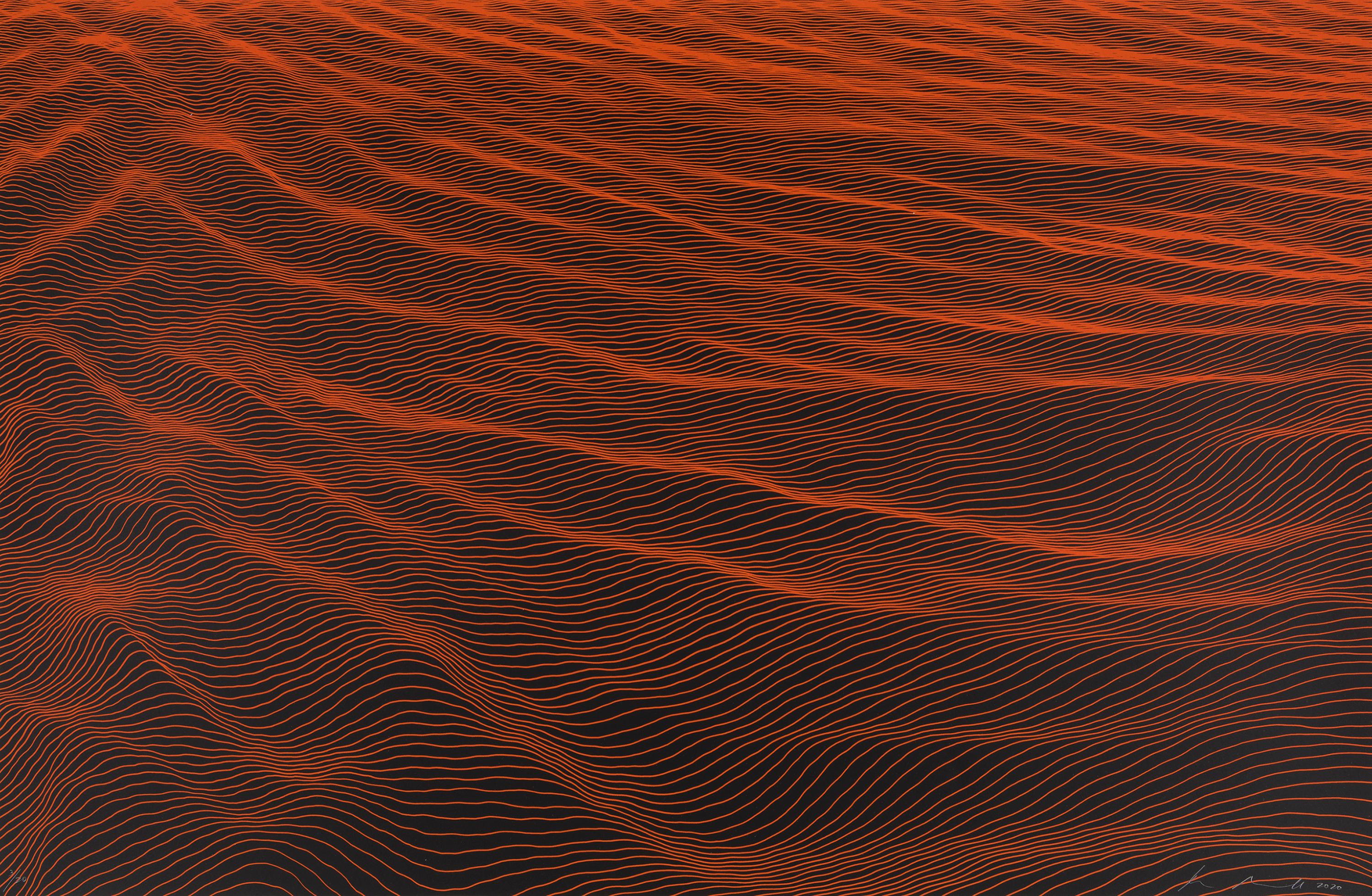
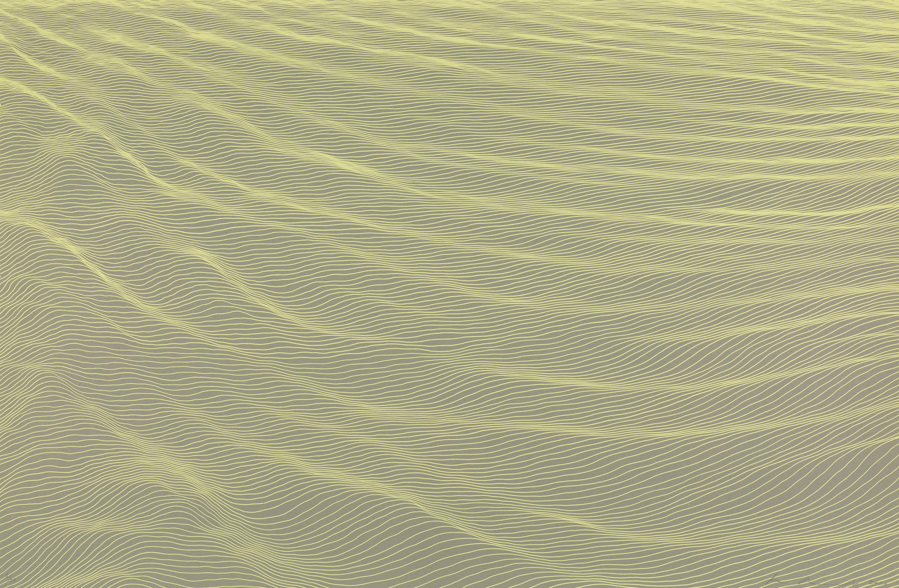
- Crepe de Chine IV, contemporary abstract red, linear patterned screenprint, 2020By Ann AspinwallLocated in New York, NYCrepe de Chine IV is a jewel-toned screen sprint featuring a serene, undulating terrain of free-flowing lines. Aspinwall works primarily in print mediums because they afford her a me...Category
2010s Abstract Abstract Prints
MaterialsScreen
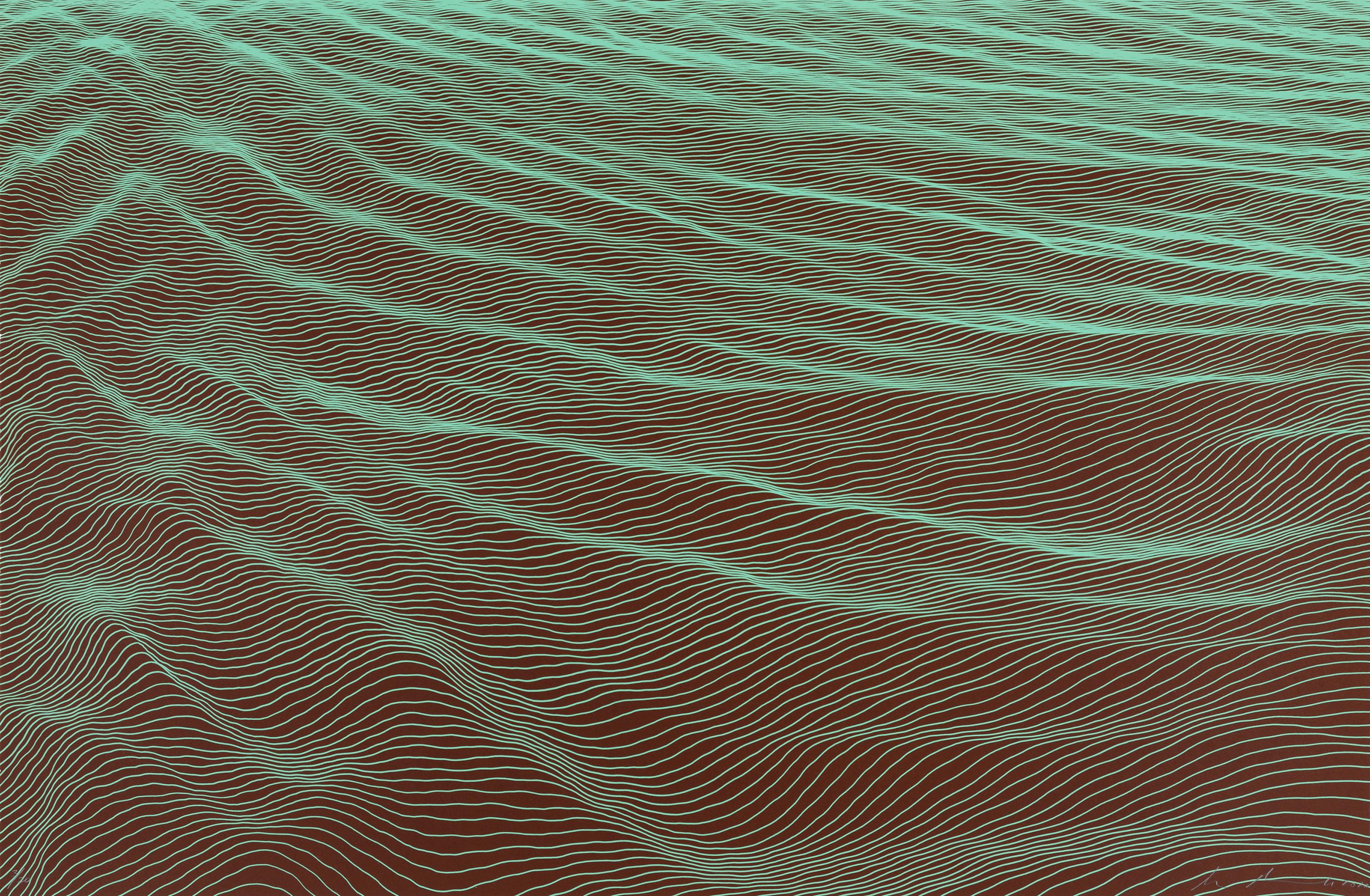
- Crepe de Chine I, contemporary abstract screenprint, 2020By Ann AspinwallLocated in New York, NYCrepe de Chine I is a pastel-colored screen sprint featuring a serene, undulating terrain of free-flowing lines. Aspinwall works primarily in print mediums because they afford her a ...Category
2010s Abstract Abstract Prints
MaterialsScreen
- Crepe de Chine III, contemporary green linear patterned abstract screenprintBy Ann AspinwallLocated in New York, NYCrepe de Chine III is a jewel-toned screen sprint featuring a serene, undulating terrain of free-flowing lines. Aspinwall works primarily in print mediums because they afford her a m...Category
2010s Abstract Abstract Prints
MaterialsScreen
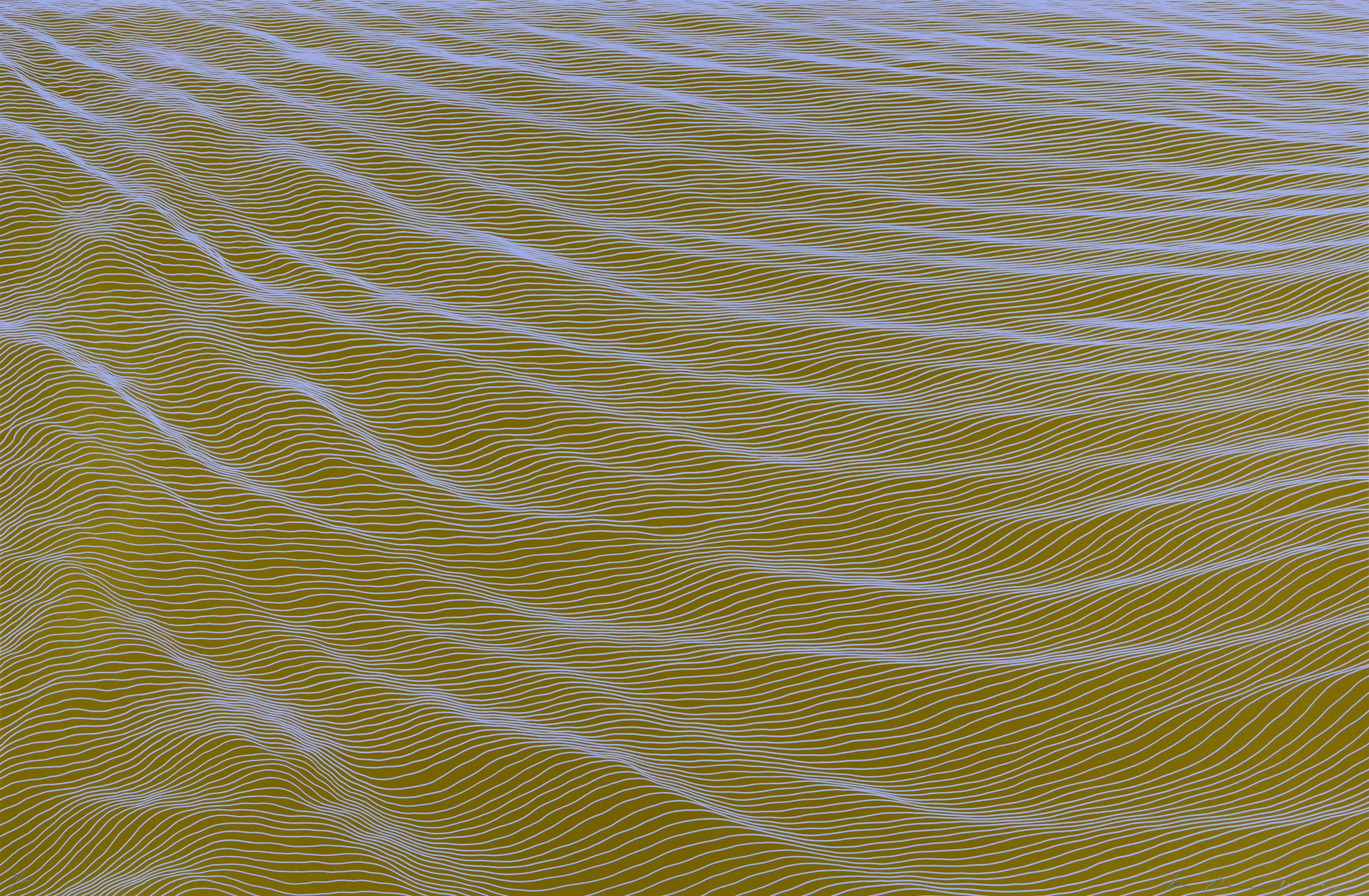
- Crepe de Chine II, contemporary blue abstract screenprintBy Ann AspinwallLocated in New York, NYCrepe de Chine II is a pastel-colored screen sprint featuring a serene, undulating terrain of free-flowing lines. Aspinwall works primarily in print mediums because they afford her a...Category
2010s Abstract Abstract Prints
MaterialsScreen