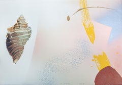
Items Similar to "Shell, " Original Etching signed by Arthur Luiz Piza
Want more images or videos?
Request additional images or videos from the seller
1 of 9
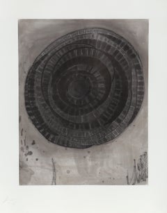
Arthur Luiz Piza"Shell, " Original Etching signed by Arthur Luiz Pizacirca 1960
circa 1960
$5,150
£3,989.78
€4,544.86
CA$7,373.45
A$8,052.38
CHF 4,226.81
MX$96,581.03
NOK 53,234.54
SEK 50,007.71
DKK 33,937.27
About the Item
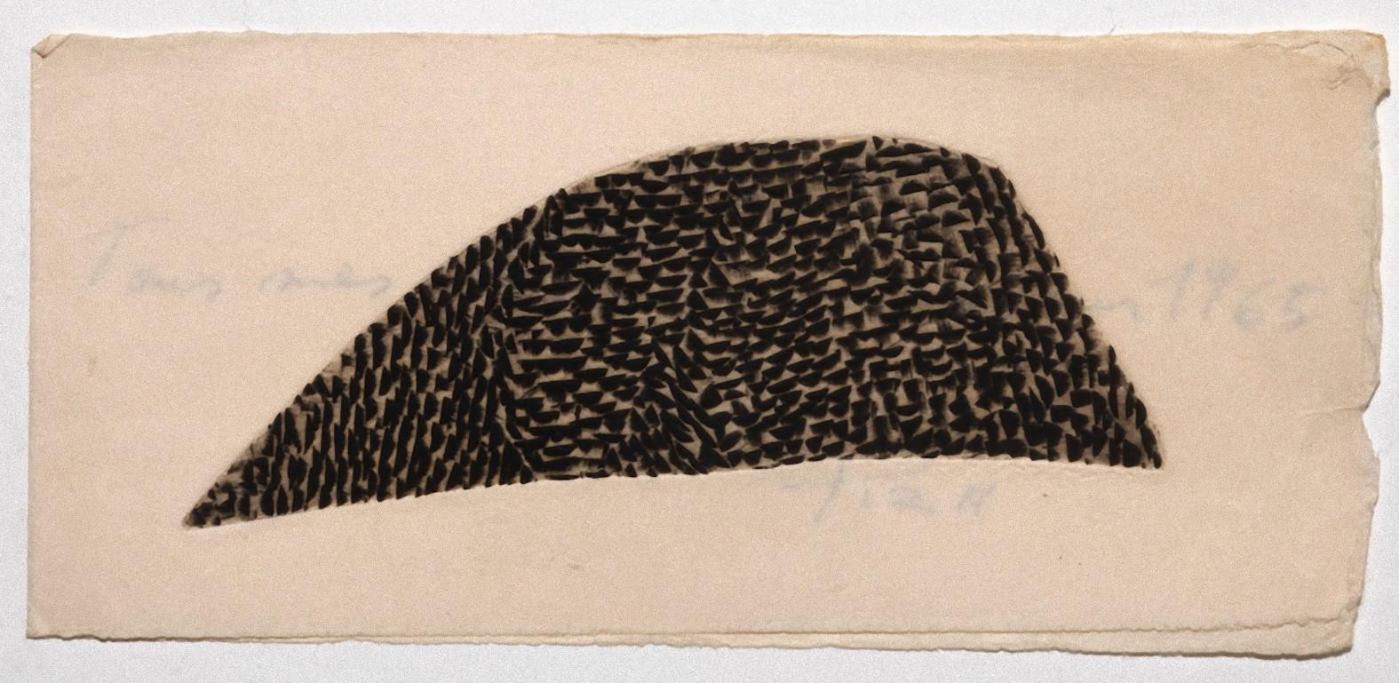
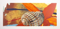
"Shell" is an original etching by Arthur Luiz Piza. It depicts an abstract, textured shell in the shape of an egg. The artist signed the piece lower right and wrote the edition number (32/99) in the lower left. This artwork is framed with a 23K gold leaf frame.
27" x 20" art
39 1/8" x 31 1/8" frame
Piza was born in Sao Paulo, where he received his first training. He moved to Paris in 1955 and worked in the studio of the master of colour etching, Johnny Friedlaender. Piza soon became expert in all the techniques of etching and aquatint, using sugar-lift extensively, but he experimented in various ways to make his work more sculptural and three dimensional. He abandoned traditional etching techniques and, using very thick copper plates, he devised his unique "gouge" technique by incising his designs into his plates with hammers and various shaped chisels. The precision required is exact as his grooves need to be precisely deep and wide enough to hold his hand-made special inks. Because of the depths of the grooves, the direction of the wiping directly affects the final impression
. Each impression of his prints requires at least 30 minutes between colours in order for the plate to be re-inked and wiped, and he has to use cold plates in order for the inks not to dry out. The process of producing each impression is a time consuming and laborious process of collaboration between Piza and his printers. His work has met with great success and is shown in major public collections world-wide, including MOMA in New York, the Bibliothèque Nationale and the Musée d’Art Nationale (Centre Pompidou) in Paris. He has been awarded numerous prizes, notably for etching, at the 1959 Sao Paolo Biennale and at Documenta Kassel in 1959.
From 1958, Piza devoted himself primarily to burin engraving. Starting from this period, the artist created reliefs and collages, as well as sculpted objects, porcelain and jewellery. During the 1960’s, Arthur Luiz Piza became known as one of the most compelling representatives of the art of engraving. His style is very personal: the plate is cut, gashed, gouged, hammered, sculpted in small, successive marks that, like scales, interlock and overlap; hollows become volumes. The artist works with the perception of matter, matter that is imaginary and poeticised. The colours used by the artist are often ochres, muted and subdued. Arthur Luiz Piza lives and works in Paris.
- Creator:Arthur Luiz Piza (1928 - 2017, Brazilian)
- Creation Year:circa 1960
- Dimensions:Height: 39.125 in (99.38 cm)Width: 31.125 in (79.06 cm)
- Medium:
- Movement & Style:
- Period:
- Condition:
- Gallery Location:Milwaukee, WI
- Reference Number:Seller: 7297g1stDibs: LU60533002051
Arthur Luiz Piza
Piza was born in Sao Paulo in 1928, where he received his first training. He moved to Paris in 1955 and worked in the studio of the master of colour etching, Johnny Friedlaender. Piza soon became expert in all the techniques of etching and aquatint, using sugar-lift extensively, but he experimented in various ways to make his work more sculptural and three dimensional. He abandoned traditional etching techniques and, using very thick copper plates, he devised his unique "gouge" technique by incising his designs into his plates with hammers and various shaped chisels. The precision required is exact as his grooves need to be precisely deep and wide enough to hold his hand-made special inks. Because of the depths of the grooves, the direction of the wiping directly affects the final impression. Each impression of his prints requires at least 30 minutes between colours in order for the plate to be re-inked and wiped, and he has to use cold plates in order for the inks not to dry out. The process of producing each impression is a time consuming and laborious process of collaboration between Piza and his printers. His work has met with great success and is shown in major public collections world-wide, including MOMA in New York, the Bibliothèque Nationale and the Musée d'Art Nationale (Centre Pompidou) in Paris. He has been awarded numerous prizes, notably for etching, at the 1959 Sao Paolo Biennale and at Documenta Kassel in 1959. Public Collections: Solomon Guggenhiem Museum,
Musee d’art de Lodz
Albertine Musuem
Belgrade Museum of Modern Art
Rome National Gallery of Modern Art
New York Musuem of Modern Art
Victoria and Albert Musuem London
Art Institute of Chicago
Museum of Contempory Art San Paulo
Museum of Modern Art Rio de Janeiro
Museum of Modern Art San Paulo
Museum of Modern Art Paris
About the Seller
4.9
Gold Seller
Premium sellers maintaining a 4.3+ rating and 24-hour response times
Established in 1966
1stDibs seller since 2017
452 sales on 1stDibs
Typical response time: 1 hour
- ShippingRetrieving quote...Shipping from: Milwaukee, WI
- Return Policy
Authenticity Guarantee
In the unlikely event there’s an issue with an item’s authenticity, contact us within 1 year for a full refund. DetailsMoney-Back Guarantee
If your item is not as described, is damaged in transit, or does not arrive, contact us within 7 days for a full refund. Details24-Hour Cancellation
You have a 24-hour grace period in which to reconsider your purchase, with no questions asked.Vetted Professional Sellers
Our world-class sellers must adhere to strict standards for service and quality, maintaining the integrity of our listings.Price-Match Guarantee
If you find that a seller listed the same item for a lower price elsewhere, we’ll match it.Trusted Global Delivery
Our best-in-class carrier network provides specialized shipping options worldwide, including custom delivery.More From This Seller
View All"In The Clear" original lithograph signed pop art abstract seashell calm vibrant
By Michael Knigin
Located in Milwaukee, WI
"In The Clear" is an original color lithograph by Michael Knigin. The artist signed, titled, and dated the artwork in lower center. This piece is an artist's proof. It features a she...
Category
1980s Pop Art Abstract Prints
Materials
Lithograph, Ink
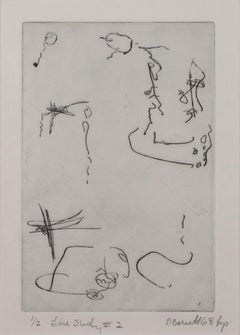
"Line Study #2, " Original Abstract Etching signed by David Barnett
By David Barnett
Located in Milwaukee, WI
"Line Study #2" is an original limited edition etching by David Barnett signed in the lower right corner. The title and edition number are in the lower left...
Category
1960s Contemporary Prints and Multiples
Materials
Etching
"Untitled 1970 C.P. #235" original lithograph abstract pop art signed mellow
By Garo Zareh Antreasian
Located in Milwaukee, WI
"Untitled 1970 C.P. #235" is an original color lithograph with blended ink signed by the artist Garo Zareh Antreasian. It is editioned 10/60 in the center lower left margin with grap...
Category
1970s Abstract Geometric Abstract Prints
Materials
Ink, Lithograph
"Fair Passer" pop art original lithograph signed abstract ocean seashell bright
By Michael Knigin
Located in Milwaukee, WI
"Fair Passer" is an original color lithograph by Michael Knigin. The artist signed the piece in the lower right and titled/editioned (65/300) in the lower left with graphite. This ar...
Category
1980s Pop Art Prints and Multiples
Materials
Lithograph
"India, " Abstract Woodcut and Monotype signed by Carol Summers
By Carol Summers
Located in Milwaukee, WI
"India" is a woodcut and monotype signed by Carol Summers. Here, Summer's abstract language for landscape imagery is taken to its most extreme: The image offers a view of a highly stylized waterfall, with red water falling down behind green foliage below. A hint of light blue at the lower left suggests a continuation of the water's flow. Above, purples and yellows mist upward from the power of the water. The playfulness of the image is enhanced by Summers' signature printmaking technique, which allows the ink from the woodblock to seep through the paper, blurring the edges of each form. Summers' signature can be found in pencil at the bottom of the rightmost blue form, with the title and edition at the bottom of the leftmost blue form. A copy of this print can be found in the collection of the Fine Arts Museums of San Francisco.
37.25 x 24.88 inches, artwork
48.5 x 35.5 inches, frame
Numbered 44 from the edition of 75
Carol Summers (1925-2016) has worked as an artist throughout the second half of the 20th century and into the first years of the next, outliving most of his mid-century modernist peers. Initially trained as a painter, Summers was drawn to color woodcuts around 1950 and it became his specialty thereafter. Over the years he has developed a process and style that is both innovative and readily recognizable. His art is known for it’s large scale, saturated fields of bold color, semi-abstract treatment of landscapes from around the world and a luminescent quality achieved through a printmaking process he invented.
In a career that has extended over half a century, Summers has hand-pulled approximately 245 woodcuts in editions that have typically run from 25 to 100 in number. His talent was both inherited and learned. Born in 1925 in Kingston, a small town in upstate New York, Summers was raised in nearby Woodstock with his older sister, Mary. His parents were both artists who had met in art school in St. Louis. During the Great Depression, when Carol was growing up, his father supported the family as a medical illustrator until he could return to painting. His mother was a watercolorist and also quite knowledgeable about the different kinds of papers used for various kinds of painting. Many years later, Summers would paint or print on thinly textured paper originally collected by his mother.
From 1948 to 1951, Carol Summers trained in the classical fine and studio arts at Bard College and at the Art Students League of New York. He studied painting with Steven Hirsh and printmaking with Louis Schanker. He admired the shapes and colors favored by early modernists Paul Klee (Sw: 1879-1940) and Matt Phillips (Am: b.1927- ). After graduating, Summers quit working as a part-time carpenter and cabinetmaker (which had supported his schooling and living expenses) to focus fulltime on art. That same year, an early abstract, Bridge No. 1 was selected for a Purchase Prize in a competition sponsored by the Brooklyn Museum.
In 1952, his work (Cathedral, Construction and Icarus) was shown the first time at the Museum of Modern Art in New York City in an exhibition of American woodcuts. In 1954, Summers received a grant from the Italian government to study for a year in Italy. Woodcuts completed soon after his arrival there were almost all editions of only 8 to 25 prints, small in size, architectural in content and black and white in color. The most well-known are Siennese Landscape and Little Landscape, which depicted the area near where he resided. Summers extended this trip three more years, a decision which would have significant impact on choices of subject matter and color in the coming decade.
After returning from Europe, Summers’ images continued to feature historical landmarks and events from Italy as well as from France, Spain and Greece. However, as evidenced in Aetna’s Dream, Worldwind and Arch of Triumph, a new look prevailed. These woodcuts were larger in size and in color. Some incorporated metal leaf in the creation of a collage and Summers even experimented with silkscreening. Editions were now between 20 and 50 prints in number. Most importantly, Summers employed his rubbing technique for the first time in the creation of Fantastic Garden in late 1957.
Dark Vision of Xerxes, a benchmark for Summers, was the first woodcut where Summers experimented using mineral spirits as part of his printmaking process. A Fulbright Grant as well as Fellowships from the Louis Comfort Tiffany Foundation and the Guggenheim Foundation followed soon thereafter, as did faculty positions at colleges and universities primarily in New York and Pennsylvania. During this period he married a dancer named Elaine Smithers with whom he had one son, Kyle. Around this same time, along with fellow artist Leonard Baskin, Summers pioneered what is now referred to as the “monumental” woodcut. This term was coined in the early 1960s to denote woodcuts that were dramatically bigger than those previously created in earlier years, ones that were limited in size mostly by the size of small hand-presses. While Baskin chose figurative subject matter, serious in nature and rendered with thick, striated lines, Summers rendered much less somber images preferring to emphasize shape and color; his subject matter approached abstraction but was always firmly rooted in the landscape.
In addition to working in this new, larger scale, Summers simultaneously refined a printmaking process which would eventually be called the “Carol Summers Method” or the “ Carol Summers Technique”. Summers produces his woodcuts by hand, usually from one or more blocks of quarter-inch pine, using oil-based printing inks and porous mulberry papers. His woodcuts reveal a sensitivity to wood especially its absorptive qualities and the subtleties of the grain. In several of his woodcuts throughout his career he has used the undulating, grainy patterns of a large wood plank to portray a flowing river or tumbling waterfall. The best examples of this are Dream, done in 1965 and the later Flash Flood Escalante, in 2003. In the majority of his woodcuts, Summers makes the blocks slightly larger than the paper so the image and color will bleed off the edge.
Before printing, he centers a dry sheet of paper over the top of the cut wood block or blocks, securing it with giant clips. Then he rolls the ink directly on the front of the sheet of paper and pressing down onto the dry wood block or reassembled group of blocks. Summers is technically very proficient; the inks are thoroughly saturated onto the surface of the paper but they do not run into each other. The precision of the color inking in Constantine’s Dream in 1969 and Rainbow Glacier in 1970 has been referred to in various studio handbooks. Summers refers to his own printing technique as “rubbing”. In traditional woodcut printing, including the Japanese method, the ink is applied directly onto the block. However, by following his own method, Summers has avoided the mirror-reversed image of a conventional print and it has given him the control over the precise amount of ink that he wants on the paper. After the ink is applied to the front of the paper, Summers sprays it with mineral spirits, which act as a thinning agent. The absorptive fibers of the paper draw the thinned ink away from the surface softening the shapes and diffusing and muting the colors. This produces a unique glow that is a hallmark of the Summers printmaking technique. Unlike the works of other color field artists or modernists of the time, this new technique made Summers’ extreme simplification and flat color areas anything but hard-edged or coldly impersonal.
By the 1960s, Summers had developed a personal way of coloring and printing and was not afraid of hard work, doing the cutting, inking and pulling himself. In 1964, at the age of 38, Summers’ work was exhibited for a second time at the Museum of Modern Art. This time his work was featured in a one-man show and then as one of MoMA’s two-year traveling exhibitions which toured throughout the United States. In subsequent years, Summers’ works would be exhibited and acquired for the permanent collections of multiple museums throughout the United States, Europe and Asia. Summers’ familiarity with landscapes throughout the world is firsthand. As a navigator-bombardier in the Marines in World War II, he toured the South Pacific and Asia.
Following college, travel in Europe and subsequent teaching positions, in 1972, after 47 years on the East Coast, Carol Summers moved permanently to Bonny Doon in the Santa Cruz Mountains in Northern California. There met his second wife, Joan Ward Toth, a textile artist who died in 1998; and it was here his second son, Ethan was born. During the years that followed this relocation, Summers’ choice of subject matter became more diverse although it retained the positive, mostly life-affirming quality that had existed from the beginning. Images now included moons, comets, both sunny and starry skies, hearts and flowers, all of which, in one way or another, remained tied to the landscape.
In the 1980s, from his home and studio in the Santa Cruz mountains, Summers continued to work as an artist supplementing his income by conducting classes and workshops at universities in California and Oregon as well as throughout the Mid and Southwest. He also traveled extensively during this period hiking and camping, often for weeks at a time, throughout the western United States and Canada. Throughout the decade it was not unusual for Summers to backpack alone or with a fellow artist into mountains or back country for six weeks or more at a time. Not surprisingly, the artwork created during this period rarely departed from images of the land, sea and sky. Summers rendered these landscapes in a more representational style than before, however he always kept them somewhat abstract by mixing geometric shapes with organic shapes, irregular in outline. Some of his most critically acknowledged work was created during this period including First Rain, 1985 and The Rolling Sea, 1989. Summers received an honorary doctorate from his alma mater, Bard College in 1979 and was selected by the United States Information Agency to spend a year conducting painting and printmaking workshops at universities throughout India. Since that original sabbatical, he has returned every year, spending four to eight weeks traveling throughout that country.
In the 1990s, interspersed with these journeys to India have been additional treks to the back roads and high country areas of Mexico, Central America, Nepal, China and Japan. Travel to these exotic and faraway places had a profound influence on Summers’ art. Subject matter became more worldly and nonwestern as with From Humla to Dolpo, 1991 or A Former Life of Budha, 1996, for example. Architectural images, such as The Pillars of Hercules, 1990 or The Raja’s Aviary, 1992 became more common. Still life images made a reappearance with Jungle Bouquet in 1997. This was also a period when Summers began using odd-sized paper to further the impact of an image.
The 1996 Night, a view of the earth and horizon as it might be seen by an astronaut, is over six feet long and only slightly more than a foot-and-a-half high. From 1999, Revuelta A Vida (Spanish for “Return to Life”) is pie-shaped and covers nearly 18 cubic feet. It was also at this juncture that Summers began to experiment with a somewhat different palette although he retained his love of saturated colors. The 2003 Far Side of Time is a superb example of the new direction taken by this colorist.
At the turn of the millennium in 1999, “Carol Summers Woodcuts...
Category
1990s Contemporary Abstract Prints
Materials
Monotype, Woodcut
20th century colorful abstract lithograph leaves signed
By Andre Beaudin
Located in Milwaukee, WI
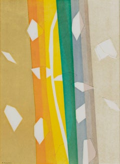
"Pour Daniel-Henry Kahnweiler - Falling Leaves" is an original lithograph, printed in 1964 by Andre Beaudin. It includes vertical frames of tan, orange, yellow, green, and gray. It i...
Category
1960s Modern Abstract Prints
Materials
Lithograph
You May Also Like
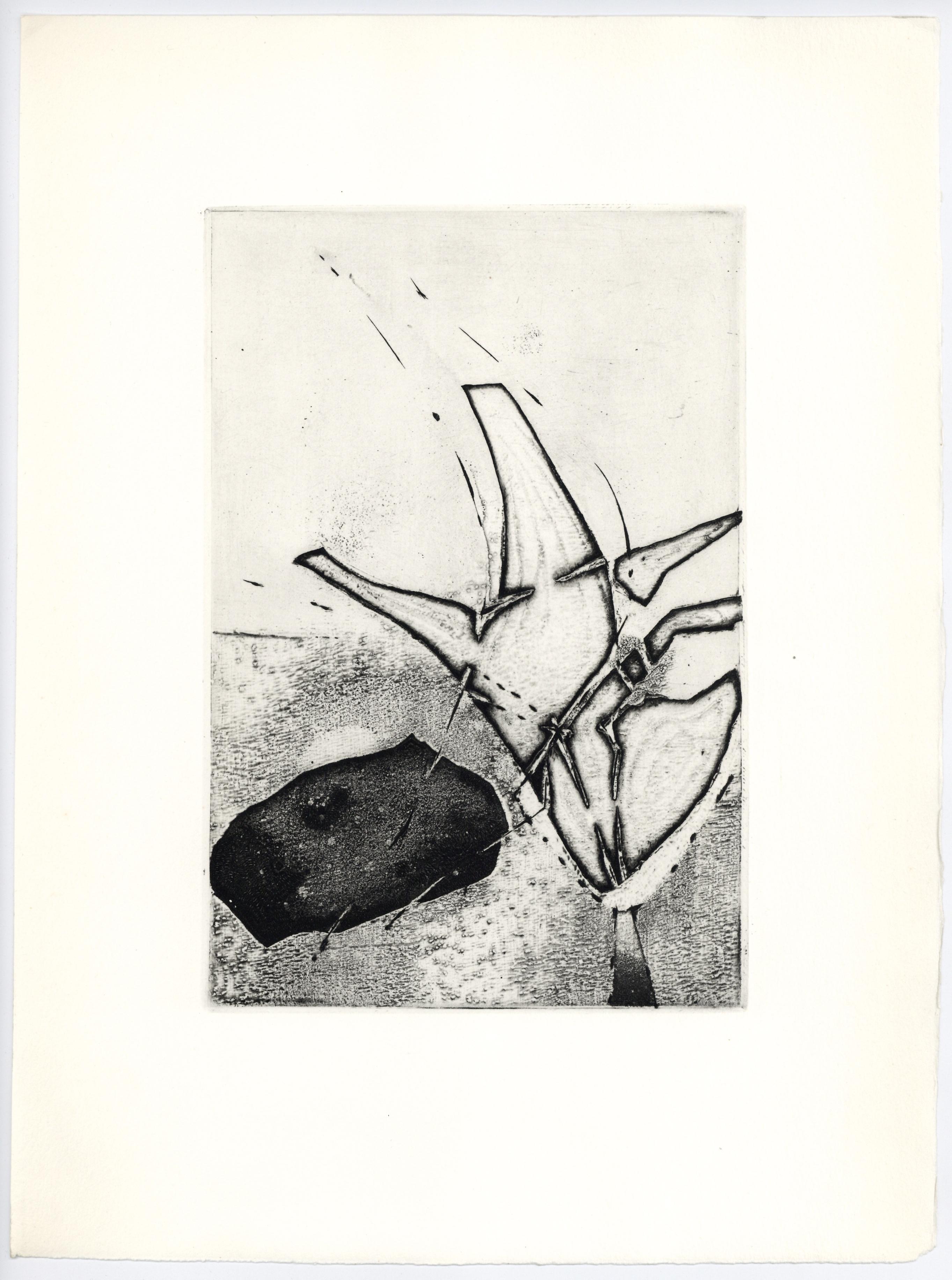
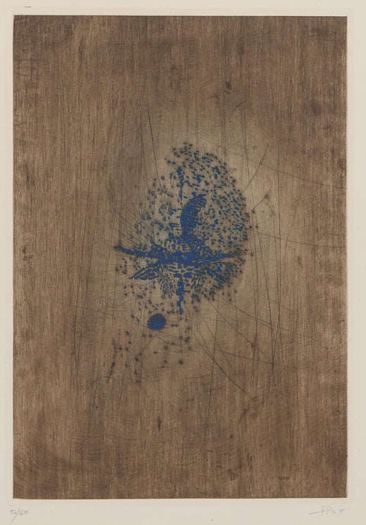
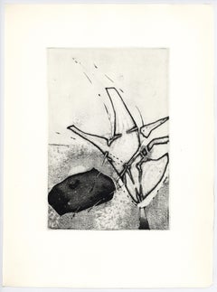
Composition - Original Etching by A.L. Piza - 1965
By Arthur Luiz Piza
Located in Roma, IT
Composition is an original etching on paper realized by Arthur Luiz Piza.
Hand-signed and dated.
The state of preservation is good except for consumed margins.
The artwork represe...
Category
1960s Contemporary Abstract Prints
Materials
Etching
original etching for Paroles Peintes
By Enrique Zañartu
Located in Henderson, NV
Medium: original etching. Printed in 1965 for the deluxe limited edition "Paroles Peintes II" portfolio, published in Paris by Lazar-Vernet. This magnificent, rich impression is one ...
Category
1960s Abstract Prints and Multiples
Materials
Etching
Abstract Etching from Album, Etching by Terry Winters
By Terry Winters
Located in Long Island City, NY
Artist: Terry Winters, American (1949 - )
Title: untitled 6 from Album
Year: 1988
Medium: Etching with Aquatint, signed and numbered in pencil
Edition: HC 2/2
Image: 20 x 16 inches
S...
Category
1980s Contemporary Abstract Prints
Materials
Etching, Aquatint
untitled 1 from Album, Etching by Terry Winters
By Terry Winters
Located in Long Island City, NY
Artist: Terry Winters, American (1949 - )
Title: untitled 1 from Album
Year: 1988
Medium: Etching with Aquatint, signed and numbered in pencil
Edition: HC 2/2
Image: 20 x 16 inches
S...
Category
1980s Contemporary Abstract Prints
Materials
Etching, Aquatint
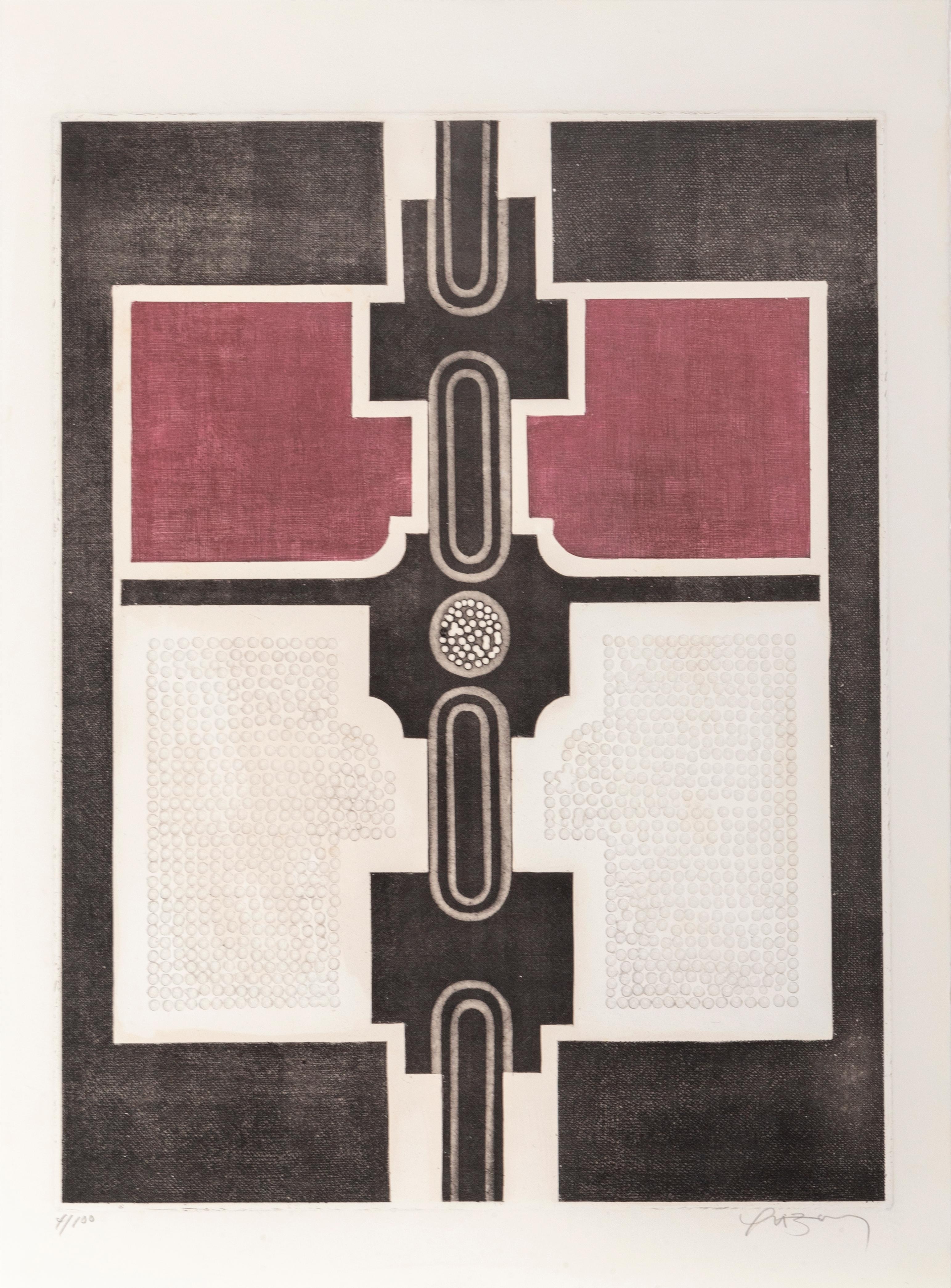
Sin Titulo I, Abstract Geometric Aquatint Etching by Marcos Yrizarry
Located in Long Island City, NY
Artist: Marcos Yrizarry, Puerto Rican (1936 - 1995)
Title: Sin Titulo I
Year: 1970
Medium: Aquatint Etching with Intaglio, signed in pencil
Edition: 100
Size: 30 in. x 22 in. (76.2 c...
Category
1970s Abstract Geometric Abstract Prints
Materials
Etching, Aquatint

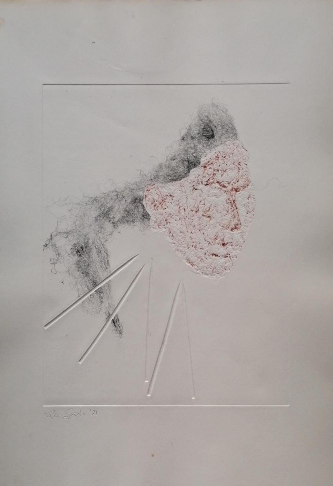
Abstract Composition - Original Etching by Leo Guida - 1971
By Leo Guida
Located in Roma, IT
Abstract Composition is an original Contemporary artwork realized in the 1971 in Italy by the italian artist Leo Guida.
Original Etching and mized media on paper. Dated and Hand-sig...
Category
1970s Modern Abstract Prints
Materials
Etching
More Ways To Browse
Shell Vintage Signs
Shell Etching
Sophie Taeuber Arp Print
The Brothers Karamazov
Totem Mario
Tracey Emin Towel
Twombly Poster
Tyler Mitchell
Vera Molnar
Vincent Gordon
Vintage Original Posters Otis Redding
W Hoffman
Walker Art Center Poster
Warhol Art Cash
Warhol Pasadena
Wassily Kandinsky 1911
Yaacov Agam Rainbow
Yaacov Agam Star