Items Similar to HOW TO SEE Looking, Talking and Thinking about Art (hand signed by David Salle)

Want more images or videos?
Request additional images or videos from the seller
1 of 13
David SalleHOW TO SEE Looking, Talking and Thinking about Art (hand signed by David Salle)2016
2016
$475
£368.22
€416.79
CA$679.83
A$741.84
CHF 385.06
MX$8,875.51
NOK 4,887.64
SEK 4,578.19
DKK 3,113.30
About the Item
David Salle
HOW TO SEE Looking, Talking and Thinking about Art (hand signed, dated and inscribed), 2016
Hardback monograph with dust jacket (hand signed and inscribed to Kevin)
Hand signed, dated 12/6/16 and inscribed to Kevin by David Salle on the title page
9 × 6 × 1 inches
Unframed
Accompanied by gallery issued Certificate of Guarantee
Provenance
signed and inscribed by David Salle for the present owner at a special event sponsored by 192 Books (run by Paula Cooper Gallery)
This hardback monograph with dust jacket is hand signed and inscribed by David Salle for the present owner at a special event sponsored by 192 Books (run by Paula Cooper Gallery)
Makes a superb gift - collectible when hand signed!
Hand signed, dated 12/6/16 and inscribed to Kevin by David Salle on the title page
Book information:
Publisher: W. W. Norton & Company; 1st edition (October 18, 2016)
English; Hardcover; 288 pages with 30 color and bw illustrations
Publisher's blurb:A master class in contemporary art by one of the preeminent painters of our time.
How does art work? How does it move us, inform us, challenge us? Internationally renowned painter David Salle’s incisive essay collection illuminates the work of many of the most influential artists of the twentieth century. Engaging with a wide range of Salle’s friends and contemporaries―from painters to conceptual artists such as Jeff Koons, John Baldessari, Roy Lichtenstein, and Alex Katz, among others―How to See explores not only the multilayered personalities of the artists themselves but also the distinctive character of their oeuvres.
Salle writes with humor and verve, replacing the jargon of art theory with precise and evocative descriptions that help the reader develop a personal and intuitive engagement with art. The result: a master class on how to see with an artist’s eye.
Reviews:
"If John Berger’s Ways of Seeing is a classic of art criticism, looking at the ‘what’ of art, then David Salle’s How to See is the artist’s reply, a brilliant series of reflections on how artists think when they make their work. The ‘how’ of art has perhaps never been better explored."
― Salman Rushdie
"David Salle’s brilliant canvases changed everything, and now his luminescent eye and voice have married in a book that is destined to alter not only how we look at art, but the language we use to describe it. His essays are a gift that, in addition to feeding one’s process of intellection, nourishes one’s art loving soul. Transcendent."
― Hilton Als
"David Salle is widely known as one of our most daring and intelligent painters, but he is also an eloquent critic. How to See is a marvel of incisive and intimate observation. For all his audacity as a painter, Salle seems touchingly proud to be a part of the family of art and to derive his pictorial forms from what he calls the ‘the shared DNA of art,’ raising the possibility that all masterworks are in fact a group project."
― Deborah Solomon
"David Salle’s thoughtful, intelligent, beautifully written essays inspire us to think about, and look at, art in wholly new ways. He makes difficult subjects (and artists) seem effortless, transparent, and he wears the depth and breadth of his knowledge of art and art history so lightly that we hardly notice how much we are learning. How to See is a pure pleasure to read."
― Francine Prose
"David Salle writes about art with a joyous lucidity that is both bracing―nothing, absolutely nothing, escapes his notice―and utterly disarming. He guides his readers through the complex world of contemporary art with a rare generosity of spirit, a dazzling skill at description, and a radiant honesty that are as challenging as they are irresistible."
― Ingrid Rowland
"David Salle asks of other art not, where does this belong? but, what does this make me feel and think about? Salle subtly and persuasively reminds us that all art, even the most seemingly recalcitrant, is there to be looked at, and that what artists do is, exactly, teach us how to see."
― Adam Gopnik
"David Salle has a sharp, thrilling eye and an uncanny ability to reorder and make new the act of seeing. These perceptive, far-ranging essays are drawn from deep knowledge and experience―reading this book feels like having a conversation about art with the smartest person in the room."
― Emma Cline
"Wonderful."
― Joan Juliet Buck
"Lovely to read… [How to See] is serious but never solemn, alert to pleasure, a boulevardier’s crisp stroll through the visual world."
― Dwight Garner, New York Times
"An upbeat, non-combative approach to art criticism… [F]resh, engaging."
― Roger White, New York Times Book Review
"Witty, chatty, intimate, sharp."
― Lorin Stein, The Paris Review
"[Salle] writes about art that he admires with passion and a discerning eye… Illuminating."
― Glen Roven, Los Angeles Review of Books
"A trenchant and light-on-its-feet collection of critical essays... about art, artists, fame, and, if you read it closely enough, what it’s like to have been David Salle for all these years.”"
― Carl Swanson, New York Magazine
"A remarkable painter whose writing is as fresh, vital, and startling as his canvases, Salle… talks about artists and their work in witty, jargon-free, and eminently accessible prose."
― Tirdad Derakhshani, Philadelphia Inquirer
"How to See is an exhilarating and cathartic experience… an offering of passion and generosity, and a pulsing invitation to the reader to find the same in the act of seeing."
― Simone Grace Seol, The National Book Review
"[A] breath of fresh air… Salle is the perfect art tour guide: literate, thoroughly entertaining, and insightful."
― Kirkus
"Sharp insights and an affable tone make this collection equivalent to a hearty discussion with a mentor―recommended for anyone interested in visual arts."
― Publishers Weekly
About David Salle:
Born in 1952 in Oklahoma, David Salle grew up in Wichita, Kansas. In 1970, he was part of the foundational class at the California Institute of the Arts in Valencia, where he studied with John Baldessari. After earning a BFA in 1973 and an MFA in 1975, both from CalArts, Salle moved to New York, where he has lived since.
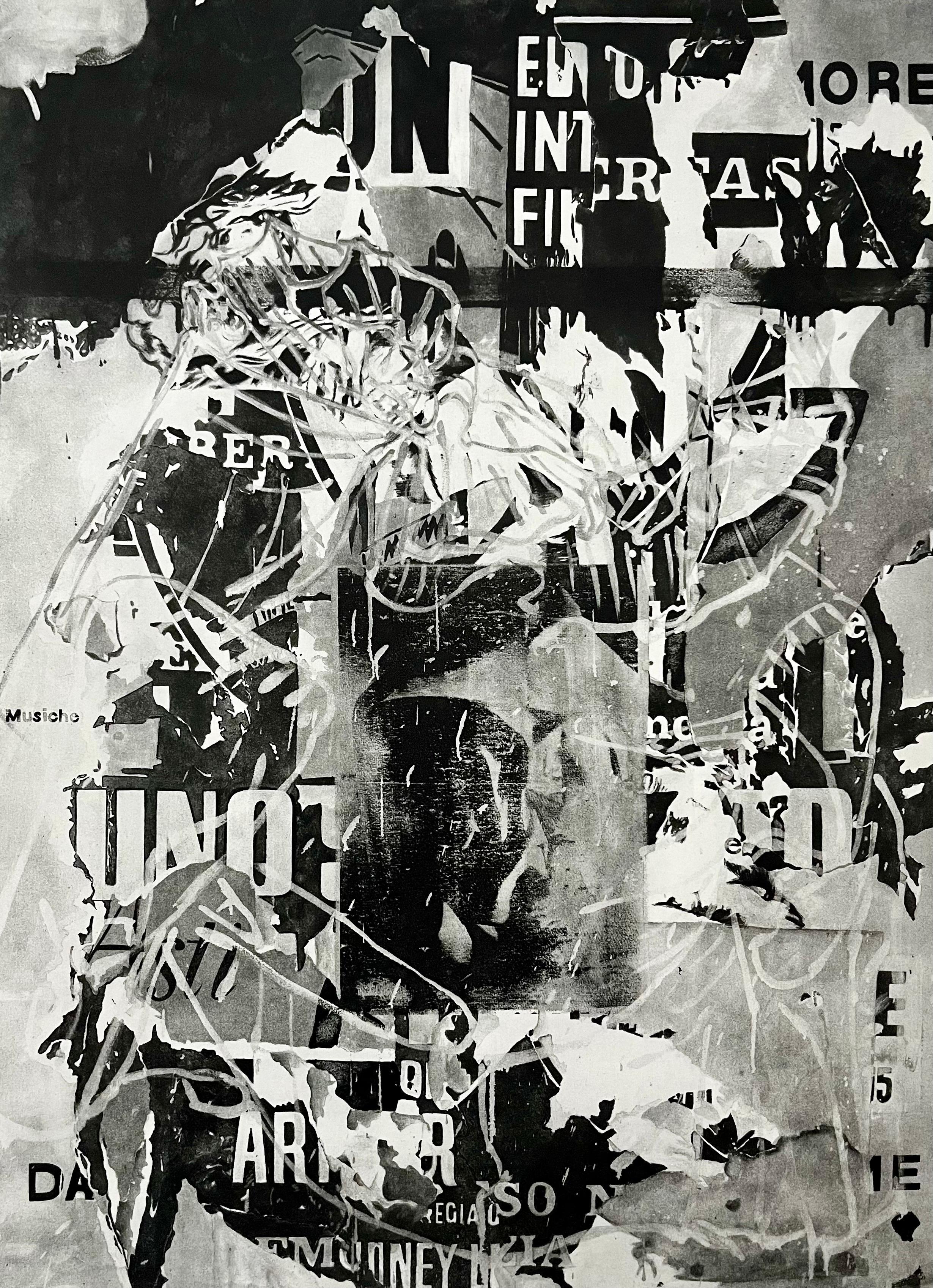
Like many artists of his generation, David Salle initially drew inspiration for his rich visual vocabulary from existing pictures, often from the worlds of advertising and graphic communication. He sought out images that, as he put it in a 1981 interview, “understand us.” Distinct from others of his generation, the mainspring of Salle’s imagery has always been his own photography, the carefully staged and lit scenes that appear in his paintings like telexes from the unconscious. Since the mid-80s, his paintings have continued to expand their emphasis on dynamic, relational composition. A typical Salle painting is one in which the viewer’s eye is kept moving; the structure and placement of images create internal rhythms that pulse with energy. Salle’s paintings often contain allusions to artists of the past – from Velázquez and Bernini, to Picasso, Giacometti, and Magritte, as well as to American art both post and pre-war. However, a catalog of references can be misleading; sources do not a painting make. The meaning of Salle’s paintings lies in the way images are contextualized and presented, with the poetry of their juxtaposition, and, more than anything, with how they are painted.
Salle’s paintings have been shown in museums and galleries worldwide for over 35 years. Solo exhibitions of his work have been held at the Whitney Museum, New York; Museum of Contemporary Art, Los Angeles; Museum of Contemporary Art, Chicago; Stedelijk Museum, Amsterdam; MoMA Vienna; Menil Collection, Houston; Haus der Kunst, Munich; Tel Aviv Museum of Art; Castello di Rivoli, Turin; the Kestner Geselshaft, Hannover; the Guggenheim Bilbao. He was the subject of solo exhibitions at the Dallas Contemporary in 2015 and the Centro de Arte Contemporáneo in Málaga, Spain in 2016. He has participated in major international expositions including Documenta 7 (1982), Venice Biennale (1982 and 1993), Whitney Biennial (1983, 1985, and 1991), Paris Biennale (1985), and Carnegie International (1985).
Salle is also widely recognized as one of the most trenchant and original critical voices of the past decade. He is a regular contributor to the New York Review of Books, and is a member of the American Academy of Arts and Letters. A collection of his essays, How To See was published in 2016 by W.W. Norton.
- Courtesy of Skarstedt Gallery
- Creator:David Salle (1952, American)
- Creation Year:2016
- Dimensions:Height: 9 in (22.86 cm)Width: 6 in (15.24 cm)Depth: 1 in (2.54 cm)
- Medium:
- Movement & Style:
- Period:
- Condition:There is overall shelfwear (scuffing, creasing, etc) to the covers, front and back, but the interior pages are in excellent condition.
- Gallery Location:New York, NY
- Reference Number:1stDibs: LU1745213546162
David Salle
David Salle, (born September 28, 1952, Norman, Oklahoma, U.S.), American painter who, together with such contemporaries as Julian Schnabel and Robert Longo, regenerated big, gestural, expressionist painting after years of pared-down minimalism and conceptual art. Salle is known for mixing modes of representation and appropriated ready-made motifs in a single canvas, suggesting but defying any legible narrative. Employing the postmodern technique of pastiche, where the close display of disparate images and styles tends to reduce everything to equivalent signs, Salle’s paintings function as metaphors for the dizzying onslaught of media culture.
About the Seller
5.0
Platinum Seller
Premium sellers with a 4.7+ rating and 24-hour response times
Established in 2007
1stDibs seller since 2022
459 sales on 1stDibs
Typical response time: 2 hours
- ShippingRetrieving quote...Shipping from: New York, NY
- Return Policy
More From This Seller
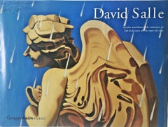
View AllRare Guggenheim Bilbao Museum poster, hand signed by David Salle, art history
By David Salle
Located in New York, NY
David Salle
Hand Signed Poster by David Salle upper left, 2000
Offset Lithograph
Signed by the artist and dedicated to Nadine
25 × 30 inches
Unframed
This is a uniquely signed David...
Category
Early 2000s Contemporary Abstract Prints
Materials
Lithograph, Offset
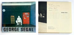
George Segal hardback monograph (Hand signed, dated and inscribed)
By George Segal
Located in New York, NY
George Segal (Hand signed, dated and inscribed), 1979
Hardback monograph with dust jacket, hand signed, dated and warmly inscribed to David by George Segal
Hand signed, dated and ins...
Category
1970s Pop Art Figurative Prints
Materials
Ink, Mixed Media, Offset
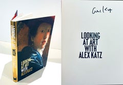
Looking at Art With Alex Katz, hardback monograph hand signed by Alex Katz
By Alex Katz
Located in New York, NY
Alex Katz
Looking at Art With Alex Katz (hand signed by Alex Katz), 2018
Hardback monograph with dust jacket (hand signed in black pen on the title page)
hand signed by Alex Katz in ...
Category
2010s Pop Art Figurative Prints
Materials
Paper, Ink, Mixed Media, Lithograph, Offset, Board
Hardback monograph: George Segal (signed and inscribed by sculptor George Segal)
By George Segal
Located in New York, NY
George Segal (signed and inscribed by George Segal), 1989
Hardback monograph with dust jacket (signed, dated and inscribed for Tera by George Segal)
Warmly signed, dated 3/27/1998 an...
Category
1980s Pop Art Figurative Prints
Materials
Paper, Ink, Mixed Media, Lithograph, Offset

Mixed media painting in monograph, Signed & inscribed to Museum Trustees, Framed
By David Hockney
Located in New York, NY
David Hockney
Hockney Paints the Stage (Signed and inscribed to Walker Museum trustees), 1983
Original acrylic, watercolor and ink painting done on title page of monograph (Signed an...
Category
1980s Pop Art Figurative Drawings and Watercolors
Materials
Paper, Ink, Acrylic, Watercolor
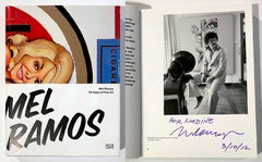
Mel Ramos 50 Years of Pop Art Book (signed, dated and inscribed by Mel Ramos)
By Mel Ramos
Located in New York, NY
Mel Ramos 50 Years of Pop Art (Hand signed, dated and inscribed to Nadine by Mel Ramos), 2010
Softback monograph with dust jacket (hand signed, dated and inscribed by Mel Ramos)
Hand...
Category
2010s Pop Art Figurative Prints
Materials
Paper, Ink, Mixed Media, Lithograph, Offset
You May Also Like
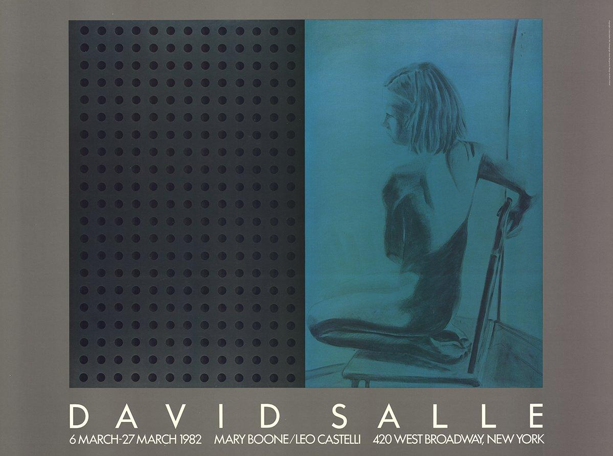
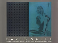
1982 After David Salle 'At Boone-Castelli' Pop Art Vintage
By David Salle
Located in Brooklyn, NY
Exhibition Poster for Leo Castelli & Mary Boone Gallery, March 6–27, 1982
First edition exhibition poster created for David Salle’s joint exhibition at Leo Castelli and Mary Boo...
Category
1980s Pop Art Prints and Multiples
Materials
Offset
David Salle Photogravure Heliogravure "Lucky" Pictures Generation Signed Print
By David Salle
Located in Surfside, FL
DAVID SALLE (American, 1952- )
Lucky
1992
Photoengraving heliogravure on Lana paper
Edition Julie Sylvester, New York
Hand signed and dated in pencil lower right, numbered lower lef...
Category
1990s Contemporary Abstract Prints
Materials
Photogravure
David Salle Photogravure Heliogravure "Lucky" Pictures Generation Signed Print
By David Salle
Located in Surfside, FL
DAVID SALLE (American, 1952- )
Lucky
1992
Photoengraving heliogravure on Lana paper
Edition Julie Sylvester, New York
Hand signed and dated in pencil lower right, numbered lower left...
Category
1990s Contemporary Abstract Prints
Materials
Photogravure
Don't Tell Her
By David Salle
Located in Fort Lauderdale, FL
Edition also includes AP 8, HC 4, PP 4, RTP 1, BAT 1; for a total of 58 prints
Category
21st Century and Contemporary Contemporary Prints and Multiples
Materials
Screen

Price Upon Request
Untitled
By David Salle
Located in Palm Desert, CA
"Untitled" is a figurative and pictorial watercolor on paper made by American post-modern artist David Salle in 1984. The work is signed in pencil, lower right, "David Salle". The ar...
Category
Late 20th Century Contemporary Figurative Drawings and Watercolors
Materials
Watercolor
$20,000
David Salle Photogravure Heliogravure "Lucky" Pictures Generation Signed Print
By David Salle
Located in Surfside, FL
DAVID SALLE (American, 1952- )
Lucky
1992
Photoengraving heliogravure on Lana paper
Edition Julie Sylvester, New York
Hand signed and dated in pencil lower right, numbered lower left...
Category
1990s Contemporary Abstract Prints
Materials
Photogravure
More Ways To Browse
Keith Haring Signed Poster
Keith Haring South Africa
Le Cocu Magnifique
Leroy Neiman Golf
Leroy Neiman Originals
Les Caprices De Goya
Marc Chagall Green
Marc Chagall Rooster
Marc Chagall Unsigned Lithographs
Maria Rivans
Marker Keith Haring
Mermaid Poster
Moulin Rouge Cheret Original Poster
Ogata Gekko
Orchestra Poster
Pablo Picasso Signature
Peter Max Angel With Heart
Peter Max Composition Red And Green