Items Similar to Transparency, signed/N limited edition print from pioneering British Pop Artist

Want more images or videos?
Request additional images or videos from the seller
1 of 11
Joe TilsonTransparency, signed/N limited edition print from pioneering British Pop Artist1970
1970
$2,000
£1,554.48
€1,760.10
CA$2,857.62
A$3,111.27
CHF 1,629.02
MX$37,345.60
NOK 20,559.22
SEK 19,277.77
DKK 13,143.79
About the Item
Joe Tilson
Transparency, 1970
Color silkscreen
Signed and numbered 166 from the edition of 500 in pencil in upper margin
Frame Included: held in the original vintage wood frame
A lovely impression of this popular 1970 British Pop Art print!
Measurements:
Print:
31 x 23 inches
Frame:
32 x 24 x .5 inches
JOE TILSON Biography
Joe Tilson (1928 - 2023) was born in London, England. From 1944 to 1946 he worked as a carpenter and cabinet maker before serving in the R.A.F between 1946 and 1949. After leaving military service, he returned to London to study at St. Martin's School of Art from 1949 to 1952, alongside Leon Kosoff and Frank Auerbach, and at the Royal College of Art from 1952 to 55 where he met Peter Blake, Allen Jones, Patrick Caulfield and David Hockney, who alongside Tilson were instrumental in the birth of British Pop Art.
In 1955 the Royal College awarded Tilson the Rome Prize, taking him to live in Italy for a year, a country from which he has drawn a lifetime of inspiration. He returned to London in 1957 and took up teaching positions over the next five years at St Martin's School of Art and the Slade School of Fine Art before travelling to New York to teach at The School of Visual Arts.
One of the founding figures of British Pop, Tilson was an enthusiastic proponent of political activism, sexual liberation and social change. He consistently broke the pre-existing boundaries of printing and print-making as he sought to widen the scope and impact of contemporary art. However, by 1970, Tilson became increasingly disillusioned with the consumer society that Pop Art had done so much to highlight and increasingly frustrated with the lack of political action that the 1960s in Britain had promised. He moved from London to the countryside and his subject matter changed radically as he turned towards cultural history as a source of inspiration.
Tilson has been a lifelong dedicated printmaker and has gained a reputation as one of Britain's foremost artists producing prints, multiples, constructions, paintings and reliefs. Exhibiting globally since the 1960s, Tilson's work is also held in collections including the Tate, London; Victoria and Albert Museum, London; Walker Art Gallery, Liverpool; The Calouste Gulbenkian Foundation, Lisbon; Galleria Nazionale d Arte Moderna, Rome; Stedelijk Museum, Amsterdam; Museum of Modern Art, New York; Yale Centre for British Art, Connecticut; and Walker Art Center, Minneapolis.
Tilson was elected a Royal Academician in 2001, becoming a Senior Academician in 2003 when the Royal Academy presented a retrospective of his work. In 2019 he unveiled a new site-specific installation at the Vience Biennale, in collaboration with Swatch, also designing a watch strap. In the same year Tilson won the Charles Wollaston award for the most distinguished work in the Royal Academy Summer Exhibition. He was recently commissioned to design a stained glass window for the Rosslyn Chapel in Edinburgh.
In 2023 a brand-new comprehensive monograph on the artist, written by art historian, writer and curator Marco Livingstone, was published by Lund Humphries.
Joe Tilson passed away aged 95 on 9 November 2023 in London, England.
- Creator:Joe Tilson (1928, British)
- Creation Year:1970
- Dimensions:Height: 32 in (81.28 cm)Width: 24 in (60.96 cm)Depth: 0.5 in (1.27 cm)
- Medium:
- Movement & Style:
- Period:
- Condition:Not examined outside of frame but appears fine.
- Gallery Location:New York, NY
- Reference Number:1stDibs: LU1745215972942
Joe Tilson
Joe Tilson (1928 – Present) Tilson was born on 24th August, 1928 in London, England. Tilson served in the Royal Air Force from 1946 – 49, after which he studied at St Martin’s School of Art (1949-1952) and the Royal College of Art (1952 – 1955). He won the Rome Prize for graduation, taking him to Italy from 1955 - 1957. From 1958 – 1963, Tilson taught at St Martin’s School of Art, the Slade School of Fine Art, University College London and the School of Visual Arts, New York. During the 1960s, Tilson’s artistic career took off as he attracted attention for his unique wooden reliefs and constructions, prints and paintings in the emerging British Pop Art style. He held his first solo exhibition at the Marlborough Galley, London in 1962. In 1977, Tilson joined the Waddington Galleries, exhibited at the Alan Cristea Gallery and the Giò Marconi Galleries in Milan. At the Venice Biennale in 1964, Tilson’s work began to gain international popularity, earning him a retrospective at the Boyman’s Museum, Rotterdam later that year. Growing anti-consumerist feeling in the 1970s pushed Tilson to begin to incorporate a wider variety of materials in his work, including stone, straw and rope to create a timeless feel to his work. This body of work was called Alchera, and was a huge success. Tilson was made a Royal Academician in 2002 which was celebrated with a retrospective exhibition in the same year at the Royal Academy entitled Joe Tilson: Pop to Present. Tilson is collected internationally, including at the Arts Council England, London; the British Library, London; Christchurch College, Oxford; the Ludwig Múzeum, Budapest; the Tate, London; Royal Academy of Arts, London; Scottish National Gallery of Modern Art, Edinburgh; The Royal Collection; Victoria and Albert Museum, London; Museum of Modern Art (MoMA), New York and the Yale Centre for British Art, New Haven
About the Seller
5.0
Platinum Seller
Premium sellers with a 4.7+ rating and 24-hour response times
Established in 2007
1stDibs seller since 2022
459 sales on 1stDibs
Typical response time: 2 hours
- ShippingRetrieving quote...Shipping from: New York, NY
- Return Policy
More From This Seller
View AllRichard Pettibone The Appropriation Warhol, Stella, Lichtenstein, Unique Signed
By Richard Pettibone
Located in New York, NY
Richard Pettibone
The Appropriation Print Andy Warhol, Frank Stella, Roy Lichtenstein, 1970
Silkscreen in colors on masonite board (unique variant on sculpted board)
Hand-signed by artist, Signed and dated on the front (see close up image)
Bespoke frame Included
This example of Pettibone's iconic Appropriation Print is silkscreened on masonite board rather than paper, giving it a different background hue, and enabling it work to be framed so uniquely.
The Appropriation print is one of the most coveted prints Pettibone ever created ; the regular edition is on a full sheet with white background; the present example was silkscreened on board, allowing it to be framed in 3-D. While we do not know how many examples of this graphic work Pettibone created, so far the present work is the only one example we have ever seen on the public market since 1970. (Other editions of The Appropriation Print have been printed on vellum, wove paper and pink and yellow paper.)
This 1970 homage to Andy Warhol, Frank Stella and Roy Lichtenstein exemplifies the type of artistic appropriation he was engaging in early on during the height of the Pop Art movement - long before more contemporary artists like Deborah Kass, Louise Lawler, etc. followed suit.
This silkscreen was in its original 1970 vintage period frame; a bespoke custom hand cut black wood outer frame was subsequently created especially to house the work, giving it a distinctive sculptural aesthetic.
Measurements:
Framed 14.5 inches vertical by 18 inches horizontal by 2 inches
Work
13 inches vertical by 16.5 inches horizontal
Richard Pettibone biography:
Richard Pettibone (American, b.1938) is one of the pioneering artists to use appropriation techniques. Pettibone was born in Los Angeles, and first worked with shadow boxes and assemblages, illustrating his interest in craft, construction, and working in miniature scales. In 1964, he created the first of his appropriated pieces, two tiny painted “replicas” of the iconic Campbell’s soup cans by Andy Warhol (American, 1928–1987). By 1965, he had created several “replicas” of paintings by American artists, such as Warhol, Roy Lichtenstein (1923–1997), Ed Ruscha (b.1937), and others, among them some of the biggest names in Pop Art. Pettibone chose to recreate the work of leading avant-garde artists whose careers were often centered on themes of replication themselves, further lending irony to his work. Pettibone also created both miniature and life-sized sculptural works, including an exact copy of Bicycle Wheel by Marcel Duchamp (French, 1887–1968), and in the 1980s, an entire series of sculptures of varying sizes replicating the most famous works of Constantin Brancusi (Romanian, 1876–1957). In more recent years, Pettibone has created paintings based on the covers of poetry books by Ezra Pound, as well as sculptures drawn from the grid compositions of Piet Mondrian (Dutch, 1872–1944). Pettibone straddles the lines of appropriation, Pop, and Conceptual Art, and has received critical attention for decades for the important questions his work raises about authorship, craftsmanship, and the original in art. His work has been exhibited at the Institute for Contemporary Art in Philadelphia, the Museum of Modern Art in New York, the Museum of Contemporary Art in Miami, and the Laguna Art Museum in Laguna Beach, CA. Pettibone is currently based in New York.
"I wished I had stuck with the idea of just painting the same
painting like the soup can and never painting another painting.
When someone wanted one, you would just do another one.
Does anybody do that now?"
Andy Warhol, 1981
Since the mid-1960s, Richard Pettibone has been making
hand-painted, small-scale copies of works by other artists — a
practice due to which he is best known as a precursor of appropriation art — and for a decade now, he has been revisiting subjects from across his career. In his latest exhibitions at
Castelli Gallery, Pettibone has been showing more of the “same”
paintings that had already been part of his 2005–6 museum retrospective,1
and also including “new” subject matter drawn from
his usual roster of European modernists and American postwar
artists. Art critic Kim Levin laid out some phases of the intricate spectrum from copies to repetitions in her review of the
Warhol-de Chirico showdown, a joint exhibition at the heyday
of appropriation art in the mid-1980s when Warhol’s appropriations of de Chirico’s work effectively revaluated “the grand
old auto-appropriator”.
Upon having counted well over a dozen
Disquieting Muses by de Chirico, Levin speculated: “Maybe he
kept doing them because no one got the point. Maybe he needed the money. Maybe he meant it when he said his technique
had improved, and traditional skills were what mattered.”
On
the other side, Warhol, in her eyes, was the “latter-day exemplar
of museless creativity”.
To Pettibone, traditional skills certainly
still matter, as he practices his contemporary version of museless creativity. He paints the same painting again and again,
no matter whether anybody shows an interest in it or not. His
work, of course, takes place well outside the historical framework of what Levin aptly referred to as the “modern/postmodern wrestling match”,
but neither was this exactly his match
to begin with.
Pettibone is one of appropriation art’s trailblazers, but his diverse
selection of sources removes from his work the critique of the
modernist myth of originality most commonly associated with
appropriation art in a narrow sense, as we see, for example, in
Sherrie Levine’s practice of re-photographing the work of Walker
Evans and Edward Weston. In particular, during his photorealist
phase of the 1970s, Pettibone’s sources ranged widely across
several art-historical periods. His appropriations of the 1980s
and 1990s spanned from Picasso etchings and Brancusi sculptures to Shaker furniture and even included Ezra Pound’s poetry.
Pettibone has professed outright admiration for his source artists, whose work he shrinks and tweaks to comic effect but, nevertheless, always treats with reverence and care. His response
to these artists is primarily on an aesthetic level, owing much
to the fact that his process relies on photographs. By the same
token, the aesthetic that attracts him is a graphic one that lends
itself to reproduction. Painstakingly copying other artists’ work by hand has been a way of making
it his own, yet each source is acknowledged in
his titles and, occasionally, in captions on white
margins that he leaves around the image as an
indication that the actual source is a photographic image. The enjoyment he receives in copying
is part of the motivation behind doing it, as is
the pleasure he receives from actually being with
the finished painting — a considerable private
dimension of his work. His copies are “handmade
readymades” that he meticulously paints in great quantities in his studio upstate in New York; the commitment
to manual labor and the time spent at material production has
become an increasingly important dimension of his recent work.
Pettibone operates at some remove from the contemporary art
scene, not only by staying put geographically, but also by refusing to recoup the simulated lack of originality through the
creation of a public persona.
In so doing, Pettibone takes a real
risk. He places himself in opposition to conceptualism, and he is
apprehensive of an understanding of art as the mere illustration
of an idea. His reading of Marcel Duchamp’s works as beautiful
is revealing about Pettibone’s priorities in this respect.
When
Pettibone, for aesthetic pleasure, paints Duchamp’s Poster for
the Third French Chess...
Category
1970s Pop Art Abstract Prints
Materials
Masonite, Pencil, Screen
California Cool Pop Art Mixed media & lithograph hand signed 20/20, artist label
By Billy Al Bengston
Located in New York, NY
Billy Al Bengston
Cockatoo AAA Dracula, 1968
Lithograph , Zinc and Aluminum, in Silver-Violet, Yellow, Two Grays and Orange on uncalendered Rives paper
Frame included
signed faintly ...
Category
1960s Pop Art Abstract Prints
Materials
Mixed Media, Lithograph
Nicola (Nicky) Weymouth, unique acetate positive of British socialite provenance
By Andy Warhol
Located in New York, NY
Andy Warhol
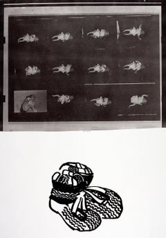
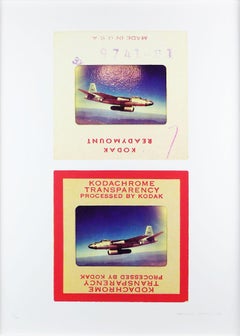
Nicola (Nicky) Weymouth, ca. 1976
Acetate positive, acquired directly from Chromacomp, Inc. Andy Warhol's printer in the 1970s. Accompanied by a Letter of Provenance from the representative of Chromacomp
Unique
Frame included:
Elegantly framed in a museum quality white wood frame with UV plexiglass:
Measurements:
Frame:
18 x 15.5 x 1.5 inches
Acetate:
11 x 8 inches
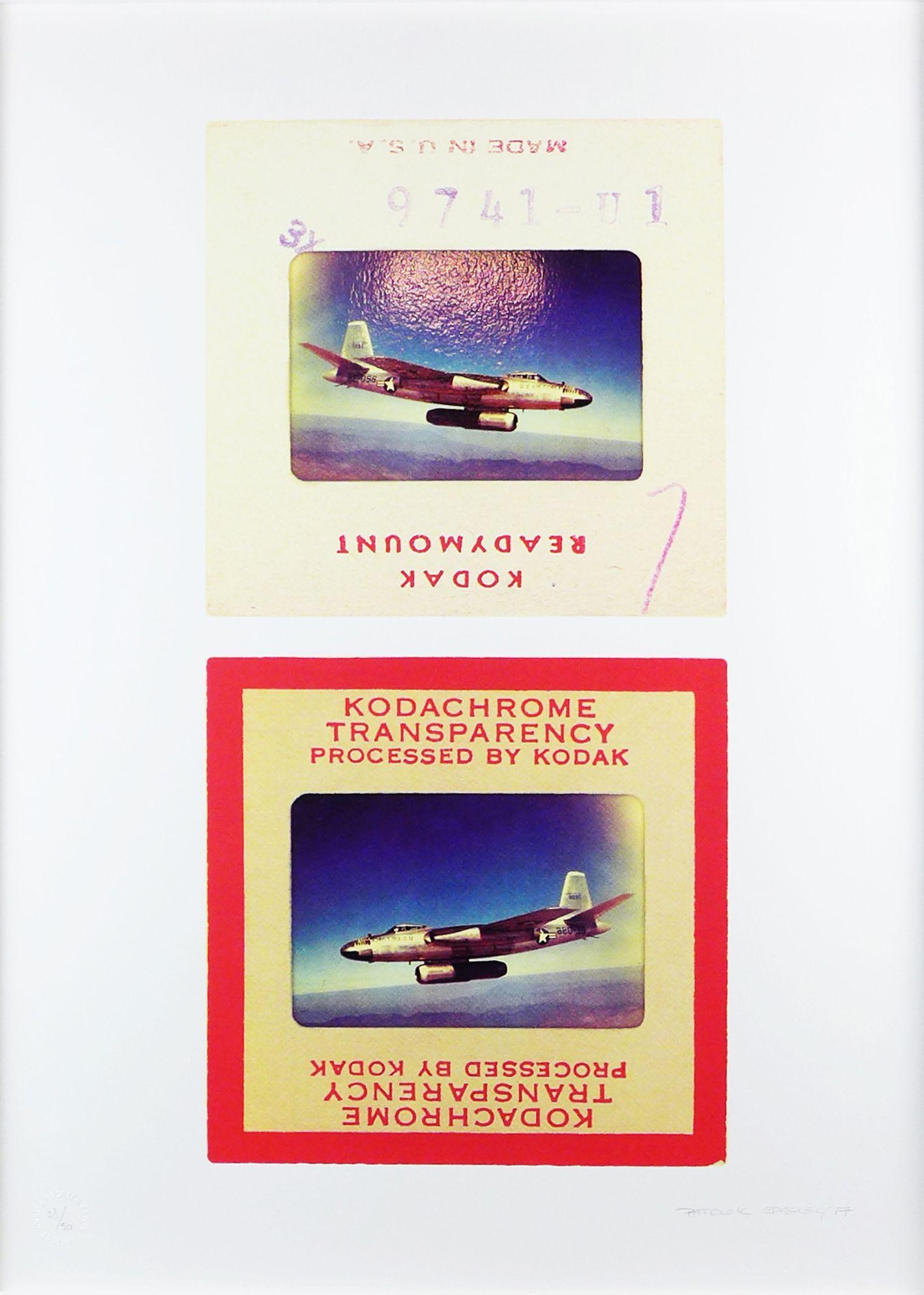
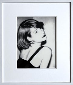
This is the original, unique photographic acetate positive taken by Andy Warhol as the basis for his portrait of Nicky Weymouth, that came from Andy Warhol's studio, The Factory to his printer. It was acquired directly from Chromacomp, Inc. Andy Warhol's printer in the 1970s. It is accompanied by a Letter of Provenance from the representative of Chromacomp. This is one of the images used by Andy Warhol to create his iconic portrait of the socialite Nicola Samuel Weymouth, also called Nicky Weymouth, Nicky Waymouth, Nicky Lane Weymouth or Nicky Samuel. Weymouth (nee Samuel) was a British socialite, who went on to briefly marry the jewelry designer Kenneth Lane, whom she met through Warhol. This acetate positive is unique, and was sent to Chromacomp because Warhol was considering making a silkscreen out of this portrait. As Bob Colacello, former Editor in Chief of Interview magazine (and right hand man to Andy Warhol), explained, "many hands were involved in the rather mechanical silkscreening process... but only Andy in all the years I knew him, worked on the acetates." An acetate is a photographic negative or positive transferred to a transparency, allowing an image to be magnified and projected onto a screen. As only Andy worked on the acetates, it was the last original step prior to the screenprinting of an image, and the most important element in Warhol's creative process for silkscreening. Warhol realized the value of his unique original acetates like this one, and is known to have traded the acetates for valuable services. This acetate was brought by Warhol to Eunice and Jackson Lowell, owners of Chromacomp, a fine art printing studio in NYC, and was acquired directly from the Lowell's private collection. During the 1970s and 80s, Chromacomp was the premier atelier for fine art limited edition silkscreen prints; indeed, Chromacomp was the largest studio producing fine art prints in the world for artists such as Andy Warhol, Leroy Neiman, Erte, Robert Natkin, Larry Zox, David Hockney and many more. All of the plates were done by hand and in some cases photographically. Famed printer Alexander Heinrici worked for Eunice & Jackson Lowell at Chromacomp and brought Andy Warhol in as an account. Shortly after, Warhol or his workers brought in several boxes of photographs, paper and/or acetates and asked Jackson Lowell to use his equipment to enlarge certain images or portions of images. Warhol made comments and or changes and asked the Lowells to print some editions; others were printed elsewhere. Chromacomp Inc. ended up printing Warhol's Mick Jagger Suite and the Ladies & Gentlemen Suite, as well as other works, based on the box of photographic acetates that Warhol brought to them. The Lowell's allowed the printer to be named as Alexander Heinrici rather than Chromacomp, since Heinrici was the one who brought the account in. Other images were never printed by Chromacomp- they were simply being considered by Warhol.
Warhol left the remaining acetates with Eunice and Jackson Lowell. After the Lowells closed the shop, the photographs were packed away where they remained for nearly a quarter of a century. This work is exactly as it was delivered from the factory. Unevenly cut by Warhol himself. This work is accompanied by a signed letter of provenance from the representative of Chromacomp, Andy Warhol's printer for many of his works in the 1970s.
About Andy Warhol:
Isn’t life a series of images that change as they repeat themselves?
—Andy Warhol
Andy Warhol’s (1928–1987) art encapsulates the 1960s through the 1980s in New York. By imitating the familiar aesthetics of mass media, advertising, and celebrity culture, Warhol blurred the boundaries between his work and the world that inspired it, producing images that have become as pervasive as their sources.
Warhol grew up in a working-class suburb of Pittsburgh. His parents were Slovak immigrants, and he was the only member of his family to attend college. He entered the Carnegie Institute of Technology (now Carnegie Mellon University) in 1945, where he majored in pictorial design. After graduation, he moved to New York with fellow student Philip Pearlstein and found steady work as a commercial illustrator at several magazines, including Vogue, Harper’s Bazaar, and the New Yorker. Throughout the 1950s Warhol enjoyed a successful career as a commercial artist, winning several commendations from the Art Directors Club and the American Institute of Graphic Arts. He had his first solo exhibition at the Hugo Gallery in 1952, showing drawings based on the writings of Truman Capote; three years later his work was included in a group show at the Museum of Modern Art for the first time.
The year 1960 marked a turning point in Warhol’s prolific career. He painted his first works based on comics and advertisements, enlarging and transferring the source images onto canvas using a projector. In 1961 Warhol showed these hand-painted works, including Little King (1961) and Saturday’s Popeye (1961), in a window display at the department store Bonwit Teller; in 1962 he painted his famous Campbell’s Soup Cans, thirty-two separate canvases, each depicting a canned soup of a different flavor. Soon after, Warhol began to borrow not only the subject matter of printed media, but the technology as well. Incorporating the silkscreen technique, he created grids of stamps, Coca-Cola bottles, shipping and handling labels, dollar bills, coffee labels...
Category
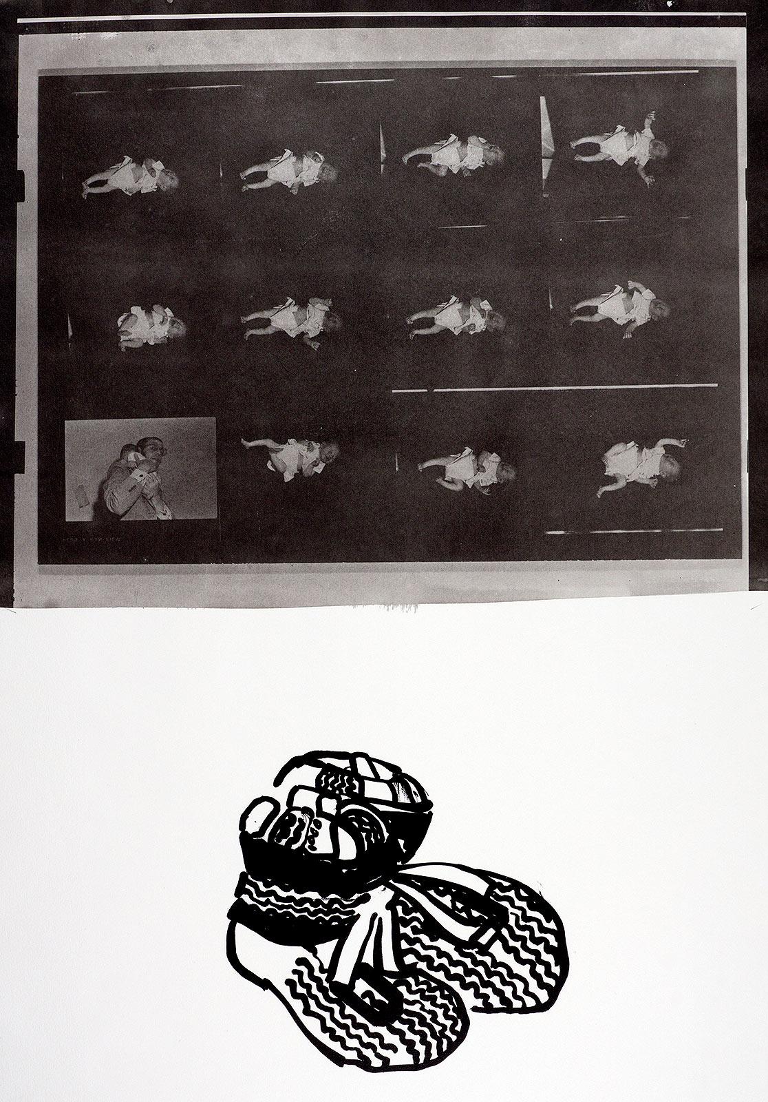
1970s Pop Art Black and White Photography
Materials
Photographic Film
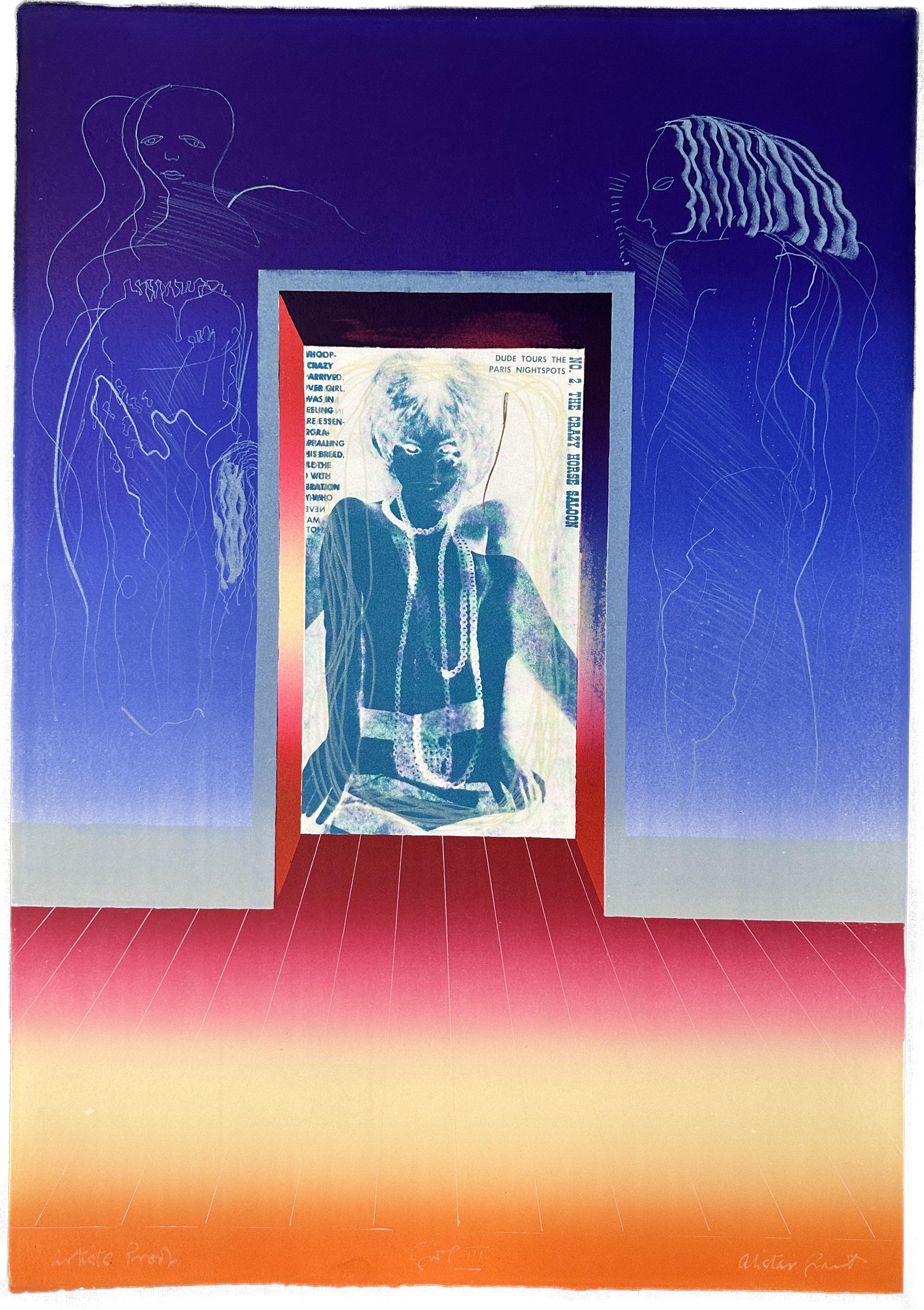
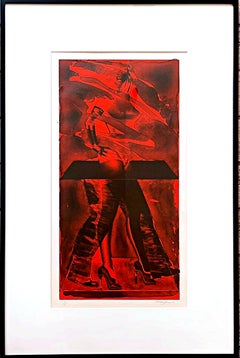
Red Feat (Lloyd, 73) Signed/N silkscreen by pioneering British Pop Artist Framed
By Allen Jones
Located in New York, NY
Rare coveted silkscreen in museum quality frame:
Allen Jones
Red Feat (Lloyd, 73), 1976
Lithograph on Arches paper
Hand signed, dated and numbered 49/60 in pencil recto, with Landfal...
Category
1970s Pop Art Abstract Prints
Materials
Lithograph
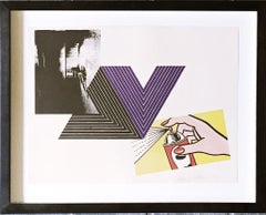
Pop Art Appropriation Print: Andy Warhol, Frank Stella, Roy Lichtenstein, SIGNED
By Richard Pettibone
Located in New York, NY
Richard Pettibone
The Appropriation Print: Andy Warhol, Frank Stella, Roy Lichtenstein, 1970
(Andy Warhol's Electric Chair, Frank Stella's Empress of India and Roy Lichtenstein's Spray)
Silkscreen in colors on smooth wove paper
Pencil signed and dated 1971 on the front
Frame included:
Elegantly floated and framed in a white wood frame under UV plexiglass in accordance with museum conservation standards
Measurements:
frame: 15 7/8 x 19 3/4 x 1 3/4 inches
sheet: 12 1/4 x 16 inches
This is one of Richard Pettibone's most iconic, popular and desirable prints done in 1970 - during the most influential era of the Pop Art movement. This homage to Andy Warhol, Frank Stella and Roy Lichtenstein exemplifies the type of artistic appropriation he was engaging in early on during the height of the Pop Art movement - long before more contemporary artists like Deborah Kass, Louise Lawler, etc. followed suit. Pencil signed and dated recto. It was created in limited edition - though the exact number is not known.
More about RIchard Pettibone:
As a young painter, Richard Pettibone began replicating on a miniature scale works by newly famous artists, and later also modernist masters, signing the original artist’s name as well as his own. His versions of Andy Warhol’s soup...
Category
1970s Pop Art Abstract Prints
Materials
Screen, Pencil
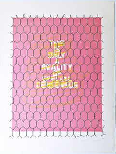
This is Only a Reality of Special Consensus, Silkscreen on Arches paper SIGNED/N
Located in New York, NY
Wayne E. Campbell
This is Only a Reality of Special Consensus, ca. 1969
Silkscreen on Arches paper with One Deckled Edge
Pencil signed and numbered 86 from the limited edition of 98 ...
Category
1960s Abstract Abstract Prints
Materials
Screen
You May Also Like
Z is for Zoe
By Harvey Daniels
Located in New Orleans, LA
This is an#1 of an edition of 7
Harvey Daniels (British, 1936-2013)
Born in London, Daniels attended the Willesden School of Art, the Slade School of Fine Art, London University an...
Category
1960s Pop Art Figurative Prints
Materials
Lithograph
Girl III - 1968 Signed Limited Edition Lithograph
By Alistair Grant
Located in Rochester Hills, MI
Alistair Grant
Girl III - 1968
Print - Lithograph 23½″ x 31'' inches
Edition: Signed in white pencil, titled and marked Artist Proof
Alistair Grant was a great and justly-rever...
Category
1960s Pop Art Figurative Prints
Materials
Lithograph

$2,400 Sale Price
20% Off
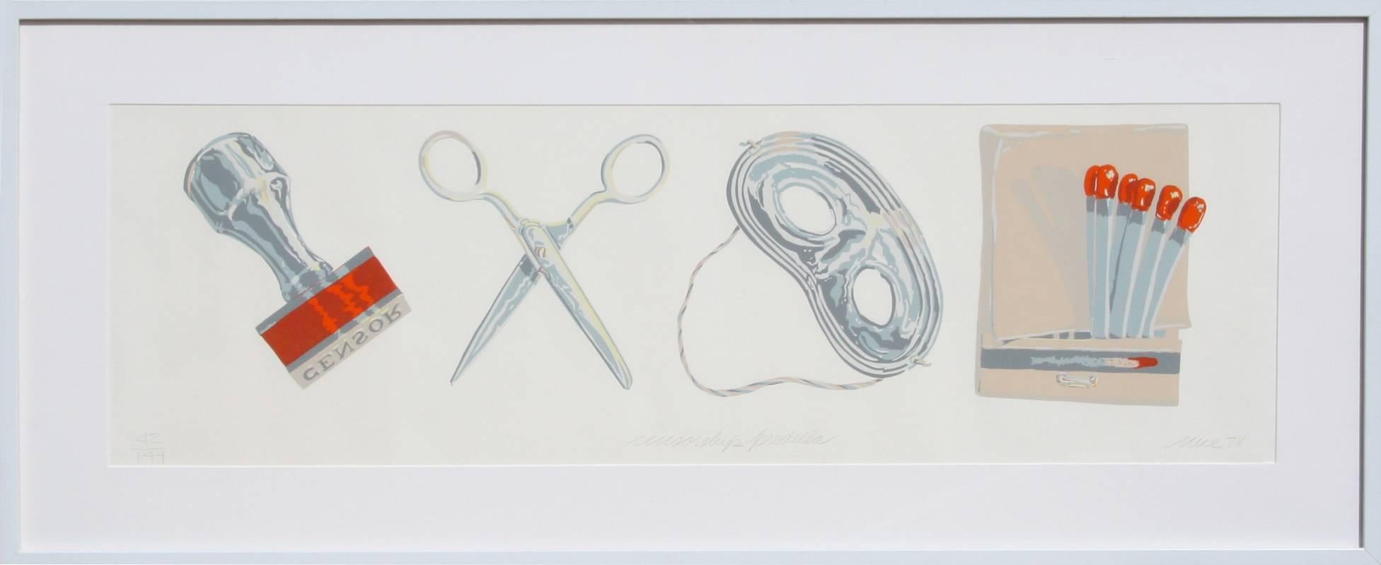
Censorship, Framed Pop Art Lithograph by Don Nice
By Don Nice
Located in Long Island City, NY
Artist: Don Nice, American (1932 - )
Title: Censorship
Year: 1978
Medium: Lithograph, signed and numbered in pencil
Edition: 144
Size: 12 in. x 38 in. (30.48 cm x 96.52 cm)
Frame Si...
Category
1970s American Modern Figurative Prints
Materials
Lithograph

Focus on Fiction, Pop Art Digital Print by Michael Knigin
By Michael Knigin
Located in Long Island City, NY
Michael Knigin, American (1942 - 2011) - Focus on Fiction, Year: 2000, Medium: Chromogenic Print on canvas, signed, dated and numbered in pen lower left, titled on verso, Edition: 2/...
Category
Early 2000s Pop Art Drawings and Watercolor Paintings
Materials
Digital
Figure - Original Offset Print by Franco Gentilini - 1970s
By Franco Gentilini
Located in Roma, IT
Figure is an original vintage offset print on ivory-colored paper, realized by Franco Gentilini ( Italian Painter, 1909-1981), in 1970s.
The state of preservation of the artwork is...
Category
1970s Modern Figurative Prints
Materials
Paper, Offset

Fighter, Hand Printed Work, Screen
Located in Yardley, PA
A fantastic original pop art screenprint, from an edition of 50 on 260gsm Fabriano paper. 5 colour print (plus gloss varnish over image). Print has a white border. Print size 50cm x 70cm All prints numbered signed & embossed with artists stamp. :: Hand Printed...
Category
2010s Pop Art Prints and Multiples
Materials
Screen
More Ways To Browse
Used Swatch Watches
Willis Wine Bar
Ww2 Propaganda Posters
Yoshitomo Nara Miss Spring
Yves Klein Blue Art
1959 Bullfight Picasso
727 Murakami
Ak47 Art
Alain Aslan
Alberto Beltran
Allan Houser Prints
Alois Kolb
Amadore Porcella
Andre Renoux
Andrzej Juchniewicz
Andy Warhol Absolut Vodka
Andy Warhol Hitchcock
Antonio Rivera