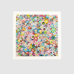
The Future will Be Full of Smile!, For Sure!
View Similar Items

Takashi MurakamiThe Future will Be Full of Smile!, For Sure!2020
2020
About the Item
- Creator:Takashi Murakami (1963, Japanese)
- Creation Year:2020
- Dimensions:Height: 29.53 in (75 cm)Width: 29.53 in (75 cm)
- Medium:
- Movement & Style:
- Period:
- Condition:
- Gallery Location:Bristol, GB
- Reference Number:Seller: LC-A1730d1stDibs: LU153127917872
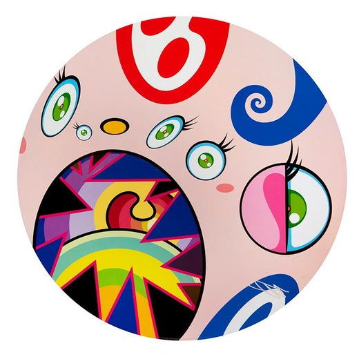
Takashi Murakami
Japanese contemporary artist Takashi Murakami may be famous among collectors for his psychedelic flowers and chaotic cartoons, but artists likely know him as the theorist behind the contemporary art movement he calls “Superflat.”
Partially inspired by the Pop art of Andy Warhol, in which celebrity culture and mundane mass-produced items became the focus of bright and colorful works that both celebrated and criticized consumerism, Murakami’s Superflat encompasses painting, sculpture, digital design and more to present a subversive look at consumerism but is also an effort to blend fine art and lowbrow culture. A multifaceted and remarkably influential artist as well as a compulsive art collector, Murakami has collaborated with brands such as Louis Vuitton, while one of his most famous Superflat works is the teddy bear on the cover of the Graduation album by American rapper Kanye West.
In 1993 Murakami earned his Ph.D. from Tokyo University of the Arts, where he was trained in nihonga, a style of painting that originated in the late 19th century by artists who worked to preserve and promote the conventions and processes associated with traditional Japanese art. While practicing nihonga, Murakami began to realize that his beliefs didn’t align with the tradition, so his art subsequently took on a satirical feel that embodied a critique of the movement. Before long, his style took a drastic turn, embracing otaku, a rising postwar cultural phenomenon among Japan’s younger crowd who loved anime and manga. (Otaku is also integral to Superflat.)
This is when Murakami’s most well-known character, Mr. DOB, was born. This anime-inspired icon, which Americans might interpret as a cross between Walt Disney’s Mickey Mouse and Lewis Carroll’s Cheshire Cat given its pronounced ears and broad and menacing grin, was part of the artist’s endeavor to elevate the otaku subculture but also to target mass consumerism. While Murakami conceived of Mr. DOB years ahead of his 2000-era Superflat theory, there is much common ground between the two. Not unlike his other creations, Murakami’s Mr. DOB is equal parts erotic, disturbing and cartoonish — an incisive mockery of the mingling of commerce and fine art so prevalent in Japanese popular culture.
Find original Takashi Murakami prints, sculptures and more on 1stDibs.
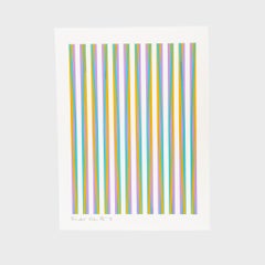
- Print for Chicago 8By Bridget RileyLocated in Bristol, GBColour screenprint on white wove paper Edition of 150 61 x 46 cm (24 x 18.1 in) Signed, numbered and dated on the front. Ink stamped initial “K” on the verso Condition upon request ...Category
20th Century Contemporary More Prints
MaterialsScreen
- Multicolor Double Face: WhiteBy Takashi MurakamiLocated in Bristol, GBSilkscreen Edition of 100 Signed and numbered on the front Mint, as issued Sold in the original KaiKai KiKi packagingCategory
21st Century and Contemporary Contemporary More Prints
MaterialsScreen
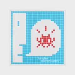
- Alert Special (Blue), 2021, Screenprint in colours, Contemporary Art, Limited EdBy InvaderLocated in Bristol, GBScreenprint in colours Edition of 60 60 x 60 cm (23.6 x 23.6 in) Signed, numbered and dated on the front, publisher stamped on the back Artwork in excellent condition. Minor soft cre...Category
2010s Contemporary More Prints
MaterialsScreen
- Multicolor Double Face: YellowBy Takashi MurakamiLocated in Bristol, GBSilkscreen Edition of 100 Signed and numbered on the front Mint, as issued Sold in the original KaiKai KiKi packagingCategory
21st Century and Contemporary Contemporary More Prints
MaterialsScreen
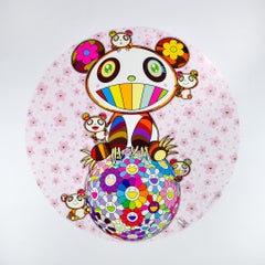
- Sakura and PandaBy Takashi MurakamiLocated in Bristol, GBOffset print with silver and high gloss varnishing Edition of 300 Signed and numbered on the front Excellent, with a soft crease on the left edge Our mission is to connect art colle...Category
21st Century and Contemporary Contemporary More Prints
MaterialsLithograph, Offset
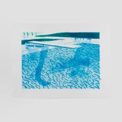
- Lithograph of Water Made of Thick and Thin Lines and Two Light Blue Washes 1978By David HockneyLocated in Bristol, GBLithograph Edition of 40 65 x 86 cm (25.6 x 33.8 in) Signed, numbered and dated on the front Condition upon request Published by Tyler Graphics Catalog raisonné reference 207 Our mi...Category
1970s Contemporary More Prints
MaterialsLithograph


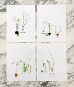
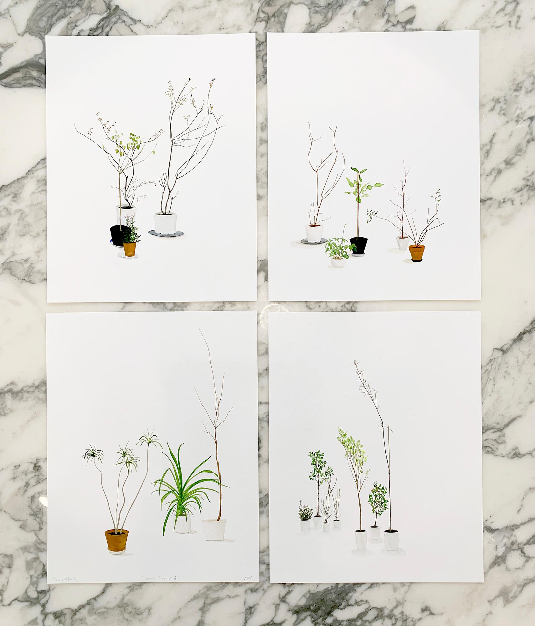
- "House Plants (Suite of 4)" minimal plants greenery modernLocated in Phoenix, AZCarrie Marill House Plants (Suite of 4), 2020 archival pigment print 14" x 11" (each) paper size (suite of 4) Edition of 10 Carrie Marill is a meticulous...Category
2010s Contemporary Still-life Prints
MaterialsArchival Pigment
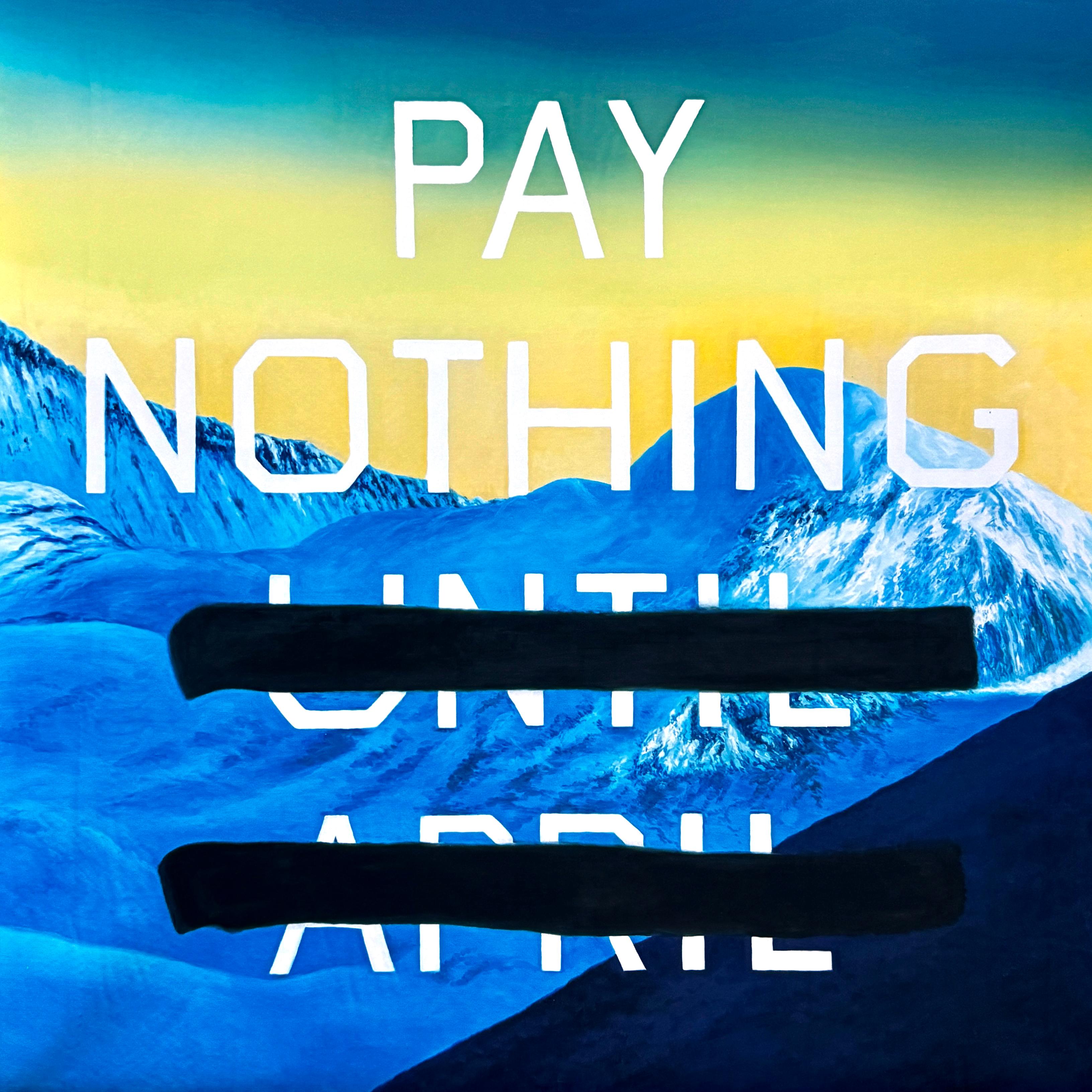
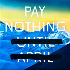
- Pay NothingLocated in London, GBKenny Schachter "Pay Nothing". Archival digital print on wove paper. Published in 2020. Edition of 60. Hand signed and numbered by the artist, verso. ‘At the height of Covid, various activist groups arose to protect artists and others from unlawful evictions for non-payment of rent due to their lack of earning capacity by an economy that all but ground to a halt—other than for the multinationals that always seem to prosper in times of crisis. One such grassroots advocacy initiative in April of 2020, was CANTPAYMAY which I spotted on artist Nicole Eisenman’s Instagram feed by way of a poster she created which proclaimed: “RENT STRIKE! STAND IN SOLIDARITY WITH THOUSANDS OF NEW YORKERS ON RENT STRIKE DURING #CANTPAYMAY. WITH MILLIONS OF NEW YORKERS OUT OF WORK, WE CAN AND MUST #CANCELRENT. SIGN THE RENT STRIKE PLEDGE TO JOIN THE MOVEMENT!” Pay Nothing is an appropriation of Ed Ruscha’s 2003 painting Pay Nothing Until April; though Ruscha attempts to disclaim meaning in his text works, it clearly references the loaded notion of having to pay-up in April, which is when both State and Federal taxes are owed across the country, as all US taxpayers are only painfully all too aware. “Says Ruscha: ‘I’m empty headed in many ways, and don’t know why I follow what I follow. Like most people, I operate on an automatic mode, and everything is an involuntary reflex. Logic flies out of the window when you’re making a picture, at least it does with me. And thank God it does.’” @tate In the context of the Covid pandemic, Pay Nothing signifies the fact that if a population is deprived of the means to earn a living, we still must eat and have a roof over our heads to feed and shelter ourselves and families. For, if we don’t have the ready capacity to provide, as Malcom X...Category
21st Century and Contemporary Contemporary Landscape Prints
MaterialsArchival Pigment
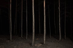
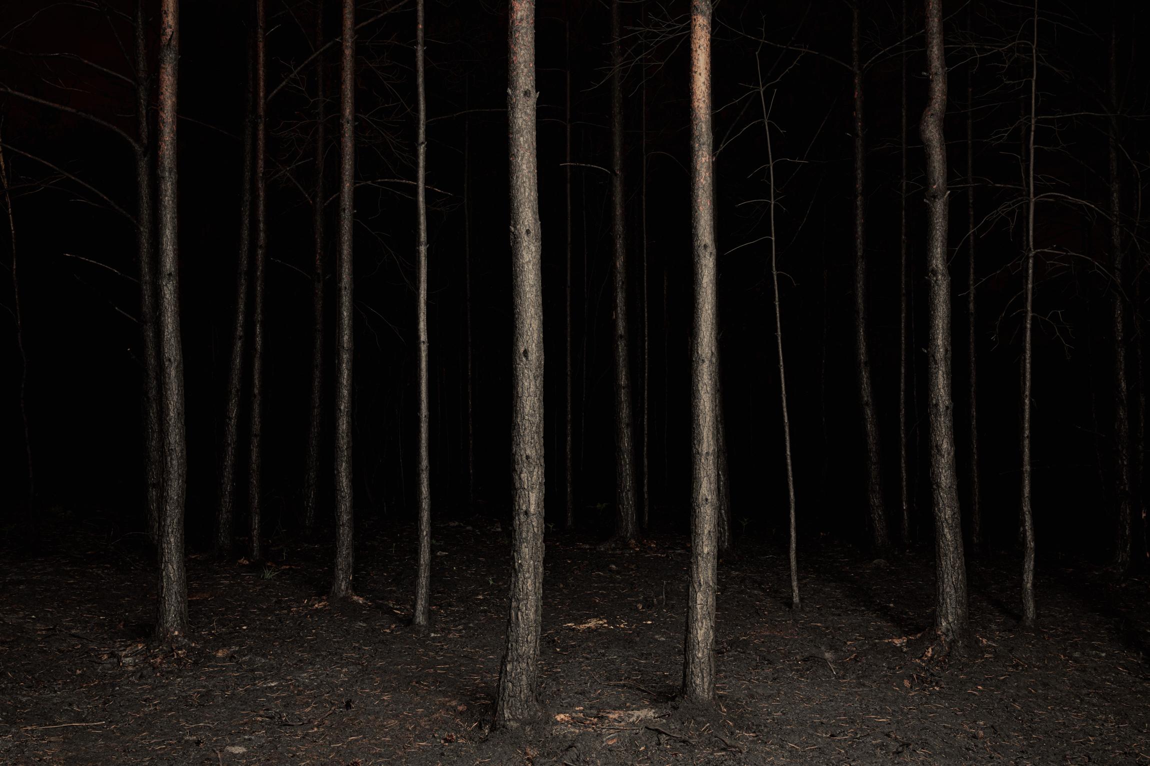
- Burnt Place #3Located in London, GBBurnt Place 03 - After the fire swept through, the forest was left scorched and barren. The ground is still warm and the unstirring air is thick with the scent of charred wood. Scorched, lifeless pines stand solemn and mournful in the shadows of the Burnt Place. About the Twilight's Path project: "We spend our lives surrounded by the security of possessions, relationships and roles, but our futures hold nothing so substantial; one day we must all enter into true not- knowing - into a dark, unconscious place." Jasper Goodall...Category
2010s Contemporary Landscape Photography
MaterialsPhotographic Paper, Archival Pigment
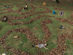
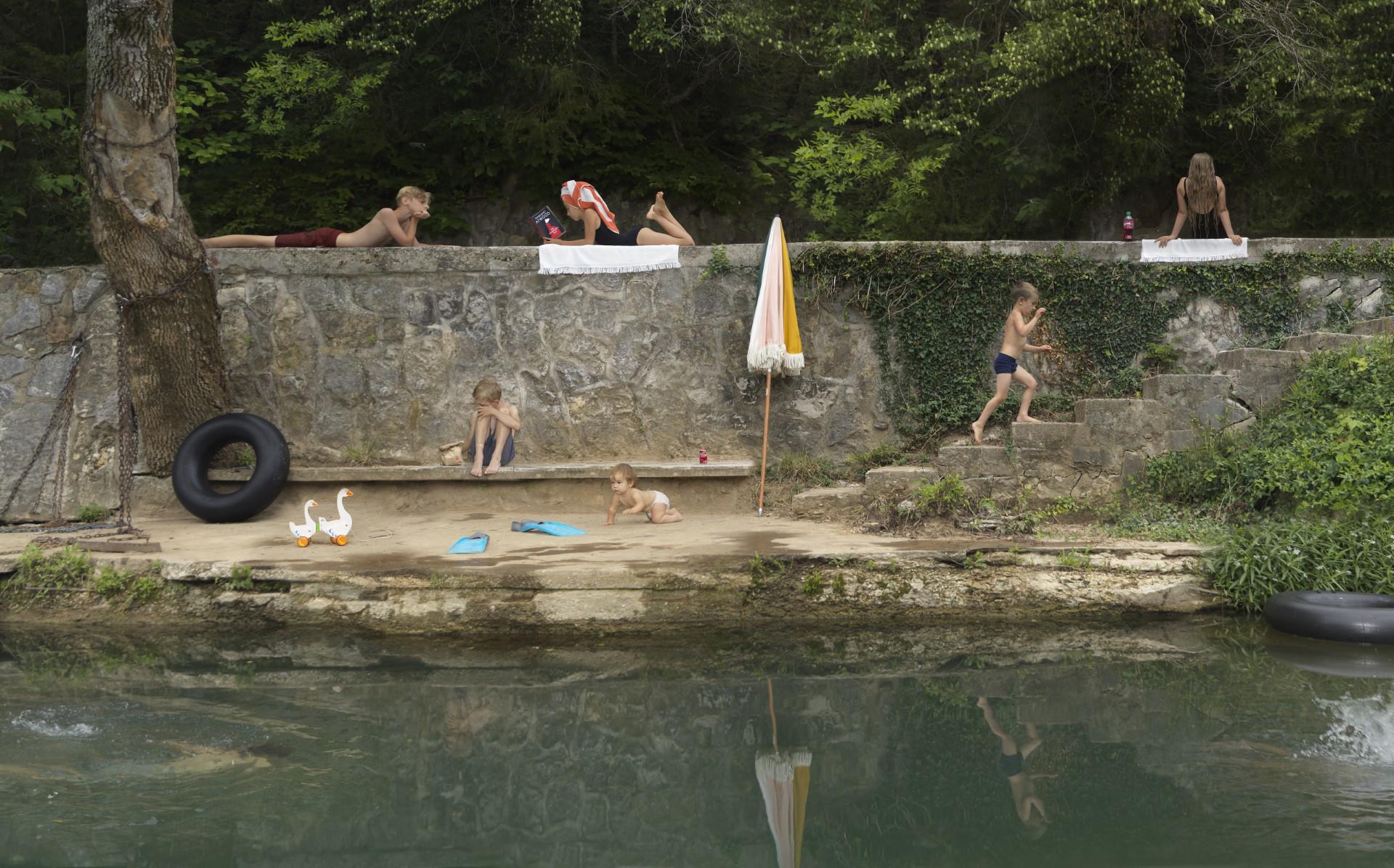
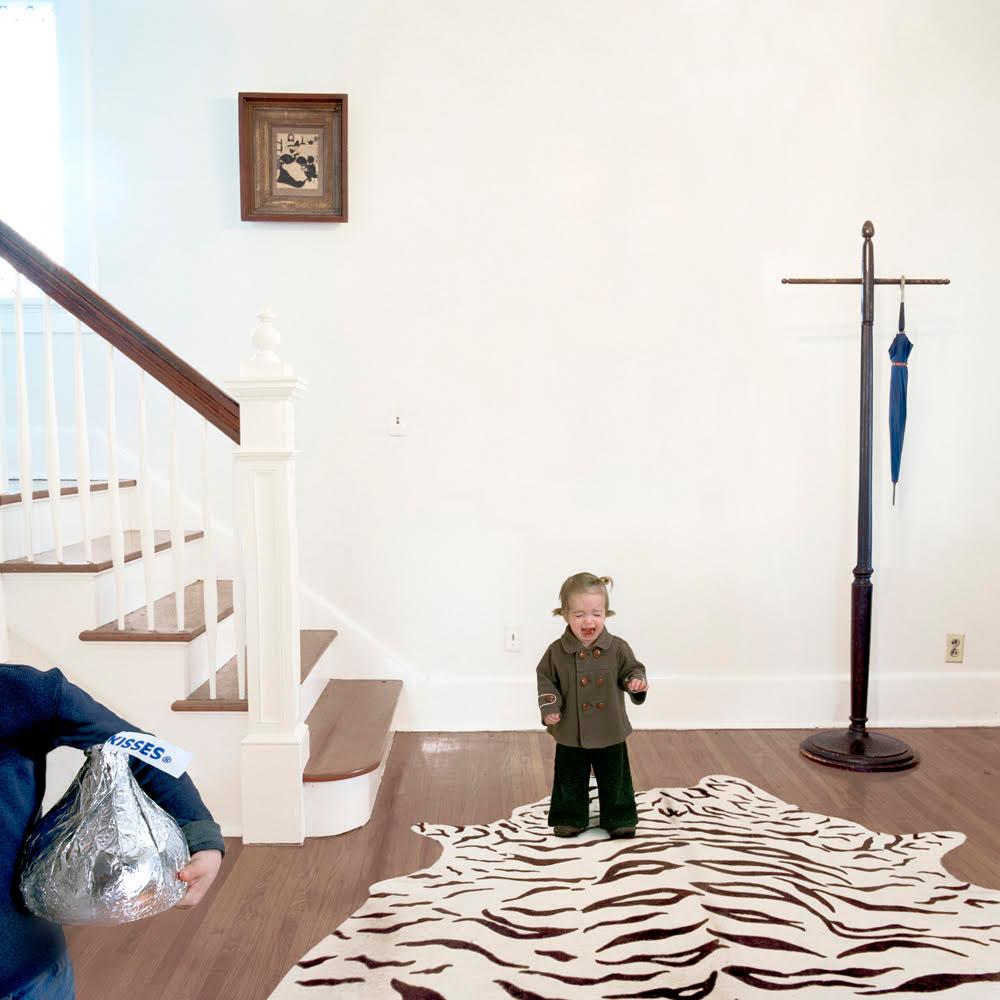
- Riverside, limited edition photograph, archival ink, signed and numberedBy Julie BlackmonLocated in Sante Fe, NMRiverside, limited edition photograph, archival ink, signed and numbered Reviewing the photographs of Julie Blackmon, critic Leah Ollman of the Los Angeles Times wrote: “Each frame is an absorbing, meticulously orchestrated slice of ethnographic theater … that abounds with tender humor but also shrewdly subtle satire.” Blackmon is a native of Springfield, MO, and her photographs are inspired by her experience of growing up the oldest of nine children—including five sisters—in what she calls “a generic American town in the middle of the U.S.” In college, Blackmon was introduced to the work of artists Sally Mann, Diane Arbus, and Helen Levitt, and she describes herself as “obsessed” with their images. “When my three children were small,” she recalls, “we moved into an old house with a darkroom in the basement. Like any mother, I wanted to take pictures of my kids. But I didn’t want to be just the ‘mother photographer.’ I wanted my work to be more: more penetrating, more artful, more striking, more thoughtful, more a reflection of the times. “Over the next few years, I progressed from making documentary black and white photographs of my life and the lives of my sisters to creating colorful, fictitious images that offered a more fantastical look at everyday life. My work became more conceptual, as I began to realize that I was not obligated to capture “reality” exactly, but that I could work more like a painter or a filmmaker, actively shaping the images I was creating. This realization—that fiction can often capture the truth more memorably than reality—was a major shift in how I saw the world around me, and it transformed my work.” “It’s thrilling to see the most common aspects of everyday life as potential stories or themes for a photograph. It changes how you see things: suddenly, a Starbucks employee on a smoke break, or an outmoded beauty shop catering to an elderly clientele, can spark a memorable image. As Nora...Category
2010s Contemporary Color Photography
MaterialsArchival Pigment
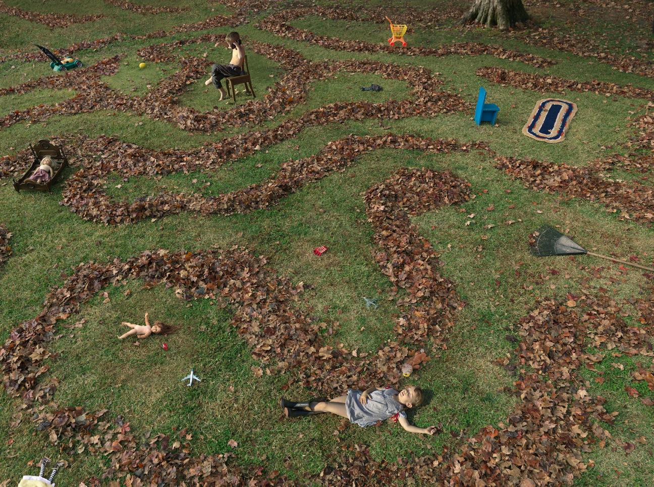
- Leaf HouseBy Julie BlackmonLocated in Sante Fe, NMReviewing the photographs of Julie Blackmon, critic Leah Ollman of the Los Angeles Times wrote: “Each frame is an absorbing, meticulously orchestrated slice of ethnographic theater … that abounds with tender humor but also shrewdly subtle satire.” Blackmon is a native of Springfield, MO, and her photographs are inspired by her experience of growing up the oldest of nine children—including five sisters—in what she calls “a generic American town in the middle of the U.S.” In college, Blackmon was introduced to the work of artists Sally Mann, Diane Arbus, and Helen Levitt, and she describes herself as “obsessed” with their images. “When my three children were small,” she recalls, “we moved into an old house with a darkroom in the basement. Like any mother, I wanted to take pictures of my kids. But I didn’t want to be just the ‘mother photographer.’ I wanted my work to be more: more penetrating, more artful, more striking, more thoughtful, more a reflection of the times. “Over the next few years, I progressed from making documentary black and white photographs of my life and the lives of my sisters to creating colorful, fictitious images that offered a more fantastical look at everyday life. My work became more conceptual, as I began to realize that I was not obligated to capture “reality” exactly, but that I could work more like a painter or a filmmaker, actively shaping the images I was creating. This realization—that fiction can often capture the truth more memorably than reality—was a major shift in how I saw the world around me, and it transformed my work.” “It’s thrilling to see the most common aspects of everyday life as potential stories or themes for a photograph. It changes how you see things: suddenly, a Starbucks employee on a smoke break, or an outmoded beauty shop catering to an elderly clientele, can spark a memorable image. As Nora Ephron...Category
2010s Contemporary Color Photography
MaterialsArchival Pigment
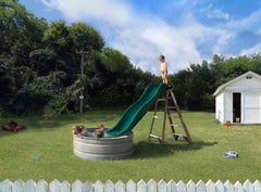
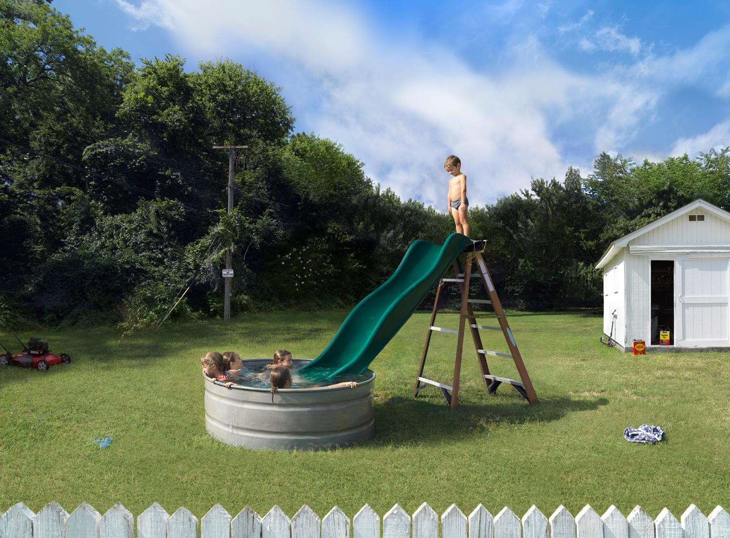
- Slide, Color Photograph, Archival Pigment Ink Print, signed and numberedBy Julie BlackmonLocated in Sante Fe, NMSlide by Julie Blackmon is from an ongoing series titled Home Grown According to the Los Angeles Times, Blackmon's images are “absorbing, meticulously orchestrated slices of ethnogr...Category
2010s Contemporary Color Photography
MaterialsColor, Archival Pigment