Methylamine 13c (Black)

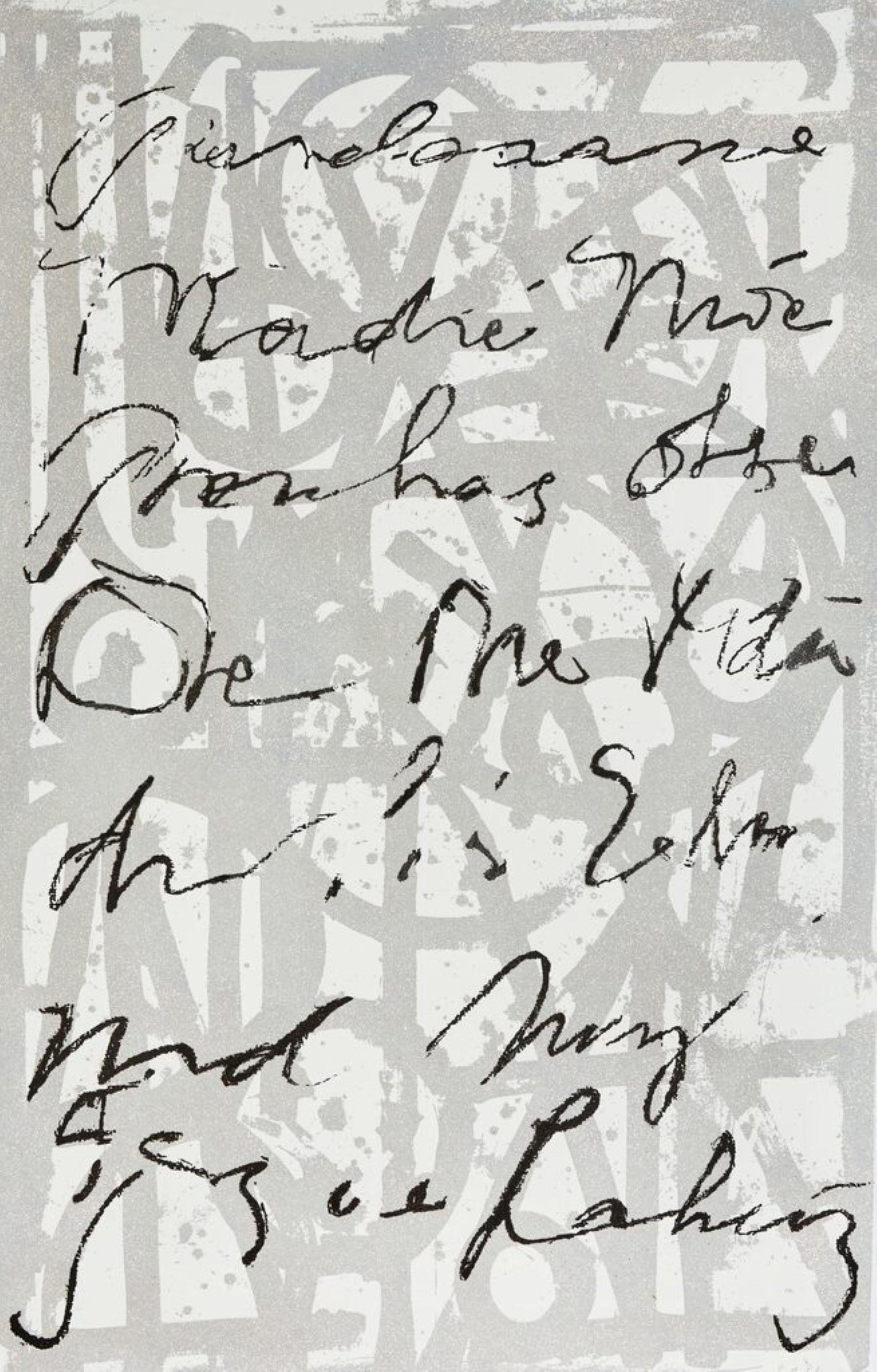
Damien HirstMethylamine 13c (Black)2014
2014
About the Item
- Creator:Damien Hirst (1965, British)
- Creation Year:2014
- Dimensions:Height: 84 in (213.36 cm)Width: 68 in (172.72 cm)
- Medium:
- Movement & Style:
- Period:
- Condition:Edition of 100.
- Gallery Location:New York, NY
- Reference Number:1stDibs: LU31221241213

Damien Hirst
British artist Damien Hirst is widely considered the enfant terrible of contemporary art. He is the most prominent of the so-called Young British Artists, or YBAs, a group, largely composed of Hirst’s classmates at Goldsmiths, in London, that began exhibiting together in warehouses and factories after 1988 and is known for the use of unconventional materials and “shock tactics” in his paintings, prints, sculptures and other works.
In the 1990s, Hirst said, “I can’t wait to get into a position to make really bad art and get away with it.” And indeed, he is notorious for piquing critics and baffling the public with such pieces as his signature glass vitrines containing dead sheep or sharks in formaldehyde, and his diamond-encrusted skull, For the Love of God.
Working primarily in sculpture, Hirst takes after French modernist master Marcel Duchamp in his use of ready-made objects and materials, which he combines to ironic effect. He often creates in series, as with "The Cure (Violet)" and "The Cure (Turquoise)," both from 2014, which are among several pill paintings referencing Andy Warhol’s embrace of mass production.
Belonging to Hirst's ongoing series of “spot” paintings, begun in the 1980s, the 2005 piece Xylene Cyanol Dye Solution is striking for its machinelike, industrial uniformity and almost childlike simplicity, a seeming rebuke to the idea of the artist-as-genius.
In addition to making art, Hirst has launched stores that sell editioned works (Other Criteria), a restaurant (Pharmacy2) and even his own London museum (Newport Street Gallery).
Find original Damien Hirst paintings, prints and other works on 1stDibs.
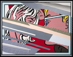
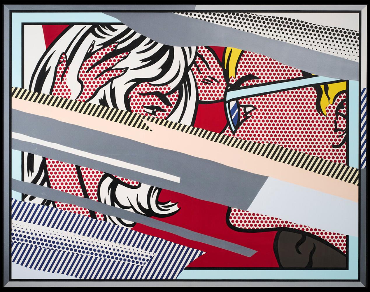
- Reflections on Conversation, from Reflection seriesBy Roy LichtensteinLocated in Miami, FLRoy Lichtenstein (1923-1997, American) Reflections on Conversation, from Reflection series 1990 Lithograph, screenprint, woodcut, relief and metalized PVC collage with embossing 53 3...Category
1990s Pop Art Portrait Prints
MaterialsPVC, Mixed Media, Lithograph, Screen, Woodcut
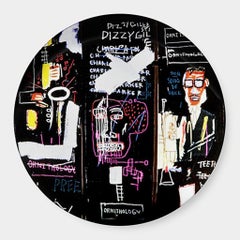
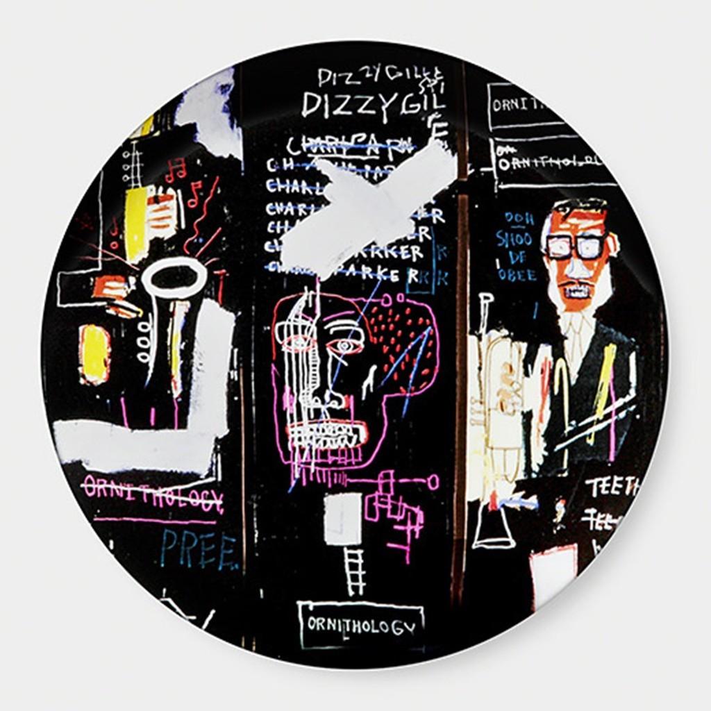
- Dizzy Gillespie, Porcelain Plate (New in Box)By Jean-Michel BasquiatLocated in New York, NYJean-Michel Basquiat Dizzy Gillespie, Porcelain Plate (New in Box), 2014 Porcelain Plate in Elegant Light Blue Gift Box The plate itself is stamped on th...Category
2010s Pop Art More Art
MaterialsPorcelain, Mixed Media, Screen
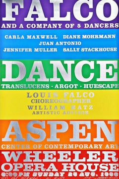
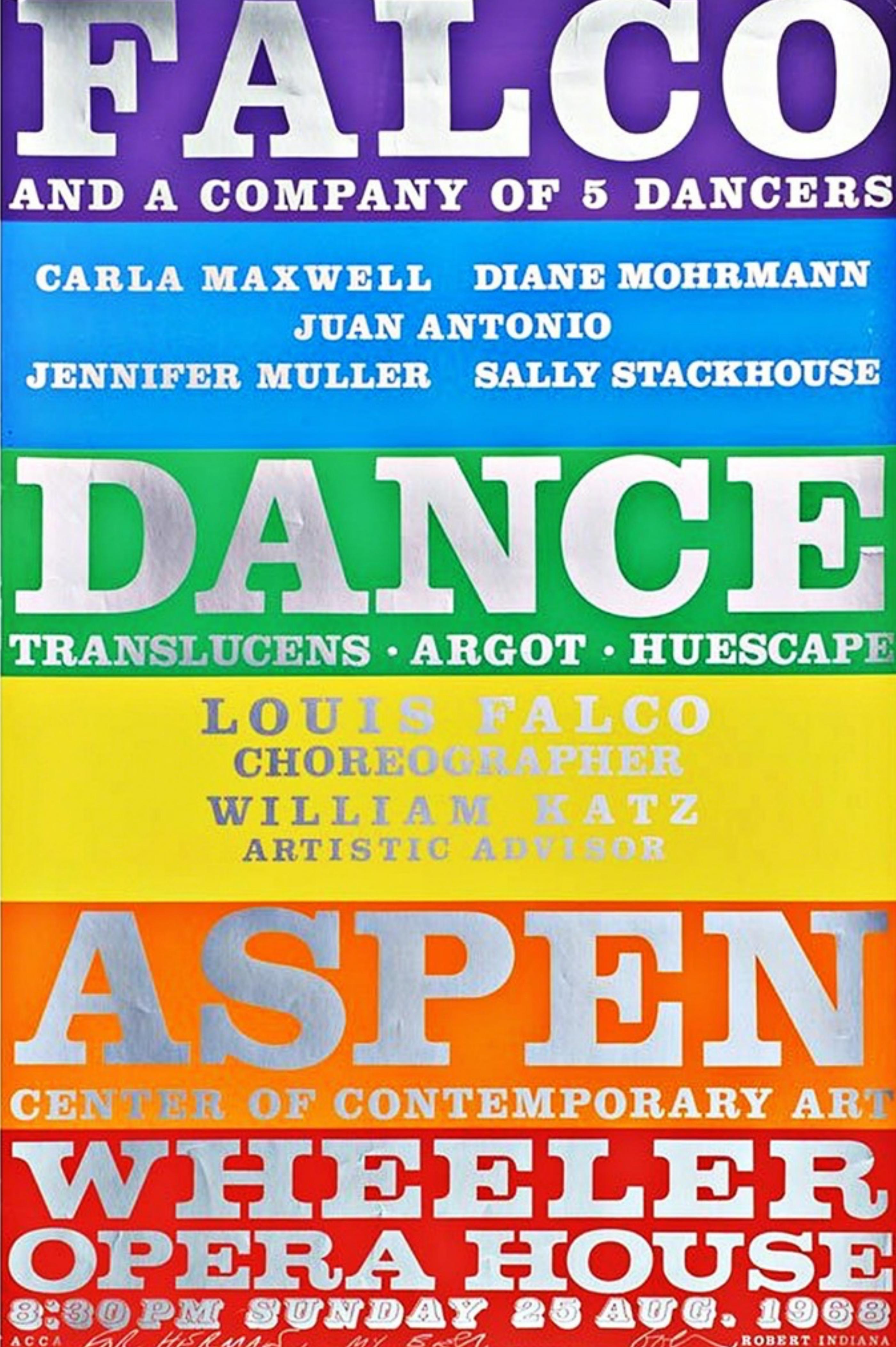
- FALCO Dance Co., Aspen Rare rainbow color print (Signed & Inscribed by Indiana)By Robert IndianaLocated in New York, NYRobert Indiana FALCO Dance Company (Hand Signed/Dedicated), 1968 Silkscreen on metallic and wove paper Hand signed by Robert Indiana with personal inscription on the front Unframed T...Category
1960s Pop Art Abstract Prints
MaterialsFoil
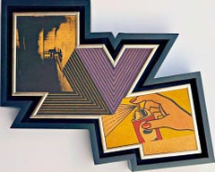
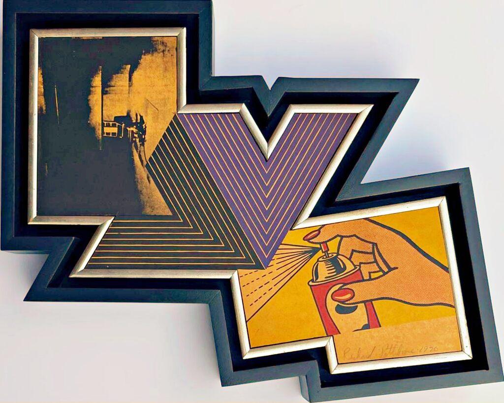
- The Appropriation piece: Andy Warhol, Frank Stella, Roy Lichtenstein Unique var.By Richard PettiboneLocated in New York, NYRichard Pettibone The Appropriation Print Andy Warhol, Frank Stella, Roy Lichtenstein, 1970 Silkscreen in colors on masonite board (unique variant on sculpted board) Hand-signed by artist, Signed and dated on the front (see close up image) Bespoke frame Included This is a rare example of Pettibone's iconic Appropriation Print, as it's silkscreened and sculpted on masonite board rather than paper, giving it a different background hue, and enabling it work to be framed so uniquely. The Appropriation print is one of the most coveted prints Pettibone ever created ; the regular edition is on a full sheet with white background; the present example was silkscreened on board, allowing it to be framed in 3-D. While we do not know how many examples of this graphic work Pettibone created, so far the present work is the only one example we have ever seen on the public market since 1970. (Other editions of The Appropriation Print have been printed on vellum, wove paper and pink and yellow paper.) This 1970 homage to Andy Warhol, Frank Stella and Roy Lichtenstein exemplifies the type of artistic appropriation he was engaging in early on during the height of the Pop Art movement - long before more contemporary artists like Deborah Kass, Louise Lawler, etc. followed suit. This silkscreen was in its original 1970 vintage period frame; a bespoke custom hand cut black wood outer frame was subsequently created especially to house the work, giving it a distinctive sculptural aesthetic. Measurements: Framed 14.5 inches vertical by 18 inches horizontal by 2 inches Work 13 inches vertical by 16.5 inches horizontal Richard Pettibone biography: Richard Pettibone (American, b.1938) is one of the pioneering artists to use appropriation techniques. Pettibone was born in Los Angeles, and first worked with shadow boxes and assemblages, illustrating his interest in craft, construction, and working in miniature scales. In 1964, he created the first of his appropriated pieces, two tiny painted “replicas” of the iconic Campbell’s soup cans by Andy Warhol (American, 1928–1987). By 1965, he had created several “replicas” of paintings by American artists, such as Warhol, Roy Lichtenstein (1923–1997), Ed Ruscha (b.1937), and others, among them some of the biggest names in Pop Art. Pettibone chose to recreate the work of leading avant-garde artists whose careers were often centered on themes of replication themselves, further lending irony to his work. Pettibone also created both miniature and life-sized sculptural works, including an exact copy of Bicycle Wheel by Marcel Duchamp (French, 1887–1968), and in the 1980s, an entire series of sculptures of varying sizes replicating the most famous works of Constantin Brancusi (Romanian, 1876–1957). In more recent years, Pettibone has created paintings based on the covers of poetry books by Ezra Pound, as well as sculptures drawn from the grid compositions of Piet Mondrian (Dutch, 1872–1944). Pettibone straddles the lines of appropriation, Pop, and Conceptual Art, and has received critical attention for decades for the important questions his work raises about authorship, craftsmanship, and the original in art. His work has been exhibited at the Institute for Contemporary Art in Philadelphia, the Museum of Modern Art in New York, the Museum of Contemporary Art in Miami, and the Laguna Art Museum in Laguna Beach, CA. Pettibone is currently based in New York. "I wished I had stuck with the idea of just painting the same painting like the soup can and never painting another painting. When someone wanted one, you would just do another one. Does anybody do that now?" Andy Warhol, 1981 Since the mid-1960s, Richard Pettibone has been making hand-painted, small-scale copies of works by other artists — a practice due to which he is best known as a precursor of appropriation art — and for a decade now, he has been revisiting subjects from across his career. In his latest exhibitions at Castelli Gallery, Pettibone has been showing more of the “same” paintings that had already been part of his 2005–6 museum retrospective,1 and also including “new” subject matter drawn from his usual roster of European modernists and American postwar artists. Art critic Kim Levin laid out some phases of the intricate spectrum from copies to repetitions in her review of the Warhol-de Chirico showdown, a joint exhibition at the heyday of appropriation art in the mid-1980s when Warhol’s appropriations of de Chirico’s work effectively revaluated “the grand old auto-appropriator”. Upon having counted well over a dozen Disquieting Muses by de Chirico, Levin speculated: “Maybe he kept doing them because no one got the point. Maybe he needed the money. Maybe he meant it when he said his technique had improved, and traditional skills were what mattered.” On the other side, Warhol, in her eyes, was the “latter-day exemplar of museless creativity”. To Pettibone, traditional skills certainly still matter, as he practices his contemporary version of museless creativity. He paints the same painting again and again, no matter whether anybody shows an interest in it or not. His work, of course, takes place well outside the historical framework of what Levin aptly referred to as the “modern/postmodern wrestling match”, but neither was this exactly his match to begin with. Pettibone is one of appropriation art’s trailblazers, but his diverse selection of sources removes from his work the critique of the modernist myth of originality most commonly associated with appropriation art in a narrow sense, as we see, for example, in Sherrie Levine’s practice of re-photographing the work of Walker Evans and Edward Weston. In particular, during his photorealist phase of the 1970s, Pettibone’s sources ranged widely across several art-historical periods. His appropriations of the 1980s and 1990s spanned from Picasso etchings and Brancusi sculptures to Shaker furniture and even included Ezra Pound’s poetry. Pettibone has professed outright admiration for his source artists, whose work he shrinks and tweaks to comic effect but, nevertheless, always treats with reverence and care. His response to these artists is primarily on an aesthetic level, owing much to the fact that his process relies on photographs. By the same token, the aesthetic that attracts him is a graphic one that lends itself to reproduction. Painstakingly copying other artists’ work by hand has been a way of making it his own, yet each source is acknowledged in his titles and, occasionally, in captions on white margins that he leaves around the image as an indication that the actual source is a photographic image. The enjoyment he receives in copying is part of the motivation behind doing it, as is the pleasure he receives from actually being with the finished painting — a considerable private dimension of his work. His copies are “handmade readymades” that he meticulously paints in great quantities in his studio upstate in New York; the commitment to manual labor and the time spent at material production has become an increasingly important dimension of his recent work. Pettibone operates at some remove from the contemporary art scene, not only by staying put geographically, but also by refusing to recoup the simulated lack of originality through the creation of a public persona. In so doing, Pettibone takes a real risk. He places himself in opposition to conceptualism, and he is apprehensive of an understanding of art as the mere illustration of an idea. His reading of Marcel Duchamp’s works as beautiful is revealing about Pettibone’s priorities in this respect. When Pettibone, for aesthetic pleasure, paints Duchamp’s Poster...Category
1970s Pop Art Mixed Media
MaterialsMasonite, Pencil, Screen, Mixed Media
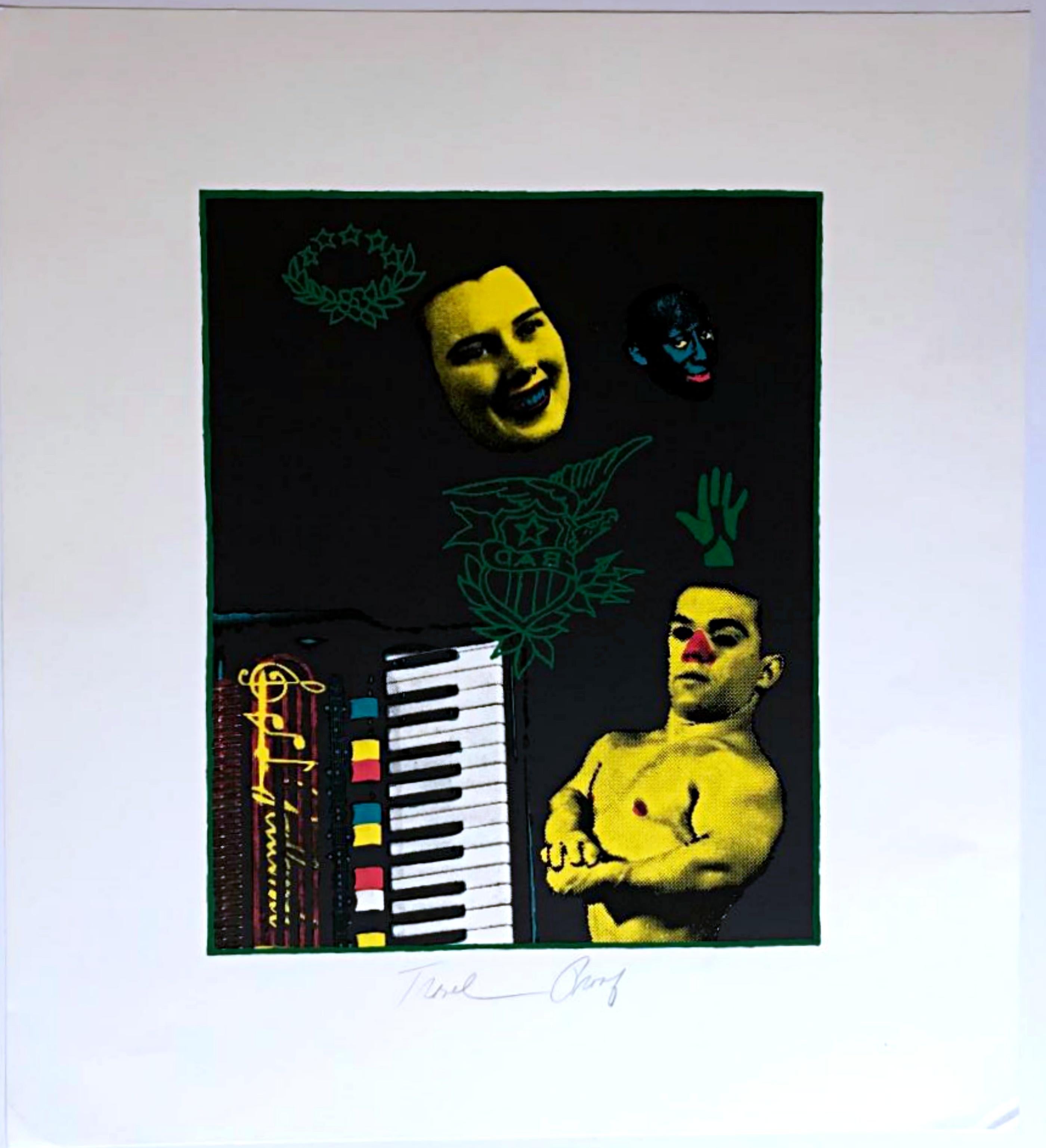
- BADBy Ed PaschkeLocated in New York, NYEd Paschke BAD, 1991 Silkscreen and Lithograph on Rising Mirage Paper, accompanied by documentation 22 × 20 inches Pencil signed, titled "BAD", and annotated "Trial Proof" on the fro...Category
1990s Pop Art Abstract Prints
MaterialsLithograph, Screen, Mixed Media, Felt Pen
 $2,350
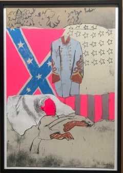
 - The Last Civil War VeteranBy Larry RiversLocated in New York, NYLarry Rivers The Last Civil War Veteran, 1970 Silkscreen and mixed media collage on paper 29 × 19 3/4 inches Frame included Edition of 100 Hand signed and numbered 55/100 in graphite lower front 1970 Mixed media collage multiple based upon famous Larry Rivers 1961 painting "The Last Civil War Veteran'. (In 1979-80, Rivers reprised this theme with another edition of 125, but this is the original 1970 print from the limited edition of only 100) In 1962, the Museum of Modern Art acquired The Last Civil War Veteran and by early 1963 put it on view. 1963 marked the hundred-year anniversary of the Emancipation Proclamation...Category
1970s Pop Art Abstract Prints
MaterialsMixed Media, Screen