Want more images or videos?
Request additional images or videos from the seller
1 of 10

Robert Indiana
"Indianapolis Museum of Art Inaugural Exhibitions", Color Silkscreen, Signed

1970

$2,200
£1,636.43
€1,915.93
CA$3,069.75
A$3,435.13
CHF 1,793.67
MX$42,231.39
NOK 22,629.15
SEK 21,293.92
DKK 14,294.34
Shipping
Retrieving quote...
The 1stDibs Promise:
Authenticity Guarantee,
Money-Back Guarantee,
24-Hour Cancellation

About the Item

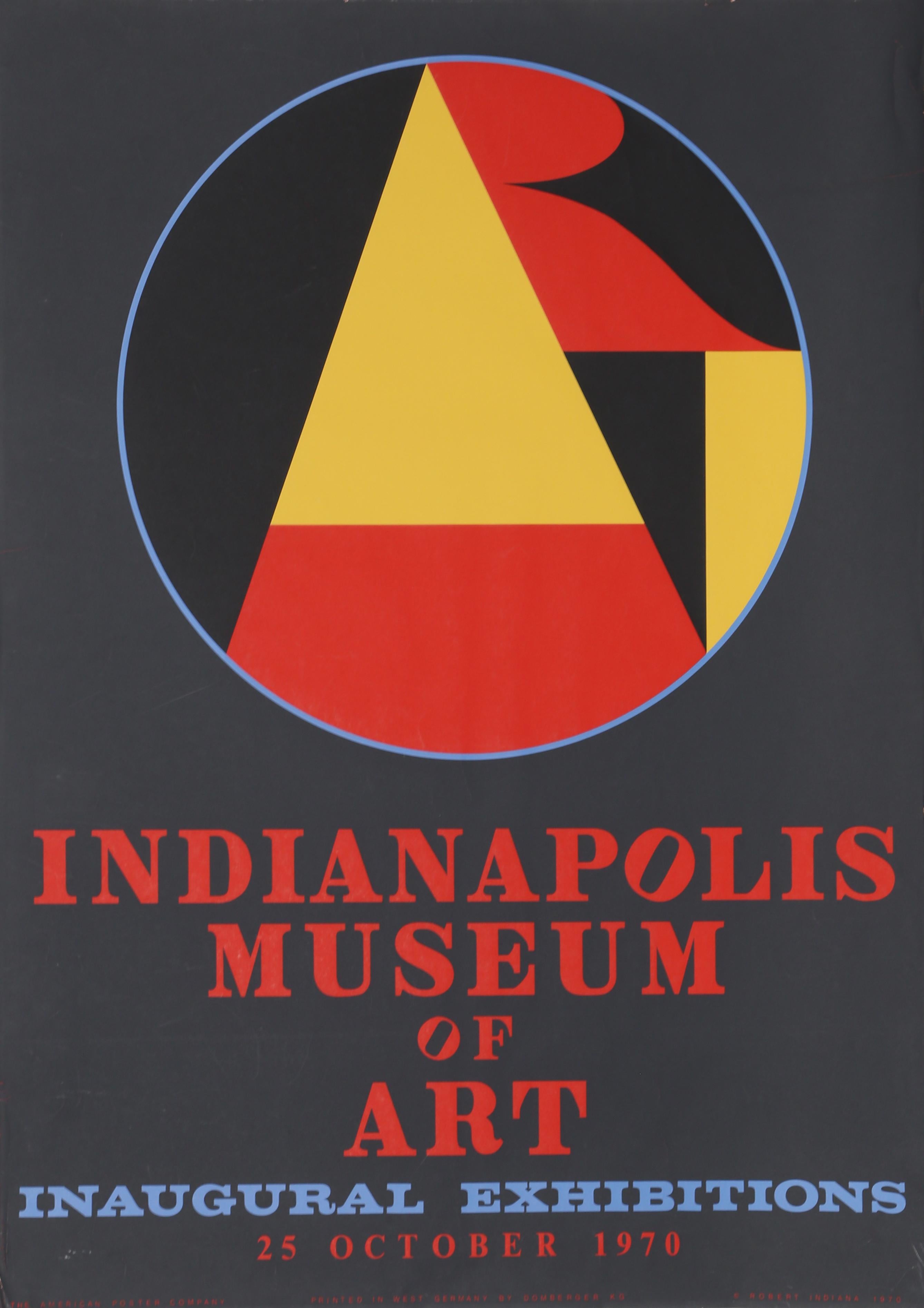
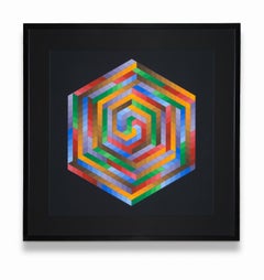
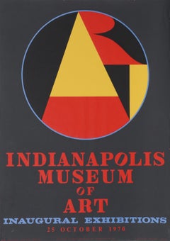
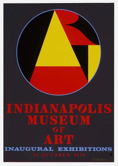
"Indianapolis Museum of Art Inaugural Exhibitions", 25 October 1970, is an eye popping large bold colorful geometric abstract silk screen. It is signed on the lower right. 
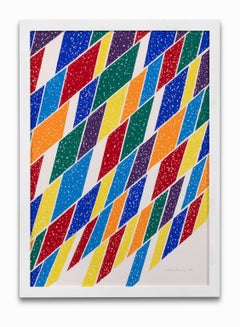
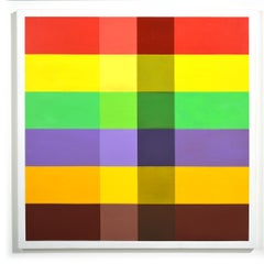
Robert Indiana, one of the preeminent figures in American art since the 1960s, played a central role in the development of assemblage art, hard-edge painting, Pop art, Neo-Dada, American Modernism and Modern Art. A self-proclaimed “American painter of signs,” Indiana created a highly original body of work that explores American identity, personal history, and the power of abstraction and language, establishing an important legacy that resonates in the work of many contemporary artists such as Andy Warhol, Keith Haring, Roy Lectenstein, David Hockney, Romero Britto, Richard Hamilton and Robert Rauschenberg who make the written word a central element of their oeuvre. Robert Indiana was born Robert Clark in New Castle, Indiana on September 13, 1928. Adopted as an infant, he spent his childhood moving frequently throughout his namesake state. At 14 he moved to Indianapolis in order to attend Arsenal Technical High School, known for its strong arts curriculum. After graduating he spent three years in the U.S. Air Force and then studied at the Art Institute of Chicago, the Skowhegan School of Sculpture and Painting in Maine, and the Edinburgh College of Art in Scotland. 
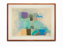
In 1956, two years after moving to New York, Indiana met Ellsworth Kelly, and upon his recommendation took up residence in Coenties Slip, where a community of artists that would come to include Kelly, Agnes Martin, James Rosenquist, and Jack Youngerman had studios. Indiana, like some of his fellow artists, scavenged the area’s abandoned warehouses for materials, creating sculptural assemblages from old wooden beams, rusted metal wheels, and other remnants of the shipping trade that had thrived in Coenties Slip. The discovery of 19th century brass stencils led to the incorporation of brightly colored numbers and short emotionally charged words onto these sculptures as well as canvases, and became the basis of his new painterly vocabulary. Although acknowledged as a leader of Pop, Indiana distinguished himself from his Pop peers by addressing important social and political issues and incorporating profound historical and literary references into his works. In 1964 Indiana accepted Philip Johnson’s invitation to design a new work for the New York State Pavilion at the New York World’s Fair, creating a 20-foot EAT sign composed of flashing lights, and collaborated with Andy Warhol on the film Eat, a silent portrait of Indiana eating a mushroom in his Coenties Slip studio. 
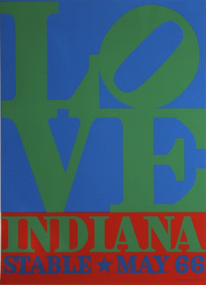
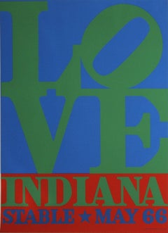
1966 marked a turning point in Indiana’s career with the success of his LOVE image, which had been featured in a solo exhibition at the Stable Gallery. The word love, a theme central to Indiana’s work, first appeared in the painting 4-Star Love (1961). Love is a subject of great spiritual significance for the artist. Initially experimenting with a composition of stacked letters in a series of 1964 rubbings, Indiana subsequently turned this inventive design, a formal departure from his previous works, into different hard-edged color variations on canvas. Indiana’s LOVE, selected by the Museum of Modern Art in 1965 for its Christmas card, quickly permeated wider popular culture, and was adopted as an emblem of the “Love Generation.” Appearing on a best-selling United States Postal Service stamp (1973) and reproduced on countless unauthorized products, the proliferation of the image led, on one hand, to negative criticism and incorrect assumptions of the artist as a sell-out. However, the image’s popularity more importantly emphasizes its great resonance with large and diverse audiences, and has become an icon of modern art. 
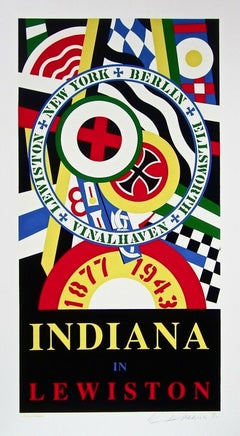
In 1978, Indiana chose to remove himself from the New York art world. He settled on the remote island of Vinalhaven in Maine. There Indiana turned to themes that related to his local experience, working on a suite of eighteen large-scale paintings known as The Hartley Elegies (1989-94), inspired by the German Officer paintings of Marsden Hartley, who lived on Vinalhaven in the summer of 1938. In addition to being a painter and sculptor, Indiana has created a significant number of prints, among them the Numbers Portfolio (1968), a collaboration with the poet Robert Creeley, as well as many other works of graphic art, including the poster for the opening of the New York State Theater, Lincoln Center (1964), the poster for the opening exhibition of the Indianapolis Museum of Art Inaugural Exhibition 1970, as well as the poster for the opening of the Hirshhorn Museum of Art (1974.) Indiana’s artwork has been featured in numerous solo and group exhibitions around the world, and his works are in the permanent collections of the Museum of Modern Art and the Whitney Museum of American Art in New York, the National Gallery of Art, the Hirshhorn Museum and Sculpture Garden and the Smithsonian Museum of American Art in Washington, D.C., the Albright-Knox Art Gallery in Buffalo, New York, the San Francisco Museum of Modern Art, the Menil Collection in Houston, the Currier Museum of Art, Manchester, New Hampshire, the Museum Ludwig in Cologne, Germany, the Stedelijk Van Abbemuseum in Eindhoven, the Netherlands, the Museum Ludwig in Vienna, Austria, the Art Museum of Ontario in Toronto, and the Israel Museum in Jerusalem. In 2013 the Whitney Museum of American Art hosted the artist’s first New York retrospective, Robert Indiana: Beyond LOVE, curated by Barbara Haskell. Indiana passed away in his home on May 19th, 2018, just a few weeks before the opening of his sculpture retrospective at the Albright-Knox Art Gallery.
  • Creator:
    Robert Indiana (1928 - 2018, American)
  • Creation Year:
    1970
  • Dimensions:
    Height: 35.5 in (90.17 cm)Width: 25.5 in (64.77 cm)
  • Medium:
  • Movement & Style:
  • Period:
  • Condition:
  • Gallery Location:
    Detroit, MI
  • Reference Number:
    1stDibs: LU128617483682

More From This Seller

View All
Roy Lichtenstein "Figures" 1978 (From Surrealist Series) Gemini G.E.L. Printers
By Roy Lichtenstein
Located in Detroit, MI
SALE ONE WEEK ONLY Title: Figures Portfolio: 1978 Surrealist Medium: Lithograph on Arches 88 paper Edition: 38 Sheet Size: 31 7/16" x 23 1/2" Image Size: 23 1/2" x 15 1/4" Signature: Hand signed in pencil Reference: Corlett 156 Printed by Gemini G.E.L. printers out of Los Angeles. Roy Fox Lichtenstein was an American pop artist. During the 1960s through the 90’s, along with Andy Warhol, Jasper Johns, and James Rosenquist, he became a leading figure in the new art movement. His work defined the premise of pop art through parody. Most of Lichtenstein's best-known works are relatively close, but not exact, copies of comic book panels, a subject he largely abandoned in 1965. Lichtenstein's Still Life paintings, sculptures and drawings, which span from 1972 through the early 1980s, cover a variety of motifs and themes, including the most traditional such as fruit, flowers, and vases. Inspired by the comic strip, Lichtenstein produced precise compositions that documented while they parodied, often in a tongue-in cheek manner. His work was influenced by popular advertising and the comic book style. His artwork was considered to be "disruptive". He described pop art as "not 'American' painting but actually industrial painting". His paintings were exhibited at the Leo Castelli Gallery in New York City. Wham!, and Drowning Girl Look Mickey proved to be his most influential works. His most expensive piece is Masterpiece which was sold for $165 million in January 2017. Lichtenstein received both his Bachelors and Masters at Ohio State University, Columbus, Ohio where he taught for ten years. In 1967, he moved back to upstate New York and began teaching again. It was at this time that he adopted the Abstract Expressionist style, being a late convert to this style of painting. Lichtenstein began teaching in upstate New York at the State University of New York at Oswego in 1958. About this time, he began to incorporate hidden images of cartoon characters such as Mickey Mouse and Bugs Bunny into is abstract works. In 1960, he started teaching at Rutgers University where he was heavily influenced by Allan Kaprow, who was also a teacher at the university. This environment helped reignite his interest in Proto-pop imagery. In 1961, Lichtenstein began his first pop paintings using cartoon images and techniques derived from the appearance of commercial printing. This phase would continue to 1965, and included the use of advertising imagery suggesting consumerism and homemaking. His first work to feature the large-scale use of hard-edged figures and Ben-Day dots was Look Mickey (1961), National Gallery of Art, Washington, D. C.) This piece came from a challenge from one of his sons, who pointed to a Mickey Mouse comic book and said; "I bet you can't paint as good as that, eh, Dad?" In the same year he produced six other works with recognizable characters from gum wrappers and cartoons. It was at this time that Lichtenstein began to find fame not just in America but worldwide. He moved back to New York to be at the center of the art scene in 1964 to concentrate on his painting. Lichtenstein used oil and Magna (early acrylic) paint in his best known works, such as Drowning Girl (1963), which was appropriated from the lead story in DC Comics’ Secret Hearts No. 83, drawn by Tony Abruzzo. (Drowning Girl now hangs in the Museum of Modern Art, New York.) Drowning Girl also features thick outlines, bold colors and Ben-Day dots, as if created by photographic reproduction. Of his own work Lichtenstein would say that the Abstract Expressionists "put things down on the canvas and responded to what they had done, to the color positions and sizes. My style looks completely different, but the nature of putting down lines pretty much is the same; mine just don't come out looking calligraphic, like Pollock’s or Kline’s. Rather than attempt to reproduce his subjects, Lichtenstein's work tackled the way in which the mass media portrays them. He would never take himself too seriously, however, saying: "I think my work is different from comic strips – but I wouldn't call it transformation; I don't think that whatever is meant by it is important to art.” When Lichtenstein's work was first exhibited, many art critics of the time challenged its originality. His work was harshly criticized as vulgar and empty. The title of a Life magazine article in 1964 asked, "Is He the Worst Artist in the U.S.?" Lichtenstein responded to such claims by offering responses such as the following: "The closer my work is to the original, the more threatening and critical the content. However, my work is entirely transformed in that my purpose and perception are entirely different. I think my paintings are critically transformed, but it would be difficult to prove it by any rational line of argument.” In 1969, Lichtenstein was commissioned by Gunter Sachs to create Composition and Leda and the Swan, for the collector's Pop Art bedroom suite at the Palace Hotel in St. Moritz. In the late 1970s and during the 1980s, Lichtenstein received major commissions for works in public places: the sculptures Lamp (1978) in St. Mary's, Georgia; Mermaid (1979) in Miami Beach; the 26 feet tall Brushstrokes in Flight (1984, moved in 1998) at John Glenn Columbus International Airport; the five-storey high Mural with Blue Brushstroke (1984–85) at the Equitable Center, New York and El Cap de Barcelona (1992) in Barcelona. In 1994, Lichtenstein created the 53-foot-long, enamel-on-metal Times Square Mural in Times Square subway station. In 1977, he was commissioned by BMW to paint a Group 5 Racing Version of the BMW 320i for the third installment in the BMW Art Car Project. The DreamWorks Records logo was his last completed project. "I'm not in the business of doing anything like that (a corporate logo) and don't intend to do it again," allows Lichtenstein. "But I know Mo Ostin and David Geffen and it seemed interesting. In 1996 the The National Gallery of Art in Washington, D.C. became the largest single repository of the artist's work when Lichtenstein donated 154 prints and 2 books. The Art Institute of Chicago has several important works by Lichtenstein in its permanent collection, including Brushstroke with Spatter (1966) and Mirror No. 3 (Six Panels) (1971). The personal holdings of Lichtenstein's widow, Dorothy Lichtenstein, and of the Roy Lichtenstein Foundation number in the hundreds. In Europe, the Museum Ludwig in Cologne has one of the most comprehensive Lichtenstein holdings with Takka Takka (1962), Nurse (1964), Compositions I (1964), besides the Frankfurt Museum fur Modern Kunst with We Rose Up slowly (1964), and Yellow and Green Brushstrokes...
Category

1970s Pop Art Abstract Prints

Materials

Lithograph

Victor Vasarely Screen Print Abstract, Geometric Squares Cubes Hexagon
By Victor Vasarely
Located in Detroit, MI
Victor Vasarely born in 1906 was a Hungarian-French artist, who is widely accepted as a "grandfather" and leader of the Op Art movement. Op Art is a form of abstract art that gives the illusion of movement by the precise use of pattern and color, or in which conflicting patterns emerge and overlap. Victor Vasarely and Brigit Riley are its most famous exponents. In its visual balancing act of color and movement from a flat plane to developed continuous flow “Untitled” is a complex arrangement of squares and colors that visually expand and contract. It is one of Vasarely’s most successful Op Art abstract works. The piece is signed on the lower right and number 20/150 on the lower left. The print is behind glass and matted. Vasarely was born in Pecs and grew up in Slovakia and Budapest, where in 1925, he took up medical studies. Abandoning medicine he turned to traditional academic painting at the private Podolini-Volkmann Academy. In 1928/1929, he enrolled at Sandor Bortnyik’s private art school widely recognized as Budapest's centre of Bauhaus studies. His studies concentrated on applied graphic art and typographical design. In 1929, he painted his Blue Study and Green Study. In 1930, he married his fellow student Claire Spinner (1908–1990). Together they had two sons, Andre and Jean-Pierre. Vasarely became a graphic designer and a poster artist during the 1930s combining patterns and organic images with each other. Vasarely utilized geometric shapes and colorful graphics, the artist created compelling illusions of spatial depth, as seen in his work Vega-Nor (1969). Vasarely’s method of painting borrowed from a range of influences, including Bauhaus design principles, Wassily Kandinsky, and Constructivism. In the late 1920s, Vasarely enrolled at the Muhely Academy in Budapest, where the syllabus was largely based on Walter Gropius’s Bauhaus school in Germany. After settling in Paris in 1930, Vasarely worked in advertising agencies to support himself as a graphic artist while creating many works including Zebra (1937), which is considered by some to be one of the earliest examples of Op Art. The artist experimented in a style based in Surrealism and Abstract Expressionism during the 1940s, before arriving at his hallmark checkerboard...
Category

Mid-20th Century Op Art Abstract Prints

Materials

Paper, Screen

Joyce T. Nagel Print "Vegetable Forms No. 9" "1st State" Signed Dated Ltd Ed
Located in Detroit, MI
"Vegetable Forms No. 9" "1st State" is a beautiful linear design woodcut of an artichoke. What is intellectually interesting is the fractal beauty of nature found in the artichoke. A fractal is a kind of pattern that we observe often in nature and in art. Whenever you observe a series of patterns repeating over and over again, at many different scales, and where any small part resembles the whole, that’s a fractal. The Artichoke is the perfect example in that the shape of the leaves repeat themselves and they are the same shape as the fruit itself. Fractals are exciting, not only for their mathematical or conceptual representation, but also for the fact that you can visualise the math—and it’s beautiful! This print is rendered in an intense green with a light blue color to delineate the intriguing linear element of the artichoke's leaves. Joyce Tilley Nagel...
Category

1970s Abstract Abstract Prints

Materials

Paper, Ink

Lance Lawlor Lithograph "Design in Black & White" Geometric Abstract
Located in Detroit, MI
"Design in Black & White" is a lithograph by the well-known Michigan designer Lance Lawlor. He was a Master of linear and decorative design and this print displays the talent for which he was sought after. Lance Stephen Lawlor was born January 6, 1955, in Detroit, Michigan. He attended the University of Michigan, graduating with a BFA in 1975 from the Penny W. Stamps School of Art & Design. He was a student of world renown costume designers of the 1930s-1950s, especially Adrian Adolph...
Category

1990s Contemporary Abstract Prints

Materials

Lithograph

Piero Dorazio Lithograph Abstract Geometric Quadrilateral Polygon
By Piero Dorazio
Located in Detroit, MI
The work is a Lithograph, not numbered, but signed and dated by the artist, Piero Dorazio. The print has an intense color field with a strong linear element being composed of quadril...
Category

1970s Abstract Expressionist Abstract Prints

Materials

Lithograph

"Color Moves" Abstract, Geometric, Linear, Colorful
Located in Detroit, MI
"Color Moves" is a colorful abstract with a broad linear element. Artist David Rubello studied and painted naturalism for many years. In 1965 he began s...
Category

2010s Abstract Geometric Abstract Paintings

Materials

Acrylic

You May Also Like

Indianapolis Museum of Art, 1970, Pop Art Screenprint Poster by Robert Indiana
By Robert Indiana
Located in Long Island City, NY
Artist: Robert Indiana, American (1928 - 2018) Title: Indianapolis Museum of Art Year: 1970 Medium: Silkscreen Poster Size: 35 x 25 in. (88.9 x 63.5 cm)
Category

1970s Pop Art Abstract Prints

Materials

Screen

Robert Indiana Signed 1970 Indianapolis Museum of Art
By Robert Indiana
Located in Pembroke Pines, FL
Artist: Robert Indiana, American (1928 - 2018) Title: Indianapolis Museum of Art Year: 1970 Medium: Silkscreen Poster Size: 35 x 25 in. (88.9 x 63.5 cm) Signed, and dated lower right...
Category

1970s Pop Art Prints and Multiples

Materials

Archival Paper, Screen

Indiana in Lewiston, Robert Indiana
By Robert Indiana
Located in Fairfield, CT
Artist: Robert Indiana (1928-2018) Title: Indiana in Lewiston Year: 1991 Medium: Silkscreen on wove paper Edition: 150, plus proofs Size: 46.5 x 26.75 inches Condition: Excellent Ins...
Category

1990s Pop Art Abstract Prints

Materials

Screen

INDIANA ELLIOT
By Robert Indiana
Located in Aventura, FL
Hand signed and numbered by the artist. Artwork is in excellent condition. Certificate of authenticity included. Edition of 150. All reasonable offers will be considered.
Category

1970s Pop Art Figurative Prints

Materials

Lithograph, Paper

INDIANA ELLIOT
$1,125 Sale Price
25% Off
Robert Indiana 'LOVE-Stable' Serigraph 1971
By Robert Indiana
Located in Brooklyn, NY
"LOVE in Blue and Green" is a notable silk-screen poster designed by Robert Indiana and published by Posters Originals in 1971. The piece is rooted in Indiana's iconic "LOVE" series,...
Category

1970s Pop Art Prints and Multiples

Materials

Screen

Indiana Elliot
By Robert Indiana
Located in San Francisco, CA
Artist: Robert Indiana (American, born 1928) Title: "Indiana Eliott" Year: 1977 Medium: Original color lithograph Edition: Numbered 32/150 in pencil Paper: Arches Image size: 18 x 14 inches paper size: 23.65 x 19.5 inches Signature: Hand signed in pencil by the artist Publisher: Leon Amiel, New York Printer: Fernand Mourlot, Paris Condition: It is in excellent condition, has never been framed. Description: From the suite "The Mother of All Us" About the artist: Robert Indiana was born in New Castle, Indiana, in 1928. His family name was Clark but he adopted the name of his native state early in his career. His father worked for a Phillips 66 gas station and his mother ran a diner. He began his studies in art in 1945 at the Herron School of Art in Indianapolis and then at the Munson-Williams-Proctor Institute in Utica, New York. He then moved to Chicago and continued his studies at the School of the Art Institute of Chicago. He also studied at the Skowhgan School of Painting and Sculpture in Maine, the Edinburgh College of Art and London University, eventually moving to New York City in 1956. A major Pop Artist, his work is characterized by the use of words and relatively flat paint with no brush strokes. This cold and somewhat mechanical approach to painting in which the words are often stenciled into the design probably was influenced by street signs, pinball machines, the commercial stenciling process used in printing and advertisements. In fact, Indiana calls himself "a painter of signs". He uses the common everyday symbols and words of America and paints them as brilliantly colored pop art paintings. His work comments in an ironic fashion on American life and culture, often making pointed political statements about American society. The words in his painting are usually simple and short words, sometimes with clear meaning and other times arranged in an ambiguous fashion to project multiple meanings, and occasionally involve puns. It is interesting to try to put his "words" together to get a sense of the meaning. For instance, in The Triumph of Tira, painted in, 1960-61, the artist presents four circles with four squares inside them and four stars inside the squares. There is one word in each star. The upper left says "Law"; the upper right says "Cat"; the lower left says "Men"; and the lower right says "Sex." Of course it is hard to understand the relationship between the words, and as you begin to speculate on what it might mean, a number of possible interpretations evolve. Other works have more obvious meanings, sometimes political. One painting shows an outline of the State of Alabama with Selma marked in the right location. The words "Just as in the anatomy of man, every nation must have its hind part", are stenciled around the map. This is a reference to the march on Selma, which was an important event in the Civil Rights Movement during the 60's. Indiana's most famous painting is of the word "Love". It is painted with the LO on the top and VE on the bottom. This painting was used as a design for an American postage stamp...
Category

1970s Pop Art Figurative Prints

Materials

Lithograph