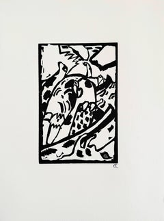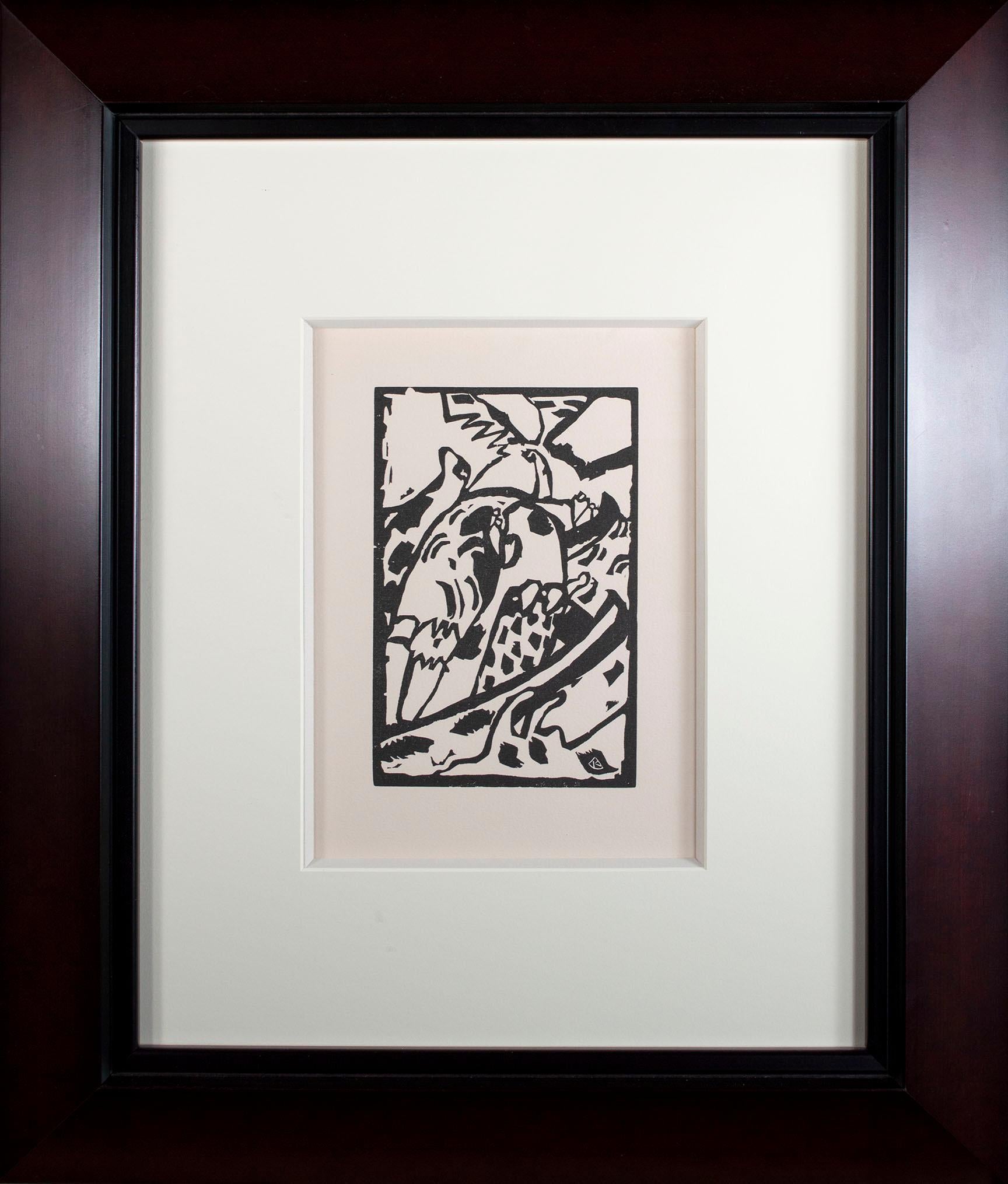
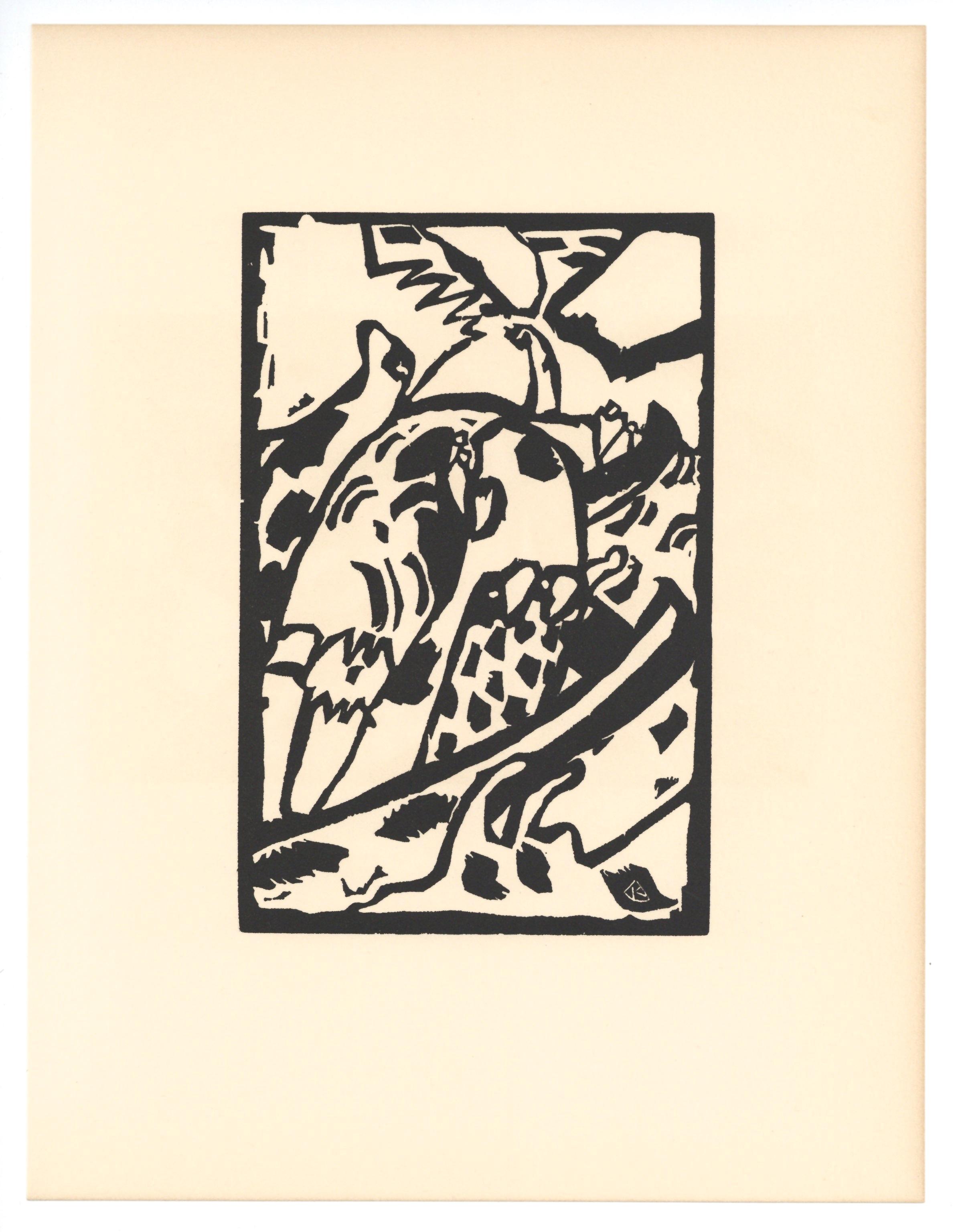
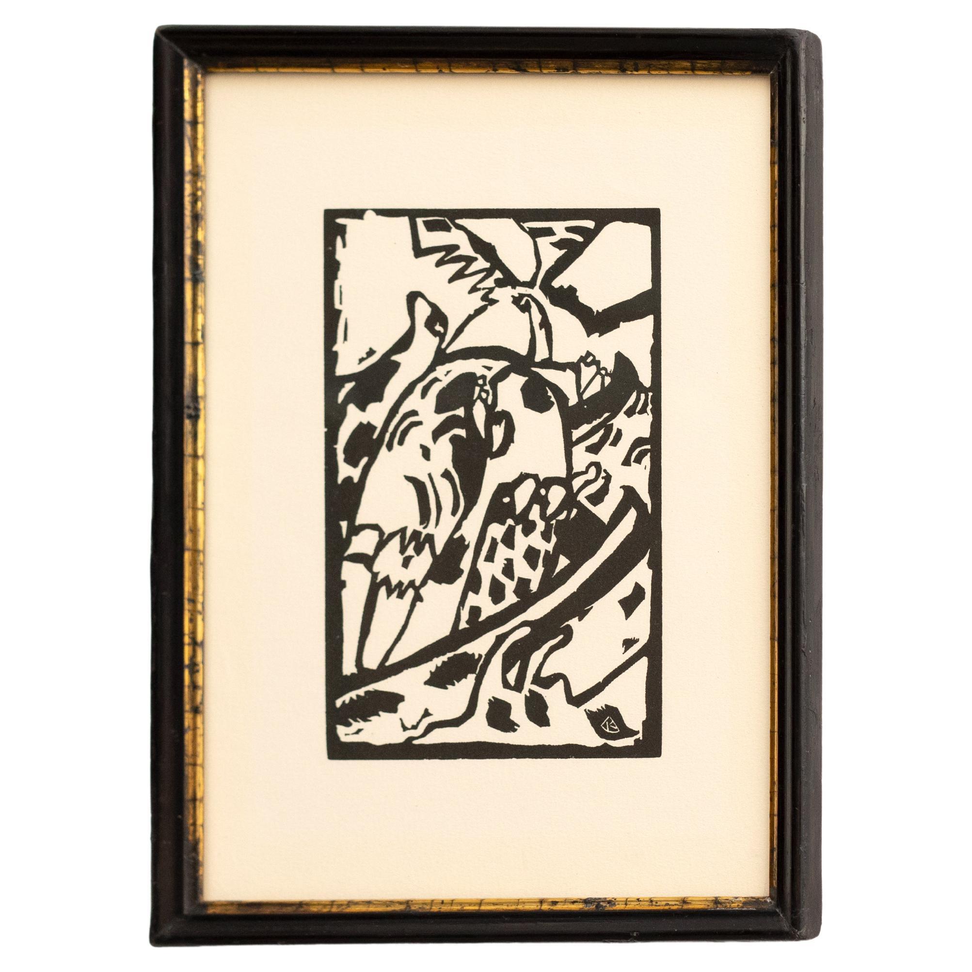
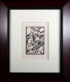
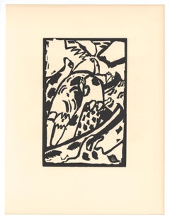
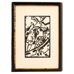
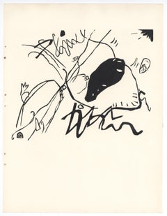
Wassily Kandinsky'Improvisation 7' original first ed. woodcut from 'Klänge' by Wassily Kandinsky1911
1911
About the Item
- Creator:Wassily Kandinsky (1866 - 1944, Russian)
- Creation Year:1911
- Dimensions:Height: 22 in (55.88 cm)Width: 19.5 in (49.53 cm)
- Medium:
- Movement & Style:
- Period:
- Condition:
- Gallery Location:Milwaukee, WI
- Reference Number:Seller: 7039g1stDibs: LU60536143852
Wassily Kandinsky
“Color is a means of exerting a direct influence upon the soul,” wrote the pioneering abstract artist Wassily Kandinsky. The Russian-born painter and theorist dedicated his life to using abstract compositions of form and color to express deep emotion as well as to depict the language of music through visuals.
Kandinsky was part of a crucial moment in art history — the early 20th century — that saw the rise of movements like Cubism. He embraced styles such as Surrealism and Fauvism and was a leading figure in bringing together Der Blaue Reiter (the name means “The Blue Rider” after one of Kandinsky’s paintings) in 1911, a group of avant-garde artists in Munich, including Paul Klee and Franz Marc, who explored spiritual concepts through their art as a response to the materialism of the time. Kandinsky also led courses on analytical drawing and color at the Bauhaus. He was appointed by founder and architect Walter Gropius to teach in Weimar in 1922. He taught at all three of the legendary school’s locations and remained with the institution until its forced closure by the Nazi party in Berlin.
The artist had the rare and unusual trait of synesthesia, the neurological ability to perceive things using multiple senses. In Kandinsky’s case, it was the gift of “seeing” music, and music appeared in every aspect of his work, including the titles of his series “Compositions,” “Improvisations” and “Impressions.” He once described the experience of painting using a musical metaphor: “I had little thought for houses and trees, drawing colored lines and blobs on the canvas with my palette knife, and making them sing just as powerfully as I knew how.”
While Kandinsky isn’t the first abstract artist — mystically inclined painter Hilma af Klint was making nonrepresentational art well before him — he certainly had the biggest impact on establishing the style. His paintings inspired the likes of Jackson Pollock, Willem de Kooning and other Abstract Expressionists. From his Untitled (First Abstract Watercolor) painted in 1910 to future works, his unique take on using color and flair for bold, experimental compositions, Kandinsky is one of the most important figures of early-20th-century art.
Find original Wassily Kandinsky art, including paintings and prints, on 1stDibs.
- ShippingRetrieving quote...Shipping from: Milwaukee, WI
- Return Policy
More From This Seller
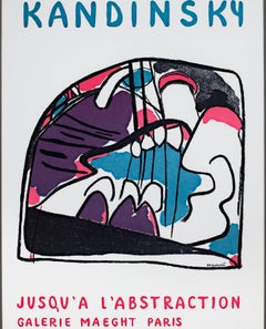
View All1910s Blue Rider Abstract Prints
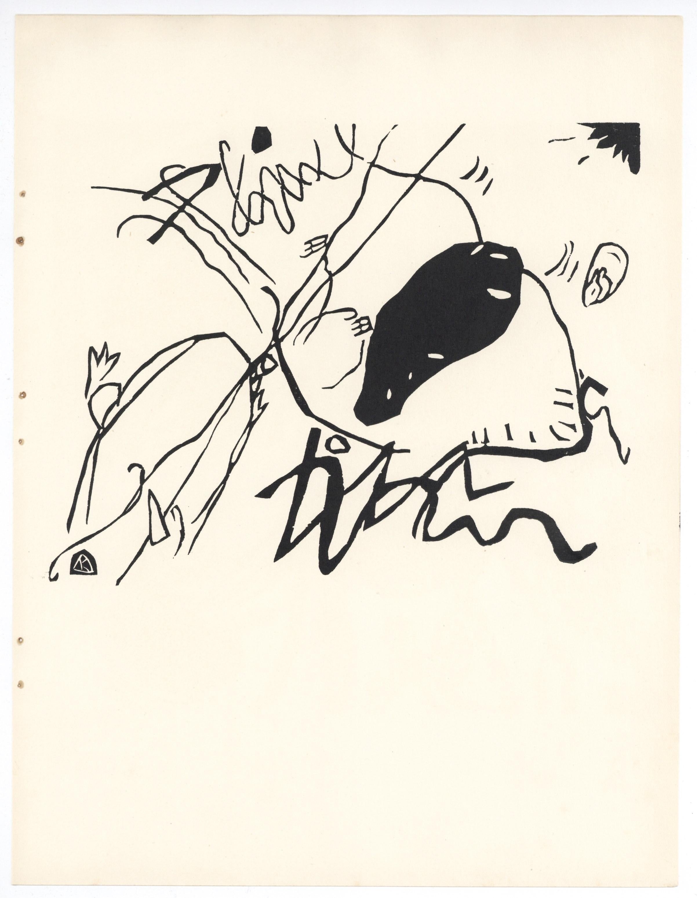
Woodcut, Laid Paper
1940s Modern Abstract Prints
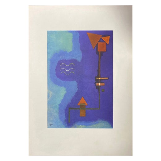
Lithograph
Late 20th Century American Modern Landscape Prints
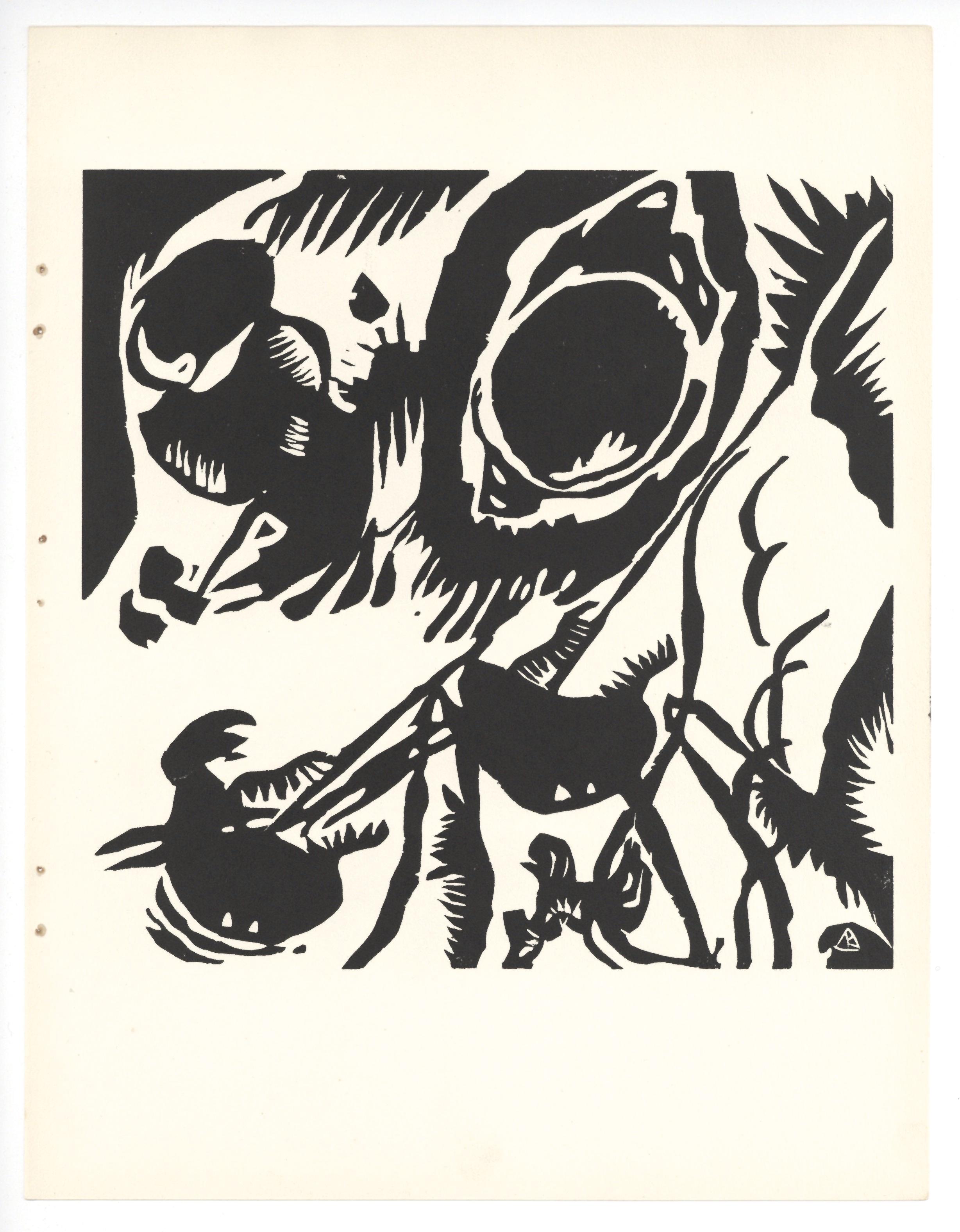
Black and White, Paper, Linocut
Late 20th Century American Modern Abstract Prints
Paper, Black and White, Linocut

1930s American Modern Figurative Prints
Woodcut, Engraving
1980s Abstract Abstract Prints
Lithograph
You May Also Like
1970s Prints and Multiples
Woodcut
1960s Abstract Geometric Animal Prints
Woodcut
Vintage 1940s German Mid-Century Modern Prints
Paper
1930s Expressionist Figurative Prints
Woodcut
1930s Expressionist Figurative Prints
Woodcut
1970s Modern More Prints
Lithograph