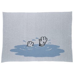
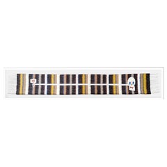
Kaws Limited Edition Cashmere Blanket by House of Voltaire
View Similar Items

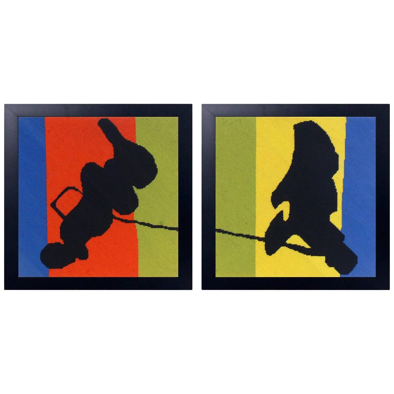
Kaws Limited Edition Cashmere Blanket by House of Voltaire
About the Item
- Creator:KAWS (Artist)
- Dimensions:Height: 0.13 in (3.31 mm)Width: 70.86 in (179.99 cm)Depth: 51.18 in (130 cm)
- Style:Modern (Of the Period)
- Materials and Techniques:Fabric,Woven
- Place of Origin:Scotland
- Period:
- Date of Manufacture:2019
- Condition:Wear consistent with age and use. This has never been used.
- Seller Location:Stamford, CT
- Reference Number:Seller: Avery & Dash - JP NHS1stDibs: LU918620064072
KAWS
In the beginning, Brian Donnelly was just a kid from Jersey City, New Jersey, who got into the graffiti thing. KAWS was his tag, chosen simply because he liked the way it looked. Today, KAWS creates all kinds of art — there are KAWS figures and toys, sculptures and colorful drawings, paintings and prints that appropriate pop phenomena like the Smurfs, the Simpsons and SpongeBob SquarePants.
In the late 1990s, the artist, a 1996 graduate of New York’s School of Visual Arts, was making a living as an illustrator for the animation studio Jumbo Pictures. Like young Hansel and Gretel with their trail of crumbs, KAWS would mark the morning route to his downtown Manhattan office with “subvertising,” “interrupting” fashion advertisements by adding his colorful character Bendy, its sinuous length sliding playfully around the likes of a Calvin Klein perfume bottle or supermodel Christy Turlington.
These creations gained a following, to the point where work posted in the morning would disappear by lunchtime. Even in those early days, KAWS was hot on the resale market.
“When I was doing graffiti,” he once explained, “it meant nothing to me to make paintings if I wasn’t reaching people.”
Instead of seeking entrée to the elite New York art world (which, frankly, wasn’t looking for a street artist anyway), KAWS moved to Japan, where a flourishing youth culture welcomed visionaries like him.
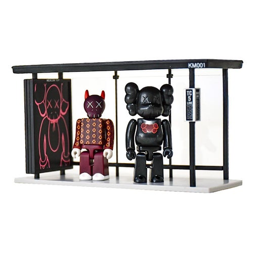
In 1999, he partnered with Bounty Hunter, a Japanese toy and streetwear brand, to release his first toy. Companion — an eight-inch-tall vinyl reimagining of Mickey Mouse, with a skull-and-crossbones head and trademark XX eyes — debuted with a limited run of 500. It sold out quickly.
Companion was the first of more than 130 toy designs, which came to include such characters as Chum, Blitz, Be@rbrick, BFF and Milo, each immediately recognizable as KAWS figures by their XX eyes. Fans have proved insatiable. In 2017, MoMA’s online store announced the availability of a limited supply of KAWS Companion figures; as avid collectors logged on to stake their claim, the website crashed — multiple times.
Companion is the most visible of the KAWS posse, appearing over the past decade in new postures and combinations in monumental KAWS statues and other works. These include Along the Way (2013), an 18-foot-tall wooden sculpture of two Companions leaning on each other for support; Together (2016), two Companions in a friendly embrace, which debuted during an exhibition of KAWS’s work at the Modern Art Museum of Fort Worth, in Texas; and KAWS:HOLIDAY (2018), a 92-foot-long inflatable Companion floating on its back in Seoul’s Seokchon Lake. The sculptures were re-created as toys, blurring the lines between art and commerce.
KAWS’s visual language may be drawn from cartoons, but his work doesn’t necessarily evoke childlike joy.
“My figures are not always reflecting the idealistic cartoon view that I grew up on,” he explains in the catalogue for the Fort Worth exhibition. “Companion is more real in dealing with contemporary human circumstances . . . . I think when I’m making work it also often mirrors what’s going on with me at that time.”
KAWS's résumé reads like a record of major 21st-century pop-culture moments. It includes his work with streetwear brands like A Bathing Ape and Supreme; his design for the cover of Kanye West’s 2008 album, 808s & Heartbreak; and his collaboration with designer Kim Jones on the Dior Homme Spring/Summer 2019 collection, Jones’s debut as the fashion brand’s creative director.
Learn how to spot a fake KAWS art toy, and browse authentic KAWS figures, prints, sculptures and mixed media works on 1stDibs.
More From This Seller
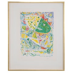
View All1990s American Modern Contemporary Art
Paper
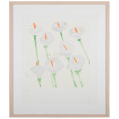
2010s American Modern Contemporary Art
Paper
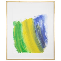
Vintage 1970s American Modern Prints
Paper
Late 20th Century Danish Modern Prints
Paper
1990s North American Modern Contemporary Art
Paper
2010s English Modern Contemporary Art
Paper
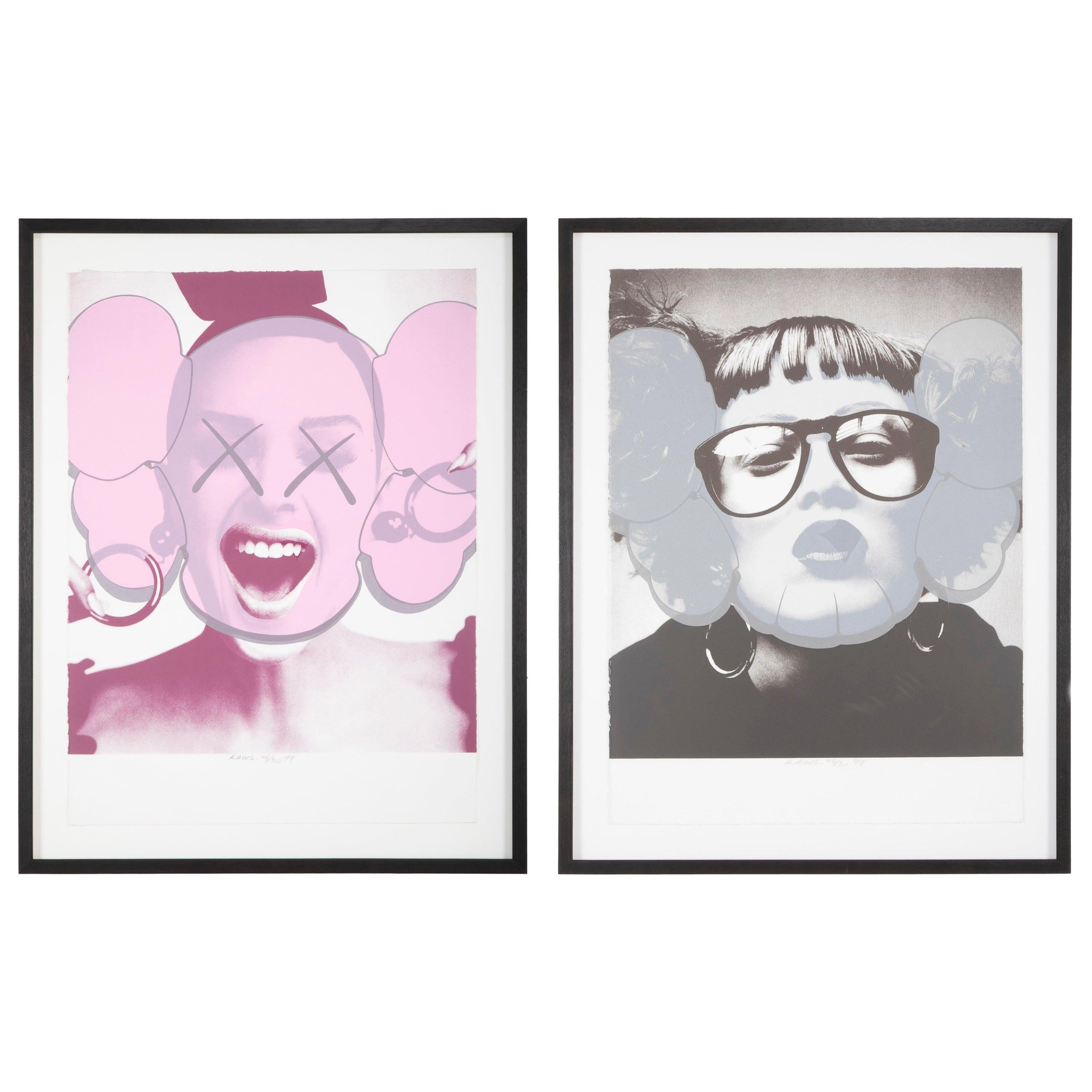
You May Also Like
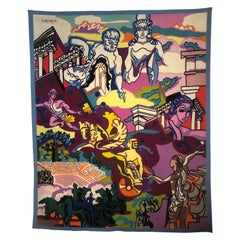
Mid-20th Century European Tapestries
Wool
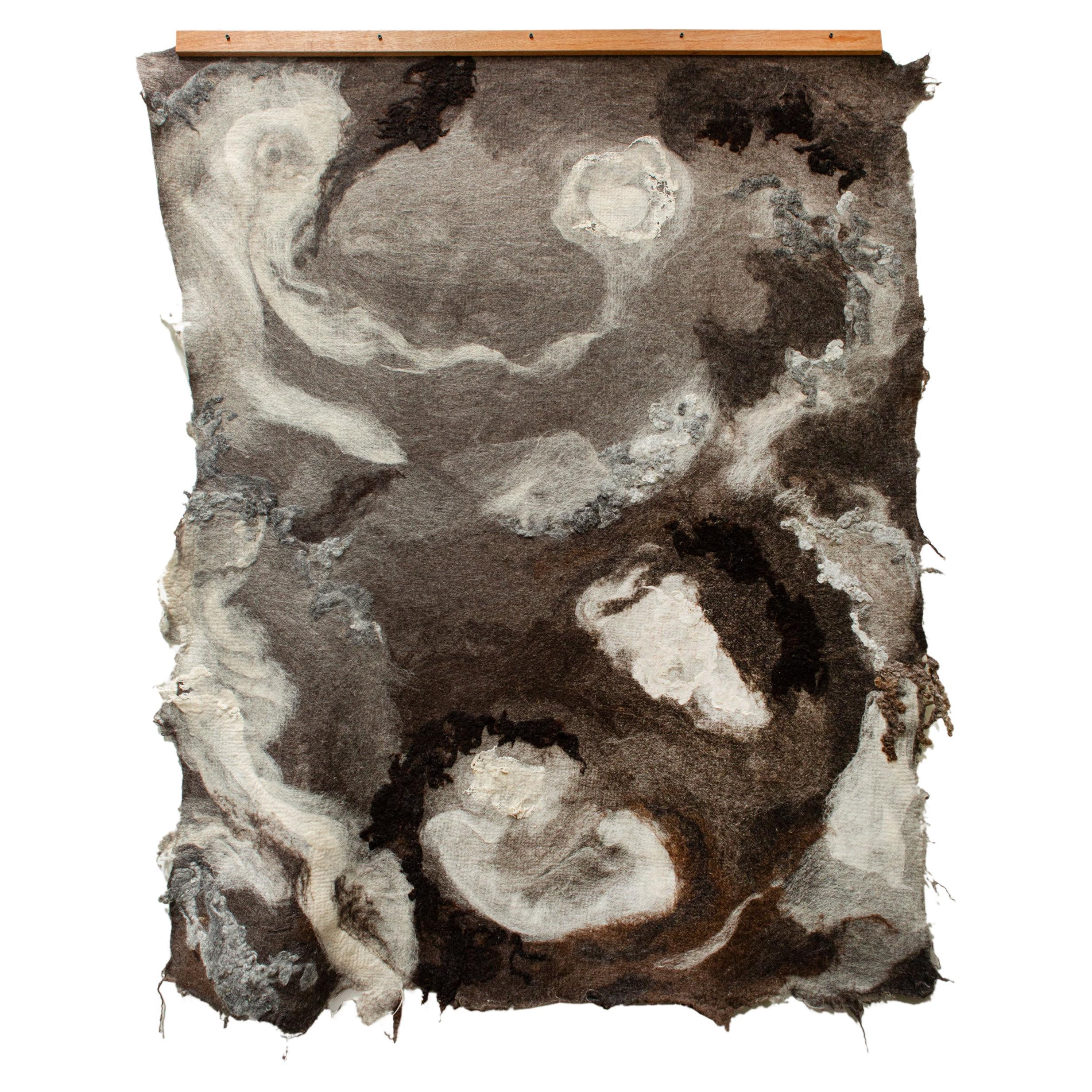
2010s Contemporary Art
Wool, Alpaca
2010s Dutch Organic Modern Contemporary Art
Textile
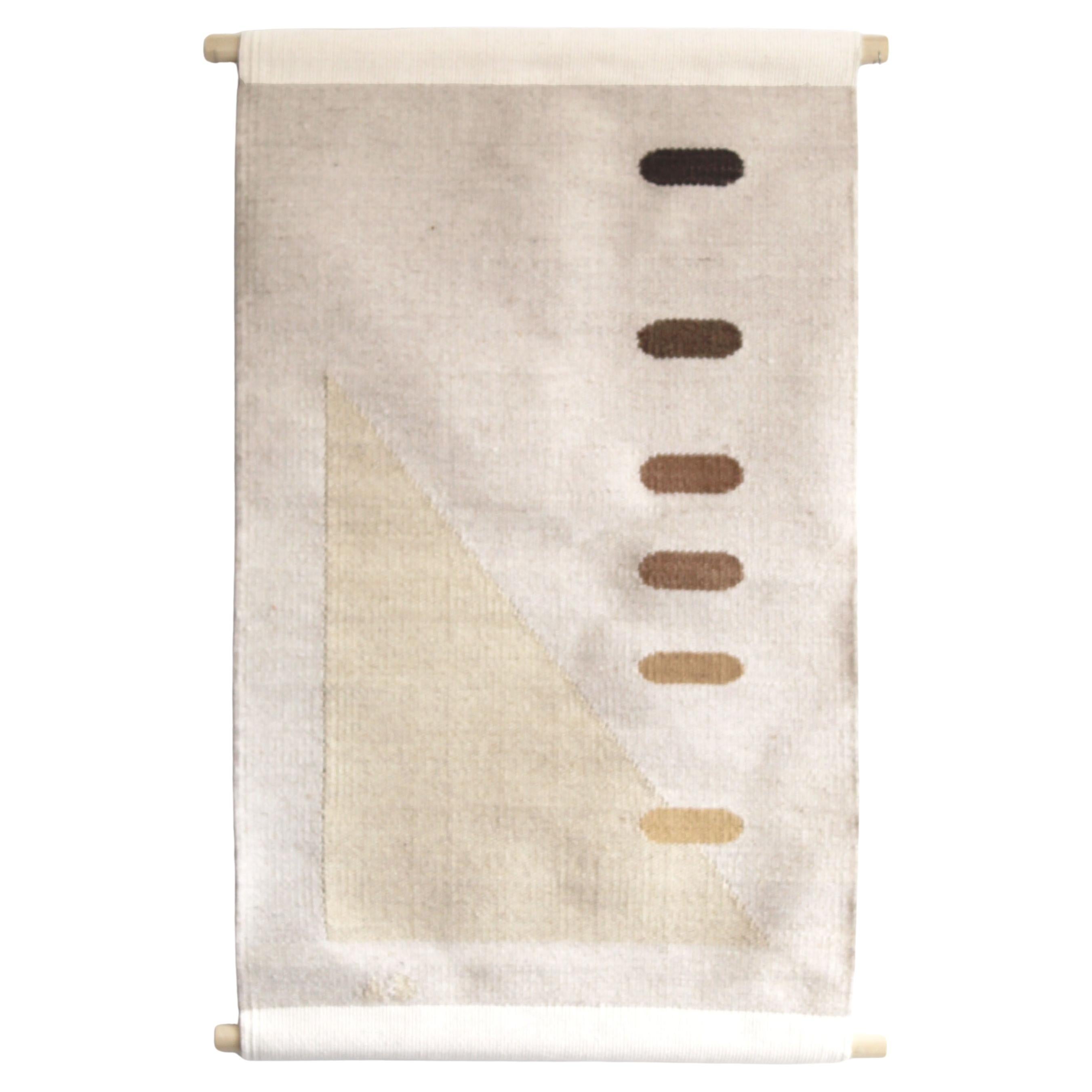
21st Century and Contemporary American Modern Tapestries
Wool, Cotton
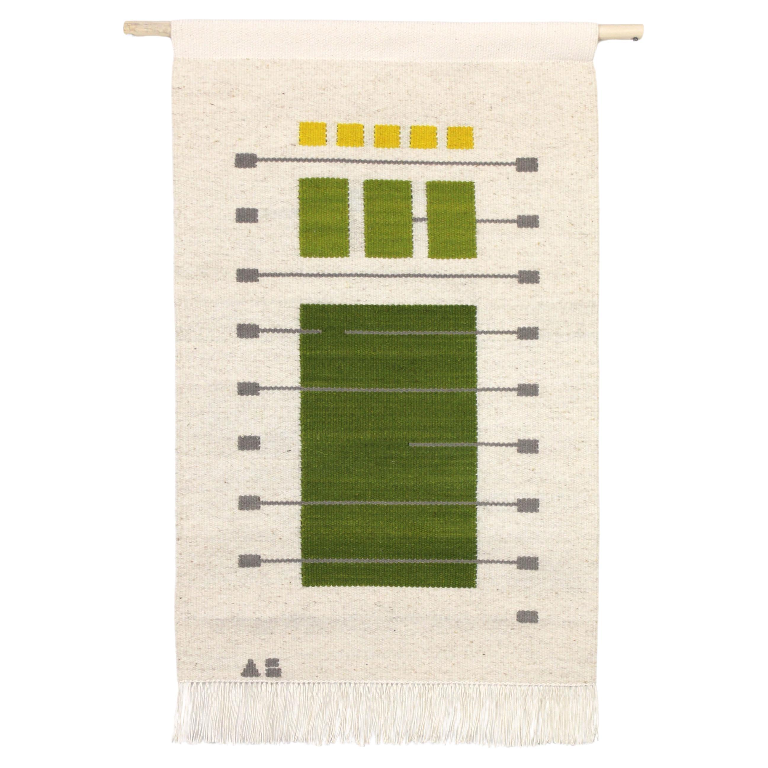
21st Century and Contemporary American Modern Tapestries
Wool, Cotton
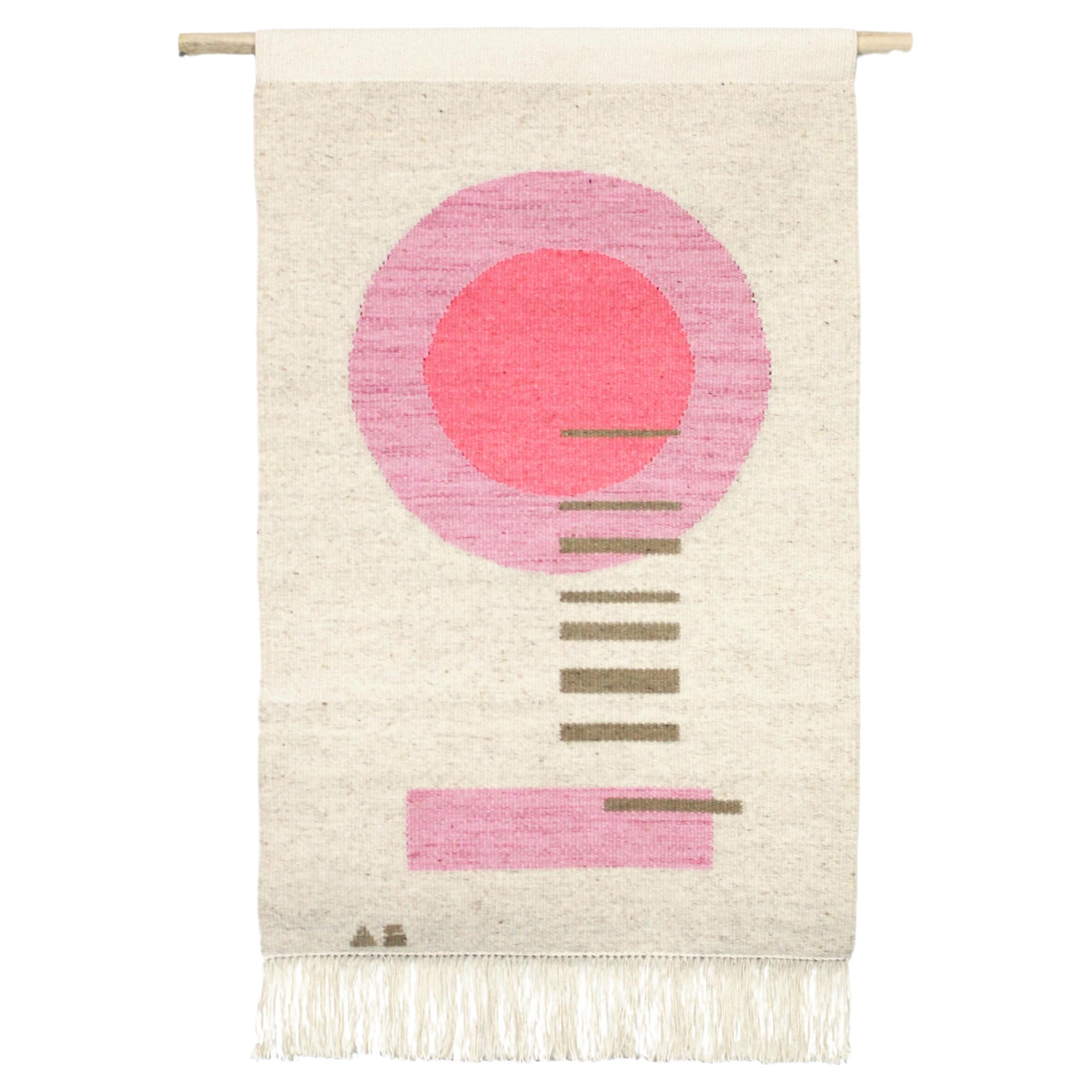
21st Century and Contemporary American Modern Tapestries
Wool, Cotton

Recently Viewed
View AllRead More
How to Spot a Fake KAWS Figure
KAWS art toys have developed an avid audience in recent decades, and as in any robust collectible market, counterfeiters have followed the mania. Of course, you don’t have to worry about that on 1stDibs, where all our sellers are highly vetted.
KAWS Is Having a Major Effect on Popular Culture, Whether on the Street or in Museums
From graffiti tagger to hypebeast obsession to auction hero — we chart the artist’s rise and his widening influence.