Located in Stockholm, Stockholm
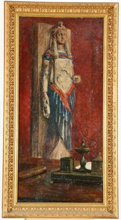
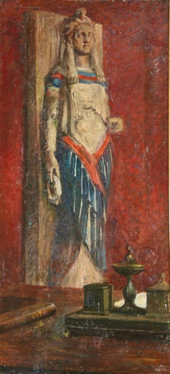
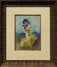
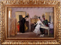
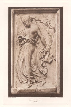
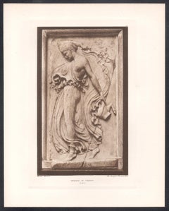
Interior scene from a study or collectors room signed and dated with monogram "HNH 1912", Hans Nikolaj Hansen (1853-1923) presenting a quiet yet intellectually charged space. In the foreground stands a writing desk furnished with an inkwell and a book, objects that suggest reflection, scholarship, and artistic contemplation. Beyond the desk, set against a deep red wall, rises a large neoclassical sculpture whose pale surface contrasts with the warmth of the interior. The composition balances intimacy with monumentality: the scholar’s table before us, the silent authority of antiquity behind. Executed in oil on canvas, the painting reveals Hansen’s characteristic sensitivity to historical atmosphere.
Hans Nikolaj Hansen was a Danish painter and Illustrator, born in 1853, the son of wine merchant C.J.A. Hansen and Sophie. After graduating in 1872 from Borgerdydskolen on Christianshavn, he followed his early artistic inclination and enrolled at the Royal Danish Academy of Fine Arts in Copenhagen, completing his studies in 1877.
He debuted the following year with the historical painting "Uden for Sigbrits Port", before travelling to Paris where he continued his education under the influential French painter Léon Bonnat. The Parisian training left a lasting imprint on his painterly discipline and compositional clarity.
He also stayed in Rome for a time where he painted numerous historical and genre works. His art is distinguished by originality, narrative imagination, and a keen sense for historical character.
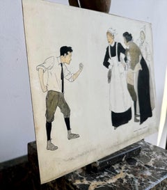
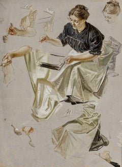
Hansen achieved his greatest recognition as an illustrator and graphic artist. His illustrations for Gaffelen by Johan Herman Wessel...
Category
Other Art Style 1910s Art