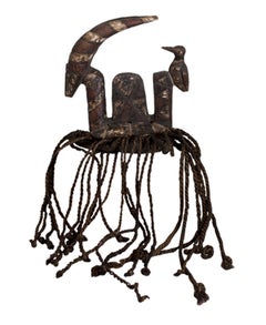
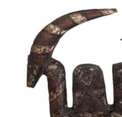
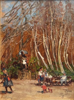
1910s Art

to
261
1,108
356
388
192
182
Overall Width
to
Overall Height
to
7,700
21,678
163,843
227,051
2,015
2,278
4,946
6,542
5,866
15,042
20,658
25,794
18,682
14,100
5,502
430
313
135
135
49
23
19
12
5
1
1,252
890
32
1,424
689
597
406
396
344
217
153
146
137
133
128
116
102
100
89
77
75
61
58
878
627
504
408
397
111
50
33
23
23
861
388
1,183
969
Period: 1910s
Winter Street Scene
Winter Street Scene

Winter Street Scene

Located in Houston, TX

Antal Berkes (1874-1938) Antal Berkes (1874–1938) was a Hungarian painter, born in Budapest, Hungary. He lived in Paris for some time and produced cityscapes there as well as simi...

Category

Other Art Style 1910s Art

Materials

Oil

Rozsa/Szucs

Rozsa/Szucs

By Arpad Bardocz

Located in New York, NY

Rozsa/Szucs. Ca 1915. Budapest. Color lithograph. Hungarian Art Nouveau posters are rare. Bardócz was a graphic artist and painter, active between the 1910’s and the 1930’s. His p...

Category

Art Nouveau 1910s Art

Materials

Lithograph

Männlicher Kopf an weibliche (Male Head Leaning against Female) /// Rottluff

Männlicher Kopf an weibliche (Male Head Leaning against Female) /// Rottluff

By Karl Schmidt-Rottluff

Located in Saint Augustine, FL

Artist: Karl Schmidt-Rottluff (German, 1884-1976) Title: "Männlicher Kopf an weibliche (Male Head Leaning against Female)" Portfolio: Das Spiel Christa vom Schmerz der Schönheit des Weibes (The Play Christa from the Pain of the Beauty of the Woman) *Issued unsigned Year: 1918 Medium: Original Woodcut Engraving on wove paper Limited edition: Unknown Printer: Fritz Voigt, Berlin, Germany Publisher: Verlag Die Aktion, Berlin, Germany Sheet size: 8.5" x 5.38" Image size: 6.25" x 3.57" Reference: Schapire No. 225, page 46; Jentsch No. 35. Rifkind No. 2563; Lang No. 300; Reed No. 118 Condition: Toning to sheet (as normal). In very good condition Very rare Notes: Provenance: private collection - Oxnard, CA. Comes from a complete originally bound 48 page folio with 9 original woodcut engravings by Schmidt-Rottluff. Text by Alfred Brust. The cover and title pages in pictures are not included, only for reference/provenance. There is an example of this work in the permanent collection of the Brücke Museum, Berlin, Germany. Biography: Karl Schmidt-Rottluff (born December 1, 1884, Rottluff, near Chemnitz, Germany—died...

Category

Expressionist 1910s Art

Materials

Engraving, Woodcut

French Cruiser

French Cruiser

By Childe Hassam

Located in New York, NY

Childe Hassam (1859-1935), French Cruiser, lithotint, 1918, signed in pencil with the cipher lower right. Reference: Griffith 8. In very good condition, printed in black ink on cream...

Category

American Impressionist 1910s Art

Materials

Lithograph

Portrait of John Seymour Lucas

Portrait of John Seymour Lucas

By Alphonse Legros

Located in Douglas, Isle of Man

Alphonse Legros 1837-1911, was a French painter and sculptor, who lived in London from 1863 until his death in 1911. He was a teacher of etching and drawing and became Slade Professo...

Category

1910s Art

Materials

Paper, Charcoal

1912 Woodcut Print 'Passage Du Ponte D'Arcole', Unframed Baroque Art

1912 Woodcut Print 'Passage Du Ponte D'Arcole', Unframed Baroque Art

Located in Brooklyn, NY

Paper Size: 19.75 x 25.5 inches ( 50.165 x 64.77 cm ) Image Size: 12.25 x 20.5 inches ( 31.115 x 52.07 cm ) Framed: No Condition: A-: Near Mint, very light signs of handling Ad...

Category

Baroque 1910s Art

Materials

Woodcut

Kostume, Plakate, und Dekorationen, "Lo Hesse"

Kostume, Plakate, und Dekorationen, "Lo Hesse"

By Walter Schnackenberg

Located in Palm Beach, FL

Walter Schnackenberg’s style changed several times during his long and successful career. Having studied in Munich, the artist traveled often to Paris where he fell under the spell of the Henri de Toulouse-Lautrec’s colorful and sensuous posters depicting theatrical and decadent subjects. Schnackenberg became a regular contributor of similar compositions to the German magazines Jugend and Simplicissimus before devoting himself to the design of stage scenery and costumes. In the artist’s theatrical work, his mastery of form, ornamentation, and Orientalism became increasingly evident. He excelled at combining fluid Art Nouveau outlines, with spiky Expressionist passages, and the postures and patterns of the mysterious East. In his later years, Schnackenberg explored the unconscious, using surreal subject matter and paler colors that plainly portrayed dreams and visions, some imbued with political connotations. His drawings, illustrations, folio prints, and posters are highly sought today for their exceedingly imaginative qualities, enchanting subject matter, and arresting use of color. SCHNACKENBERG: KOSTUME, PLAKATE UND DEKORATIONEN, a cardboard bound art book consisting of 43 prints of work by Walter Schnackenberg, 30 of which are color lithographs that are signed and some are titled and dated in the plate, as well as black and white prints and photographs with accompanying text by Oskar Bie; lithographs printed at Kunstanstalt Oskar Consee in Munich, other images printed by Gesellschaft Pick & Co. in Munich, the text and cover with color images by Schnackenberg front and verso printed by R. Oldenbourg in Munich; published by Musarion Verlag, Munich, 1920. The majority of Walter Schnackenberg’s artistic output was destroyed by bomb attacks in Munich in 1944. The highly publicized 2013 auction in New York of the recovered pre-war poster collection once belonging to German poster aficionado, Hans Sachs...

Category

Expressionist 1910s Art

Materials

Lithograph

Woman on a Patio
Woman on a Patio

Woman on a Patio

By Karl Albert Buehr

Located in Fairlawn, OH

Woman on a Patio Pastel on paper, c. 1915 Unsigned Provenance: Gift of the artist to his wife, Mary Hess Buehr By decent to the artist's niece, daughter of Will Hess David Saltzman Robert Henry Adams Fine Art Thomas French Fine Art Ronald C. Sloter, Columbus, Ohio Columbus College of Art and Design (de-accessed) Exhibited at Robert Henry Adams Fine Art, 1994, the first exhibition at the North Franklin Street Gallery. One of the early Chicago artists to adopt Impressionism, Karl Buehr became a figure and landscape painter. As a figure painter, his specialty became "gorgeously colored images of young women on porches overlooking brilliant summertime gardens." (Kennedy 98) His later work often showed a female figure with serious expression engaging the viewer with a direct stare. In his landscapes, he was noted for his strong coloration. In a December 1896 student exhibition at the Art Institute, a reviewer for the "Chicago Times Herald" described Buehr's landscapes as "blithe and joyous" with "country roads brilliant in sunlight . . . fields rich in summer verdure, under soft skies painted in a high, musical key." (Gerdts 68) Buehr was born as one of seven sons to a prosperous German family who immigrated to America and settled in Chicago in 1869. He was first exposed to his signature style of Impressionism in 1888 when he enrolled in night classes at the Art Institute while working in the shipping department of a lithographic firm near the Institute. He remained a student there until 1897 and was recognized in a "Chicago Times Herald" editorial of June 13, 1897 as one of the Institute's most outstanding pupils. The next year, his art career was temporarily put on hold when he briefly enlisted with the U.S. Army in the Spanish American War. In 1899, he resumed his art studies, this time with Frank Duveneck. He exhibited a painting at the Paris Salon of 1900. In 1905, thanks to a wealthy Chicago patron, Buehr and his family moved to France. They spent the following year in Taormina, Sicily, and spent time in Venice as well. In Paris, Buehr studied at the Academy Julian with Raphael Collin for two years. Then he went to England, enrolling in the London Art School but had returned to Paris by 1908. During this time, he began painting at Giverny, the home of Impressionist leader Claude Monet (1840-1926, and by 1912, Buehr was listing that village as his home address. One of his good friends and associates at Giverny was Frederick Frieseke. One of Buehr's paintings from that time, "News from Home", was exhibited in 1913 at the French Salon in Paris and at the annual exhibit of the Chicago Art Institute. It shows a woman in floral dress sitting on a porch with a background with potted flowers and lush greenery background. Of his painting done at Giverny, Buehr wrote in 1912 to William Macbeth of Macbeth Galleries in New York: "My figures painted in and around Giverny are costumed and in appropriate out door settings." (Gerdts 68) In 1914, he returned to the United States and took a teaching position in Chicago at the Art Institute, which he held for the remainder of his life. He was married to Mary Hess, a painter of miniatures and decorative works. In 1928-29, he was a guest artist at Stanford University. Courtesy, AskArt “Karl Albert Buehr (1866–1952) was a painter born in Germany. Buehr was born in Feuerbach - near Stuttgart. He was the son of Frederick Buehr and Henrietta Doh (Dohna?). He moved to Chicago with his parents and siblings in the 1880s. In Chicago, young Karl worked at various jobs until he was employed by a lithograph company near the Art Institute of Chicago. Introduced to art at work, Karl paid regular visits to the Art Institute, where he found part-time employment, enabling him to enroll in night classes. Later, working at the Institute as a night watchman, he had a unique opportunity to study the masters and actually posted sketchings that blended in favorably with student's work. Having studied under John H. Vanderpoel, Buehr graduated with honors, while his work aroused such admiration that he was offered a teaching post there, which he maintained for many years thereafter. He graduated from the Art Inst. of Chicago and served in the IL Cav in the Spanish–American War. Mary Hess became Karl's wife—she was a student of his and an accomplished artist in her own right. In 1922, he was elected into the National Academy of Design as an Associate member. Art Studies in Europe In 1904, Buehr received a bronze medal at the St. Louis Universal Exposition, then, in 1905, Buehr and his family moved to France, thanks to a wealthy Chicago patron, and they spent the following year in Taormina, Sicily, where the artist painted local subjects, executing both genre subjects and landscapes as well as time in Venice. Buehr spent at least some time in Paris, where he worked with Raphaël Collin at the Académie Julian. Giverny and American Impressionism Prior to this time, Buehr had developed a quasi-impressionistic style, but after 1909, when he began spending summers near Monet in Giverny, his work became decidedly characteristic of that plein-air style but he began focusing on female subjects posed out-of-doors. He remained for some time in Giverny, and here he became well-acquainted with other well known expatriate America impressionists such as Richard Miller, Theodore Earl Butler, Frederick Frieseke, and Lawton Parker. It seems likely that Buehr met Monet, since his own daughter Kathleen and Monet’s granddaughter, Lili Butler, were playmates, according to George Buehr, the painter’s son. His other daughter Lydia died before adulthood due to diabetes. He returned to Chicago at the onset of World War I and taught at The Art Inst for many years. One of his noted pupils at the Art Institute was Archibald Motley...

Category

Abstract Impressionist 1910s Art

Materials

Pastel

Art Deco Costume Design - Eva

Art Deco Costume Design - Eva

By Georges Lepape

Located in Miami, FL

The paper in some of these photos looks overly textured due to the sharpness of the high-res digital camera. In person, with the human eye, the paper looks reasonably smooth with out blemishes. For this fashion illustration, Georges Lepape paints a stunning abstract pattern for the subject dress that is repeated in her hair. The work represents an early use of metallic paint, with silver metallic in the dress and bronze metallic in the blouse. Lepape's highly detailed drawing becomes more evident the closer you look. It's quite amazing how deftly he rendered facial feature on such a small scale. "Eva" 1918 Gouache, watercolor, and ink on paper Signed and dated, lower right: '1918' Inscribed, verso: "Costume for L'enfantement du mort, (miracle en pourpre, et or.). Devised by Marcel L'Herbier and performed at the Théatre Edouard VII and the Comédie des Champs-Elysées, 1919" Provenance: Ex-collection Lucien...

Category

Art Deco 1910s Art

Materials

Paper, Ink, Watercolor, Pencil, Gouache

Deco Woman
Deco Woman

Deco Woman

By William Sommer

Located in Fairlawn, OH

Deco Woman Crayon on paper, c. 1920 Signed in ink lower left: "Wm. Sommer" (see photo) Provenance: Estate of the artist Edwin Sommer (the artist’s son) Jose...

Category

Art Deco 1910s Art

Materials

Crayon

H.O. Miethke Das Werk folio "Portrait of Hermine Gallia" collotype print

H.O. Miethke Das Werk folio "Portrait of Hermine Gallia" collotype print

DAS WERK GUSTAV KLIMTS, a portfolio of 50 prints, ten of which are multicolor collotypes on chine colle paper laid down on hand-made heavy cream wove paper with deckled edges; under ...

Category

Vienna Secession 1910s Art

Materials

Paper

"Retreat from Marignano" set of 3 Copper Plate Prints

"Retreat from Marignano" set of 3 Copper Plate Prints

By Ferdinand Hodler & R. Piper & Co.

Located in Palm Beach, FL

The three prints included in this set are: "Retreat from Marignano", "Retreat from Marignano (left panel)", "Retreat from Marignano (right panel)". 2018 marks the centenary anniversary of Ferdinand Hodler’s death. In that 100 years time, the art world’s esteem of this important artist has proved fickle. It has shifted from extolling his artistic merits during his lifetime to showing something of a feigned disdain- more reflective of the world political order than a true change of heart for Hodler’s work. After years of Hodler being all but a footnote in the annals of art history and generally ignored, finally, the pendulum has righted itself once again. Recent retrospective exhibitions in Europe and the United States have indicated not only a joyful rediscovery of Hodler’s art but a firm conviction that his work and world view hold particular relevance today. DAS WERK FERDINAND HODLERS is not only a collection of printed work reflecting the best of all of his painted work created up to 1914 just before the outbreak of World War I, the portfolio itself is an encapsulation of Hodler’s ethos, Parallelisme. Hodler developed his philosophy of Parallelisme as a unifying approach to art which strips away detail in search of harmony. By means of abstraction, symmetry and repetition, Hodler sought ways to depict Nature’s essence and her fundamental, universal order. He believed these universal laws governing the natural, observable world extend to the spiritual realm. Symbolist in nature with Romantic undertones, his works are equally portraits of these universal concepts and feelings governing all life as they are a visual portrait in the formal sense. Whether his subject is a solitary tree, a moment in battle, mortal fear, despair, the awe inspired by a vast mountain range, a tender moment or even the collective conviction in a belief, Hodler unveils this guiding principle of Parallelisme. Several aspects of Hodler’s portfolio reinforce his tenets of Parallelisme. The Table of Contents clearly preferences a harmonious design over detail. The two columns, consisting of twenty lines each, list the images by order of appearance using their German titles. The abbreviated titles are somewhat cryptic in that they obscure the identities of the sitters. Like the image Hodler presents, they are distillations of the sitter without any extraneous details. This shortening was also done in an effort to maintain a harmonious symmetry of the Table of Contents, themselves, and keep titles to a one-line limit. The twenty-fourth title: “Bildnis des Schweizerischen Gesandten C.” was so long, even with abbreviation, that it required two lines; so, for the sake of maintaining symmetry, the fortieth title: “Bauernmadchen” was omitted from the list. This explains why the images are not numbered. Hodler’s reasoning is not purely esoteric. Symmetry and pattern reach beyond mere formal design principles. Finding sameness and imposing it over disorder goes to the root of Hodler’s identity and his art. A Swiss native, Hodler was bi-lingual and spoke German and French. Each printed image, even number forty, have titles in both of Hodler’s languages. Certainly, there was a market for Hodler’s work among francophones and this inclusion may have been a polite gesture to that end; however, this is the only place in the portfolio which includes French. With German titles at the lower left of each image, Hodler’s name at bottom center and corresponding French titles at the lower right of each image, there is a harmony and symmetry woven into all aspects of the portfolio. This holds true for the page design, as it applies to each printed image and as it describes the Swiss artist himself. Seen in this light, Hodler’s portfolio of printed work is the epitome of Hodler’s Parallelisme. DAS WERK FERDINAND HODLERS is also one of the most significant documents to best tell the story of how Hodler, from Switzerland, became caught between political cross-hairs and how the changing tides of nations directly impacted the artist during his lifetime as well as the accessibility of his art for generations to come. The Munich-based publisher of the portfolio, R. Piper & Co., Verlag, plays a crucial role in this story. Publishing on a wide range of subjects from philosophy and world religion to music, literature and the visual arts; the publisher’s breadth of inquiry within any one genre was equal in scope. Their marketing strategy to publish multiple works on Hodler offers great insight as to what a hot commodity Hodler was at that time. R.Piper & Co.’s Almanach, which they published in 1914 in commemoration of their first ten years in business, clearly illustrates the rapid succession- strategically calculated for achieving the deepest and broadest impact - in which they released three works on Hodler to hit the market by the close of 1914. DAS WERK FERDINAND HODLERS was their premier publication. It preceded C.A. Loosli’s Die Zeichnungen Ferdinand Hodlers, a print portfolio after 50 drawings by Hodler which was released in Autumn of 1914 at the mid-level price-point of 75-150 Marks; and a third less expensive collection of prints after original works by Hodler, which had not been included in either of the first two portfolios, was released at the end of that year entitled Ferdinand Hodler by Dr. Ewald Bender. The title and timing of DAS WERK FERDINAND HODLERS' debut leaves little doubt as to the connection it has with another avant-garde portfolio of art prints, Das Werk Gustav Klimts, released in 5 installments from 1908 -1914 by Galerie Miethke in Vienna. Hodler, himself, was involved in Klimt’s ground-breaking project. As the owner of Klimt’s 1901 painting, “Judith with the Head of Holifernes” which appears as the ninth collotype print in the second installment of Das Werk Gustav Klimts, Hodler was obliged to grant access of the painting to the art printers in Vienna for them to create the collotype sometime before 1908. Hodler had been previously invited in 1904 to take part in what would be the last exhibition of the Vienna Secession before Klimt and others associated with Galerie Miethke broke away. In an interview that same year, Hodler indicated that he respected and was impressed by Klimt. Hodler’s esteem for Klimt went beyond the art itself; he emulated Klimt’s method aimed at increasing his market reach and appeal to a wider audience by creating a print portfolio of his painted work. By 1914, Hodler and his publisher had the benefit of hindsight to learn from Klimt’s Das Werk publication. Responding to the sluggish sales of Klimt’s expensive endeavor, Hodler’s publisher devised the same diversified 1-2-3 strategy for selling Hodler’s Das Werk portfolio as they did with regards to all three works on Hodler they published that year. For their premium tier of DAS WERKS FERDINAND HODLERS, R. Piper & Co. issued an exclusive Museum quality edition of 15 examples on which Hodler signed each page. At a cost of 600 Marks, this was generally on par with Klimt’s asking price of 600 Kronen for his Das Werk portfolio. A middle-tiered Preferred edition of 30, costing somewhat less and with Hodler’s signature only on the Title Page, was also available. The General edition, targeting the largest audience with its much more affordable price of 150 Marks, is distinguishable by its smaller size. Rather than use the subscription format Miethke had chosen for Klimt’s portfolios which proved to have had its challenges, R. Piper & Co. employed a different strategy. In addition to instantly gratifying the buyer with all 40 of the prints comprising DAS WERK FERDINAND HODLERS and the choice among three price points, they advertised in German journals a fourth possibility of ordering single prints from them directly. These printed images are easily discernible from the three complete folio editions. The paper size of the single purchased images is of the larger format like the Museum and Preferred editions, measuring 65 h x 50 w cm; however, the paper itself is the same copper print paper used in the General edition and then mounted on poster board. The publishing house positioned itself to be a direct retailer of Hodler’s art. They astutely recognized the potential for profitability and the importance, therefore, of having proprietary control over his graphic works. R. Piper & Co. owned the exclusive printing rights to Hodler’s best work found in their three publications dating from 1914. That same year, a competing publication out of Weimar entitled Ferdinand Hodler: Ein Deutungsversuch von Hans Muhlestein appeared. Its author, a young scholar, expressed his frustration with the limited availability of printable work by Hodler. In his Author’s Note on page 19, dated Easter, 1914, Muhlestein confirms that the publisher of Hodler’s three works from that same year owned the exclusive reproductive rights to Hodler’s printed original work. He goes further to explain that even after offering to pay to use certain of those images in his book, the publisher refused. Clearly, a lot of jockeying for position in what was perceived as a hot market was occurring in 1914. Instead, their timing couldn’t have been more ill-fated, and what began with such high hopes suddenly found a much different market amid a hostile climate. The onset of WWI directly impacted sales. Many, including Ferdinand Hodler, publicly protested the September invasion by Germany of France in which the Reims Cathedral, re-built in the 13th century, was shelled, destroying priceless stained glass and statuary and burning off the iron roof and badly damaging its wooden interior. Thomas Gaehtgens, Director of the Getty Research Institute describes how the bombing of Reims Cathedral triggered blindingly powerful and deeply-felt ultra-nationalistic responses: “The event profoundly shocked French intellectuals, who for the most part had an intense admiration for German literature, music and art. By relying on press accounts and abstracting from the visual propagandistic content, they were unable to interpret the siege of Reims without turning away from German culture in disgust. Similarly, the German intelligentsia and bourgeoisie were also shocked to find themselves described as vandals and barbarians. Ninety-three writers, scientists, university professors, and artists signed a protest, directed against the French insults, that defended the actions of the German army.” In similar fashion, a flurry of open letters published in German newspapers and journals as well as telegrams and postcards sent directly to Hodler following his outcry in support of Reims reflected the collectively critical reaction to Hodler’s position. Loosli documents that among the list of telegrams Hodler received was one from none other than his publisher in Germany, R.Piper & Co. Allegiances were questioned. The market for Hodler in Germany immediately softened. Matters worsened for the publisher beyond the German backlash to Hodler and his loss of appeal in the home market; with the war in full swing until 1918, there was little chance a German publisher would have much interest coming from outside of Germany and Austria. Following the war and Hodler’s death in 1918, the economy in Germany continued to spiral out and just 5 years later, hyper-inflation had rendered its currency worthless vis-a-vis its value in the pre-war years. Like the economy, Hodler’s reputation was slow to find currency in these difficult times. Even many French art fans had turned sour on Hodler as they considered his long-standing relationship in German and Austrian art circles. Thus, the portfolio’s rarity in Hodler’s lifetime and, consequently, the availability of these printed images from DAS WERK FERDINAND HODLERS since his death has been scarce. In many ways, Hodler and his portfolios were casualties of war. Thwarted from their intended purpose of reaching a wide audience and show-casing Parallelisme, Hodler’s unique approach to art, this important, undated work has been both elusive and shrouded in mystery. Perhaps DAS WERK FERDINAND HODLERS was left undated as a means of affirming the timelessness of Hodler’s art. Digging back into the past, Hodler’s contemporaries, like R. Piper, C.A. Loosli and Hans Muhlestein, indeed provide the keys to unequivocally clarify what has largely been mired in obscurity. Just after Hodler’s death, the May, 1918 issue of the Burlington Review ran a small column which opined hope for better access to R.Piper & Co.’s DAS WERK FERDINAND HODLERS; 100 years later, it is finally possible. Hodler’s voice rings out through these printed works. Once more, his modern approach to depicting portraits, landscapes and grand scale scenes of Swiss history speak to us of what is universal. Engaging with any one of these images is the chance to connect to Hodler’s vision and his world view- weltanschauung in German, vision du monde in French- however one expresses these concepts through language, its message embedded in his work is the same: “We differ from one another, but we are like each other even more. What unifies us is greater and more powerful than what divides us.” Today, Hodler’s art couldn’t be more timely. FERDINAND HODLER (SWISS, 1853-1918) explored Parallelisme through figurative poses evocative of music, dance and ritual. His images of sex, night, desertion and death as well as his many landscapes exploring the universal longing for harmony with Nature are unique and important works embodying a Symbolist paradigm. Truly a Modern Master, Hodler’s influence can be felt in the work of Gustav Klimt and Kolomon Moser and subsequent Expressionist artists such as Egon Schiele. He was born into an impoverished family in Bern, Switzerland in 1853. His entire family succumbed to tuberculosis, and he was orphaned by the age of 13, the only surviving child among his 13 siblings. In the absence of family, the influence and guidance which his art instructors provided Hodler was foundational and profound. Hodler began formal studies in 1872 at the Geneva School of Design. Under Barthelemy Menn, Hodler was drawn to the ordered beauty of Euclidian geometry and Durer’s fundamentals of human proportion that proved to be guiding principles informing his art throughout his life. By the 1880s, Hodler began to enjoy some recognition for his work which put him on a new path towards stability. Remaining in Geneva, he became assistant to the well-known muralist, Edouard Castres. Following his first solo show in 1885, Hodler’s work took on a Symbolist quality. He frequently associated with a group of Swiss Symbolist...

Category

Symbolist 1910s Art

Materials

Paper

Kostume, Plakate, und Dekorationen, "Odeon-Casino"

Kostume, Plakate, und Dekorationen, "Odeon-Casino"

By Walter Schnackenberg

Located in Palm Beach, FL

Walter Schnackenberg’s style changed several times during his long and successful career. Having studied in Munich, the artist traveled often to Paris where he fell under the spell of the Henri de Toulouse-Lautrec’s colorful and sensuous posters depicting theatrical and decadent subjects. Schnackenberg became a regular contributor of similar compositions to the German magazines Jugend and Simplicissimus before devoting himself to the design of stage scenery and costumes. In the artist’s theatrical work, his mastery of form, ornamentation, and Orientalism became increasingly evident. He excelled at combining fluid Art Nouveau outlines, with spiky Expressionist passages, and the postures and patterns of the mysterious East. In his later years, Schnackenberg explored the unconscious, using surreal subject matter and paler colors that plainly portrayed dreams and visions, some imbued with political connotations. His drawings, illustrations, folio prints, and posters are highly sought today for their exceedingly imaginative qualities, enchanting subject matter, and arresting use of color. SCHNACKENBERG: KOSTUME, PLAKATE UND DEKORATIONEN, a cardboard bound art book consisting of 43 prints of work by Walter Schnackenberg, 30 of which are color lithographs that are signed and some are titled and dated in the plate, as well as black and white prints and photographs with accompanying text by Oskar Bie; lithographs printed at Kunstanstalt Oskar Consee in Munich, other images printed by Gesellschaft Pick & Co. in Munich, the text and cover with color images by Schnackenberg front and verso printed by R. Oldenbourg in Munich; published by Musarion Verlag, Munich, 1920. The majority of Walter Schnackenberg’s artistic output was destroyed by bomb attacks in Munich in 1944. The highly publicized 2013 auction in New York of the recovered pre-war poster collection once belonging to German poster aficionado, Hans Sachs has reintroduced the world to Walter Schnackenberg’s graphic genius and priceless ephemeral art from a lost era. Besides the museum world, designer Karl Lagerfeld is one of the most prodigious collectors of Schnackenberg. Flipping through the pages of Kostume, Plakate und Dekorationen, it becomes quite clear that Schnackenberg’s collection is ground zero at the crossroads of early modern fashion where the cult of celebrity meets up with dance, music, theater and cabaret, film and the graphic medium. Berlin and Munich under Germany’s Weimar Republic in the first quarter of the 20th century produced just the atmosphere to feed this burgeoning industry. Rising inflation sparked a recklessness to live large for the moment and heightened a desire for escapism. An influx of Indian and East Asian dancers and musicians added to the artsy bohemian cultural mix. A new decadence and tolerance resulted. Film boldly featured provocative subject matter. Cabarets became popular venues giving rise to the demi-monde in which people from all social stations mixed more freely in a thriving underground economy and culture where there was a blurring of boundaries and of social codes. Noted art historian and cultural doyen, Oskar Bie astutely observes in his introduction to Schnackenberg’s publication that what unites the images is fantasy and advertisement. Schnackenberg uses the eye as an instrument to brilliantly construct and convey this double message. His personages never directly confront the viewer. Their eyes gaze off in the distance like those of the screenplayer and film star Hedamaria Scholz in Schnackenberg’s “Die Rodelhexe” movie poster. Their eyes follow the path of a dance composition or become a transfixed and ogling male gaze such as the iconic 1911 Odeon Casino...

Category

Expressionist 1910s Art

Materials

Lithograph

STEHENDE KNABE UND ZWEI MADCHEN

STEHENDE KNABE UND ZWEI MADCHEN

By Otto Mueller

Located in Portland, ME

Mueller, Otto. STEHENDE KNABE UND ZWEI MADCHEN. Karsch 67. Lithograph, 1917. 12 3/4 x 9 7/8 inches; 323 x 250 mm. Monogrammed in the stone. Edition of about 300. In excellent conditi...

Category

1910s Art

Materials

Lithograph

Costume Design for Androcles and the Lion -  Albert Rutherston, 1913

Costume Design for Androcles and the Lion - Albert Rutherston, 1913

Located in London, GB

ALBERT RUTHERSTON, RWS (1881-1953) Page for the Emperor – Costume Design for Androcles and the Lion Variously inscribed: “Androcles”/No.28/ Two Pages for The Emperor/ Mr Alfree/Mr Bugh/King Watercolour, pen and ink and gold paint Framed 25 by 19 cm., 9 ¾ by 7 ½ in. (frame size 43 by 36 cm., 17 by 14 ¼ in.) Provenance: By descent in the family of the artist. Exhibited: London, Sally Hunter Fine Art, Albert Rutherston – Drawings, Theatre Designs & other Treasures, 2016, no.75. The present work is a costume design for a page in Androcles and the Lion, a play in two acts by George Bernard. Rutherston designed the set and costumes for the 1913 premier production performed at St James’s Theatre, London and produced by Harley Granville-Barker. Born Albert Daniel Rothenstein, he was the youngest of the six children of Moritz and Bertha Rothenstein, German-Jewish immigrants who had settled in Bradford, Yorkshire in the 1860s. He and his siblings proved to be a hugely talented and artistic family, his elder brother became Sir William Rotherstein (1872-1945), the artist and director of the Royal College of Art; two of his other siblings, Charles Rutherston and Emily Hesslein, both accumulated major modern British and French art collections and his nephew Sir John Rothenstein was direct of the Tate Gallery. He was educated at Bradford Grammar School before moving to London in 1898 to study at the Slade School of Art where he became close friends with Augustus John and William Orpen. He met Walter Sickert during a painting holiday in France in 1900 and by introducing Sickert to Spencer Gove became instrumental in the beginning of the Camden Town Group. He was one of Sickert’s most frequent companions and was one of the original members of the Fitzroy Street Group. Rutherston had a sociable and attractive personality, he frequently travelled abroad with other artists including Max Beerbohm, Spencer Gore, Walter Russell and Edna Clarke Hall...

Category

Modern 1910s Art

Materials

Ink, Watercolor

WINTERSONNE
WINTERSONNE

WINTERSONNE

By Erich Heckel

Located in Portland, ME

Heckel, Erich (German, 1883-1970). WINTERSONNE. Dube 318. Drypoint, 1913. Edition size not known. Signed and dated "Heckel 1913" in pencil. Printed on heavy wove paper. 4 3/4 x 6 1/...

Category

1910s Art

Materials

Woodcut, Drypoint

"The Disappointed" Copper Plate Heliogravure

"The Disappointed" Copper Plate Heliogravure

By Ferdinand Hodler & R. Piper & Co.

Located in Palm Beach, FL

2018 marks the centenary anniversary of Ferdinand Hodler’s death. In that 100 years time, the art world’s esteem of this important artist has proved fickle. It has shifted from extolling his artistic merits during his lifetime to showing something of a feigned disdain- more reflective of the world political order than a true change of heart for Hodler’s work. After years of Hodler being all but a footnote in the annals of art history and generally ignored, finally, the pendulum has righted itself once again. Recent retrospective exhibitions in Europe and the United States have indicated not only a joyful rediscovery of Hodler’s art but a firm conviction that his work and world view hold particular relevance today. DAS WERK FERDINAND HODLERS is not only a collection of printed work reflecting the best of all of his painted work created up to 1914 just before the outbreak of World War I, the portfolio itself is an encapsulation of Hodler’s ethos, Parallelisme. Hodler developed his philosophy of Parallelisme as a unifying approach to art which strips away detail in search of harmony. By means of abstraction, symmetry and repetition, Hodler sought ways to depict Nature’s essence and her fundamental, universal order. He believed these universal laws governing the natural, observable world extend to the spiritual realm. Symbolist in nature with Romantic undertones, his works are equally portraits of these universal concepts and feelings governing all life as they are a visual portrait in the formal sense. Whether his subject is a solitary tree, a moment in battle, mortal fear, despair, the awe inspired by a vast mountain range, a tender moment or even the collective conviction in a belief, Hodler unveils this guiding principle of Parallelisme. Several aspects of Hodler’s portfolio reinforce his tenets of Parallelisme. The Table of Contents clearly preferences a harmonious design over detail. The two columns, consisting of twenty lines each, list the images by order of appearance using their German titles. The abbreviated titles are somewhat cryptic in that they obscure the identities of the sitters. Like the image Hodler presents, they are distillations of the sitter without any extraneous details. This shortening was also done in an effort to maintain a harmonious symmetry of the Table of Contents, themselves, and keep titles to a one-line limit. The twenty-fourth title: “Bildnis des Schweizerischen Gesandten C.” was so long, even with abbreviation, that it required two lines; so, for the sake of maintaining symmetry, the fortieth title: “Bauernmadchen” was omitted from the list. This explains why the images are not numbered. Hodler’s reasoning is not purely esoteric. Symmetry and pattern reach beyond mere formal design principles. Finding sameness and imposing it over disorder goes to the root of Hodler’s identity and his art. A Swiss native, Hodler was bi-lingual and spoke German and French. Each printed image, even number forty, have titles in both of Hodler’s languages. Certainly, there was a market for Hodler’s work among francophones and this inclusion may have been a polite gesture to that end; however, this is the only place in the portfolio which includes French. With German titles at the lower left of each image, Hodler’s name at bottom center and corresponding French titles at the lower right of each image, there is a harmony and symmetry woven into all aspects of the portfolio. This holds true for the page design, as it applies to each printed image and as it describes the Swiss artist himself. Seen in this light, Hodler’s portfolio of printed work is the epitome of Hodler’s Parallelisme. DAS WERK FERDINAND HODLERS is also one of the most significant documents to best tell the story of how Hodler, from Switzerland, became caught between political cross-hairs and how the changing tides of nations directly impacted the artist during his lifetime as well as the accessibility of his art for generations to come. The Munich-based publisher of the portfolio, R. Piper & Co., Verlag, plays a crucial role in this story. Publishing on a wide range of subjects from philosophy and world religion to music, literature and the visual arts; the publisher’s breadth of inquiry within any one genre was equal in scope. Their marketing strategy to publish multiple works on Hodler offers great insight as to what a hot commodity Hodler was at that time. R.Piper & Co.’s Almanach, which they published in 1914 in commemoration of their first ten years in business, clearly illustrates the rapid succession- strategically calculated for achieving the deepest and broadest impact - in which they released three works on Hodler to hit the market by the close of 1914. DAS WERK FERDINAND HODLERS was their premier publication. It preceded C.A. Loosli’s Die Zeichnungen Ferdinand Hodlers, a print portfolio after 50 drawings by Hodler which was released in Autumn of 1914 at the mid-level price-point of 75-150 Marks; and a third less expensive collection of prints after original works by Hodler, which had not been included in either of the first two portfolios, was released at the end of that year entitled Ferdinand Hodler by Dr. Ewald Bender. The title and timing of DAS WERK FERDINAND HODLERS' debut leaves little doubt as to the connection it has with another avant-garde portfolio of art...

Category

Symbolist 1910s Art

Materials

Paper

Nora Davison Eton College watercolour c. 1920

Nora Davison Eton College watercolour c. 1920

Located in London, GB

To see our other views of Public Schools, Oxford and Cambridge, scroll down to "More from this Seller" and below it click on "See all from this Seller" - or send us a message if you cannot find the view you want. Nora Davison...

Category

Impressionist 1910s Art

Materials

Watercolor

"Preparing for fishing", 19th Century oil on canvas by E. Martínez Cubells

"Preparing for fishing", 19th Century oil on canvas by E. Martínez Cubells

By Enrique Martinez Cubells y Ruiz

Located in Madrid, ES

ENRIQUE MARTÍNEZ CUBELLS Y RUIZ Spanish, 1874 - 1947 PREPARING FOR FISHING signed "E. M - CUBELLS. RUIZ" (lower right) oil on canvas laid on panel 11-1/4 X 15-1/4 inches (28.6 X 38....

Category

Realist 1910s Art

Materials

Canvas, Oil, Panel

Study of woman in bathing suit - Ink drawing - circa 1916

Study of woman in bathing suit - Ink drawing - circa 1916

By Georges Conrad

Located in Paris, IDF

Georges CONRAD (1874-1936) Study of woman in bathing suit Original India ink and color pencil drawing Signed with the stamp of atelier On paper 26.5 x 20 cm (c. 10.4 x 7.8 in) Ver...

Category

Academic 1910s Art

Materials

India Ink, Color Pencil

Nineteenth-century Coachman - Ink drawing - 1916

Nineteenth-century Coachman - Ink drawing - 1916

By Georges Conrad

Located in Paris, IDF

Georges CONRAD (1874-1936) Nineteenth-century Coachman Original India ink and pencil drawing Signed with the stamp of atelier On paper 26.5 x 20 cm (c. 10,4 x 7.8 in) Very good co...

Category

Academic 1910s Art

Materials

India Ink

Les Vins de Bourgogne.

Les Vins de Bourgogne.

By Guy Arnoux

Located in New York, NY

Les Vins de Bourgogne. printed by Devambez, Paris, signed in the plate. 1916. Color lithograph. On Linen Guy Arnoux is an artist , illustrator and graphic designer French. He ...

Category

Art Deco 1910s Art

Materials

Lithograph

Secretary in the Subway - Pencil drawing - circa 1913

Secretary in the Subway - Pencil drawing - circa 1913

By Georges Conrad

Located in Paris, IDF

Georges CONRAD (1874-1936) Secretary in the Subway Original pencil and color pencils drawing Signed with the stamp of atelier On paper 26.5 x 20 cm (c. 10,4 x 7.8 in) Good conditio...

Category

Academic 1910s Art

Materials

Carbon Pencil, Color Pencil

"Eurhythmie" Copper Plate Heliogravure

"Eurhythmie" Copper Plate Heliogravure

By Ferdinand Hodler & R. Piper & Co.

Located in Palm Beach, FL

2018 marks the centenary anniversary of Ferdinand Hodler’s death. In that 100 years time, the art world’s esteem of this important artist has proved fickle. It has shifted from extolling his artistic merits during his lifetime to showing something of a feigned disdain- more reflective of the world political order than a true change of heart for Hodler’s work. After years of Hodler being all but a footnote in the annals of art history and generally ignored, finally, the pendulum has righted itself once again. Recent retrospective exhibitions in Europe and the United States have indicated not only a joyful rediscovery of Hodler’s art but a firm conviction that his work and world view hold particular relevance today. DAS WERK FERDINAND HODLERS is not only a collection of printed work reflecting the best of all of his painted work created up to 1914 just before the outbreak of World War I, the portfolio itself is an encapsulation of Hodler’s ethos, Parallelisme. Hodler developed his philosophy of Parallelisme as a unifying approach to art which strips away detail in search of harmony. By means of abstraction, symmetry and repetition, Hodler sought ways to depict Nature’s essence and her fundamental, universal order. He believed these universal laws governing the natural, observable world extend to the spiritual realm. Symbolist in nature with Romantic undertones, his works are equally portraits of these universal concepts and feelings governing all life as they are a visual portrait in the formal sense. Whether his subject is a solitary tree, a moment in battle, mortal fear, despair, the awe inspired by a vast mountain range, a tender moment or even the collective conviction in a belief, Hodler unveils this guiding principle of Parallelisme. Several aspects of Hodler’s portfolio reinforce his tenets of Parallelisme. The Table of Contents clearly preferences a harmonious design over detail. The two columns, consisting of twenty lines each, list the images by order of appearance using their German titles. The abbreviated titles are somewhat cryptic in that they obscure the identities of the sitters. Like the image Hodler presents, they are distillations of the sitter without any extraneous details. This shortening was also done in an effort to maintain a harmonious symmetry of the Table of Contents, themselves, and keep titles to a one-line limit. The twenty-fourth title: “Bildnis des Schweizerischen Gesandten C.” was so long, even with abbreviation, that it required two lines; so, for the sake of maintaining symmetry, the fortieth title: “Bauernmadchen” was omitted from the list. This explains why the images are not numbered. Hodler’s reasoning is not purely esoteric. Symmetry and pattern reach beyond mere formal design principles. Finding sameness and imposing it over disorder goes to the root of Hodler’s identity and his art. A Swiss native, Hodler was bi-lingual and spoke German and French. Each printed image, even number forty, have titles in both of Hodler’s languages. Certainly, there was a market for Hodler’s work among francophones and this inclusion may have been a polite gesture to that end; however, this is the only place in the portfolio which includes French. With German titles at the lower left of each image, Hodler’s name at bottom center and corresponding French titles at the lower right of each image, there is a harmony and symmetry woven into all aspects of the portfolio. This holds true for the page design, as it applies to each printed image and as it describes the Swiss artist himself. Seen in this light, Hodler’s portfolio of printed work is the epitome of Hodler’s Parallelisme. DAS WERK FERDINAND HODLERS is also one of the most significant documents to best tell the story of how Hodler, from Switzerland, became caught between political cross-hairs and how the changing tides of nations directly impacted the artist during his lifetime as well as the accessibility of his art for generations to come. The Munich-based publisher of the portfolio, R. Piper & Co., Verlag, plays a crucial role in this story. Publishing on a wide range of subjects from philosophy and world religion to music, literature and the visual arts; the publisher’s breadth of inquiry within any one genre was equal in scope. Their marketing strategy to publish multiple works on Hodler offers great insight as to what a hot commodity Hodler was at that time. R.Piper & Co.’s Almanach, which they published in 1914 in commemoration of their first ten years in business, clearly illustrates the rapid succession- strategically calculated for achieving the deepest and broadest impact - in which they released three works on Hodler to hit the market by the close of 1914. DAS WERK FERDINAND HODLERS was their premier publication. It preceded C.A. Loosli’s Die Zeichnungen Ferdinand Hodlers, a print portfolio after 50 drawings by Hodler which was released in Autumn of 1914 at the mid-level price-point of 75-150 Marks; and a third less expensive collection of prints after original works by Hodler, which had not been included in either of the first two portfolios, was released at the end of that year entitled Ferdinand Hodler by Dr. Ewald Bender. The title and timing of DAS WERK FERDINAND HODLERS' debut leaves little doubt as to the connection it has with another avant-garde portfolio of art prints, Das Werk Gustav Klimts, released in 5 installments from 1908 -1914 by Galerie Miethke in Vienna. Hodler, himself, was involved in Klimt’s ground-breaking project. As the owner of Klimt’s 1901 painting, “Judith with the Head of Holifernes” which appears as the ninth collotype print in the second installment of Das Werk Gustav Klimts, Hodler was obliged to grant access of the painting to the art printers in Vienna for them to create the collotype sometime before 1908. Hodler had been previously invited in 1904 to take part in what would be the last exhibition of the Vienna Secession before Klimt and others associated with Galerie Miethke broke away. In an interview that same year, Hodler indicated that he respected and was impressed by Klimt. Hodler’s esteem for Klimt went beyond the art itself; he emulated Klimt’s method aimed at increasing his market reach and appeal to a wider audience by creating a print portfolio of his painted work. By 1914, Hodler and his publisher had the benefit of hindsight to learn from Klimt’s Das Werk publication. Responding to the sluggish sales of Klimt’s expensive endeavor, Hodler’s publisher devised the same diversified 1-2-3 strategy for selling Hodler’s Das Werk portfolio as they did with regards to all three works on Hodler they published that year. For their premium tier of DAS WERKS FERDINAND HODLERS, R. Piper & Co. issued an exclusive Museum quality edition of 15 examples on which Hodler signed each page. At a cost of 600 Marks, this was generally on par with Klimt’s asking price of 600 Kronen for his Das Werk portfolio. A middle-tiered Preferred edition of 30, costing somewhat less and with Hodler’s signature only on the Title Page, was also available. The General edition, targeting the largest audience with its much more affordable price of 150 Marks, is distinguishable by its smaller size. Rather than use the subscription format Miethke had chosen for Klimt’s portfolios which proved to have had its challenges, R. Piper & Co. employed a different strategy. In addition to instantly gratifying the buyer with all 40 of the prints comprising DAS WERK FERDINAND HODLERS and the choice among three price points, they advertised in German journals a fourth possibility of ordering single prints from them directly. These printed images are easily discernible from the three complete folio editions. The paper size of the single purchased images is of the larger format like the Museum and Preferred editions, measuring 65 h x 50 w cm; however, the paper itself is the same copper print paper used in the General edition and then mounted on poster board. The publishing house positioned itself to be a direct retailer of Hodler’s art. They astutely recognized the potential for profitability and the importance, therefore, of having proprietary control over his graphic works. R. Piper & Co. owned the exclusive printing rights to Hodler’s best work found in their three publications dating from 1914. That same year, a competing publication out of Weimar entitled Ferdinand Hodler: Ein Deutungsversuch von Hans Muhlestein appeared. Its author, a young scholar, expressed his frustration with the limited availability of printable work by Hodler. In his Author’s Note on page 19, dated Easter, 1914, Muhlestein confirms that the publisher of Hodler’s three works from that same year owned the exclusive reproductive rights to Hodler’s printed original work. He goes further to explain that even after offering to pay to use certain of those images in his book, the publisher refused. Clearly, a lot of jockeying for position in what was perceived as a hot market was occurring in 1914. Instead, their timing couldn’t have been more ill-fated, and what began with such high hopes suddenly found a much different market amid a hostile climate. The onset of WWI directly impacted sales. Many, including Ferdinand Hodler, publicly protested the September invasion by Germany of France in which the Reims Cathedral, re-built in the 13th century, was shelled, destroying priceless stained glass and statuary and burning off the iron roof and badly damaging its wooden interior. Thomas Gaehtgens, Director of the Getty Research Institute describes how the bombing of Reims Cathedral triggered blindingly powerful and deeply-felt ultra-nationalistic responses: “The event profoundly shocked French intellectuals, who for the most part had an intense admiration for German literature, music and art. By relying on press accounts and abstracting from the visual propagandistic content, they were unable to interpret the siege of Reims without turning away from German culture in disgust. Similarly, the German intelligentsia and bourgeoisie were also shocked to find themselves described as vandals and barbarians. Ninety-three writers, scientists, university professors, and artists signed a protest, directed against the French insults, that defended the actions of the German army.” In similar fashion, a flurry of open letters published in German newspapers and journals as well as telegrams and postcards sent directly to Hodler following his outcry in support of Reims reflected the collectively critical reaction to Hodler’s position. Loosli documents that among the list of telegrams Hodler received was one from none other than his publisher in Germany, R.Piper & Co. Allegiances were questioned. The market for Hodler in Germany immediately softened. Matters worsened for the publisher beyond the German backlash to Hodler and his loss of appeal in the home market; with the war in full swing until 1918, there was little chance a German publisher would have much interest coming from outside of Germany and Austria. Following the war and Hodler’s death in 1918, the economy in Germany continued to spiral out and just 5 years later, hyper-inflation had rendered its currency worthless vis-a-vis its value in the pre-war years. Like the economy, Hodler’s reputation was slow to find currency in these difficult times. Even many French art fans had turned sour on Hodler as they considered his long-standing relationship in German and Austrian art circles. Thus, the portfolio’s rarity in Hodler’s lifetime and, consequently, the availability of these printed images from DAS WERK FERDINAND HODLERS since his death has been scarce. In many ways, Hodler and his portfolios were casualties of war. Thwarted from their intended purpose of reaching a wide audience and show-casing Parallelisme, Hodler’s unique approach to art, this important, undated work has been both elusive and shrouded in mystery. Perhaps DAS WERK FERDINAND HODLERS was left undated as a means of affirming the timelessness of Hodler’s art. Digging back into the past, Hodler’s contemporaries, like R. Piper, C.A. Loosli and Hans Muhlestein, indeed provide the keys to unequivocally clarify what has largely been mired in obscurity. Just after Hodler’s death, the May, 1918 issue of the Burlington Review ran a small column which opined hope for better access to R.Piper & Co.’s DAS WERK FERDINAND HODLERS; 100 years later, it is finally possible. Hodler’s voice rings out through these printed works. Once more, his modern approach to depicting portraits, landscapes and grand scale scenes of Swiss history speak to us of what is universal. Engaging with any one of these images is the chance to connect to Hodler’s vision and his world view- weltanschauung in German, vision du monde in French- however one expresses these concepts through language, its message embedded in his work is the same: “We differ from one another, but we are like each other even more. What unifies us is greater and more powerful than what divides us.” Today, Hodler’s art couldn’t be more timely. FERDINAND HODLER (SWISS, 1853-1918) explored Parallelisme through figurative poses evocative of music, dance and ritual. His images of sex, night, desertion and death as well as his many landscapes exploring the universal longing for harmony with Nature are unique and important works embodying a Symbolist paradigm. Truly a Modern Master, Hodler’s influence can be felt in the work of Gustav Klimt and Kolomon Moser...

Category

Symbolist 1910s Art

Materials

Paper

"Exuberant Woman" Copper Plate Heliogravure

"Exuberant Woman" Copper Plate Heliogravure

By Ferdinand Hodler & R. Piper & Co.

Located in Palm Beach, FL

2018 marks the centenary anniversary of Ferdinand Hodler’s death. In that 100 years time, the art world’s esteem of this important artist has proved fickle. It has shifted from extolling his artistic merits during his lifetime to showing something of a feigned disdain- more reflective of the world political order than a true change of heart for Hodler’s work. After years of Hodler being all but a footnote in the annals of art history and generally ignored, finally, the pendulum has righted itself once again. Recent retrospective exhibitions in Europe and the United States have indicated not only a joyful rediscovery of Hodler’s art but a firm conviction that his work and world view hold particular relevance today. DAS WERK FERDINAND HODLERS is not only a collection of printed work reflecting the best of all of his painted work created up to 1914 just before the outbreak of World War I, the portfolio itself is an encapsulation of Hodler’s ethos, Parallelisme. Hodler developed his philosophy of Parallelisme as a unifying approach to art which strips away detail in search of harmony. By means of abstraction, symmetry and repetition, Hodler sought ways to depict Nature’s essence and her fundamental, universal order. He believed these universal laws governing the natural, observable world extend to the spiritual realm. Symbolist in nature with Romantic undertones, his works are equally portraits of these universal concepts and feelings governing all life as they are a visual portrait in the formal sense. Whether his subject is a solitary tree, a moment in battle, mortal fear, despair, the awe inspired by a vast mountain range, a tender moment or even the collective conviction in a belief, Hodler unveils this guiding principle of Parallelisme. Several aspects of Hodler’s portfolio reinforce his tenets of Parallelisme. The Table of Contents clearly preferences a harmonious design over detail. The two columns, consisting of twenty lines each, list the images by order of appearance using their German titles. The abbreviated titles are somewhat cryptic in that they obscure the identities of the sitters. Like the image Hodler presents, they are distillations of the sitter without any extraneous details. This shortening was also done in an effort to maintain a harmonious symmetry of the Table of Contents, themselves, and keep titles to a one-line limit. The twenty-fourth title: “Bildnis des Schweizerischen Gesandten C.” was so long, even with abbreviation, that it required two lines; so, for the sake of maintaining symmetry, the fortieth title: “Bauernmadchen” was omitted from the list. This explains why the images are not numbered. Hodler’s reasoning is not purely esoteric. Symmetry and pattern reach beyond mere formal design principles. Finding sameness and imposing it over disorder goes to the root of Hodler’s identity and his art. A Swiss native, Hodler was bi-lingual and spoke German and French. Each printed image, even number forty, have titles in both of Hodler’s languages. Certainly, there was a market for Hodler’s work among francophones and this inclusion may have been a polite gesture to that end; however, this is the only place in the portfolio which includes French. With German titles at the lower left of each image, Hodler’s name at bottom center and corresponding French titles at the lower right of each image, there is a harmony and symmetry woven into all aspects of the portfolio. This holds true for the page design, as it applies to each printed image and as it describes the Swiss artist himself. Seen in this light, Hodler’s portfolio of printed work is the epitome of Hodler’s Parallelisme. DAS WERK FERDINAND HODLERS is also one of the most significant documents to best tell the story of how Hodler, from Switzerland, became caught between political cross-hairs and how the changing tides of nations directly impacted the artist during his lifetime as well as the accessibility of his art for generations to come. The Munich-based publisher of the portfolio, R. Piper & Co., Verlag, plays a crucial role in this story. Publishing on a wide range of subjects from philosophy and world religion to music, literature and the visual arts; the publisher’s breadth of inquiry within any one genre was equal in scope. Their marketing strategy to publish multiple works on Hodler offers great insight as to what a hot commodity Hodler was at that time. R.Piper & Co.’s Almanach, which they published in 1914 in commemoration of their first ten years in business, clearly illustrates the rapid succession- strategically calculated for achieving the deepest and broadest impact - in which they released three works on Hodler to hit the market by the close of 1914. DAS WERK FERDINAND HODLERS was their premier publication. It preceded C.A. Loosli’s Die Zeichnungen Ferdinand Hodlers, a print portfolio after 50 drawings by Hodler which was released in Autumn of 1914 at the mid-level price-point of 75-150 Marks; and a third less expensive collection of prints after original works by Hodler, which had not been included in either of the first two portfolios, was released at the end of that year entitled Ferdinand Hodler by Dr. Ewald Bender. The title and timing of DAS WERK FERDINAND HODLERS' debut leaves little doubt as to the connection it has with another avant-garde portfolio of art prints, Das Werk Gustav Klimts, released in 5 installments from 1908 -1914 by Galerie Miethke in Vienna. Hodler, himself, was involved in Klimt’s ground-breaking project. As the owner of Klimt’s 1901 painting, “Judith with the Head of Holifernes” which appears as the ninth collotype print in the second installment of Das Werk Gustav Klimts, Hodler was obliged to grant access of the painting to the art printers in Vienna for them to create the collotype sometime before 1908. Hodler had been previously invited in 1904 to take part in what would be the last exhibition of the Vienna Secession before Klimt and others associated with Galerie Miethke broke away. In an interview that same year, Hodler indicated that he respected and was impressed by Klimt. Hodler’s esteem for Klimt went beyond the art itself; he emulated Klimt’s method aimed at increasing his market reach and appeal to a wider audience by creating a print portfolio of his painted work. By 1914, Hodler and his publisher had the benefit of hindsight to learn from Klimt’s Das Werk publication. Responding to the sluggish sales of Klimt’s expensive endeavor, Hodler’s publisher devised the same diversified 1-2-3 strategy for selling Hodler’s Das Werk portfolio as they did with regards to all three works on Hodler they published that year. For their premium tier of DAS WERKS FERDINAND HODLERS, R. Piper & Co. issued an exclusive Museum quality edition of 15 examples on which Hodler signed each page. At a cost of 600 Marks, this was generally on par with Klimt’s asking price of 600 Kronen for his Das Werk portfolio. A middle-tiered Preferred edition of 30, costing somewhat less and with Hodler’s signature only on the Title Page, was also available. The General edition, targeting the largest audience with its much more affordable price of 150 Marks, is distinguishable by its smaller size. Rather than use the subscription format Miethke had chosen for Klimt’s portfolios which proved to have had its challenges, R. Piper & Co. employed a different strategy. In addition to instantly gratifying the buyer with all 40 of the prints comprising DAS WERK FERDINAND HODLERS and the choice among three price points, they advertised in German journals a fourth possibility of ordering single prints from them directly. These printed images are easily discernible from the three complete folio editions. The paper size of the single purchased images is of the larger format like the Museum and Preferred editions, measuring 65 h x 50 w cm; however, the paper itself is the same copper print paper used in the General edition and then mounted on poster board. The publishing house positioned itself to be a direct retailer of Hodler’s art. They astutely recognized the potential for profitability and the importance, therefore, of having proprietary control over his graphic works. R. Piper & Co. owned the exclusive printing rights to Hodler’s best work found in their three publications dating from 1914. That same year, a competing publication out of Weimar entitled Ferdinand Hodler: Ein Deutungsversuch von Hans...

Category

Symbolist 1910s Art

Materials

Paper

Early 1900 Art Deco Terracotta Sculpture " a panther on a rock " 19Th

Early 1900 Art Deco Terracotta Sculpture " a panther on a rock " 19Th

Located in Gavere, BE

Outstanding sculpture depicting a panther in an attacking position, standing on a rock. The sculpture has a beautiful patina. It displays excellent muscular proportions. Made from ...

Category

Art Deco 1910s Art

Materials

Terracotta, Clay

"Day" Copper Plate Heliogravure

"Day" Copper Plate Heliogravure

By Ferdinand Hodler & R. Piper & Co.

Located in Palm Beach, FL

2018 marks the centenary anniversary of Ferdinand Hodler’s death. In that 100 years time, the art world’s esteem of this important artist has proved fickle. It has shifted from extolling his artistic merits during his lifetime to showing something of a feigned disdain- more reflective of the world political order than a true change of heart for Hodler’s work. After years of Hodler being all but a footnote in the annals of art history and generally ignored, finally, the pendulum has righted itself once again. Recent retrospective exhibitions in Europe and the United States have indicated not only a joyful rediscovery of Hodler’s art but a firm conviction that his work and world view hold particular relevance today. DAS WERK FERDINAND HODLERS is not only a collection of printed work reflecting the best of all of his painted work created up to 1914 just before the outbreak of World War I, the portfolio itself is an encapsulation of Hodler’s ethos, Parallelisme. Hodler developed his philosophy of Parallelisme as a unifying approach to art which strips away detail in search of harmony. By means of abstraction, symmetry and repetition, Hodler sought ways to depict Nature’s essence and her fundamental, universal order. He believed these universal laws governing the natural, observable world extend to the spiritual realm. Symbolist in nature with Romantic undertones, his works are equally portraits of these universal concepts and feelings governing all life as they are a visual portrait in the formal sense. Whether his subject is a solitary tree, a moment in battle, mortal fear, despair, the awe inspired by a vast mountain range, a tender moment or even the collective conviction in a belief, Hodler unveils this guiding principle of Parallelisme. Several aspects of Hodler’s portfolio reinforce his tenets of Parallelisme. The Table of Contents clearly preferences a harmonious design over detail. The two columns, consisting of twenty lines each, list the images by order of appearance using their German titles. The abbreviated titles are somewhat cryptic in that they obscure the identities of the sitters. Like the image Hodler presents, they are distillations of the sitter without any extraneous details. This shortening was also done in an effort to maintain a harmonious symmetry of the Table of Contents, themselves, and keep titles to a one-line limit. The twenty-fourth title: “Bildnis des Schweizerischen Gesandten C.” was so long, even with abbreviation, that it required two lines; so, for the sake of maintaining symmetry, the fortieth title: “Bauernmadchen” was omitted from the list. This explains why the images are not numbered. Hodler’s reasoning is not purely esoteric. Symmetry and pattern reach beyond mere formal design principles. Finding sameness and imposing it over disorder goes to the root of Hodler’s identity and his art. A Swiss native, Hodler was bi-lingual and spoke German and French. Each printed image, even number forty, have titles in both of Hodler’s languages. Certainly, there was a market for Hodler’s work among francophones and this inclusion may have been a polite gesture to that end; however, this is the only place in the portfolio which includes French. With German titles at the lower left of each image, Hodler’s name at bottom center and corresponding French titles at the lower right of each image, there is a harmony and symmetry woven into all aspects of the portfolio. This holds true for the page design, as it applies to each printed image and as it describes the Swiss artist himself. Seen in this light, Hodler’s portfolio of printed work is the epitome of Hodler’s Parallelisme. DAS WERK FERDINAND HODLERS is also one of the most significant documents to best tell the story of how Hodler, from Switzerland, became caught between political cross-hairs and how the changing tides of nations directly impacted the artist during his lifetime as well as the accessibility of his art for generations to come. The Munich-based publisher of the portfolio, R. Piper & Co., Verlag, plays a crucial role in this story. Publishing on a wide range of subjects from philosophy and world religion to music, literature and the visual arts; the publisher’s breadth of inquiry within any one genre was equal in scope. Their marketing strategy to publish multiple works on Hodler offers great insight as to what a hot commodity Hodler was at that time. R.Piper & Co.’s Almanach, which they published in 1914 in commemoration of their first ten years in business, clearly illustrates the rapid succession- strategically calculated for achieving the deepest and broadest impact - in which they released three works on Hodler to hit the market by the close of 1914. DAS WERK FERDINAND HODLERS was their premier publication. It preceded C.A. Loosli’s Die Zeichnungen Ferdinand Hodlers, a print portfolio after 50 drawings by Hodler which was released in Autumn of 1914 at the mid-level price-point of 75-150 Marks; and a third less expensive collection of prints after original works by Hodler, which had not been included in either of the first two portfolios, was released at the end of that year entitled Ferdinand Hodler by Dr. Ewald Bender. The title and timing of DAS WERK FERDINAND HODLERS' debut leaves little doubt as to the connection it has with another avant-garde portfolio of art prints, Das Werk Gustav Klimts, released in 5 installments from 1908 -1914 by Galerie Miethke in Vienna. Hodler, himself, was involved in Klimt’s ground-breaking project. As the owner of Klimt’s 1901 painting, “Judith with the Head of Holifernes” which appears as the ninth collotype print in the second installment of Das Werk Gustav Klimts, Hodler was obliged to grant access of the painting to the art printers in Vienna for them to create the collotype sometime before 1908. Hodler had been previously invited in 1904 to take part in what would be the last exhibition of the Vienna Secession before Klimt and others associated with Galerie Miethke broke away. In an interview that same year, Hodler indicated that he respected and was impressed by Klimt. Hodler’s esteem for Klimt went beyond the art itself; he emulated Klimt’s method aimed at increasing his market reach and appeal to a wider audience by creating a print portfolio of his painted work. By 1914, Hodler and his publisher had the benefit of hindsight to learn from Klimt’s Das Werk publication. Responding to the sluggish sales of Klimt’s expensive endeavor, Hodler’s publisher devised the same diversified 1-2-3 strategy for selling Hodler’s Das Werk portfolio as they did with regards to all three works on Hodler they published that year. For their premium tier of DAS WERKS FERDINAND HODLERS, R. Piper & Co. issued an exclusive Museum quality edition of 15 examples on which Hodler signed each page. At a cost of 600 Marks, this was generally on par with Klimt’s asking price of 600 Kronen for his Das Werk portfolio. A middle-tiered Preferred edition of 30, costing somewhat less and with Hodler’s signature only on the Title Page, was also available. The General edition, targeting the largest audience with its much more affordable price of 150 Marks, is distinguishable by its smaller size. Rather than use the subscription format Miethke had chosen for Klimt’s portfolios which proved to have had its challenges, R. Piper & Co. employed a different strategy. In addition to instantly gratifying the buyer with all 40 of the prints comprising DAS WERK FERDINAND HODLERS and the choice among three price points, they advertised in German journals a fourth possibility of ordering single prints from them directly. These printed images are easily discernible from the three complete folio editions. The paper size of the single purchased images is of the larger format like the Museum and Preferred editions, measuring 65 h x 50 w cm; however, the paper itself is the same copper print paper used in the General edition and then mounted on poster board. The publishing house positioned itself to be a direct retailer of Hodler’s art. They astutely recognized the potential for profitability and the importance, therefore, of having proprietary control over his graphic works. R. Piper & Co. owned the exclusive printing rights to Hodler’s best work found in their three publications dating from 1914. That same year, a competing publication out of Weimar entitled Ferdinand Hodler: Ein Deutungsversuch von Hans Muhlestein appeared. Its author, a young scholar, expressed his frustration with the limited availability of printable work by Hodler. In his Author’s Note on page 19, dated Easter, 1914, Muhlestein confirms that the publisher of Hodler’s three works from that same year owned the exclusive reproductive rights to Hodler’s printed original work. He goes further to explain that even after offering to pay to use certain of those images in his book, the publisher refused. Clearly, a lot of jockeying for position in what was perceived as a hot market was occurring in 1914. Instead, their timing couldn’t have been more ill-fated, and what began with such high hopes suddenly found a much different market amid a hostile climate. The onset of WWI directly impacted sales. Many, including Ferdinand Hodler, publicly protested the September invasion by Germany of France in which the Reims Cathedral, re-built in the 13th century, was shelled, destroying priceless stained glass and statuary and burning off the iron roof and badly damaging its wooden interior. Thomas Gaehtgens, Director of the Getty Research Institute describes how the bombing of Reims Cathedral triggered blindingly powerful and deeply-felt ultra-nationalistic responses: “The event profoundly shocked French intellectuals, who for the most part had an intense admiration for German literature, music and art. By relying on press accounts and abstracting from the visual propagandistic content, they were unable to interpret the siege of Reims without turning away from German culture in disgust. Similarly, the German intelligentsia and bourgeoisie were also shocked to find themselves described as vandals and barbarians. Ninety-three writers, scientists, university professors, and artists signed a protest, directed against the French insults, that defended the actions of the German army.” In similar fashion, a flurry of open letters published in German newspapers and journals as well as telegrams and postcards sent directly to Hodler following his outcry in support of Reims reflected the collectively critical reaction to Hodler’s position. Loosli documents that among the list of telegrams Hodler received was one from none other than his publisher in Germany, R.Piper & Co. Allegiances were questioned. The market for Hodler in Germany immediately softened. Matters worsened for the publisher beyond the German backlash to Hodler and his loss of appeal in the home market; with the war in full swing until 1918, there was little chance a German publisher would have much interest coming from outside of Germany and Austria. Following the war and Hodler’s death in 1918, the economy in Germany continued to spiral out and just 5 years later, hyper-inflation had rendered its currency worthless vis-a-vis its value in the pre-war years. Like the economy, Hodler’s reputation was slow to find currency in these difficult times. Even many French art fans had turned sour on Hodler as they considered his long-standing relationship in German and Austrian art circles. Thus, the portfolio’s rarity in Hodler’s lifetime and, consequently, the availability of these printed images from DAS WERK FERDINAND HODLERS since his death has been scarce. In many ways, Hodler and his portfolios were casualties of war. Thwarted from their intended purpose of reaching a wide audience and show-casing Parallelisme, Hodler’s unique approach to art, this important, undated work has been both elusive and shrouded in mystery. Perhaps DAS WERK FERDINAND HODLERS was left undated as a means of affirming the timelessness of Hodler’s art. Digging back into the past, Hodler’s contemporaries, like R. Piper, C.A. Loosli and Hans Muhlestein, indeed provide the keys to unequivocally clarify what has largely been mired in obscurity. Just after Hodler’s death, the May, 1918 issue of the Burlington Review ran a small column which opined hope for better access to R.Piper & Co.’s DAS WERK FERDINAND HODLERS; 100 years later, it is finally possible. Hodler’s voice rings out through these printed works. Once more, his modern approach to depicting portraits, landscapes and grand scale scenes of Swiss history speak to us of what is universal. Engaging with any one of these images is the chance to connect to Hodler’s vision and his world view- weltanschauung in German, vision du monde in French- however one expresses these concepts through language, its message embedded in his work is the same: “We differ from one another, but we are like each other even more. What unifies us is greater and more powerful than what divides us.” Today, Hodler’s art couldn’t be more timely. FERDINAND HODLER (SWISS, 1853-1918) explored Parallelisme through figurative poses evocative of music, dance and ritual. His images of sex, night, desertion and death as well as his many landscapes exploring the universal longing for harmony with Nature are unique and important works embodying a Symbolist paradigm. Truly a Modern Master, Hodler’s influence can be felt in the work of Gustav Klimt and Kolomon Moser...

Category

Symbolist 1910s Art

Materials

Paper

Studious Girl Reading a Book  - Women's Education  - Female Illustrator

Studious Girl Reading a Book - Women's Education - Female Illustrator

By Elizabeth Shippen Green

Located in Miami, FL

The work represents a carefully rendered and meticulously observed environmental portrait of a young girl absorbed in study in front of a book case. It celebrates the intelligence of womanhood from a woman's perspective. Initialed in cartouche lower right literature: "The Silver Pencil", Hardy, Harper's Monthly, June 1912, pg. 22 Elizabeth Shippen Green (September 1, 1871 – May 29, 1954) was an American illustrator. She illustrated children's books and worked for publications such as The Ladies' Home Journal, The Saturday Evening Post and Harper's Magazine. Education Green enrolled at the Pennsylvania Academy of the Fine Arts in 1887 and studied with the painters Thomas Pollock Anshutz, Thomas Eakins, and Robert Vonnoh.[2] She then began study with Howard Pyle at Drexel Institute where she met Violet Oakley and Jessie Willcox Smith. New Woman As educational opportunities were made more available in the 19th century, women artists became part of professional enterprises, including founding their own art associations. Artwork made by women was considered to be inferior, and to help overcome that stereotype women became “increasingly vocal and confident” in promoting women's work, and thus became part of the emerging image of the educated, modern and freer “New Woman”.[4] Artists "played crucial roles in representing the New Woman...

Category

Academic 1910s Art

Materials

Paper, Chalk, Charcoal

Extraction of Marble Blocks - Vintage Photo - 1910s

Extraction of Marble Blocks - Vintage Photo - 1910s

Located in Roma, IT

Extraction of Marble Blocks is a Silver Salt print realized in the 1910s. From Alinari archive. Good conditions and aged.

Category

Modern 1910s Art

Materials

Photographic Paper

Transportation of Marble Blocks - Vintage Photo - 1910s

Transportation of Marble Blocks - Vintage Photo - 1910s

Located in Roma, IT

Transportation of Marble Blocks is a Silver Salt print realized in the 1910s. From Alinari archive. Good conditions and aged.

Category

Modern 1910s Art

Materials

Photographic Paper

Original watercolour Nude by Antoine Calbet

Original watercolour Nude by Antoine Calbet

By Antoine Calbet

Located in Pasadena, CA

Antoine Calbet presents his works, mainly portraits and genre scenes, at the Salons of the Société des artistes français from 1881 until 1940, as well as at the international exhibit...

Category

Art Nouveau 1910s Art

Materials

Watercolor, Pastel

Transportation of Marble Blocks - Vintage Photo - 1910s

Transportation of Marble Blocks - Vintage Photo - 1910s

Located in Roma, IT

Transportation of Marble Blocks is a Silver Salt print realized in the 1910s. From Alinari archive. Good conditions and aged.

Category

Modern 1910s Art

Materials

Photographic Paper

Transportation of Marble Blocks - Vintage Photo - 1910s

Transportation of Marble Blocks - Vintage Photo - 1910s

Located in Roma, IT

Transportation of Marble Blocks is a Silver Salt print realized in the 1910s. From Alinari archive. Good conditions and aged.

Category

Modern 1910s Art

Materials

Photographic Paper